Hi Friends! We’re excited to share more about our newest renovation project, #theblondevic. (If you missed our intro post on the house, you can check it out here.) The 3 story home was built in 1900 in King Lincoln District and will have 4 bedrooms/3.5 bathrooms when we’re finished. We’ll take you through the home one floor at a time and show you what we’re workin with. We’ll start on the first floor.
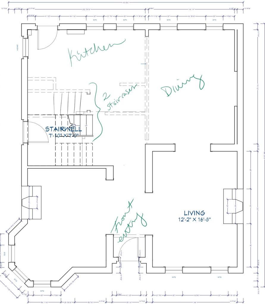
Here’s a drawing of the existing floor plan. The dotted lines represent walls that we’re going to be adjusting/taking out.
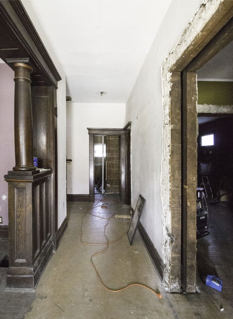
This is what you see when you walk in the front door.
On the left, there’s a room with a turret, fireplace, and gorgeous original woodwork. Our plan is to make this room into an office/library.
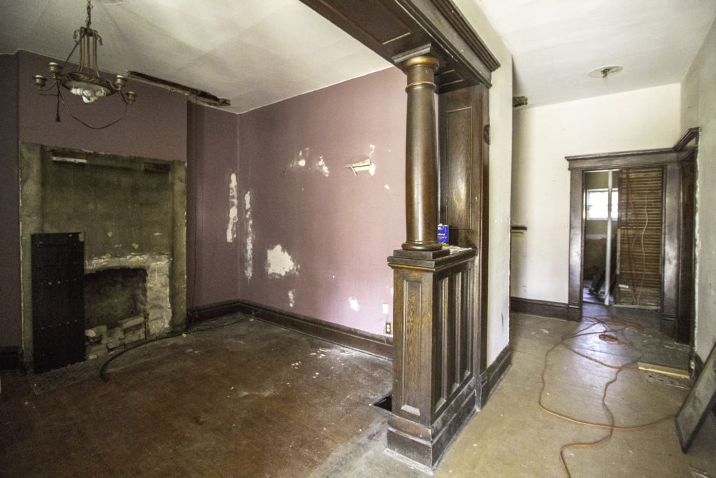 So. Much. Potential.
To the right of the entry area is the living room. We’re going to keep the slot machine and repurpose it. Jk, jk! We are, however, going to restore the two sets of pocket doors in this room – one between this room and the dining room, and the other between this room and the front entry.
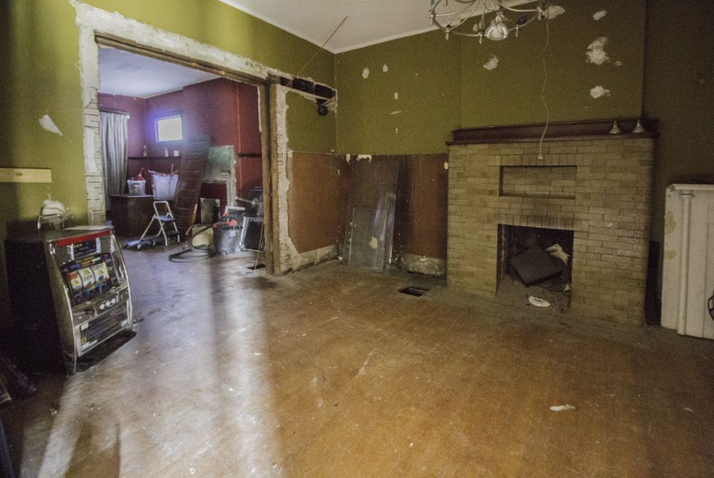
Behind the living room is the dining room. The kitchen is through those doors on the left.
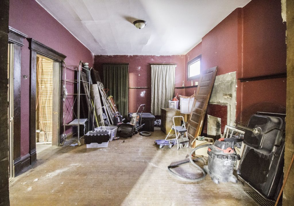 Here’s another view of the dining room from the old kitchen. The living room is on the right.
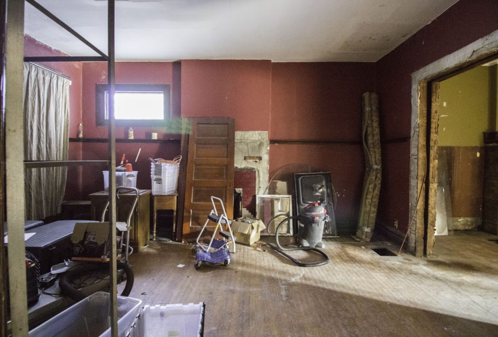
From the dining room, we make our way toward the kitchen. This wall between the two rooms will be coming out, and yes, we’ll be saving that woodwork 🙂
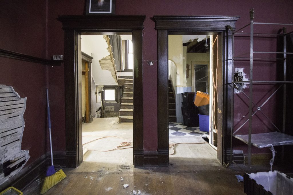
The house has two sets of stairs parallel to each other, which we’ve never seen before. At first, we assumed that the one on the right was an old servant’s staircase, but it connects with the main staircase at the landing and doesn’t lead anywhere else. If anyone has theories, we’d love to hear them! (P.S., the height of the archway is interestingly low. We both have to duck when walking down the stairs to avoid hitting our heads – and I’m 5’4″!)
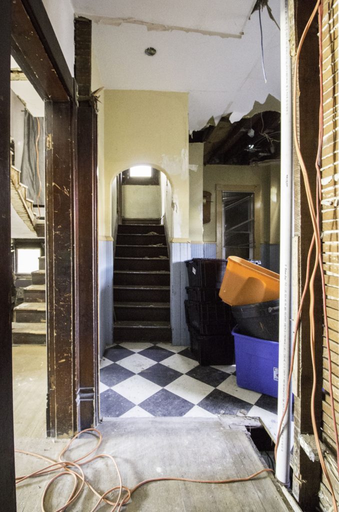
Here’s the good ol’ kitchen, looking toward the back of the house.
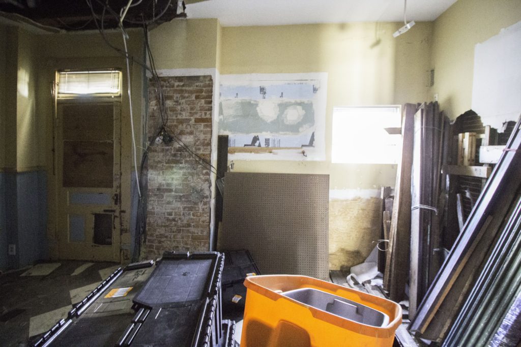
Here’s another look at the second staircase in the kitchen. On the other side of that wall is the main staircase.
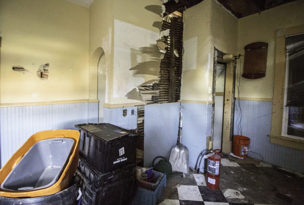
And last but not least, here’s what the main staircase going up to the 2nd floor looks like. The doorway at the top of the staircase leads to the second staircase in the kitchen. Unfortunately, the guys who used to live here stole the original balusters and banister (along with a lot of other stuff), so we’ll need to rebuild it. We have some fun ideas up our sleeves.
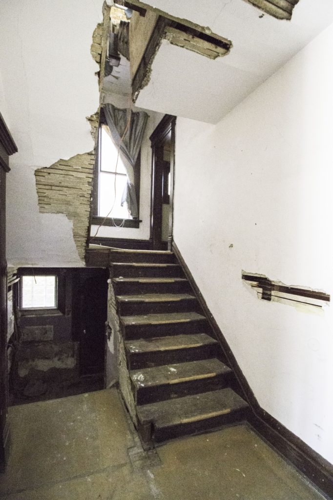
Here’s another view of the two sets of stairs from the landing. Interesting, right? If you turn right at the bottom of the stairs, you’d get back to the front door.
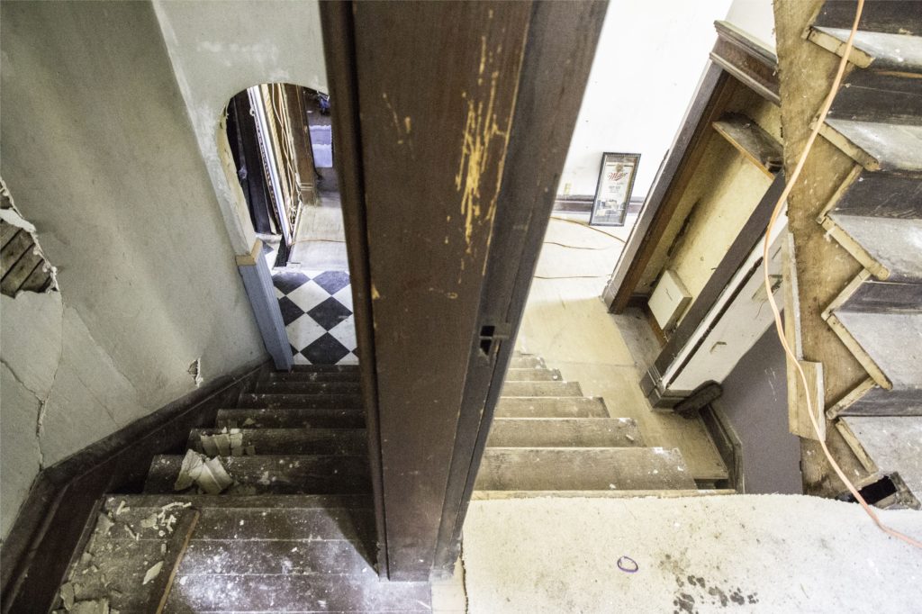
So, what are we going to do? We’re leaving most of the walls exactly where they are, with two exceptions: 1, we’re removing the 2nd staircase and 2, we’re opening up the wall between the kitchen and dining room.
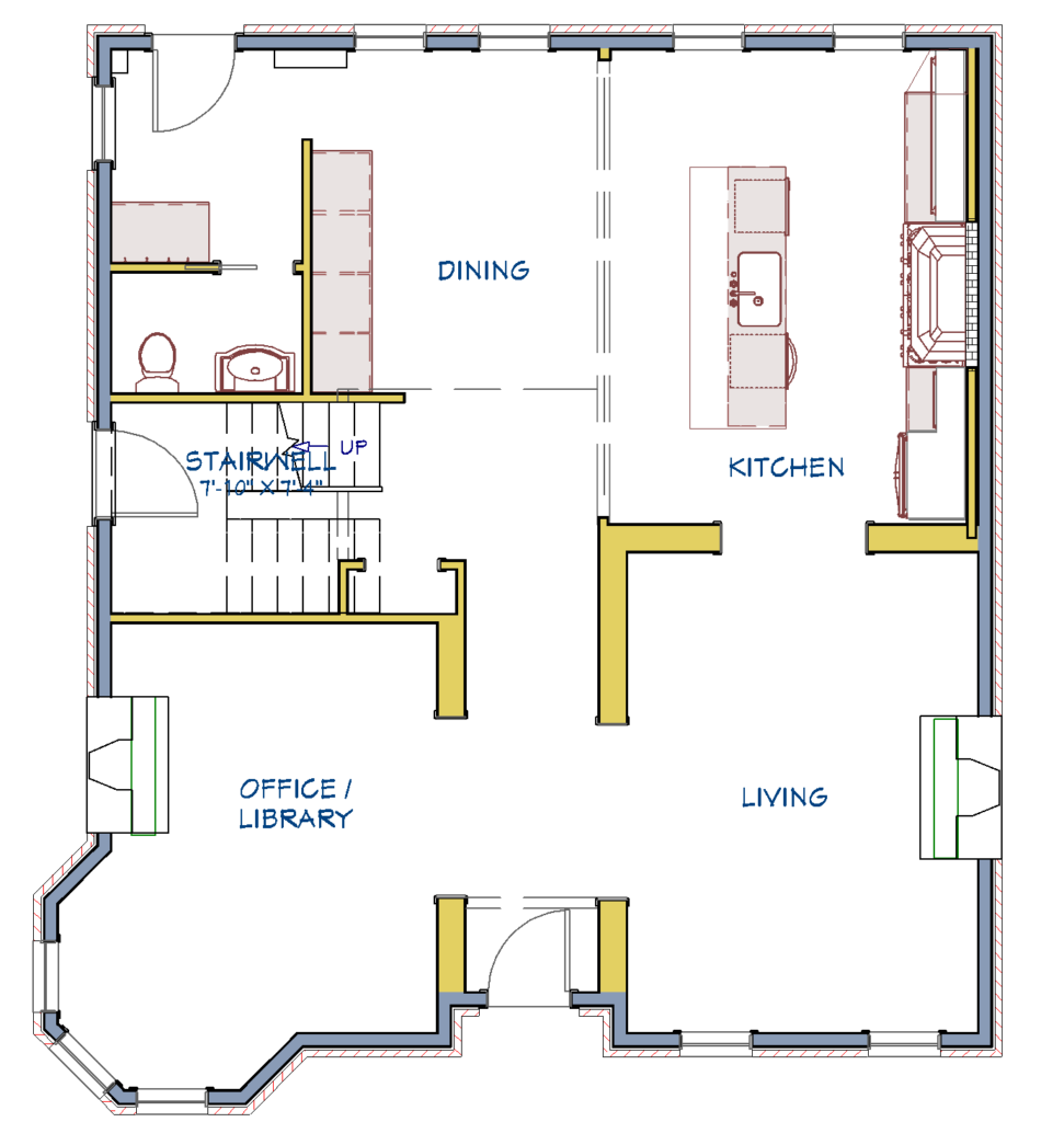
Our first thought was to try to keep both sets of stairs, because why not? They’re unique and fun and add a sense of history to the home. But, after we started digging into design planning, we realized that the space where the second staircase is would be the best spot for a 1st floor powder room. 2 staircases vs 1st floor powder room? We chose the powder room.
As for the kitchen/dining room swap, we started off with our kitchen in the kitchen and were super excited about the design we came up with.
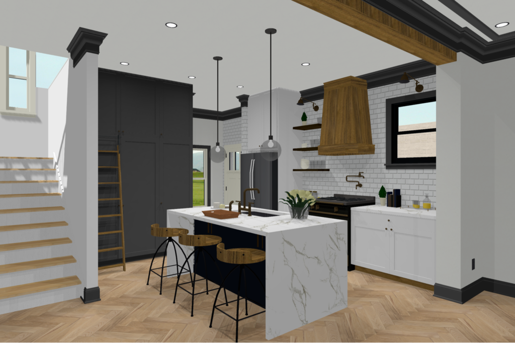
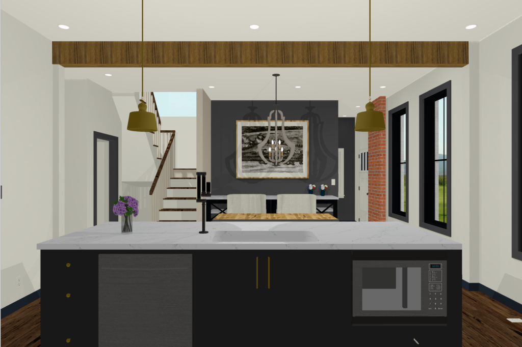
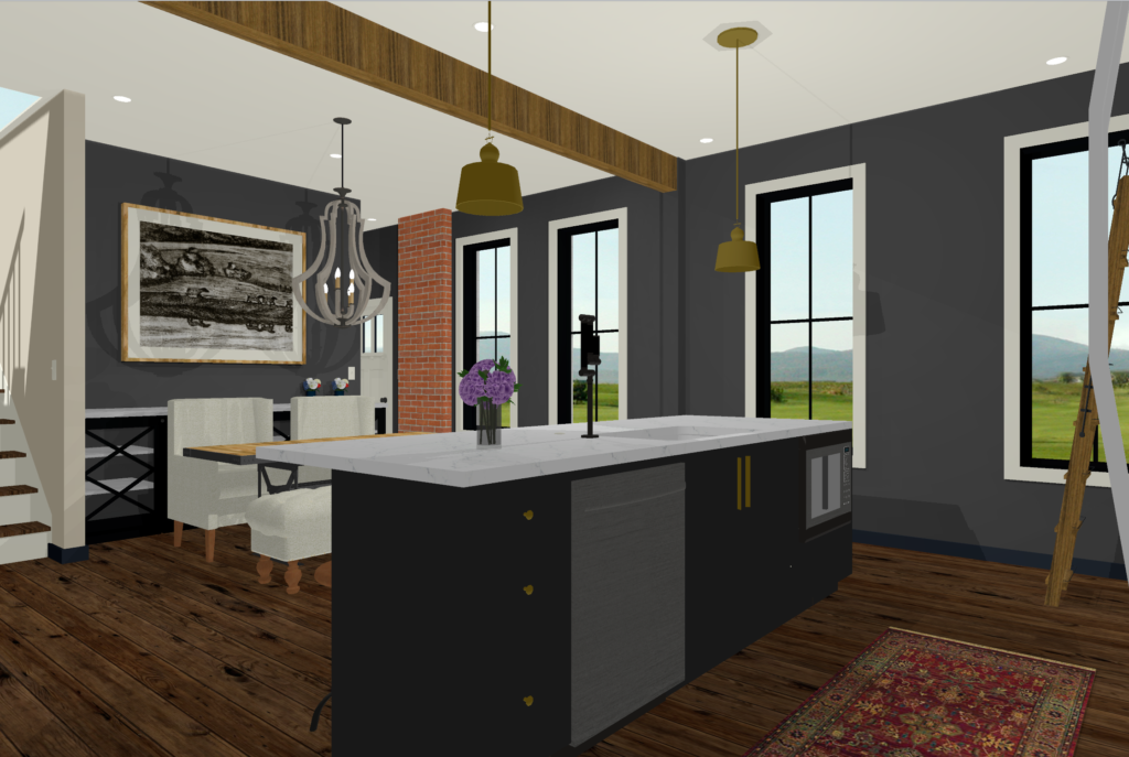
We had been working off the preliminary measurements on the auditor’s site + the ones we took when we first saw the house in December, so we went back to double check that everything was correct. It wasn’t. There was a large chimney that we hadn’t accounted for, and the overall size of the room was smaller than we thought. We tried to rework it, but it felt like we were trying to fit a square peg in a round hole. We scrapped our plans, started over, and experimented with moving the kitchen into the dining room. The dining room has a really nice, long wall that’s perfect for cabinets and appliances. We’re still making tweaks, but the layout could look something like this. (Update: just kidding, we changed our minds! Read about our final kitchen/dining plan here.)
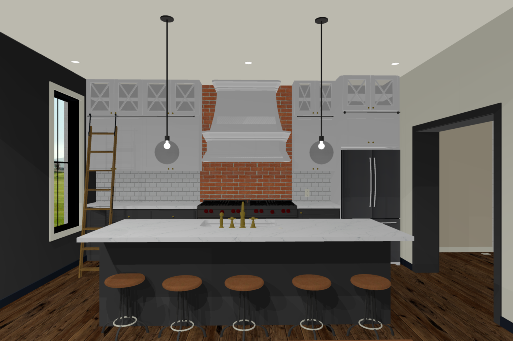
Or this.
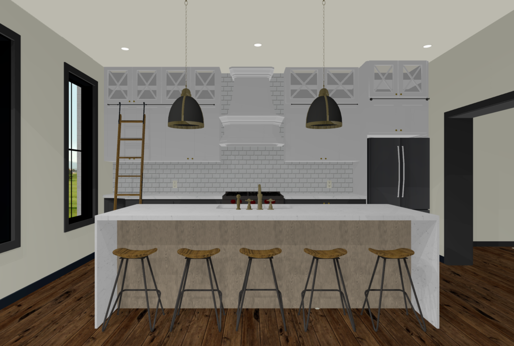
Or maybe neither, because we like to change our minds a lot 😉 Either way, it’ll be an improvement over this.
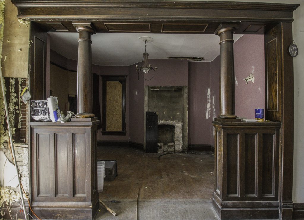
 Here’s the view from the soon-to-be kitchen into the new dining area, without the wall there.
 This wall.

It’s gonna be good, guys. If you’re curious about the rest of the house, you can check out the 2nd floor tour here, and the 3rd floor tour here. We’ll be back soon with more. Follow us on Instagram for updates in the meantime!
B + C
The Victorian (1890’s) I grew up in had a stair case just like that! The servants stairs to the kitchen met the regular stairs at the landing, then one set of stairs up to the second. I agree that ditching it for a powder room is the way to go! I really like the darker if the two kitchen plans ( without the waterfall countertop.) looks like a huge project, but fun!
Thanks for sharing, Helen! So fun.
So gorgeous!!! Me and my hubby are starting our first flip next month. I’m so excited/nervous. What site do you use to create the virtual design?
Woohooo! That’s exciting. We used Chief Architect for this, but have heard great things about Sketchup. Good luck w/your project! If we can help at all, let us know!
Can’t wait to see you do your magic on this classic lady!
Thanks Karen. We’re excited!
Looks great! Im also a fan for option 1 without the waterfall. Much husband is going to hate that I saw this now because it’s giving me all kinds of ideas for our kitchen/dining remodel
Swapping them makes so much sense!
Hahah, love it. Thanks for your comment, Stephanie!
Your ideas look amazing, like you said there is so much potential! I can only guess that the second stairs was some sort of attempt to divide the place into two separate units – maybe for renting out? Also, what software do you use for your renderings? Are you using Sketchup? Thanks.
Thanks Jill! We used Chief Architect for this but have heard great things about Sketchup.
This home is so outrageously charming, I can’t wait to see the in between and end results 🙂 Also, I think this home calls for the use and overuse of the word “parlor.” Don’t you!?
Yes!!
You guys are doing great things. Love you!
Thanks Gloria!
[…] Getting a little closer, this was the old kitchen space in all of its messy glory. (psst, you can find the rest of the first floor before tour here). […]
[…] Getting a little closer, this was the old kitchen space in all of its messy glory. (psst, you can find the rest of the first floor before tour here). […]
[…] Getting a little closer, this was the old kitchen space in all of its messy glory. (psst, you can find the rest of the first floor before tour here). […]