

It’s been over a year since we began planning the kitchen at White Cape Cottage. The day is finally here to show you what it looks like now and spill all of the details!
This post is sponsored by Lowe’s. Thank you for supporting the brands that support Beginning in the Middle.
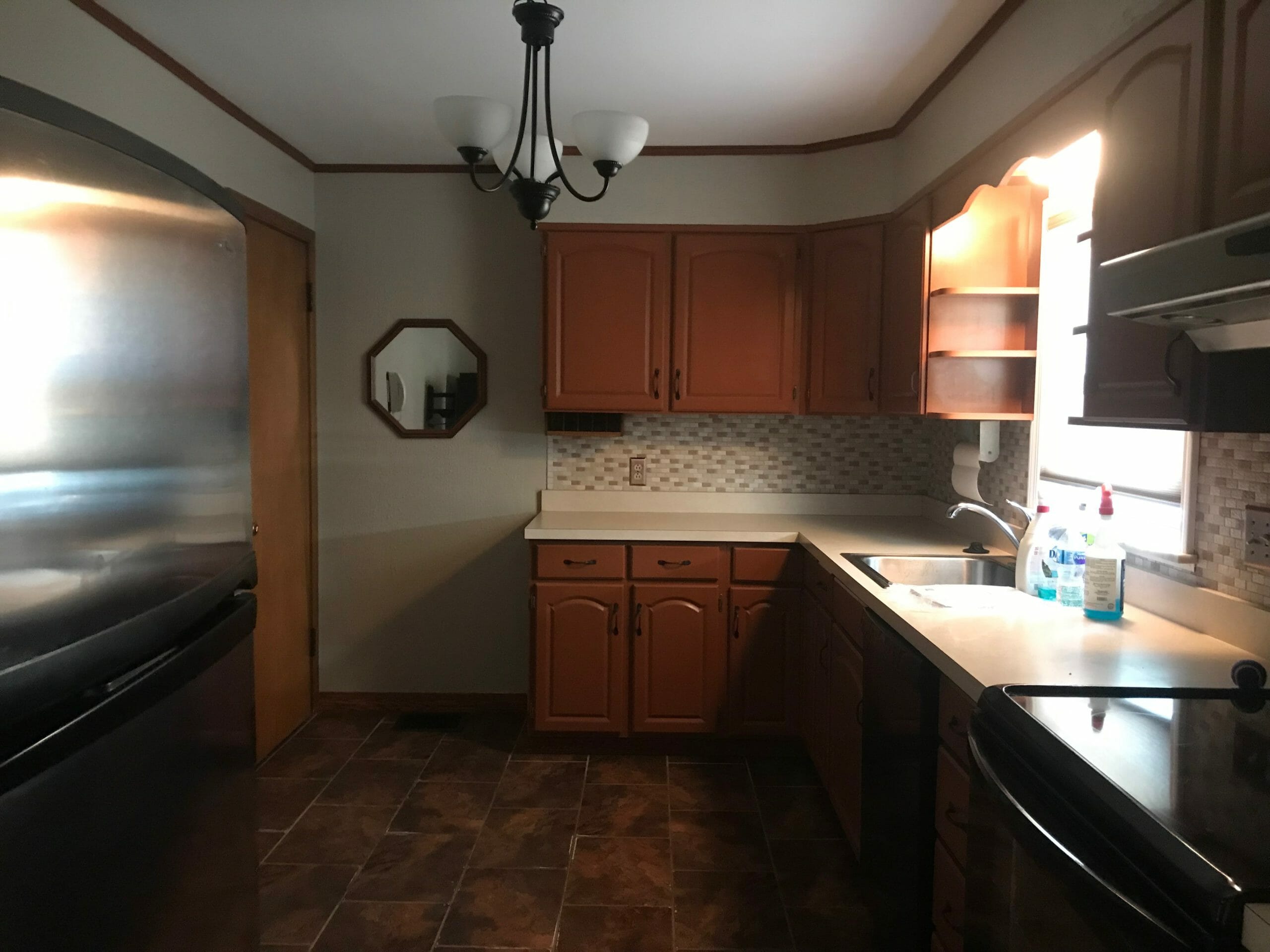
recap: BEFORE
Here’s a quick reminder of what the kitchen looked like when my parents bought White Cape Cottage. We wrote a separate post explaining all of our design plans, budget, and layout changes — if you missed it, click here to catch up.
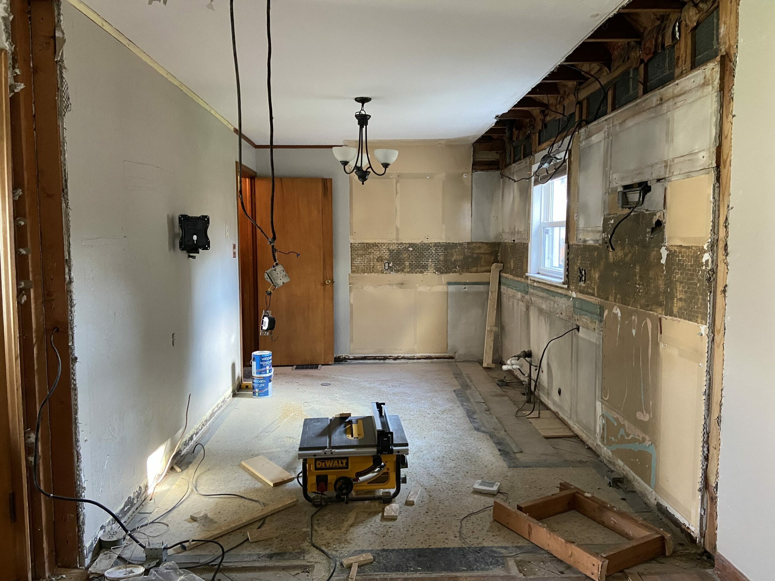
Then came demo.
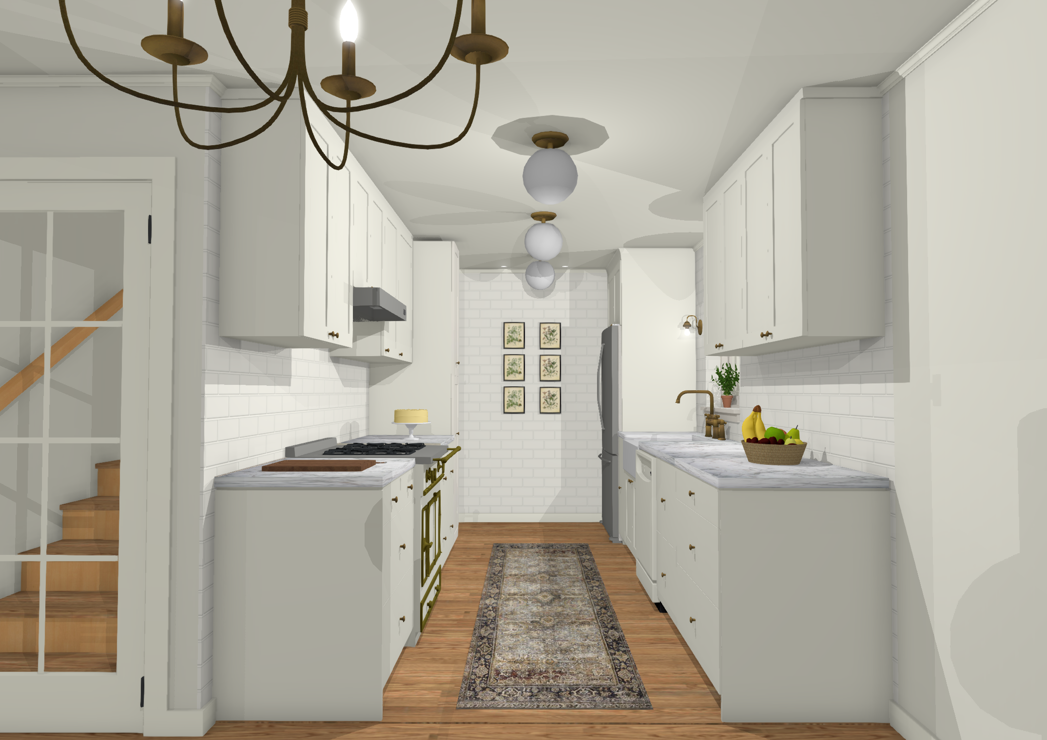
And then, our final rendering.
And now…
AFTER
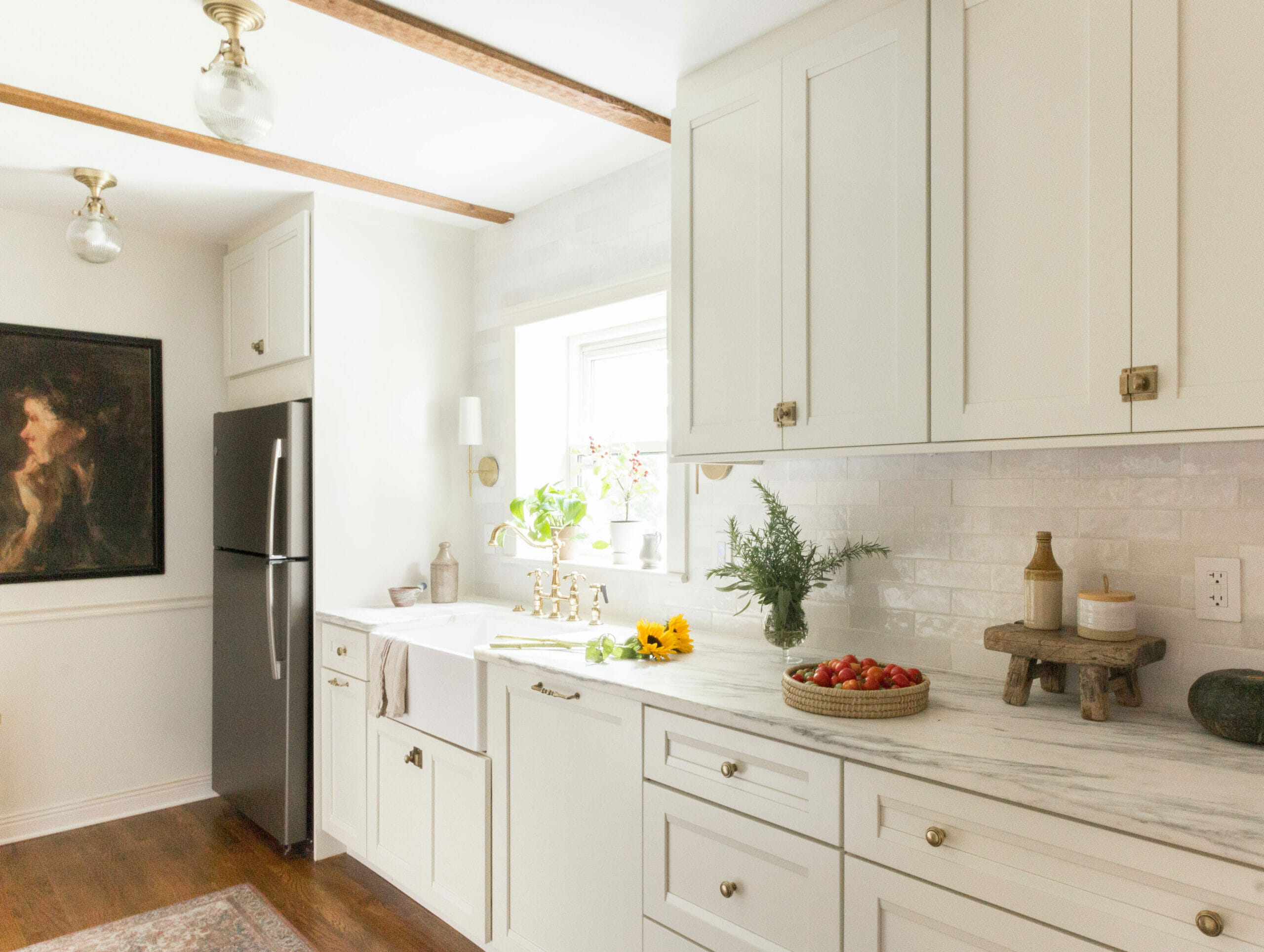
Heeeeeere she is! I’m so proud of how this little kitchen turned out, and am so thankful we had the help of Lowe’s to make it top notch for my parents. Let’s walk through all of it, shall we?
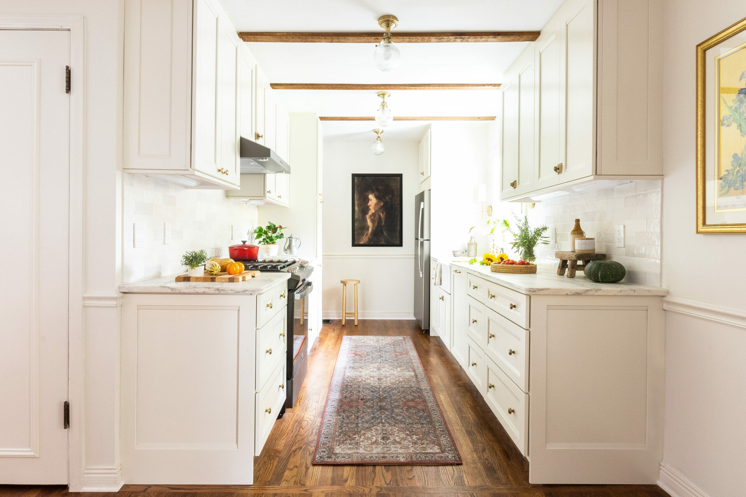
The cabinetry is custom from Kraftmaid. The creamy off-white color is Canvas, and the door style is Sonata. It’s very close to shaker style, but has an extra bevel detail on the top and bottom that makes all the difference. We took advantage of a 30% off sale that Lowe’s was having — it allowed us to save about 5k on our order (the total for everything, including the extra end panels and extra trim pieces, came to about $10k). We were able to customize all of the cabinet choices based on my parents’ needs, from a KitchenAid mixer cabinet to XL drawers for pots and pans.
The furniture end panels might just be the star of the show here… I love how they elevate the whole look of the kitchen, especially from the dining room. We’ll do a detailed blog post taking you through all of the cabinetry details in the coming weeks, so stay tuned.
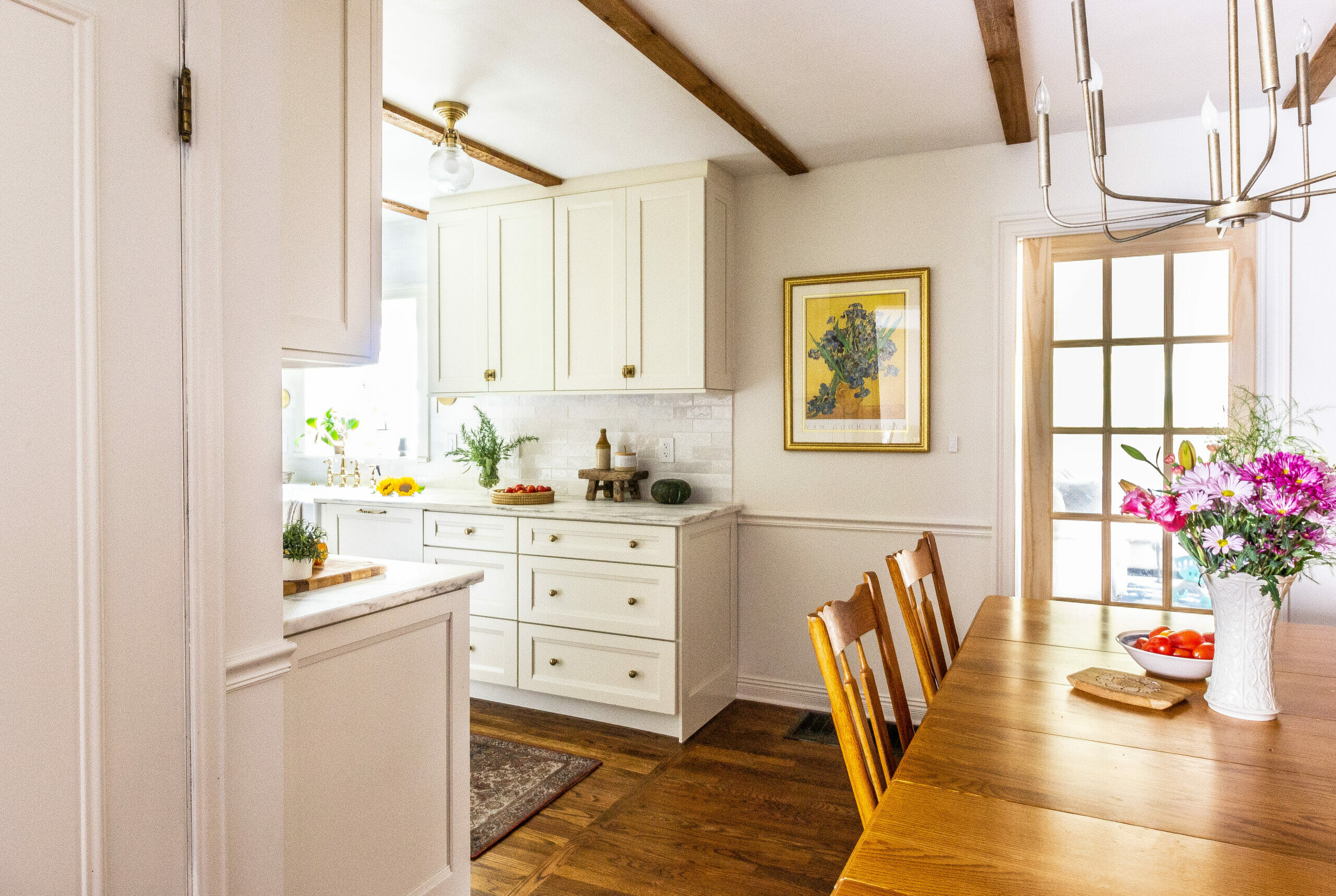
We had originally proposed an archway into this kitchen (we’re not usually big fans of open concept), but my parents loved the idea of having it open to the dining room — especially since it’s a small space with limited light. It was the right decision for this house and they love it.
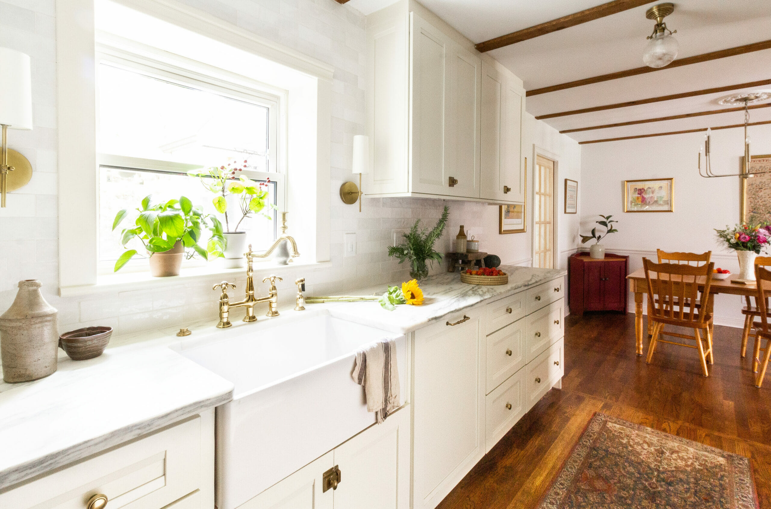
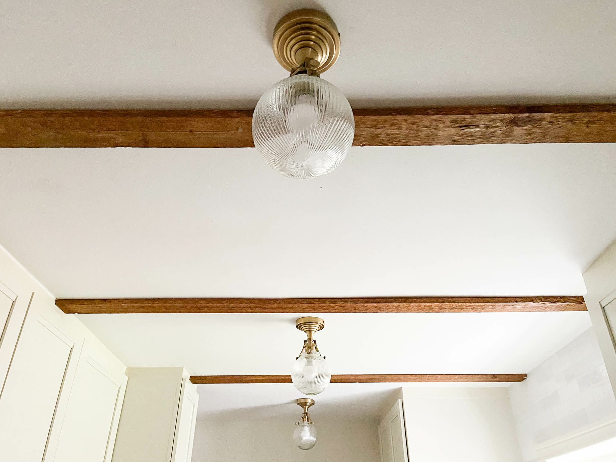
We added shallow beams to the ceiling in both the living and dining spaces, and WOW does it make a difference. It would have been very hard to add crown to the kitchen because the ceiling height is off by 1-2 inches from side to side (#oldhouseproblems). We wanted to add something, and knew that a warm accent would be perfect. These are off-the-shelf unfinished cedar boards (around $10 each) that we stained Minwax Provincial to match the floor.
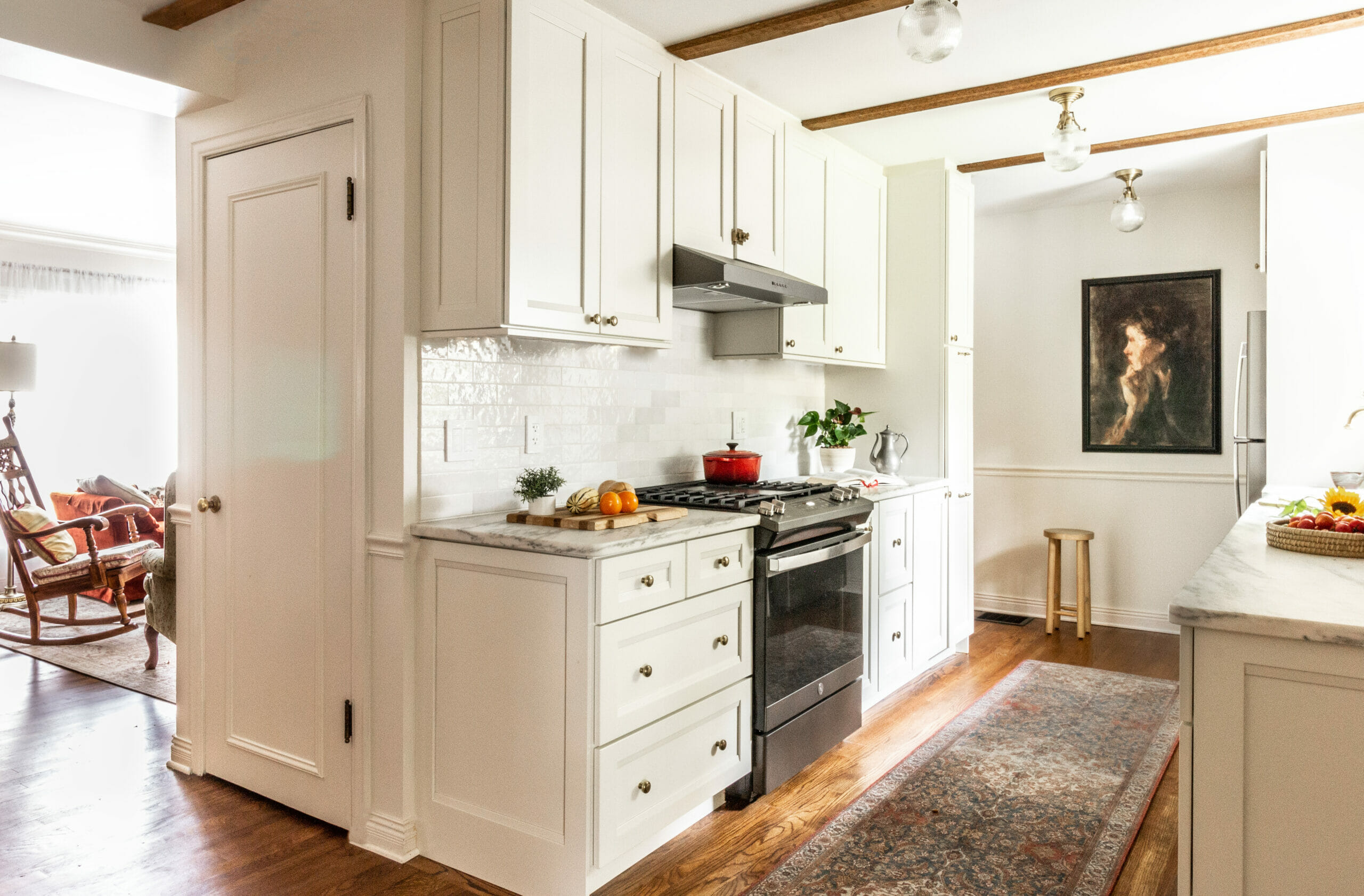
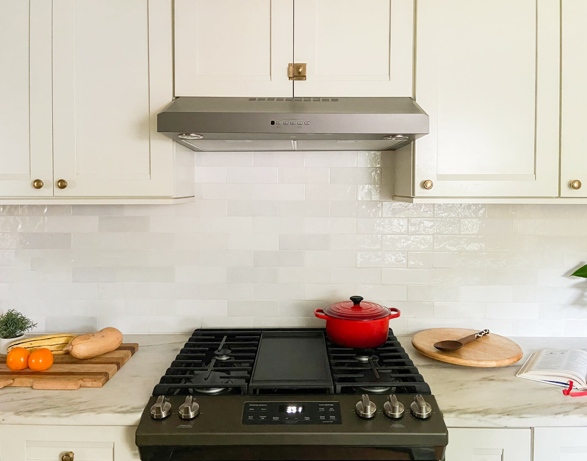
We chose GE Slate appliances, which are a matte taupey gray that works so well with brass. It’s warmer than stainless steel and doesn’t smudge. We opted for a panel-ready dishwasher (it’s to the right of the sink) for a cleaner look. The panel is a cabinet door that fits the size of the dishwasher (24″ wide).
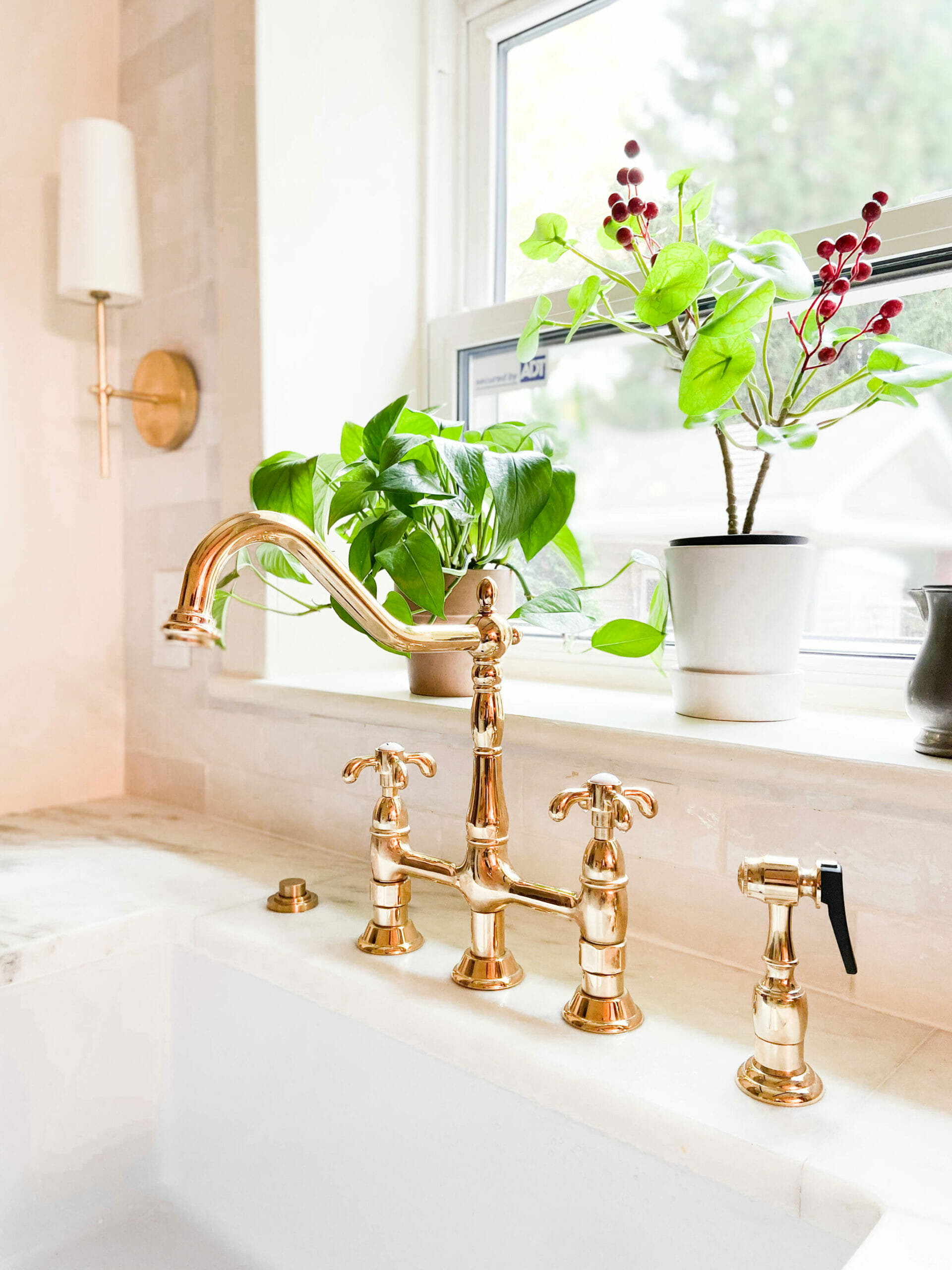
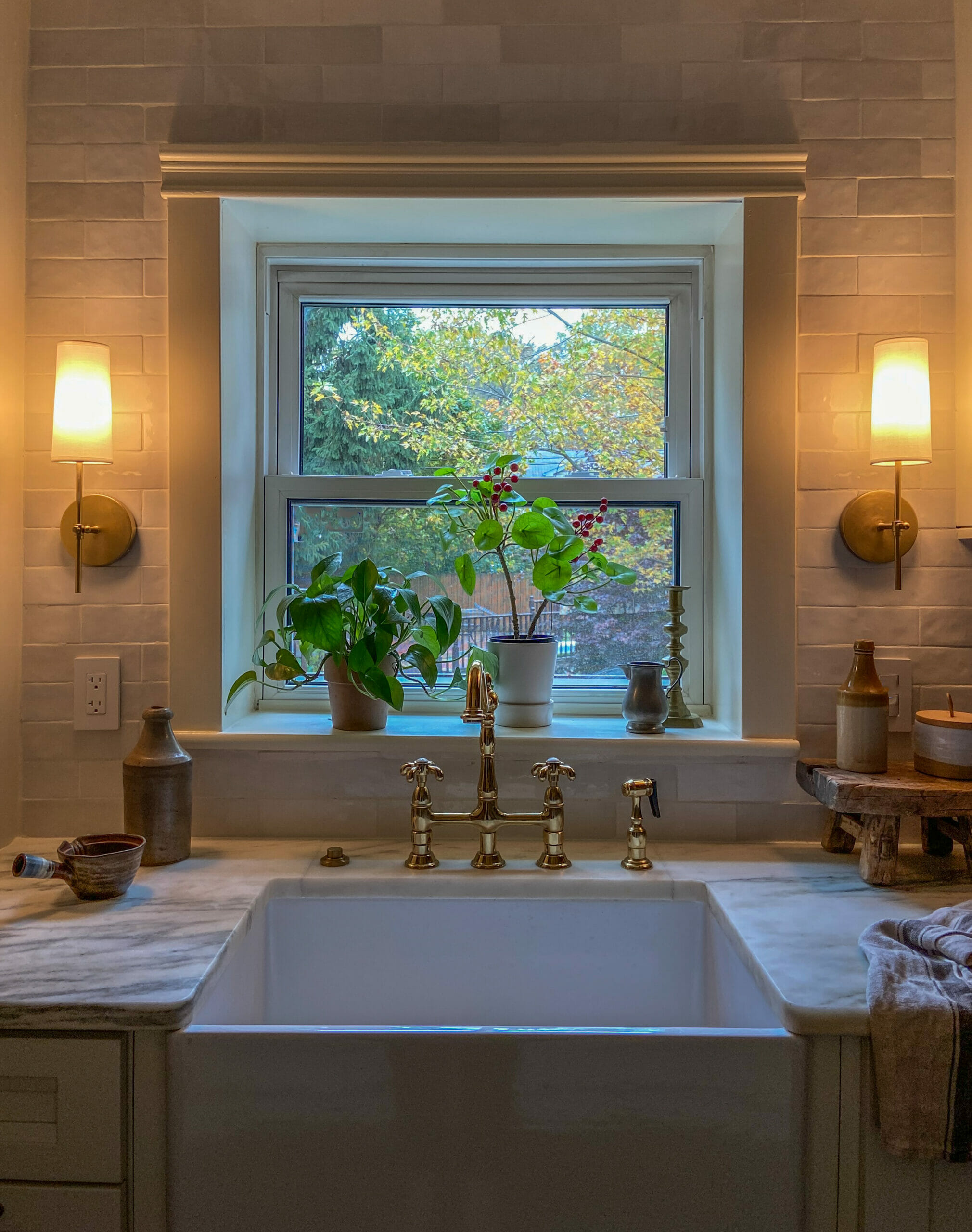
Designing a kitchen that feels high end is all in the details. We chose this affordable brass French-style faucet that’s incredibly well made and oh-so-pretty.
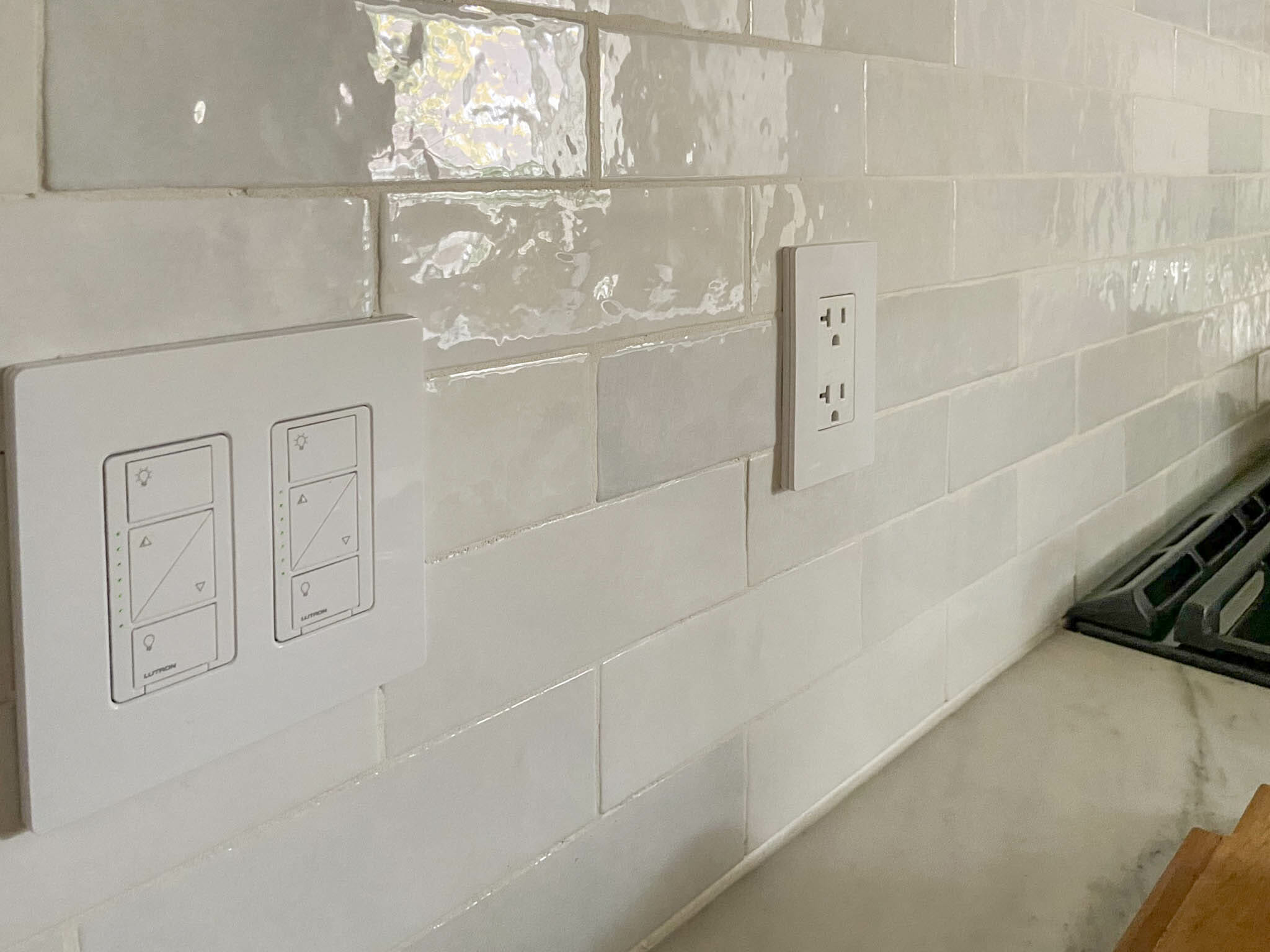
We wanted the backsplash to feel classic and have great texture without adding too much visual impact. We’re so happy with the Cloe tile we installed in this kitchen (it’s by Bedrosians). Each tile is a little different – some are more gray, some are more creamy and some are more of a true white – which gives it a custom look. Compared to other glazed tiles, the price point on these is fantastic too.
Lighting was a big factor in making this kitchen shine (pun intended). Good lighting in a kitchen goes well beyond can lights. Kitchens aren’t only used to cook — they’re also used to make coffee in the mornings when you’re just waking up, and when you’re winding down at night. Having a variety of dimmable accent lighting and functional lighting is such an important, often overlooked element in a kitchen. Here’s a rundown of the lighting we added:
1 // Sconces flanking the window. These sconces were incredibly affordable and have warmer bulbs that are on a dimmer switch (they’re currently out of stuck, but scroll down to our Source section for similar alternatives we found!). We planned our cabinetry placement around them, and purposely left about 13″ of space on either end of the window so they wouldn’t feel crowded. Leaving some space for a window to breathe — especially when it’s a small window in a small kitchen — makes all the difference. The window now feels intentional, instead of squished between cabinetry, and the lighting the sconces put off is soft and pretty. Perfect for early mornings.
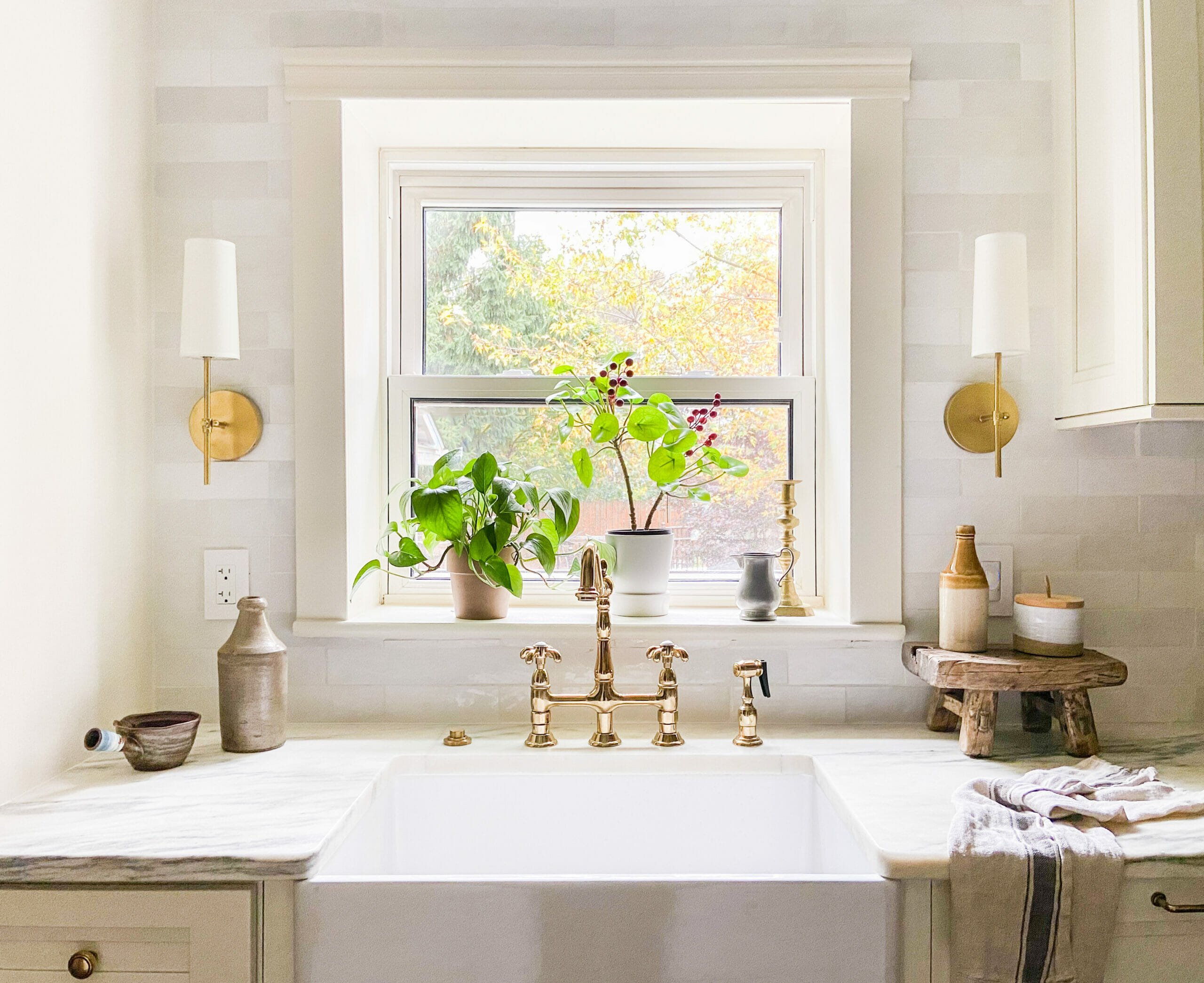
Here’s what they look like on. I love how it makes the tile pop, too!
2 // Undercabinet lighting. The kitchen isn’t super bright so we wanted to make sure the countertops could be fully illuminated if needed. These lights are 3000k and add a ton of light to the kitchen when they’re turned on, even when the ceiling lights are turned off.
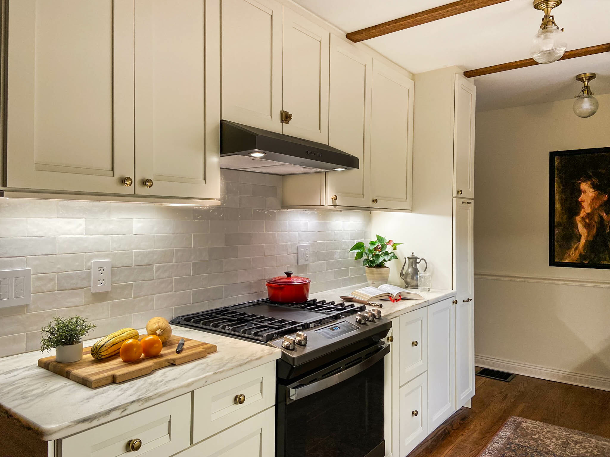
3 // Semi-flush ceiling lights. The main source of lighting in the kitchen comes from three ceiling fixtures running down the center of the kitchen. We opted for these fixtures instead of recessed lighting to add some extra style to the kitchen. They draw your eye up and look so pretty from the dining room.
Onto the floors. We replaced the old brown swirly tile with new hardwood floors to match the originals. We’ll do a separate blog post on the process, but love how they came out. The new ones are unfinished red oak that we stained Minwax Provincial. You really can’t tell the difference between old and new!
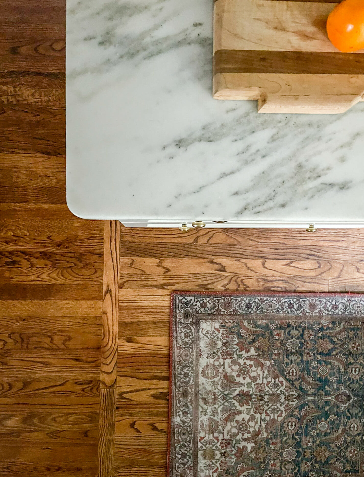
The countertop material is Danby Marble that we sourced locally. Danby is a type of marble that’s from Vermont and has a higher density than Italian marble, making it more durable. It’s so, so gorgeous.

SOURCE LIST + details
Cabinets: Our cabinets are Kraftmaid from Lowe’s. We took advantage of a 30% off custom cabinetry sale, which saved us about 5k (the total for all of the cabinets, cover panels, etc came to about $10k). These doors are the Sonata door style and the color is Canvas. We have a separate blog post coming later this month with every last detail about the cabinets, so stay tuned!
Sink: We needed a sink that was smaller than 30″ to fit into our 30″ sink cabinet. This one is 27″ and reversible and HEAVY (it’s fireclay). It’s very deep, so it helps keep dirty dishes hidden (so important for open kitchens!)
Brass faucet: We were so excited to find this well priced, sturdy brass faucet that makes the whole kitchen feel fancier. It’s currently out of stock, but we found a very similar one by the same brand here. You can also check out our blog post from a few months ago where we linked a bunch of great brass finds by clicking here.
Sconces: We incorporated sconces flanking the sink window, which was one of the best decisions we made during our planning process. They’re out of stock, but we found a few similar ones here, here and here.
Semi-flush ceiling lights: LOVE these semi-flush fixtures we found. They hung down a little lower than we liked, so we ordered these replacement shades that are just a bit smaller than the ones they came with.
Backsplash tile: We chose Bedrosians Cloe tile in white to add texture without too much business. This tile has imperfect edges and each tile is slightly different, which makes it a bit more interesting than standard subway tile.
Refrigerator: The fridge is in the back of the kitchen and not highly visible, so this was an area we saved money. We opted for a top freezer fridge that tucks in nicely!
Range: We chose a slide-in gas range in Slate finish by GE. It’s matte and hides everything, and has a warmer gray tone than stainless steel.
Dishwasher: We opted for a panel-ready dishwasher so it would blend with cabinetry. We chose this Bosch model that has wonderful reviews and is SO quiet.
Range hood: We chose a GE slate convertible range hood to match the range. A small microwave will go in a cabinet for use when needed (my parents aren’t microwave-all-the-time people, so we didn’t want to put a gigantic one over the range).
Floors: The floors are unfinished red oak hardwood that we refinished and stained Minwax Provincial. Lowe’s sells the wood in bundles. We’ll share more details on this process in a separate blog post.
Beams: Cedar 1×4 boards (unfinished)


Beautiful! What paint color did you select for the walls? Thank you!
Thanks! Shoji White.
Beautiful!!! STRONG WORK. Did you also replace the window over the sink?? It seem to have a slightly deeper ledge than the original… perfect for plants… Also, what direction is this window facing (N, E, S, or W?) Are the plants growing well? We have an east facing window in our kitchen and I wonder if I would be able to grow plants adequately in that window. Thank you!
Hi! We framed out the wall so it could be insulated (the exterior is cinderblock), so that’s why you’re seeing the deeper window ledge in the new kitchen. The window is west facing so it gets great afternoon light.
Your spaces are always stunning! Can you tell me approximately when Lowe’s offers a discount on custom cabinetry? I’ve been to the Kraftmaid outlet (great prices) but it’s difficult to find what you need and since contractors get first dibs, the good stuff goes fast☹️
Thank you! We ordered these at the end of 2019 / early 2020. I would call your local store… they have the same a few times a year!
Hi, where is that runner from. Love it!
Thanks! Here’s the link: https://amzn.to/32KrYaa (it’s Ocean/Multi but lots of other combos are available too)
This is a beautiful and timeless kitchen! I love it! You’ve given me a lot of ideas to upgrade the kitchen in a rental property we need to renovate! Thank you so much for sharing!
So glad to hear this!
Hi- Could you share your picks for hardware pulls/knobs? Thank you!
They’re all Emtek (French Antique finish) and they are SOLID. We have the latches and knobs in our own kitchen, too. Here are the links:
1. Spindle Pull
2. Latches
3. Knobs
I hope this helps!
Catching up on your posts a few weeks after the fact…you’ve done a superb job throughout this home. Your folks must be thrilled to pieces. Beautiful work with staying power (in design and quality).
thank you so much Cat!
I love this for my own galley kitchen. My question is: what happened to the dishwasher? Is it behind one of the doors?
Thank you! The dishwasher is to the right of the sink. It’s a panel-ready one, so it looks like a cabinet.
What color did you paint the trim (baseboards/crown moulding) in this room? And is it the same as in the adjoining rooms with open concept? Struggling to find a cohesive trim color for my entire home!
Same as the walls, but semi-gloss – Shoji White
In the kitchen, we custom matched the paint color to the cabinet color.
What a beautiful kitchen! Do you recall what brand and color grout you used for the Cloe tiles? We are using those same beautiful tiles in our kitchen reno, and I’m struggling with what grout to choose. I love the way yours look! Thank you!
I believe it was just called “White”
Hello! I’ve saved nearly every photo of this beautiful kitchen to my Pinterest board. 🙂 I came upon it once again when Googling “Danby Marble + Cloe Tile” and I had to look at everything once again! From what I’m reading, Danby comes in a few different options. Do you recall which one you used? It’s simply gorgeous and looks stunning with the tile. Thank you!
Thank you! Montclair.
[…] so we can curate a good mix of old and new. Since we began working with Lowe’s on our White Cape Cottage kitchen renovation, we’ve been noticing a growing selection of décor available on Lowe’s.com in addition […]
[…] of our goals for the kitchen renovation at White Cape Cottage was to make the room feel cohesive with the rest of the house, especially after opening up the wall […]
Hello,
We are purchasing a home out of state that has a galley kitchen. This is a huge inspiration! Can you tell me the dimensions of the kitchen so I can see if something like this would work? Also, is a door or a framed window next to the dining table? I couldn’t tell from the pictures if there was a door knob or not. Thank you
I love that you left your CPA job and are living your passion and supporting your family doing it. I’m also so happy that you’re talented at it lol! These projects and pictures are amazing and I thoroughly enjoyed the articles, pictures and even the comments! It’s wonderful to read all the questions and generous of you to share the details to those who admire your work! ADMIRABLE!! As someone who is also passionate about decorating and remodeling, I will be sure to bookmark your site and return often to see your journey. Thank you for sharing!!
This made my day, Melissa! Thank you so much for these kind words!