Just like that, 6 weeks came and went… which means it’s final reveal time! If you missed our week 1-5 One Room Challenge posts, you can catch up here:
Week 4: Trim, Paint & Decor Changes
Week 6 was definitely the most eventful and trying week of the entire challenge. With shipments arriving up until yesterday, we were scrambling to get it all done in time. On top of that, when we were having our electricians install our new light fixtures last week, they discovered that our wiring was really messed up and that our panel was about to fry. We went without power for a few days last week while they got everything fixed, which put us behind even more, but it all worked out.
We’re so grateful to have had the opportunity to participate in the One Room Challenge, and if we’re being honest, if we hadn’t, our living & dining rooms would still resemble a partially renovated storage unit!
 Without further ado, let’s see some after photos, all taken by the talented Allie Lehman of The Wonder Jam here in Columbus. All of the sources are linked at the bottom of the post.
Here’s what the view from the front door looks like now!
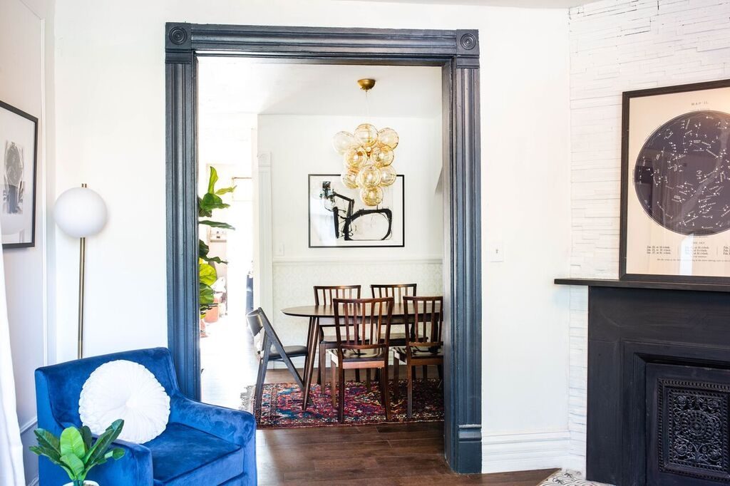
Here’s the view from the dining room looking into the living room. We love how the panel molding and artwork add formality, while the furnishings make the space feel super relaxed.
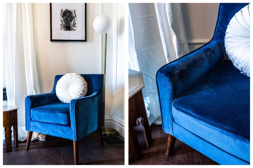
We created a sitting nook with blue velvet accent chairs, the modern floor lamp, and artwork from Chairish. We love how it fills this little corner in the living room.
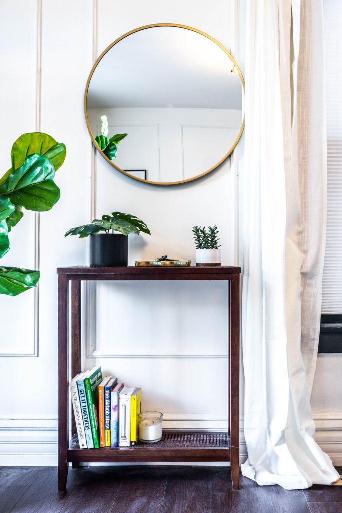
We added a small console table and mirror right by the front door, as well as some hooks for hanging our coats (because this old house has no coat closet).

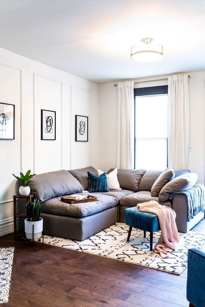
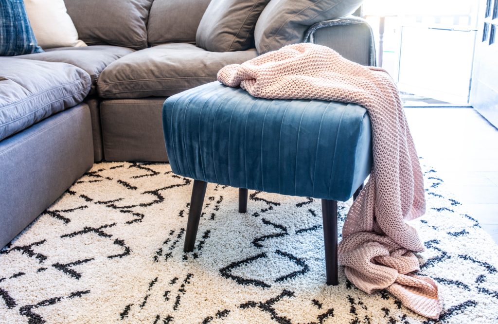
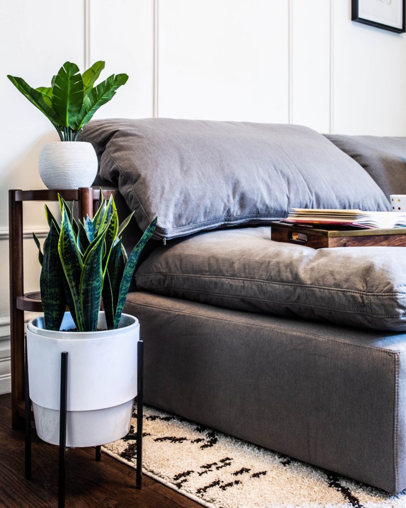
About this sectional from Lamps Plus… it’s ahmazing. It’s on the larger end for the space, but because this isn’t just a photo shoot (we actually live here), we knew we needed something that was actually comfortable vs something that just looked good for photos. We envision spending a lot of time in here!
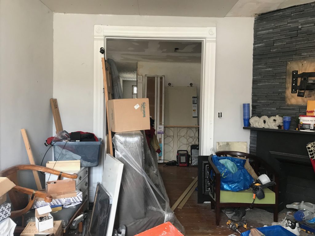
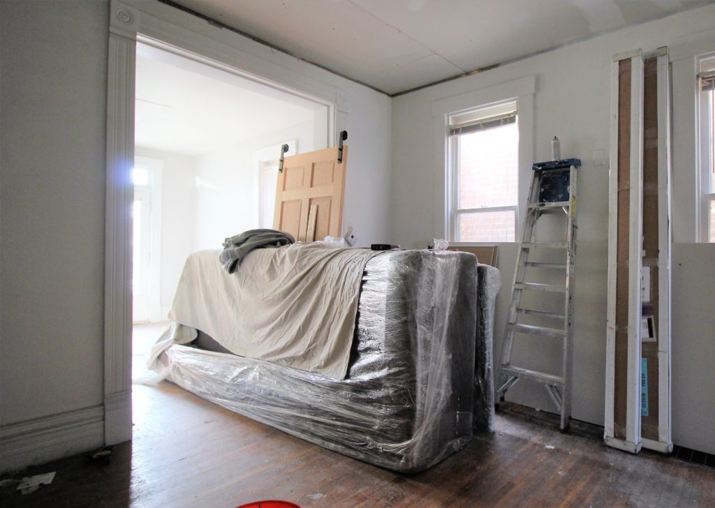
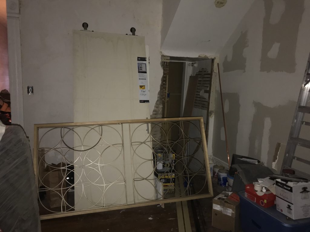
Moving into the dining room. Remember when it used to look like this?
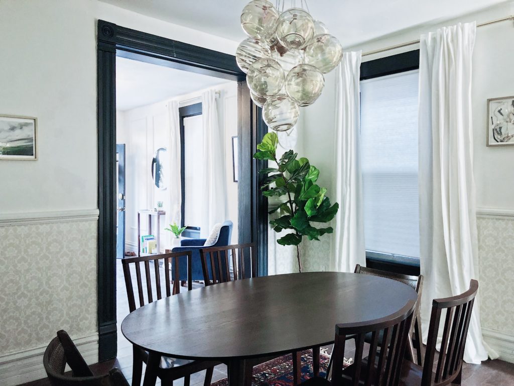
Here’s what it looks like now. Muchhhh better.
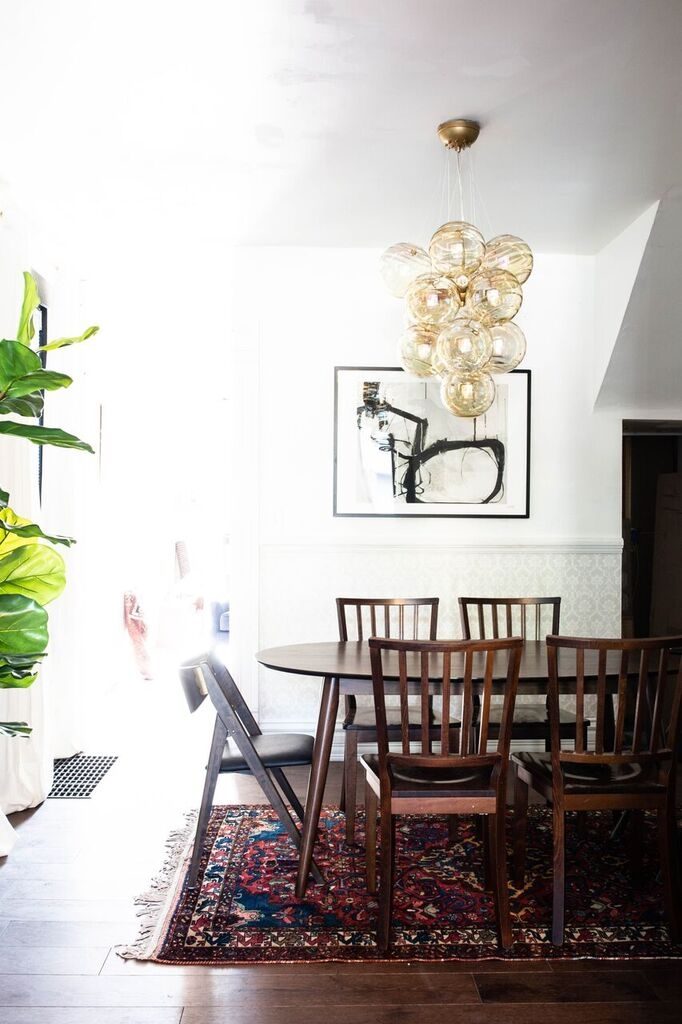
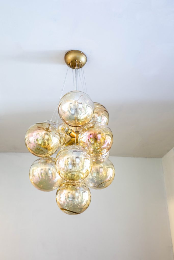
We love the way the chandelier looks mixed with the vintage furniture & rug. It really elevates the space and adds a fun design element. Also, we love the piece of statement art from Minted. We were super excited to find that the artist, Kirsta Benedetti, is from Columbus, too!
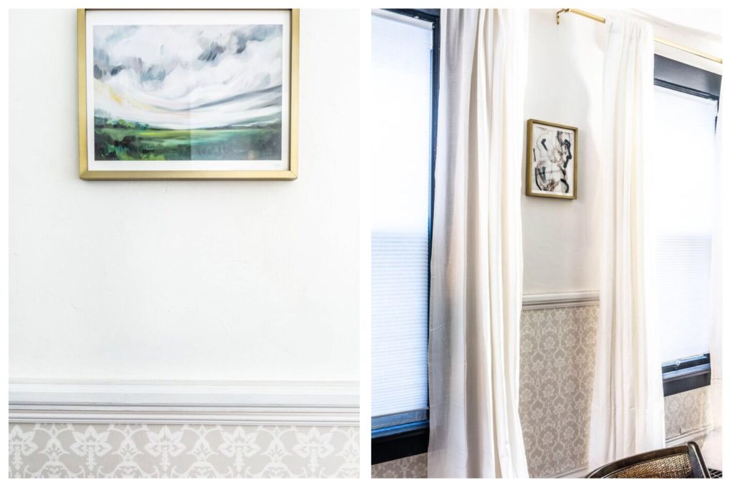
We chose to wallpaper the bottom half of the walls, and leave the top half white. We had some weird ceiling lines going on, so we wanted to avoid highlighting them. Having white space on the top half of the wall also allowed us to incorporate some fun artwork with a neutral backdrop.
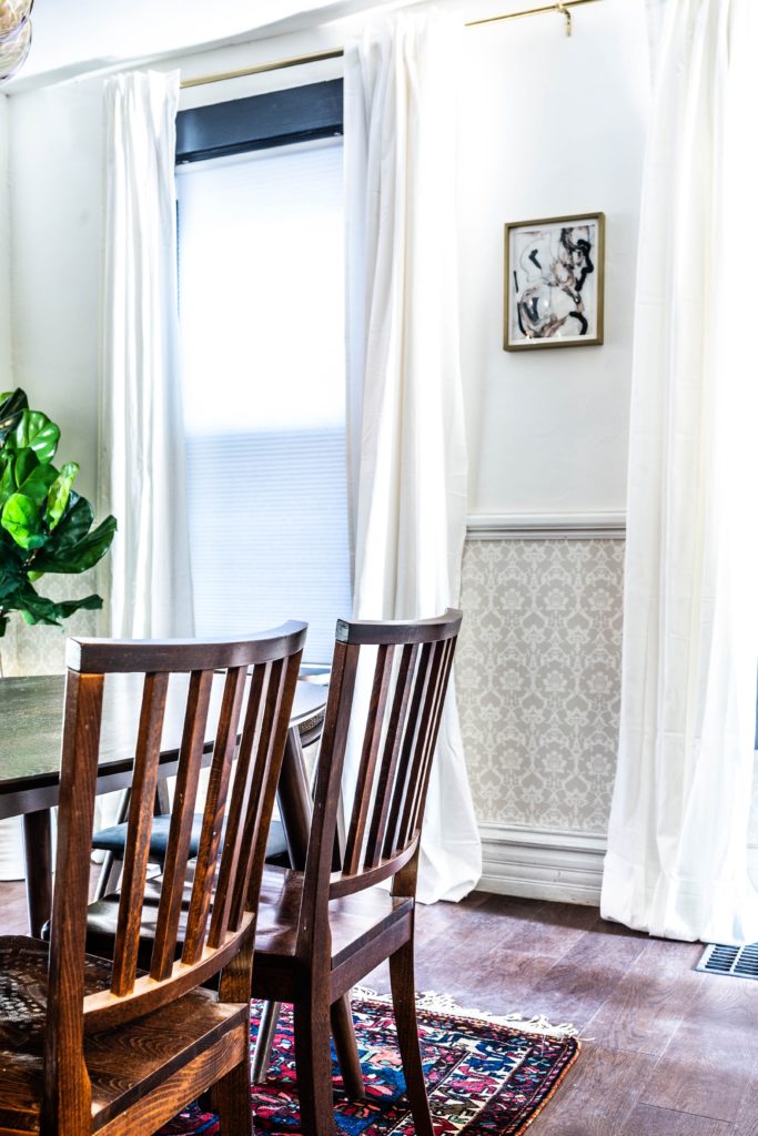
Here’s the dining room looking into the living room from a different angle.
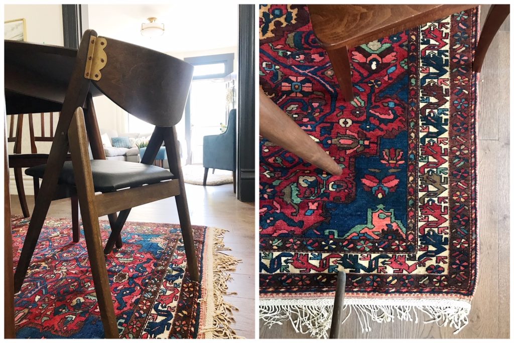
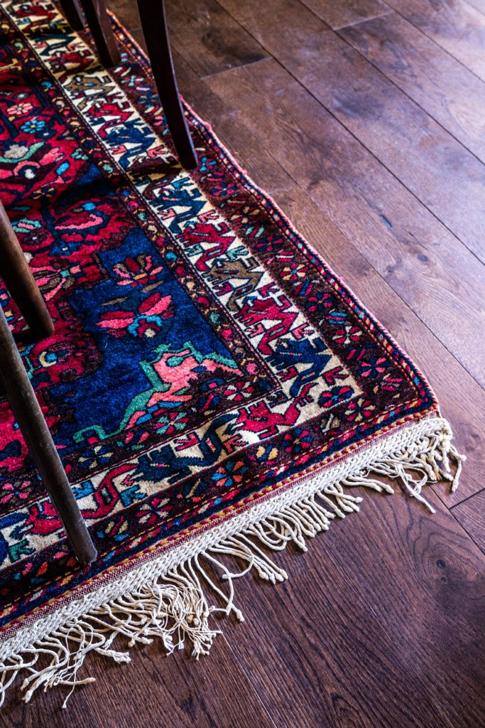
Another favorite: the rug! We have gotten so many compliments on the rug already. It really grounds the room & adds some bold pops of color.
We chose to go over the old floors with new ones for a few reasons, but the main reason was that the existing oak floors were really thin & not in the best shape. We chose Mohawk’s TecWood Metropolitan Chic engineered hardwood floors in Midtown Oak. They’re a classic medium/dark brown, really similar to the tone we’d be looking for if we had been able to refinish the old ones. They’re perfect for the space, and were easy to install! They look different in different light — here they are in our really well lit living room…
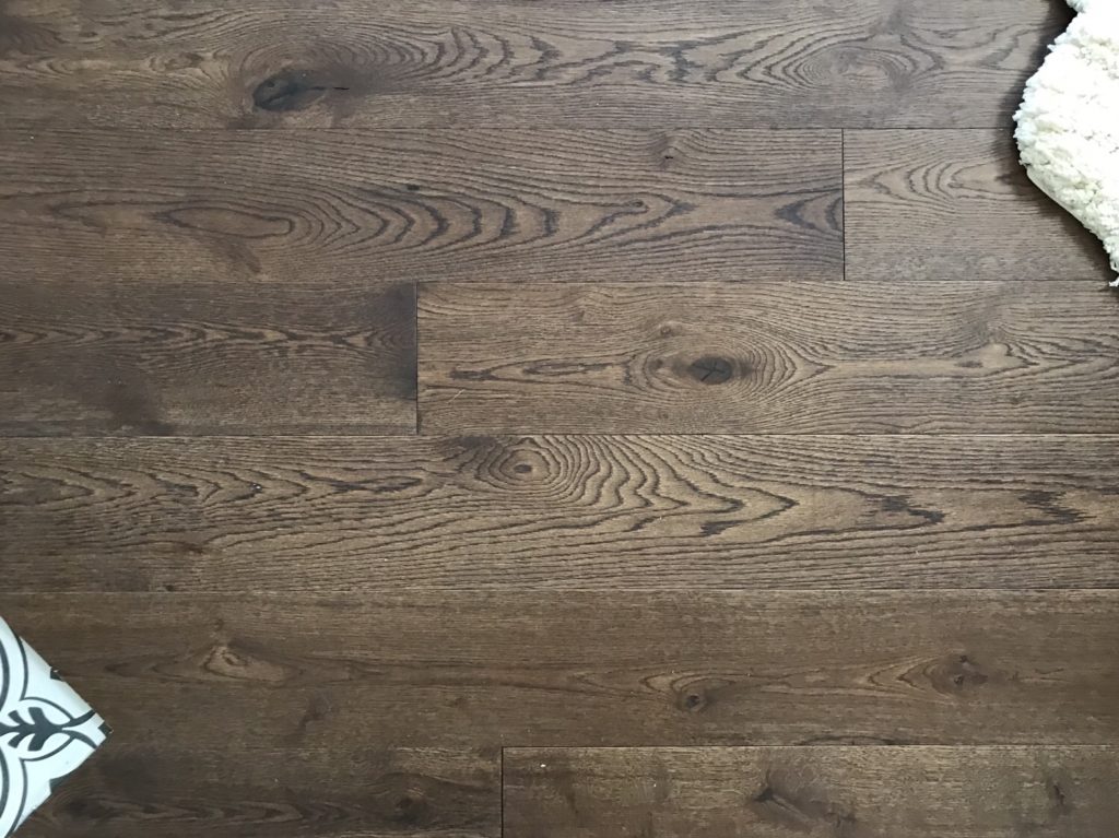
And here they are in the darker dining room. They’re pretty!
That’s all for now, folks! Here’s all the links to the amazing products we used to transform the space.
Both Rooms:
2. Wall Paint Color: Farrow & Ball Wimborne White
3. Trim Paint Color: Farrow & Ball Railings
Living Room:
- Sectional Sofa from Lamps Plus
- Blue accent chair from HomePop
- Wall Molding from Metrie
- Flush mount light fixture from Bellacor
- Artwork above blue chair from Chairish
- Artwork above couch from Minted (Artist: Catilustre)
- Floor lamp from Bellacor
- Brass curtain rods from Bellacor
- Hooks by front door from Bellacor
- Striped Throw from Bellacor
- Wood & Rattan Entry Table
- Ruched velvet ottoman (available in multiple colors)
- Round Gold Mirror above entry table
- Wood & Rattan side table next to couch
- Black & white rug – we had this previously, but this and this are similar
- Potted snake plant
Dining Room:
- Bubble Chandelier (Update: no longer available on Bellacor’s site. The brand is Dimond Lighting. You can find the gold bubble chandelier here and also a frosted glass version here. Looks like they’ll both be back in stock this summer.)
- Vintage rug from ESale Rugs
- Wallpaper from Farrow & Ball
- Chair rail from Metrie
- Large artwork on back wall from Minted (Artist: Kirsta Benedetti)
- Landscape artwork from Minted (Artist: Emily Jeffords)
- Art between windows from Minted (Artist: Angela Simeone)
- Brass curtain rod from Bellacor
- Dining chairs – vintage
- Dining table (similar here)
- Fiddle Leaf Fig Tree
A HUGE thanks to Linda from Calling It Home for organizing the ORC, and for all of the amazing sponsors who made this project possible! Make sure you check out everyone else’s reveals today too!!
Apartment 34 | Coco & Jack | The English Room | The Gold Hive
Gray Malin | Jenna Sue Design | Jojotastic | Kelly Rogers Int. | Linda Holt | Marcus Design
Michelle Gage | Natasha Habermann | The Painted House | Rambling Renovators
Sacramento Street | Shannon Claire | Sketch 42 | Stephanie Kraus | Bisou Style
Media Partner House Beautiful | TM by ORC

Congrats on completion and some fabulous new spaces! Bravo!
Thanks Holly!
It turned out beautifully!! I love the dark painted trim in the living room and that dining room light fixture is to die for! Now go relax on that new cushy sofa and enjoy your gorgeous new spaces 🙂
Thanks Danielle!
So pretty!! I love the sectional…I’d plop down and never leave!
Thanks Angela! Loved reading your about your reveal!
This turned out so beautifully! Love how the spaces flow one into the other. The chandelier is stunning. Congratulations!
Thanks Jen!!
Congrats on this project! I just started following you, admiring the blond vic. Could you clarify; is the blond vic your eventual home or an investment property? Is this new ORC space your current home? Sorry, I’m somewhat very confuse ..!!
Thank you! The Blonde Vic is an investment project. This one is where we live now. 🙂
this looks incredible! you totally deserve a nap on that amazing sofa 😉
Thanks Joanna!! So excited for that nap. Can’t wait to check out your space, too!
This is lovely – and the chandelier is fabulous. Enjoy!
Thanks Caireen!
So beautiful and collected! It was so fun playing along with you this round!
Thanks Shannon! Likewise!
[…] 34 | Beginning in the Middle | Coco & Jack | The English Room | The Gold […]
[…] 34 | Beginning in the Middle | Coco & Jack | The English Room | The Gold […]
Love the view from the front door thru to dining room what a transformation. Love the floor color . Excellent choices. Great job!!!!!
Thank you for your kind words!!
Wow! Great job! I’ve really enjoyed following you guys on this journey! I tried the link for the beautiful dining room chandelier but it took me to general chandelier section- and a bubble search didn’t find it. Could you tell me a better way to find it on their site? Thx!
Thanks Elizabeth! We were informed by Bellacor that the chandelier is no longer available. I poked around to see if anyone else carries it (it’s the Dimond Cielo 3-light pendant) — here are a few other links to the gold bubble chandelier and also a frosted glass version. Looks like they’ll both be back in stock this summer.
Congratulations on this beautiful space! I love the lighting fixture you choose above the dining room table and the blue chair in the living room! Enjoy your space, you deserve it!
Thank you Carrie! <3
What a cozy room and such a transformation! I love that you wallpapered the BOTTOM of the walls because I’m so used to seeing it on the TOP. I’m also a sucker for dark accents, so the dark trim and fireplace with the white walls is bliss! You two are geniuses.
Thanks for your kind words, Ashley! We absolutely loved reading about your makeover, too — you’re so talented!
Love that small ottomon in front of your sectional. Where did you find it, please?
Thanks! It’s pretty isn’t it? Here’s the link: Laurel Ruched Velvet Ottoman
Wow! What a big transformation in such a short time! I LOVE that chandelier! And the dark trim is awesome. You must be happy to have it all done 🙂
Thanks Wanda! Happy is an understatement 🙂
I can’t believe how far this room has come. The transformation is incredible! Love all of your attention to detail. I think the rug and those floors are one of my favorite features. Although that sectional looks really inviting. Great job.
Thanks Linda! We’re so thankful to have been included in the challenge!
Congratulations both rooms look great! Can you provide sourcing info on the chandelier, i couldn’t find it on Bellacor’s website. Thanks so much!
Thank you Louise! We were informed by Bellacor that the chandelier is no longer available. I poked around to see if anyone else carries it (it’s the Dimond Cielo 3-light pendant) — here are a few other links to the gold bubble chandelier and also a frosted glass version. Looks like they’ll both be back in stock this summer.
I love this! So many great traditional elements, with lots of modern pops of style and color. Really lovely. And I love that it looks like a real home, not just a showcase of design. Well done and inspiring!
Thank you so much Laurie! Your kind words mean a lot to us <3
[…] Beginning in the Middle: Dining Room using our Bakhtiar Persian Rug . How bold and vibrant is this?! We love how this vintage rug ties the entire dining room together! […]
Beautiful! (found your Blog from Better After) 🙂
Thank you Reenie!
Very good brief and this post helped me a lot. Say thank you I searching for your facts. Thanks for sharing with us!
[…] 34 | Beginning in the Middle | Coco & Jack | The English Room | The Gold […]
[…] 34 | Beginning in the Middle | Coco & Jack | The English Room | The Gold Hive | Gray […]
[…] And THIS is how it ended up (you can see the full reveal post with source info and renovation details here): […]
[…] от автора блога https://beginninginthemiddle.com […]
Really awesome blog, your blog is really useful for me. Thanks for sharing this informative blog.