A very special thank you to Lowe’s for sponsoring this post and for making this project possible. As always, all opinions & thoughts are our own.
Our Pearl duplex kitchen reno is officially underway, and we’re excited!!
If you’re new here and don’t know what we’re talking about, we’ll catch you up. We purchased a duplex in 2015 that we’ve slooowly been renovating in between other projects. We’ve been living in one half of the property (#thepearlstproject), and the other half has been sitting vacant almost the whole time… until now. Having both sides of the duplex renovated is a big part of our business plan and it feels so good to be taking a step toward getting it done. When we’re finished with renovations, we’ll be adding it to our vacation rental site The Village Host and listing it on Airbnb. It might just be our prettiest rental yet, and we can’t wait to share it with you.
We’re partnering with Lowe’s to tackle the kitchen renovation first, and are sharing a series of posts along the way about our design process & renovation progress. In our last post, we wrote all about how to plan a kitchen layout and select appliances that fit your space. In that post we also revealed the layout we chose for the Pearl kitchen and renderings for the design.
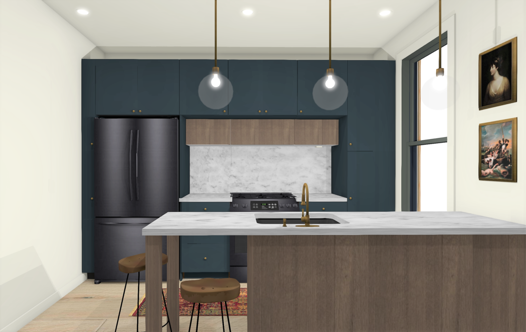
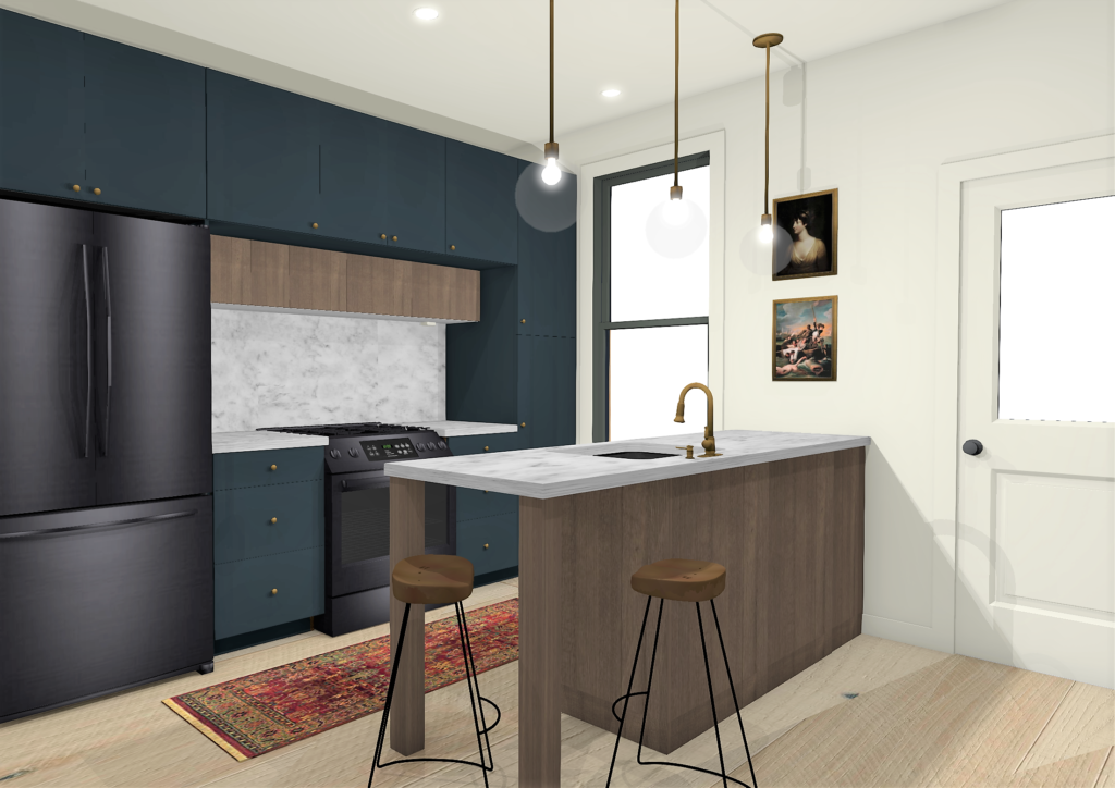
This week, we’re diving into how to select finishes & colors that make your kitchen feel cohesive & well-designed. We’ve broken down the process into six steps that we hope will help guide you as you design your own kitchen!
1. Gather inspiration and look for patterns
Gathering inspiration is something we ask all of our clients to do, both as an exercise for them to sort through their preferences, and for us to use as a guide when designing their kitchens. We also do this for every kitchen we design on our investment properties, including our Pearl kitchen.
Everyone gathers inspiration differently, so this can be anything from creating Pinterest boards of images you love to snipping magazine articles & catalogue photos to finding objects that inspire your aesthetic. Don’t overthink the process. You should select inspiration that you’re drawn to & reflects what you love, and you don’t need to know why.
When you’re finished, look back at what you’ve gathered and see if you notice any patterns. Do you see lots of black hardware? Rustic beams? Lots of color, or lots of neutrals? Fun patterns? If there are repeating elements, jot them down because they’re usually hints of what you’d like to incorporate into your design.
Tip: Don’t overthink the process. You should select inspiration photos that you’re drawn to & reflect what you love. You don’t need to know why.
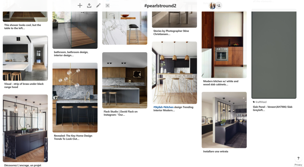
Here’s a snapshot of what our Pinterest board looks like for our Pearl kitchen project (click here to see all of the pins in more detail!). Patterns we notice in ours? Hidden range hoods, two-toned cabinetry, slab cabinet doors, interesting lighting and stone backsplashes.
2. Prioritize your preferences
After gathering inspiration and taking note of patterns in the photos you’ve gathered, begin creating a list of must-haves. What’s most important to you, and what are you willing to compromise on? Every decision in a kitchen design usually leads to a series of other decisions, so if you can be clear on what you love the most, it helps guide the rest of the selections to follow.
For our Pearl kitchen project, we narrowed down our list of must-haves to:
-
- Two different types of cabinets
- Light wood floors
- Slab cabinet doors
- Brass accents
3. Create a cohesive look with mood boards
One of our favorite ways to do this is by creating mood boards that include all of the finishes & colors we’d like to incorporate into a design. You can create mood boards in Word, Photoshop, and other programs, as well as on poster boards or pieces of paper. When all finishes are together, it helps you visualize whether they’ll work together and allows you to play around with which combination looks best. It’s easy to swap out brass hardware for black hardware, try different cabinet colors & styles, and countertop materials — and then see how each switch impacts the rest of the elements on the board.
Tip: Get your mood board started with your top one or two must-have finishes, and then layer in everything else one at a time.
In our Pearl kitchen project, we started with a wide range of options and narrowed it down to what feels like a mix of modern & Scandinavian design. Here’s what our final mood board looks like:
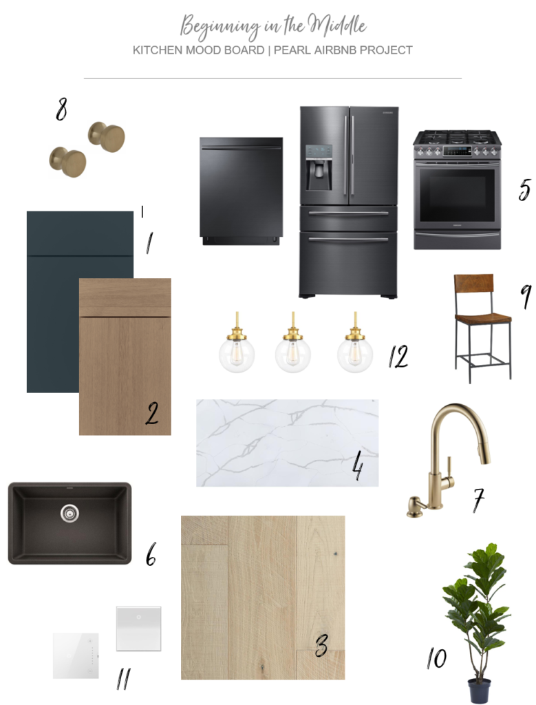
Mood board product links: 1 || 2 || 3 || 4 || 5 – 5 – 5 || 6 || 7 || 8 || 9 || 10 || 11 || 12
The first thing we added to the board were the floors (which we are SO EXCITED ABOUT), followed by the cabinets (WHICH WE ARE ALSO SO EXCITED ABOUT). We went back and forth between a few different cabinet colors and dark/light wood tones to see what best tied in with the floors. We ultimately landed on a mix of painted maple doors in a really pretty color called Maritime, and textured quartersawn oak doors in a cool wood tone called Boardwalk. Both door styles are the Willa doors from the Diamond line at Lowe’s, so even though they have a different finish, they’ll match up when they’re installed.
After that, we layered in the countertops, which are a veiny Allen + Roth Quartz design called Crystal. We decided to go with a brass faucet and were excited to find a Delta Trask faucet + soap dispenser combo in Champagne Bronze for $329. We’ve used the Delta Trinsic faucet several times, so we were expecting the price to be in the $400s as it usually is (PS, it’s worth it). A soap dispenser is another $30+, so to be able to get a super similar looking faucet + soap dispenser in the same finish for $329 is a steal. Here’s a side-by-side of the two (Trinsic is on the left, Trask is on the right). Can you tell the difference?
- Delta Trinsic
- Delta Trask (Lowe’s Exclusive)
We’ll also be incorporating small brass globe pendants that’ll hang over the island and round brass knobs, which will go on both the doors and drawers. Because there’s no other stainless steel in the space, we chose a black granite composite undermount sink, which will tie in really nicely with the brass fixtures and black stainless appliances. It’s going to look so good, guys!!
4. Order samples
Once you have a mood board (or two) put together, it’s time to order samples. There’s two big reasons we’d HIGHLY suggest ordering samples before making your final selections.
- Colors and textures and scales of patterns tend to look different on-screen than in real life. Having a tangible product in front of you to touch and feel helps ensure that you actually like it and don’t just think you do in the photos.
- Collecting samples of all of the finishes you plan to incorporate into your space will ensure that they will all work together.
Tip: When ordering samples, we’d suggest ordering 3-5 pieces if there’s any type of pattern involved, especially tile, wallpaper, and flooring. Sometimes a single tile or plank looks different than a grouping, so having enough on site to display what the full pattern will look like when it’s installed is best.
5. Select paint colors
We suggest saving paint color selection for your walls until after you have your other finish samples on site. Being able to compare paint colors to the exact tile or cabinet color or countertop you’ll be installing will help ensure that everything coordinates in real life. When selecting paint, start by choosing a few options and get a sample of each (at Lowe’s, the paint samples are a few dollars — well worth the investment!). Samples are super important because paint colors not only look different on screen than in person, but they also look different depending on lighting and time of day.
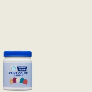
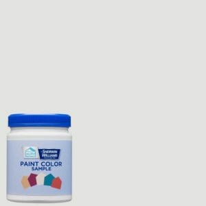
We typically keep the walls neutral in our kitchens so that the other finishes can shine. A few of our favorites are Alabaster (a creamy white), Pure White (a true white), and Sterling White (a grey white).
- Alabaster
- Pure White
- Sterling White
These are all Sherwin Williams colors available through the HGTV Home by Sherwin Williams line at Lowe’s. In this line, there are also several Color Collections available that are worth checking out if you’re looking for guidance in selecting color schemes in your kitchen (or any room, for that matter!). The collections are curated so that all of the colors within them coordinate with each other, so it takes the guesswork out of mixing and matching throughout your space and your home.
Tip: Paint a large swatch on the wall of your kitchen and compare it with your other finish samples to make sure they all work together.
6. Be flexible and prepare to make changes
You can do all of the planning in the world, but in any kitchen renovation, changes are inevitable. Something’s out of stock, the layout has to be adjusted because of a hidden duct discovered upon demo… and the list goes on. Remember to be flexible and open minded throughout the process. It will all work out!
—
We’ll be posting lots of progress of our Pearl kitchen reno in between blog posts on Instagram, so make sure you’re following us @beginninginthemiddle for updates! We’ll be back soon, friends.



Simple but elegant kitchen. Thanks for sharing this article.
Thanks for this helpful synopsis of your process! Love your designs!
I think that with any renovation, people tend to forget about the color options and just focus on what things they are adding or removing. As you mentioned here, you do want to have a cohesive look. I’d want to go for something like that to avoid it looking odd with mismatching colors.
[…] this rendering we shared of the #pearlround2 kitchen design? (If you didn’t, you can catch up here and get the DL on the whole project […]
Today’s kitchens serve more roles than ever before: entertainment center, home office, cooking and dining space. The electronics for an entertainment center may include TV, music and internet connection and the office area may have a desk, files, computer and bookshelves.
[…] How to Select Finishes & Colors to Create a Cohesive Kitchen Design […]
This inspires me to redesign my kitchen. I love the idea of your design with the right color and theme I think I can achieve my dream kitchen. It may take a little budget by I’m on it now. Hope I can achieve the design that I wanted. Thanks!
[…] Kitchen appliances are an essential component of any kitchen. That being said, most of us don’t want them to be the focal point in one of the hardest-working areas in our home. With these tips and tricks, you can use your appliances to finally achieve a cohesive look in your kitchen. […]
Hi, there to everyone, the contents existing at this site are really amazing for people knowledge, well, keep up the nice work fellows.
Thank you so much for inspiring and motivating me to redesign my kitchen. The colors, materials and the design ideas are great tips for those people are beginners in this field Hopefully, I can do a renovation like this one. It’s very amazing !! Keep up the good work!!
you’re welcome, Layla!