The first project at my parents’ house is finished! We spent the past 2 weeks updating the living room, and we’re so happy with how it all turned out.
This post is sponsored by Lowe’s.
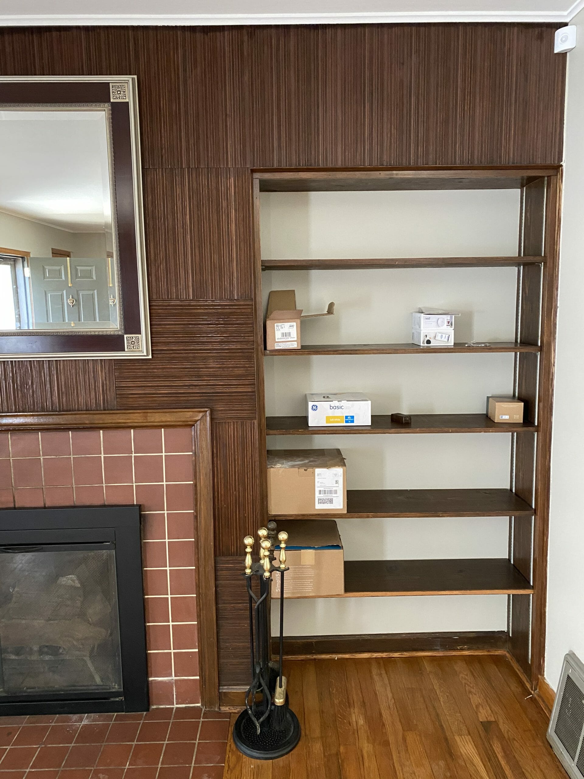
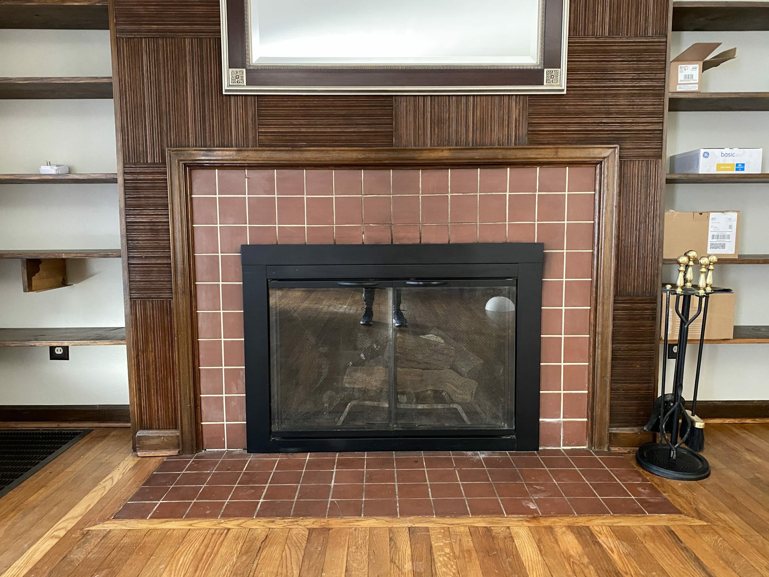
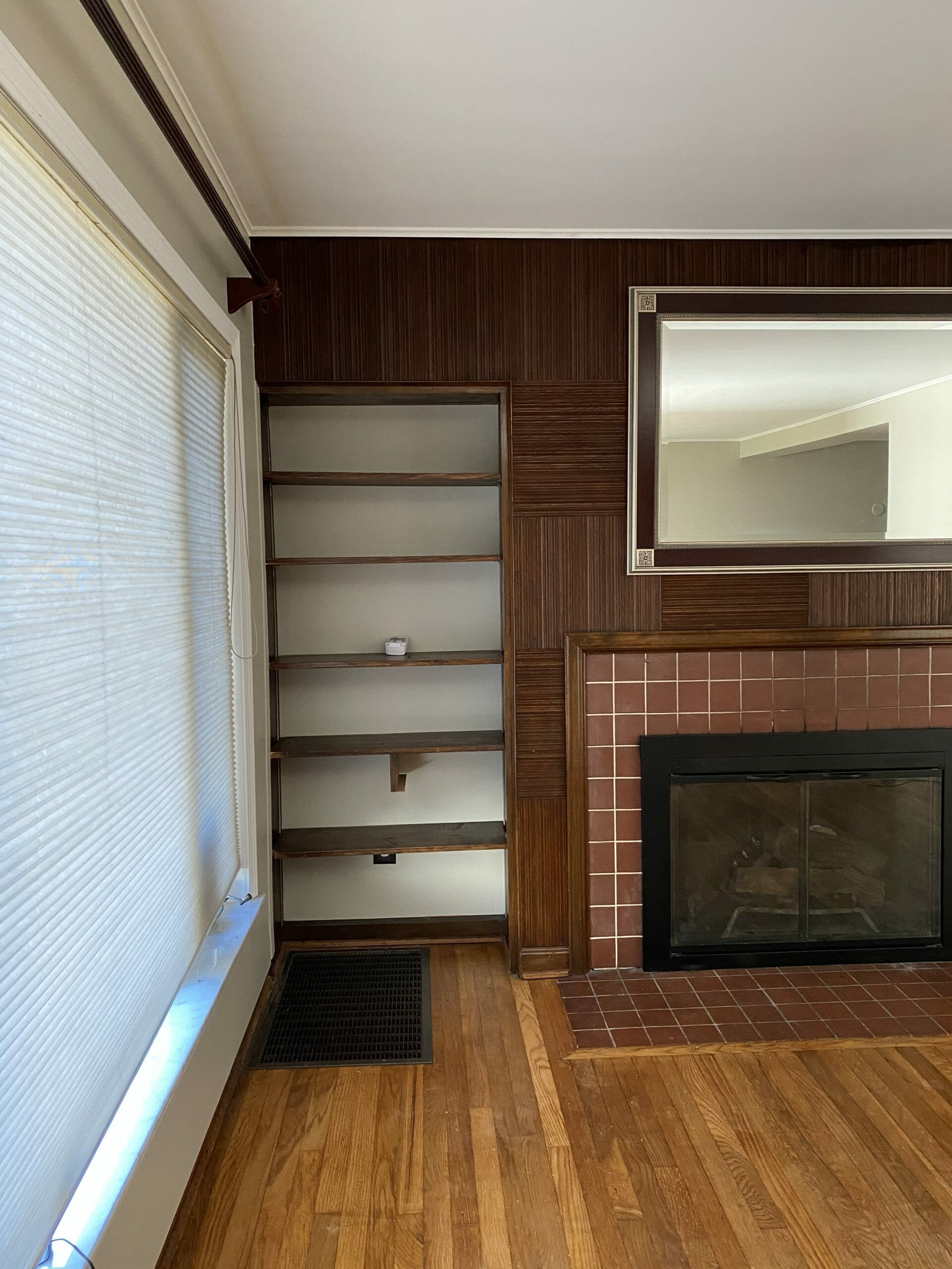
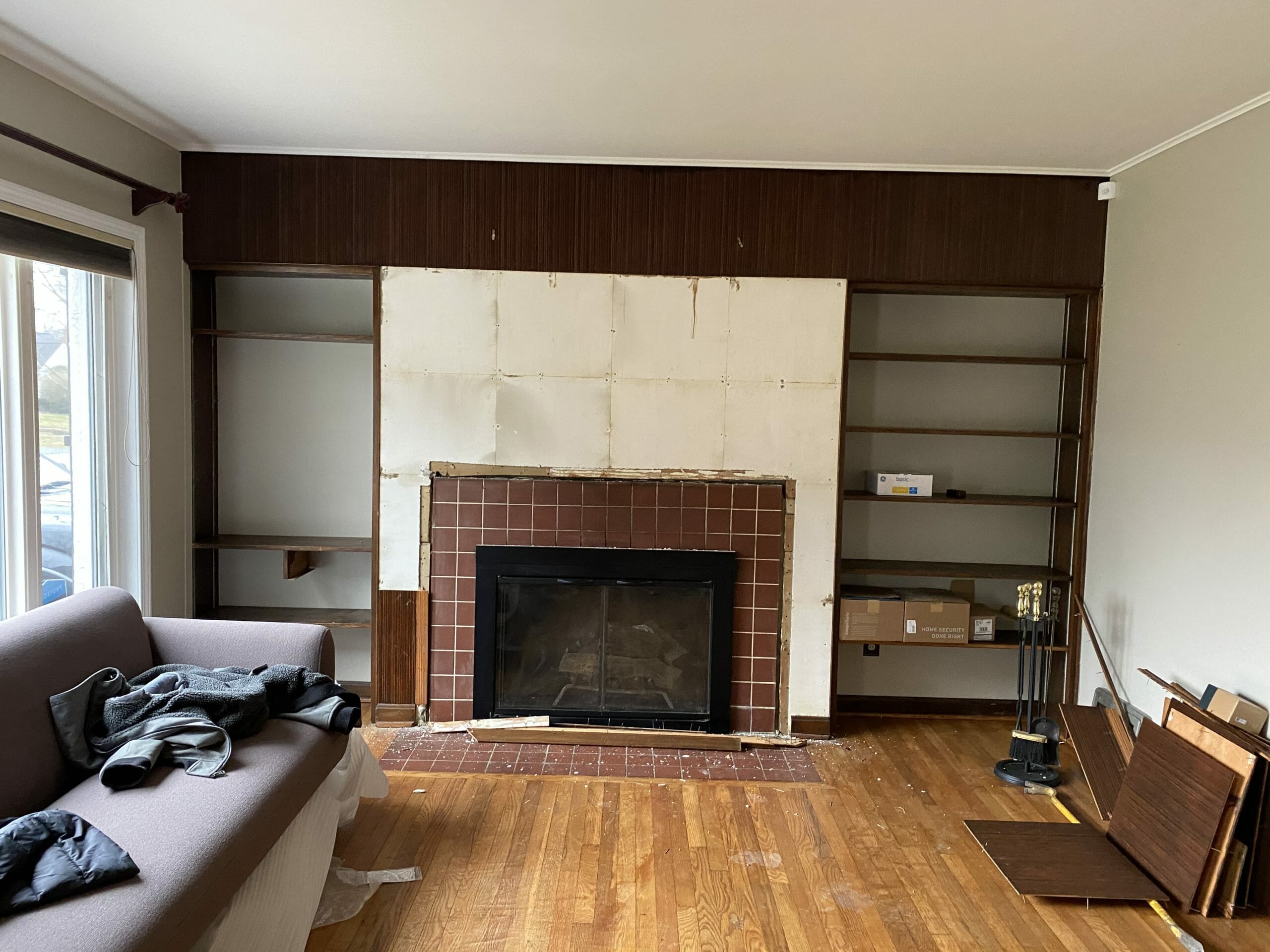
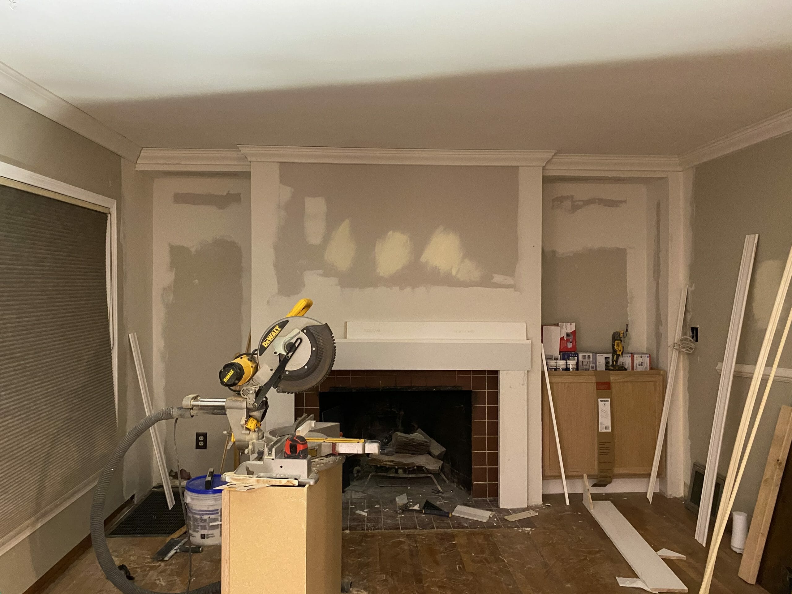
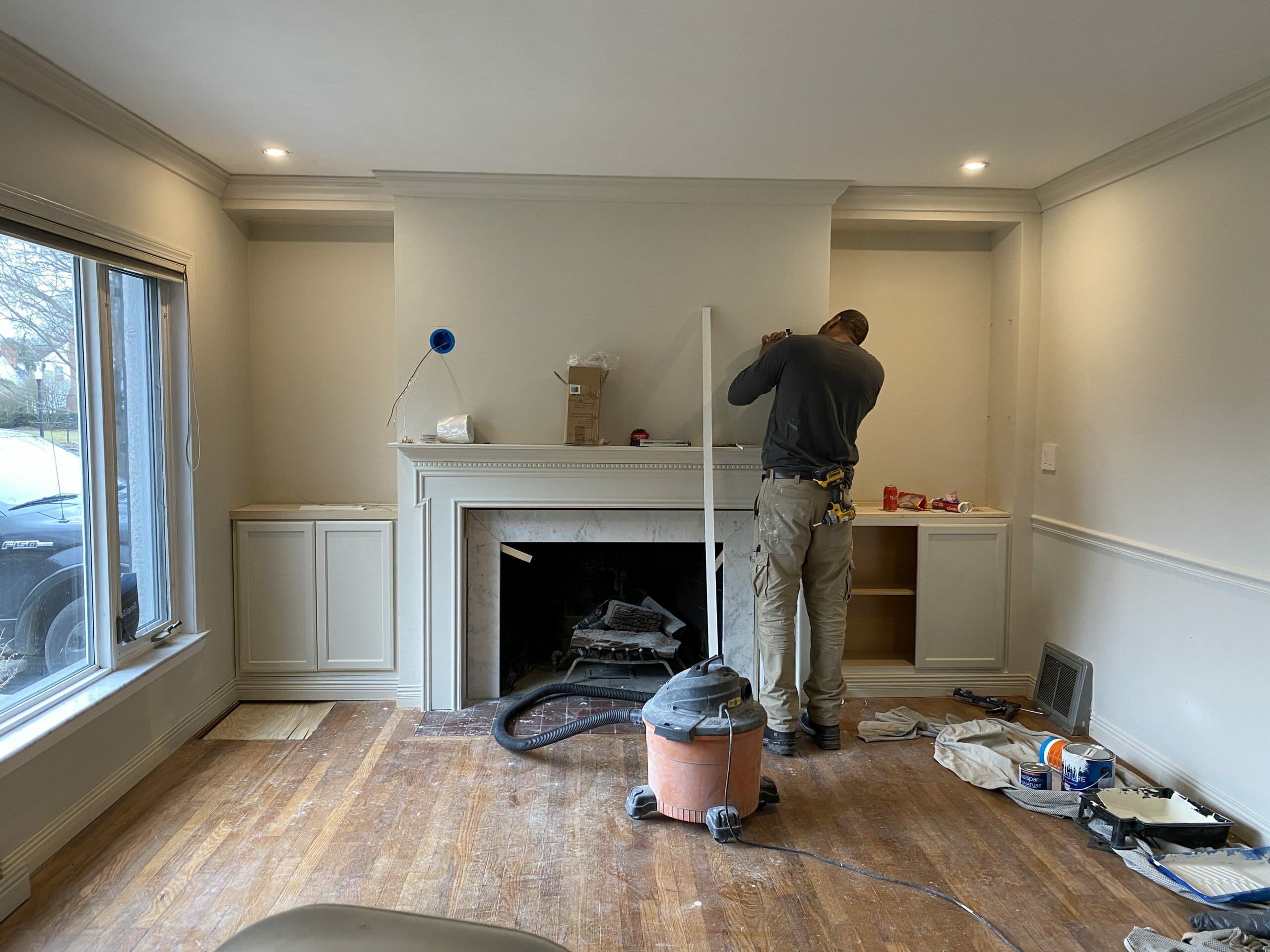
The fireplace wall is one of the first things you see when you enter the house. It felt dark and dated, and made the whole room feel smaller than it really is.

Here’s a closer look at the right side…
… and the fireplace…
… and the left side.
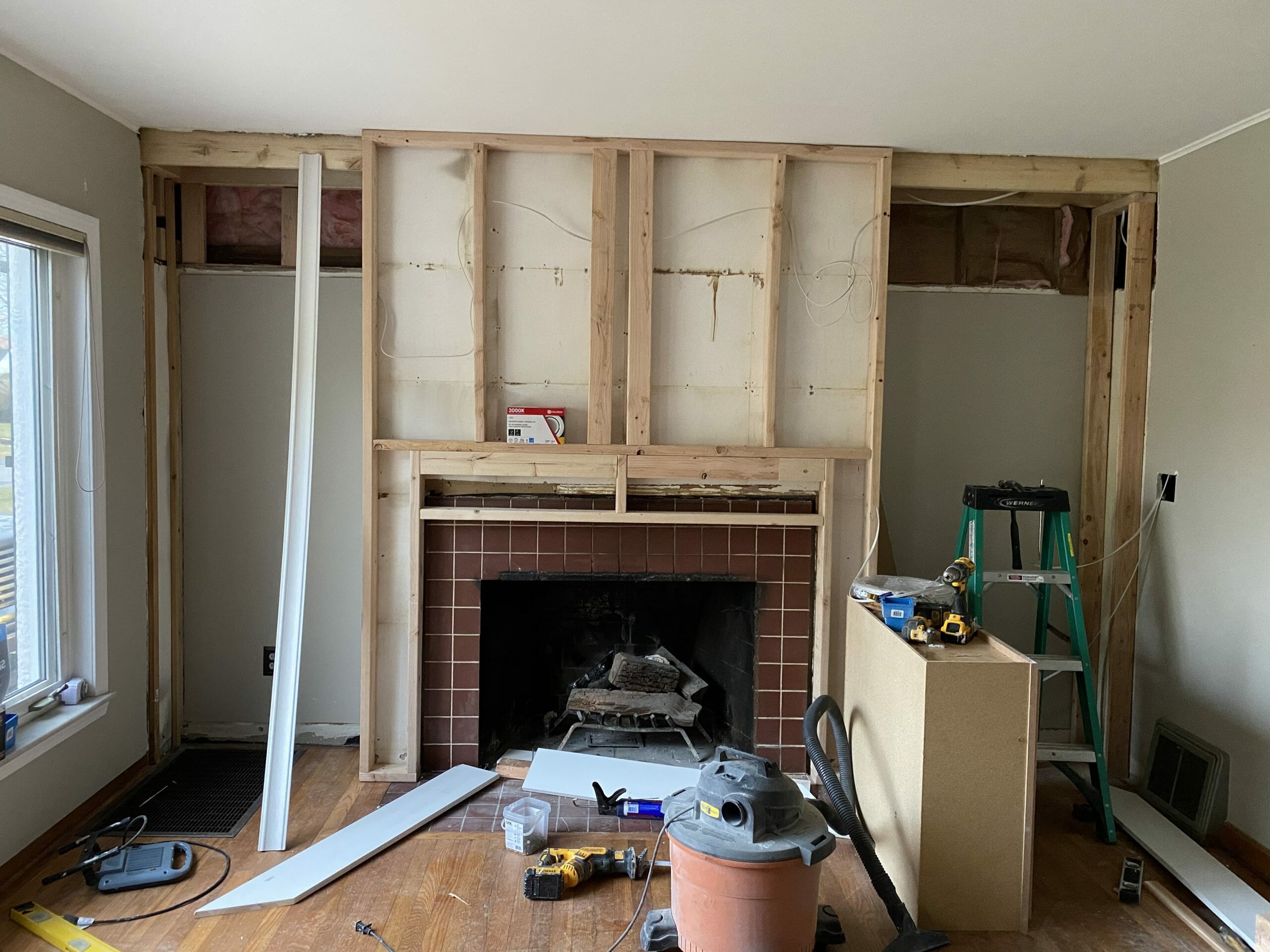
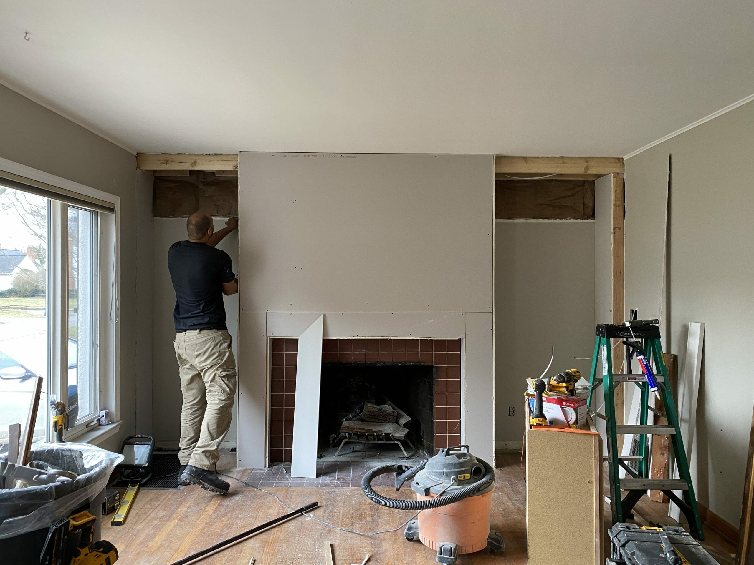
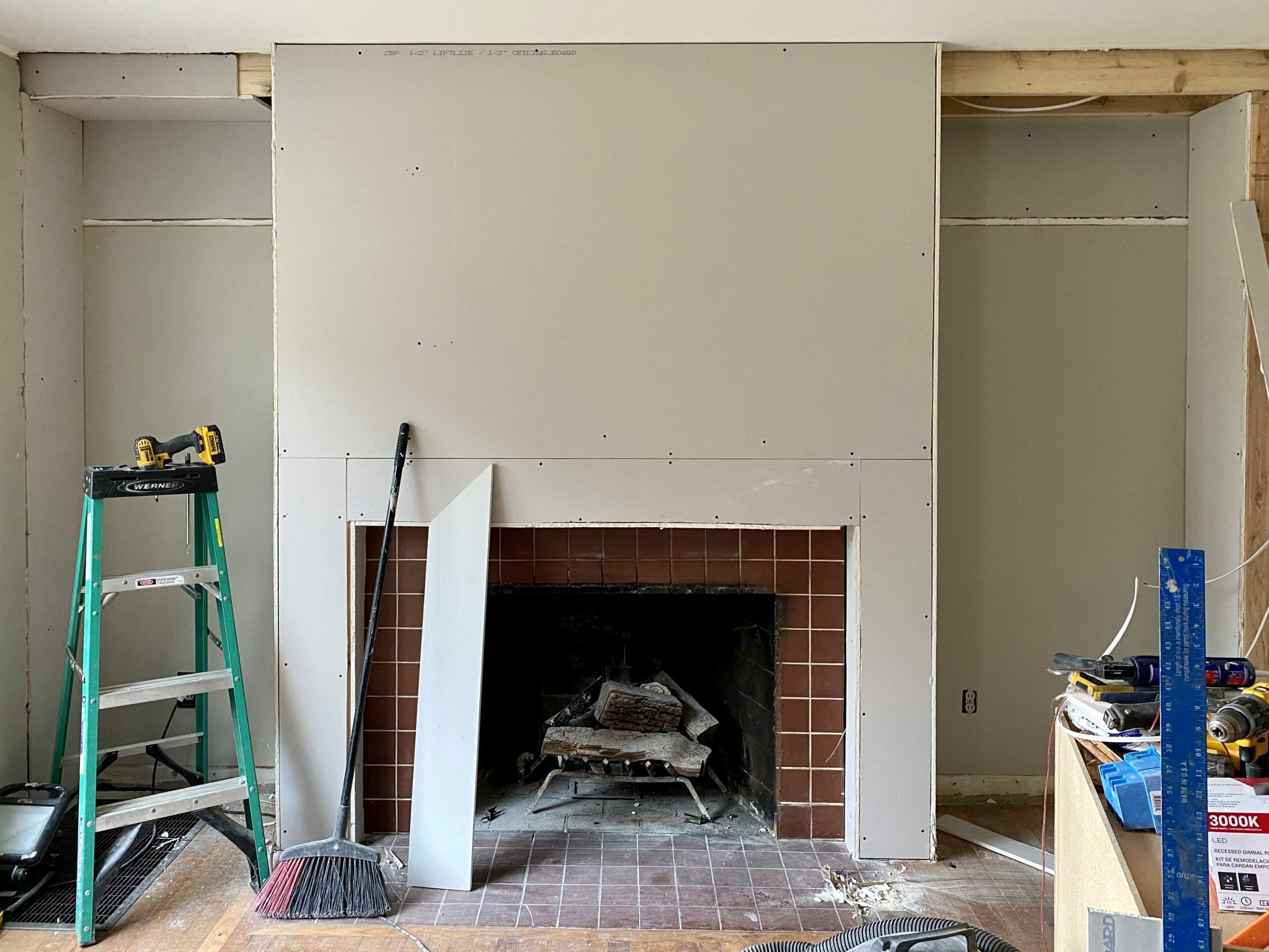
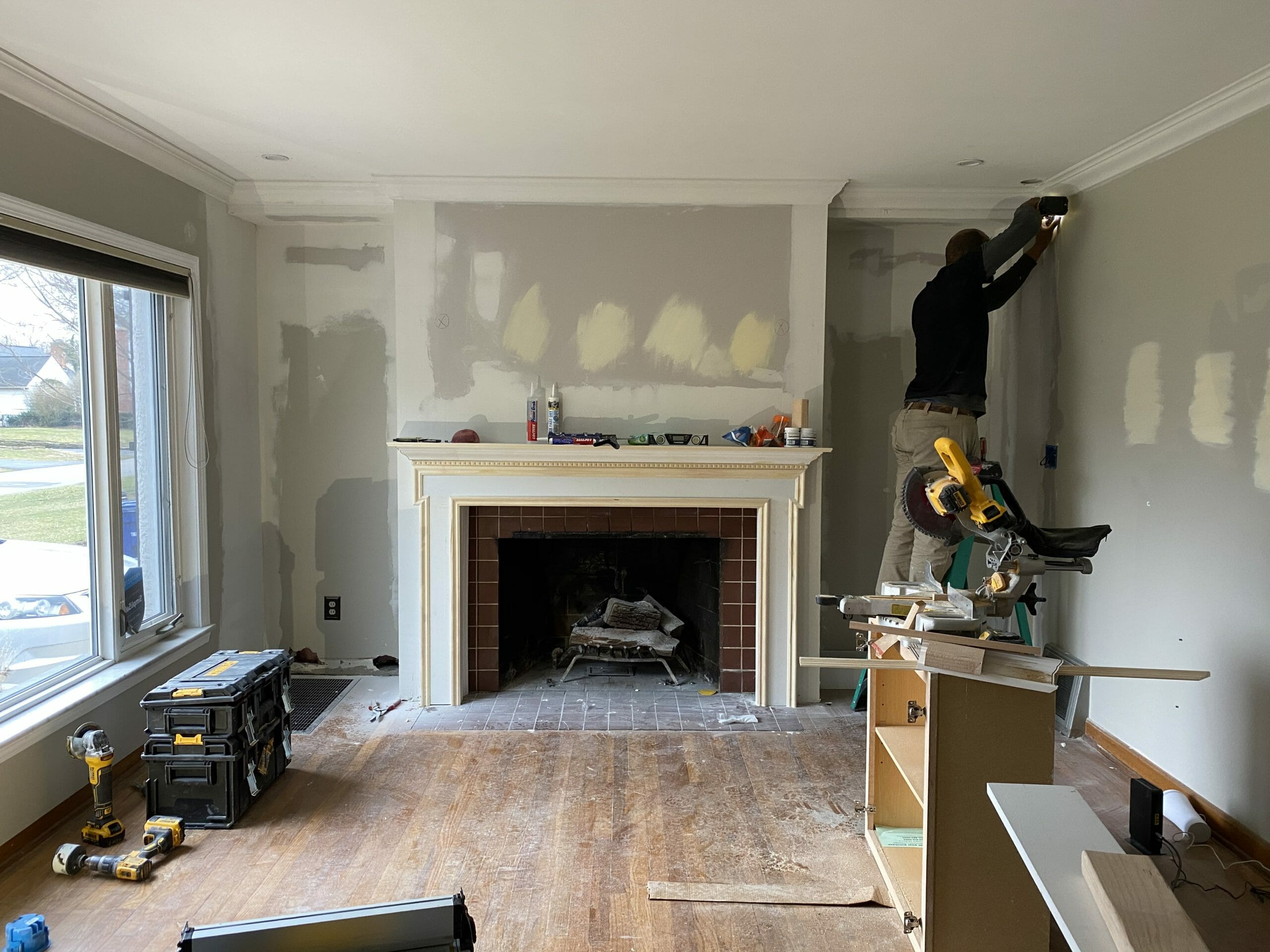
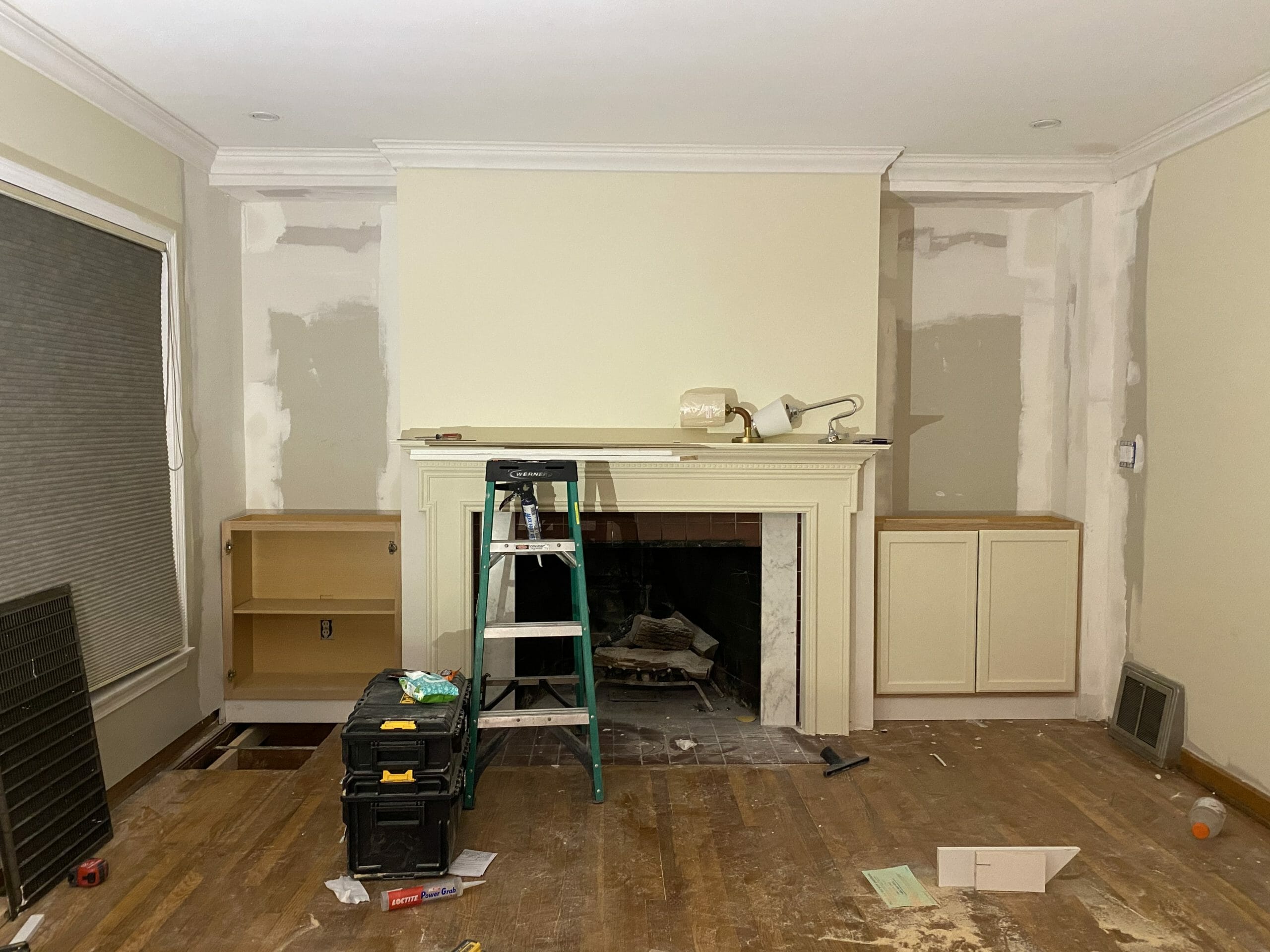
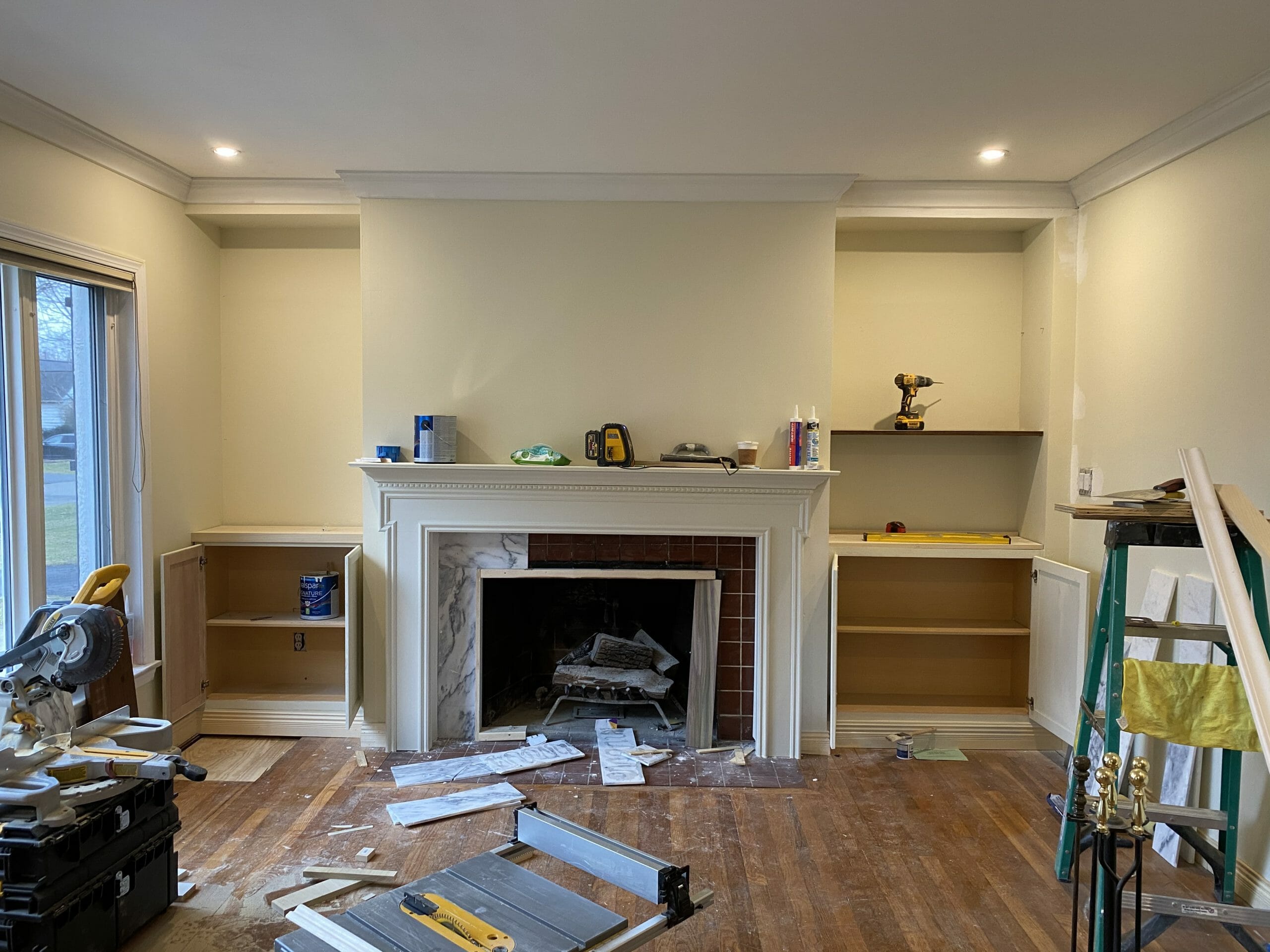
Click through to see how this wall transformed, stage by stage!
so. much. better.
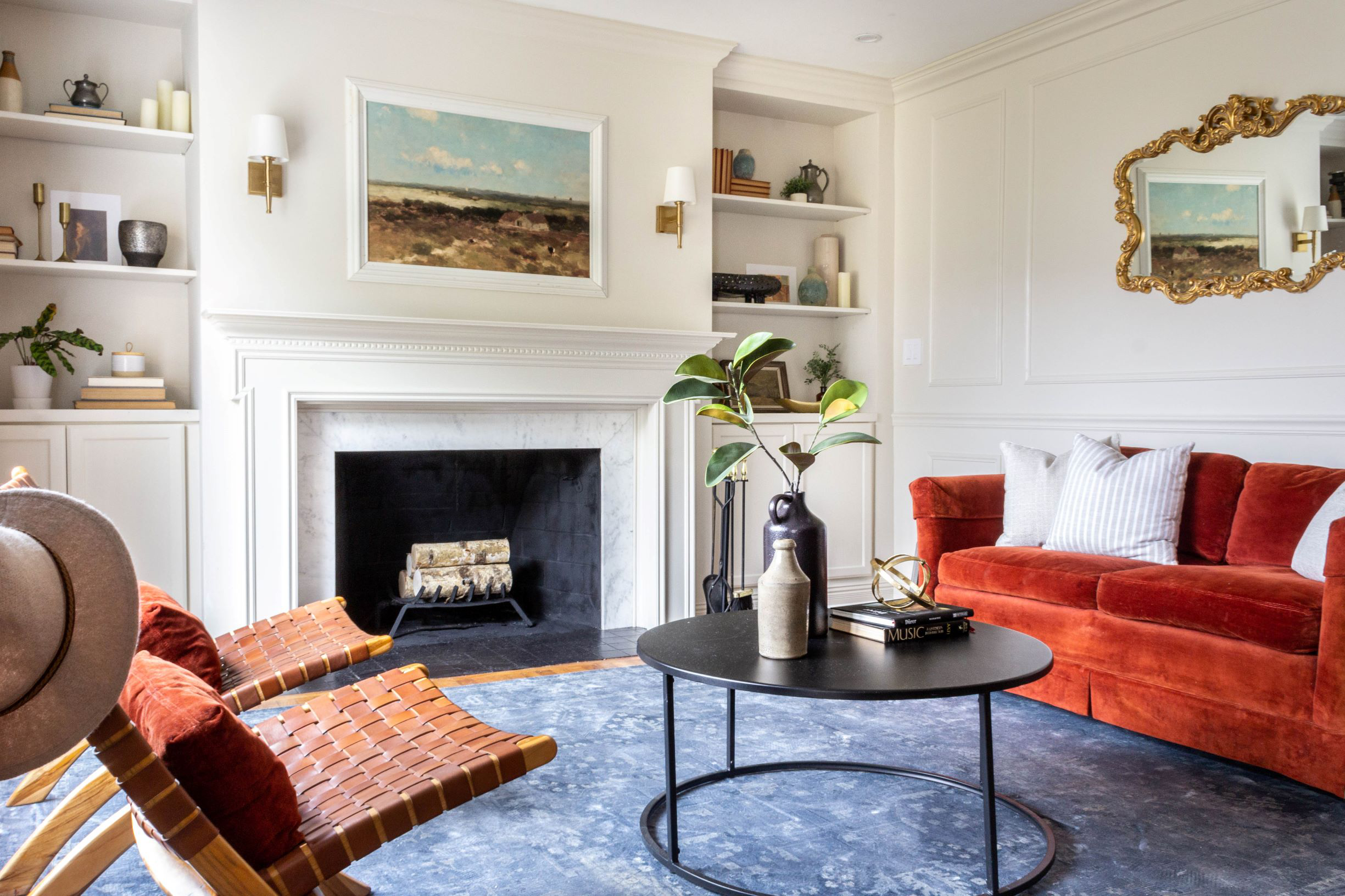
Now when you come in the front door, this is what you see!
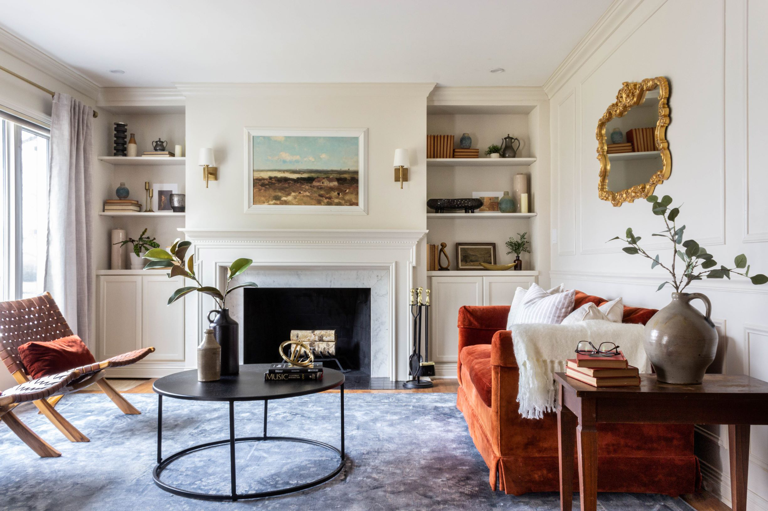
chairs // rug // sconces // curtains // brass curtain rod // gold sphere // pillar candle holder // fringed white throw // gold mirror // cabinets // black footed bowl // brass bowl // blue vases // picture frame molding
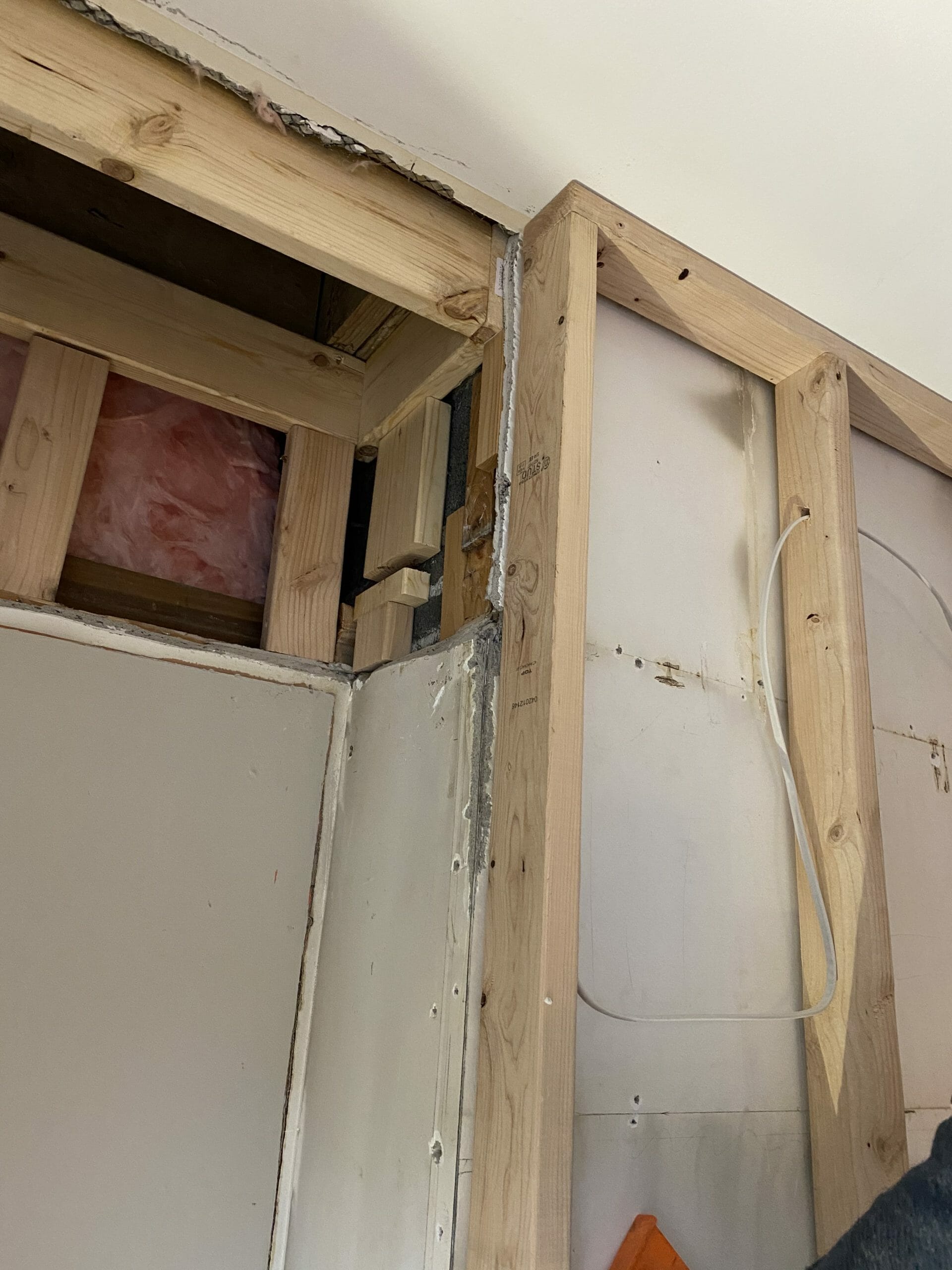
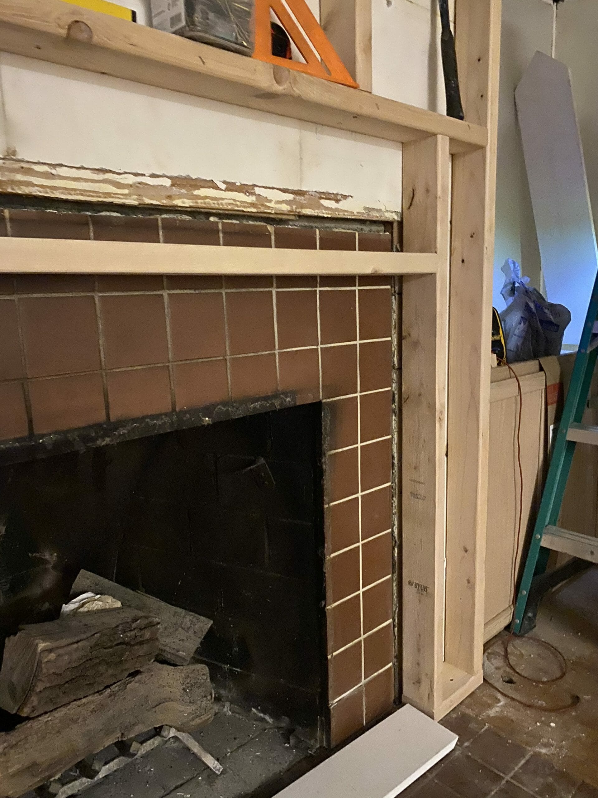
We touched just about everything in this room. We started by framing out the chimney with 2x4s, which allowed us to easily run new electrical for the sconces and add about 4″ of depth to the wall.
I love how the crown molding looks stepping back from the chimney onto the shelves now. Those outside corners make a big difference.
chairs // rug // sconces // gold sphere // gold mirror // cabinets // black footed bowl // brass bowl // blue vases // picture frame molding
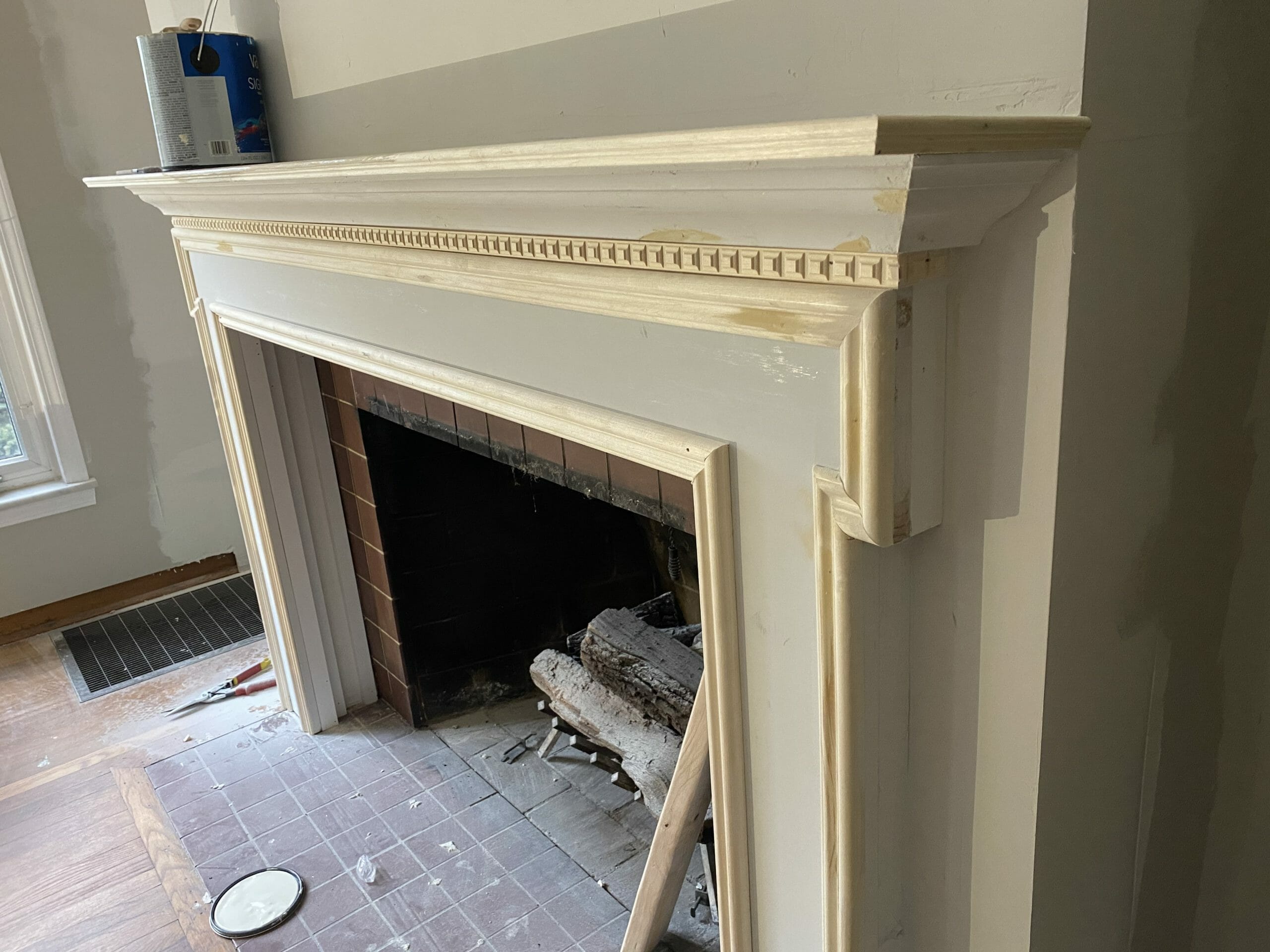
Installing a mantel and removing the fireplace cover created even more depth. We built this mantel from scratch using in-stock materials from Lowe’s. Building it ourselves allowed us to customize the dimensions to fit this specific fireplace. It cost a few hundred dollars but looks much more expensive! I love that it feels elegant but doesn’t take over the room.
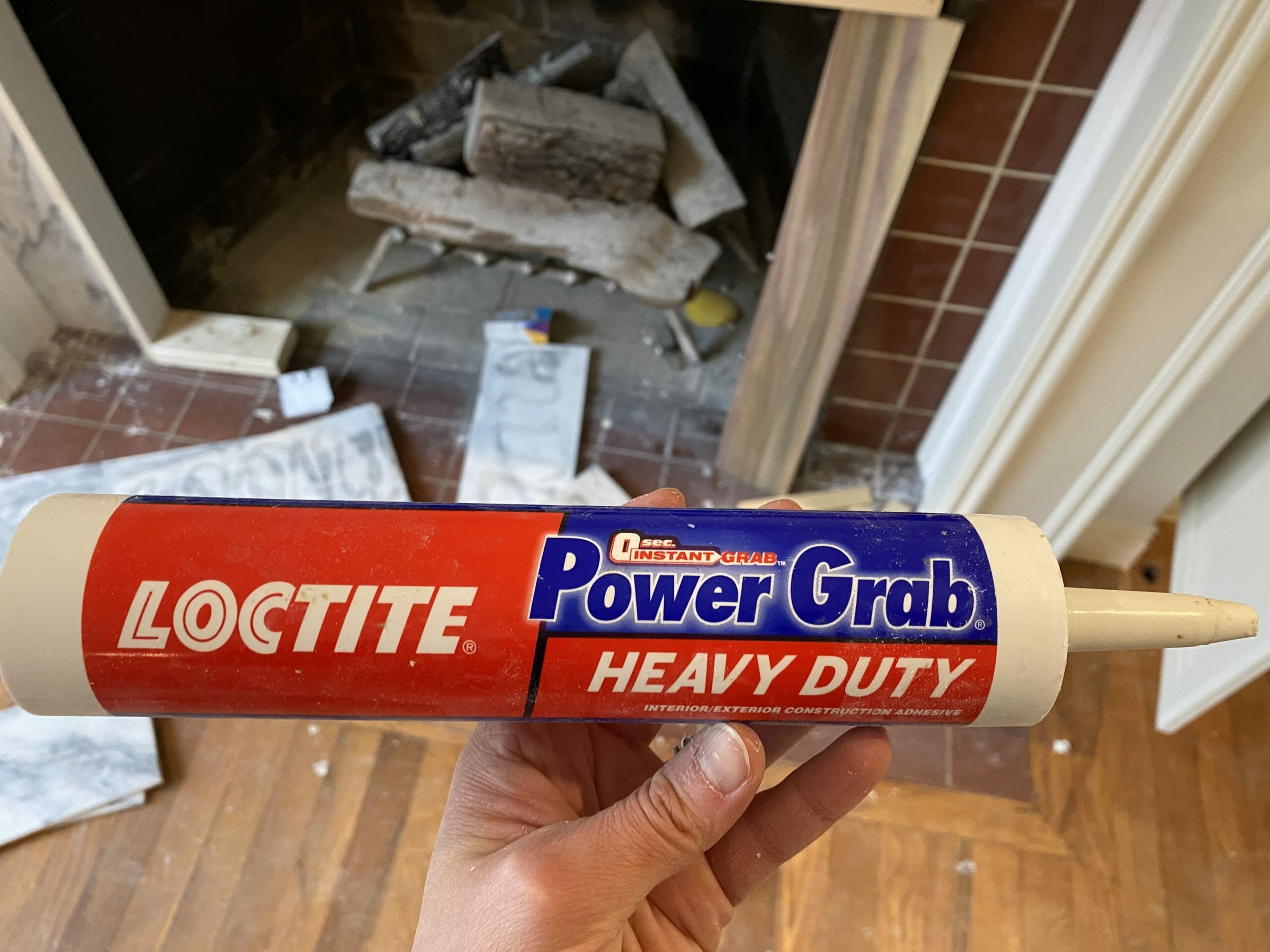
We covered the old red tile with leftover marble we had from a previous project with Power Grab construction adhesive. It worked great and majorly cut back on demo. The only thing to be aware of is that it takes some time to dry, so you definitely need a support under any vertical hanging wall tiles/slabs or they’ll slide off. Lesson learned 😉
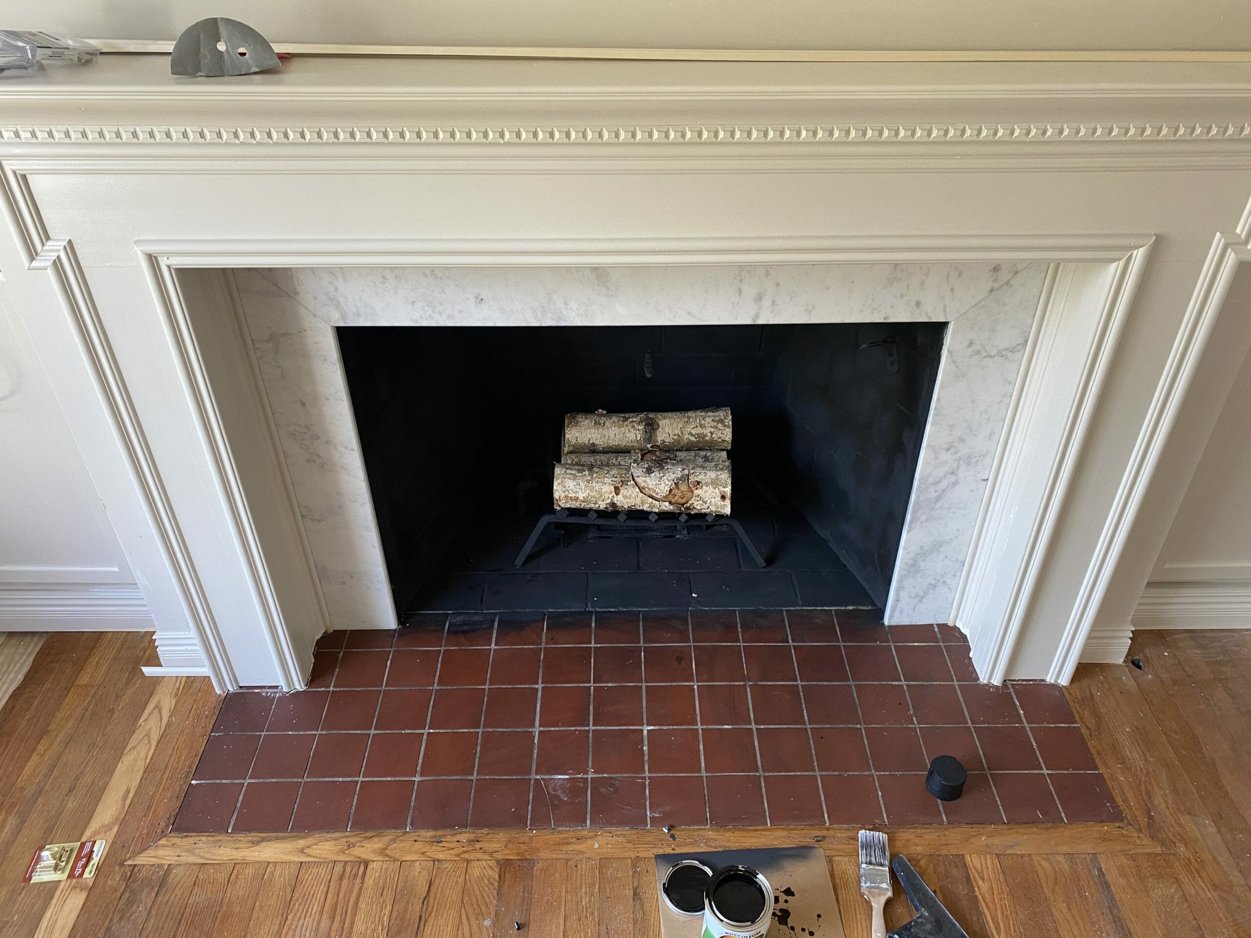
We painted the inside of the firebox + floor tile with high heat paint. For about $10 in paint, the paint worked SO WELL and saved us hours of time. We did the same thing to our fireboxes and hearth tiles at home and it’s held up well.
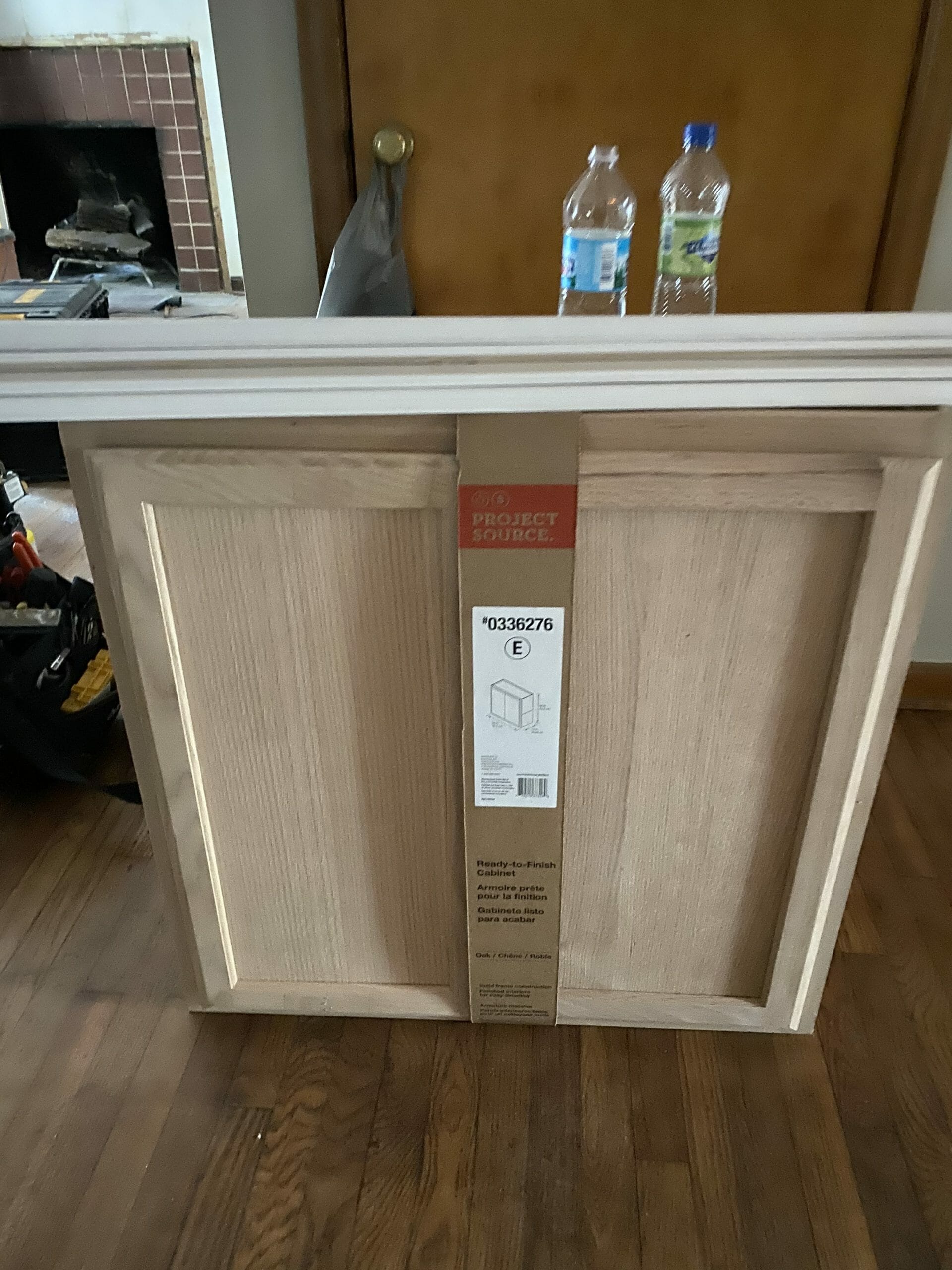
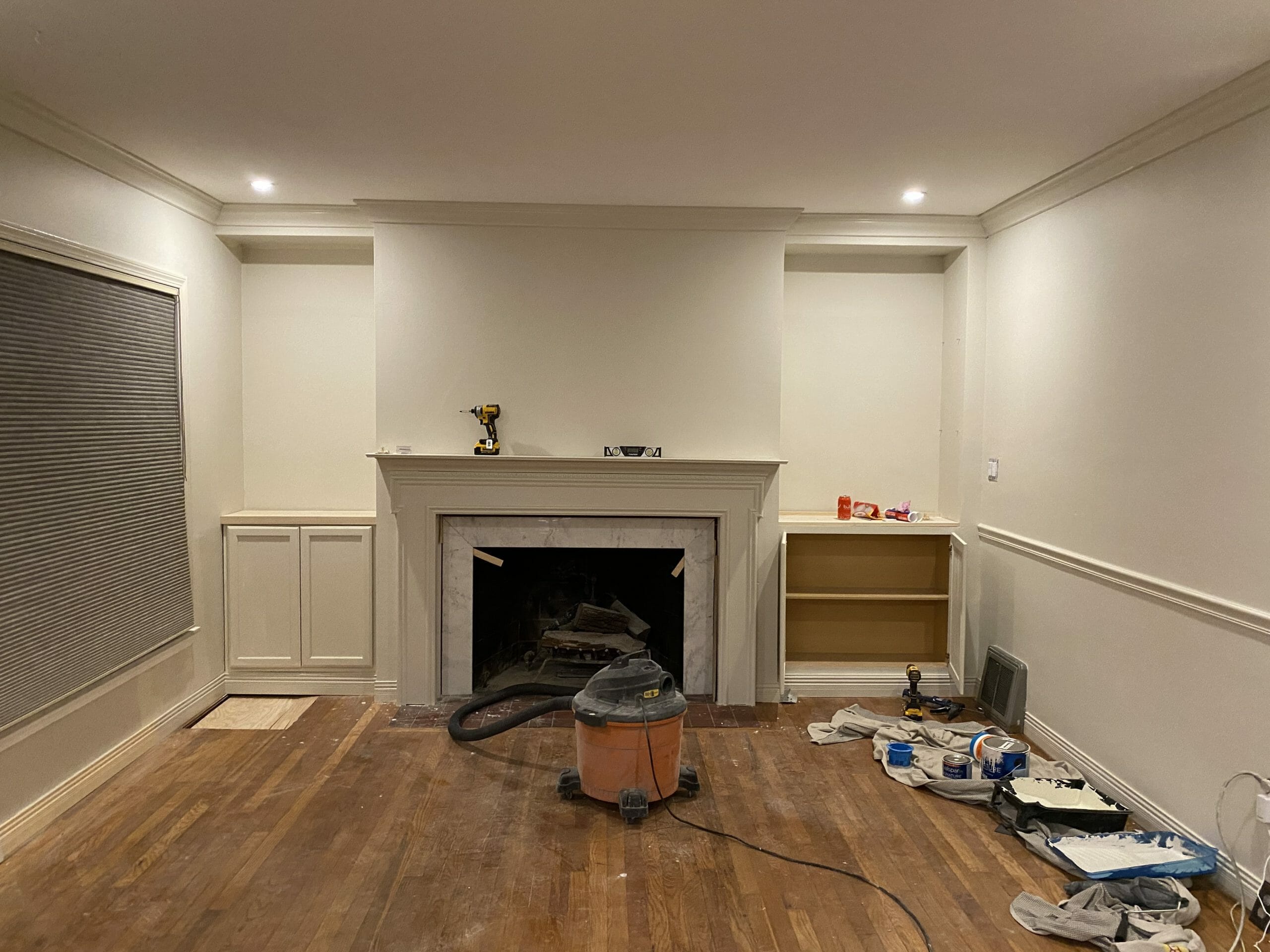
We decided to swap the full-height shelves for a mix of cabinets and shelves for a few reasons: extra storage, less dusting, and more balance. We used in-stock upper cabinets instead of base cabinets flanking the fireplace. Upper cabinets are much less deep than lower cabinets — typically 12-15″ vs 24″ — and work much better for fireplace walls.
We built a 4″ toe kick under each cabinet using 2x4s and installed new baseboards to make them look built in.
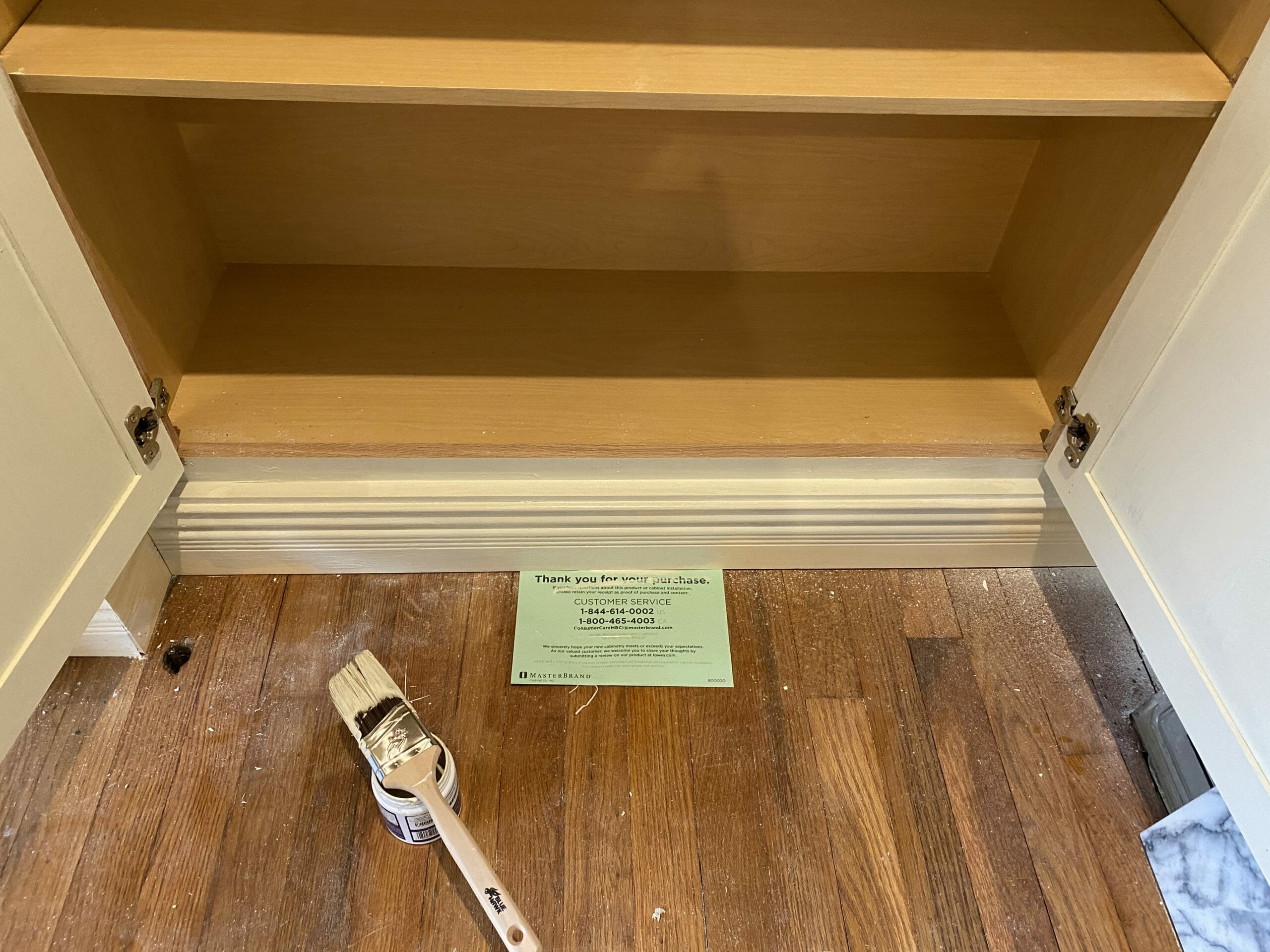
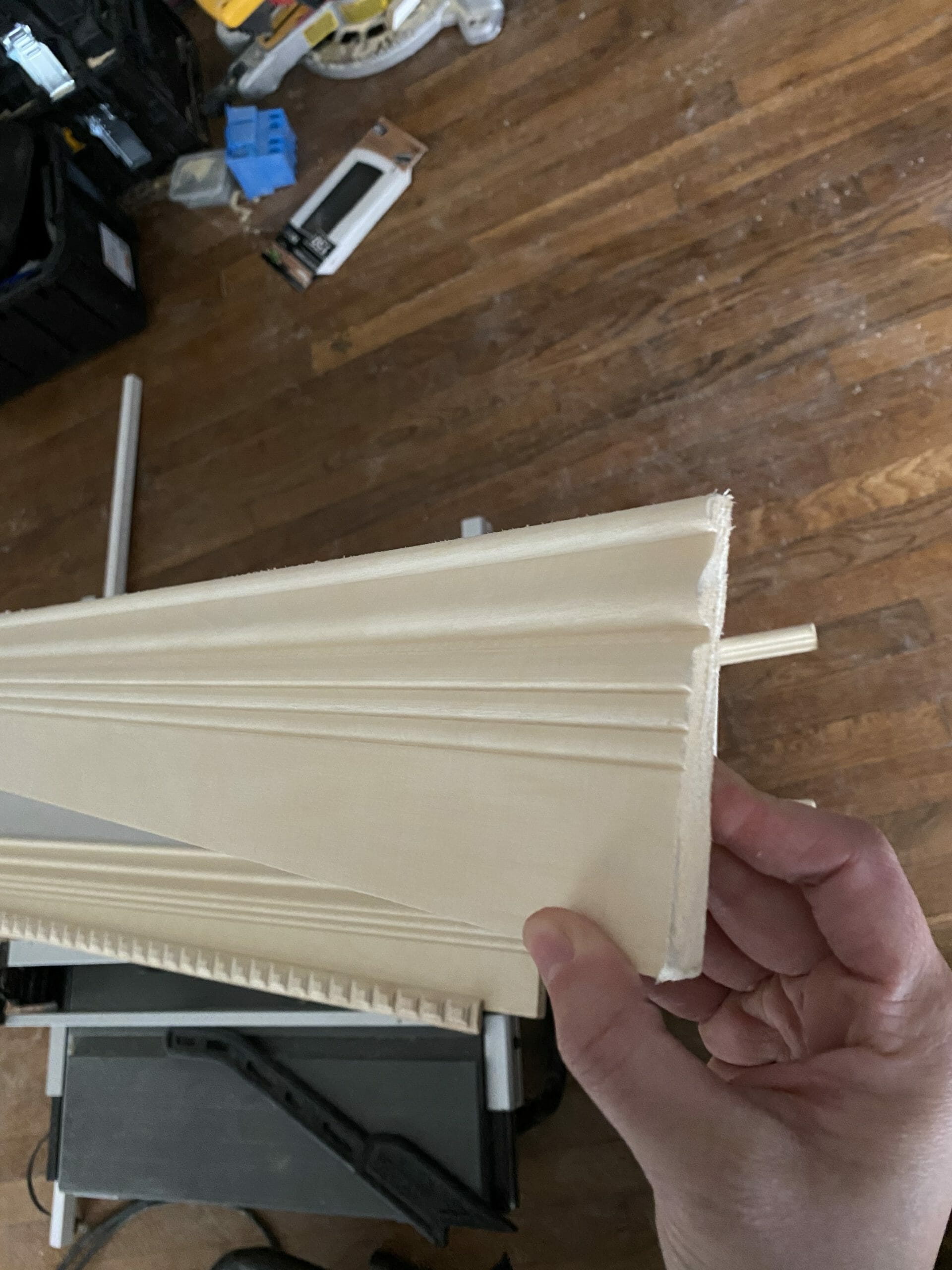
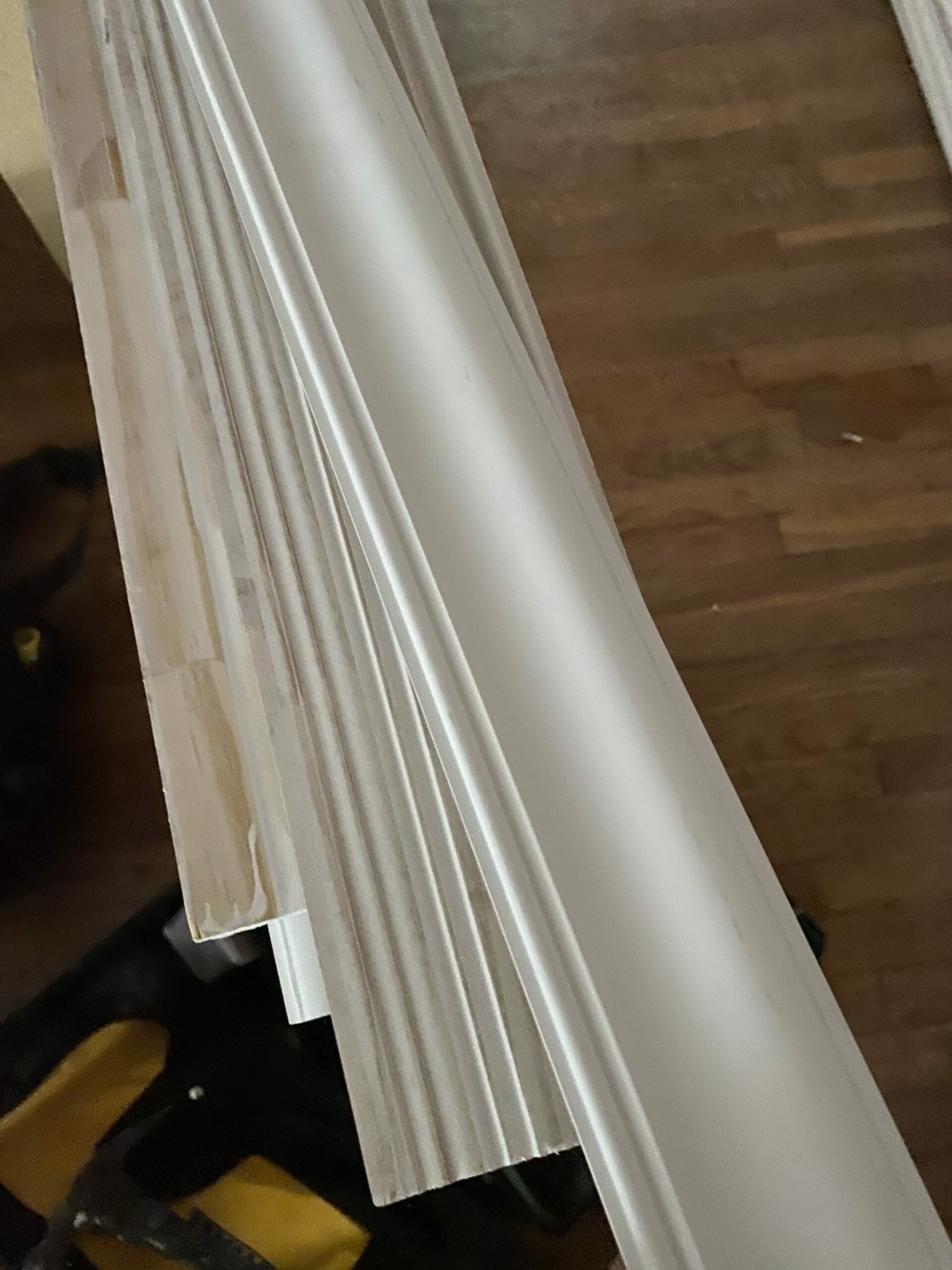
Speaking of baseboards… they are gorgeous! They’re pine and have a little fluted detail that makes them look fancy, but they were super reasonably priced (about $5 per 8 foot piece).
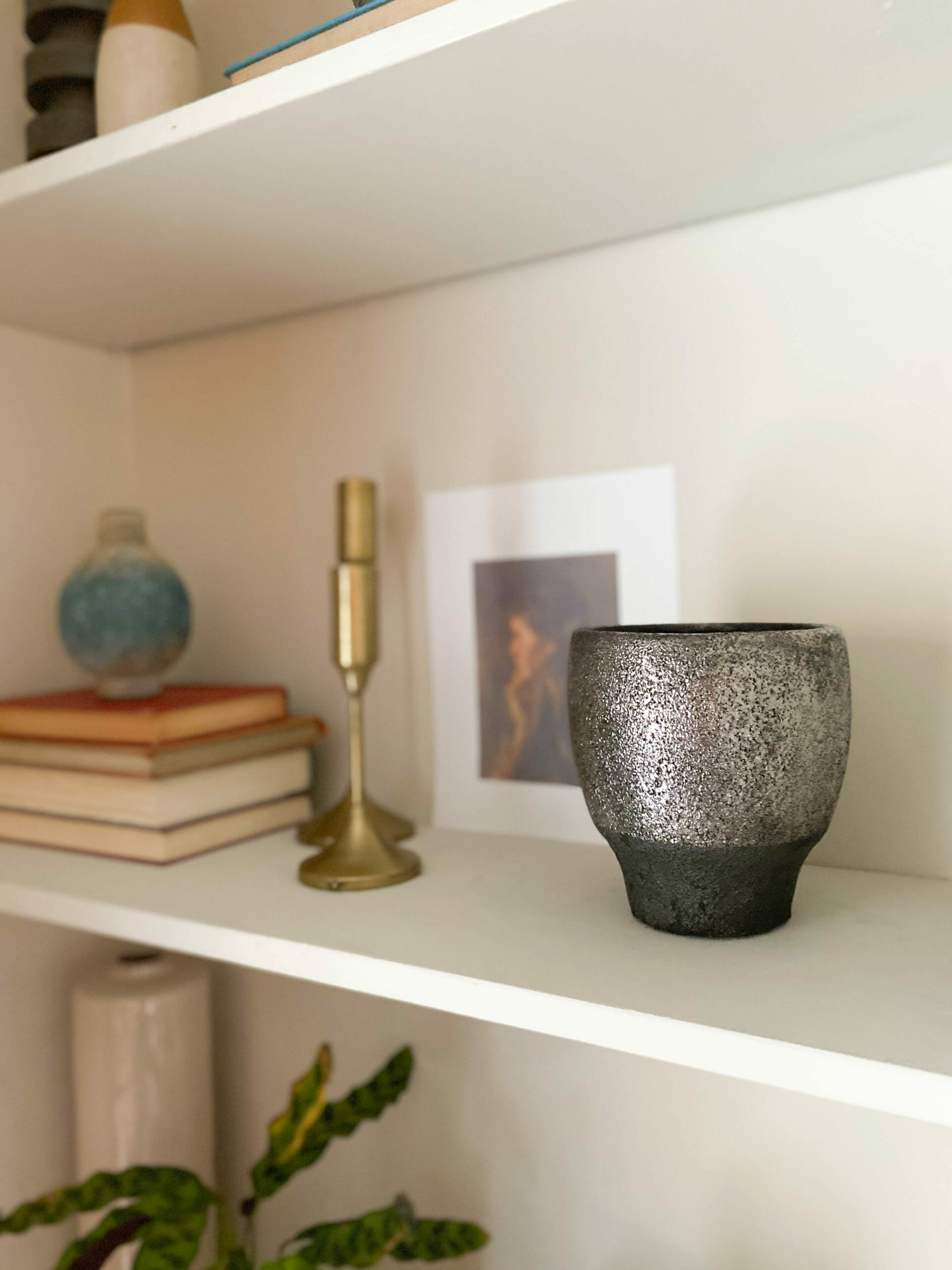
Above the cabinetry, we removed the soffit and reused the old pieces of wood for shelves. We decorated them with old books, antiques, and decor from Lowe’s.
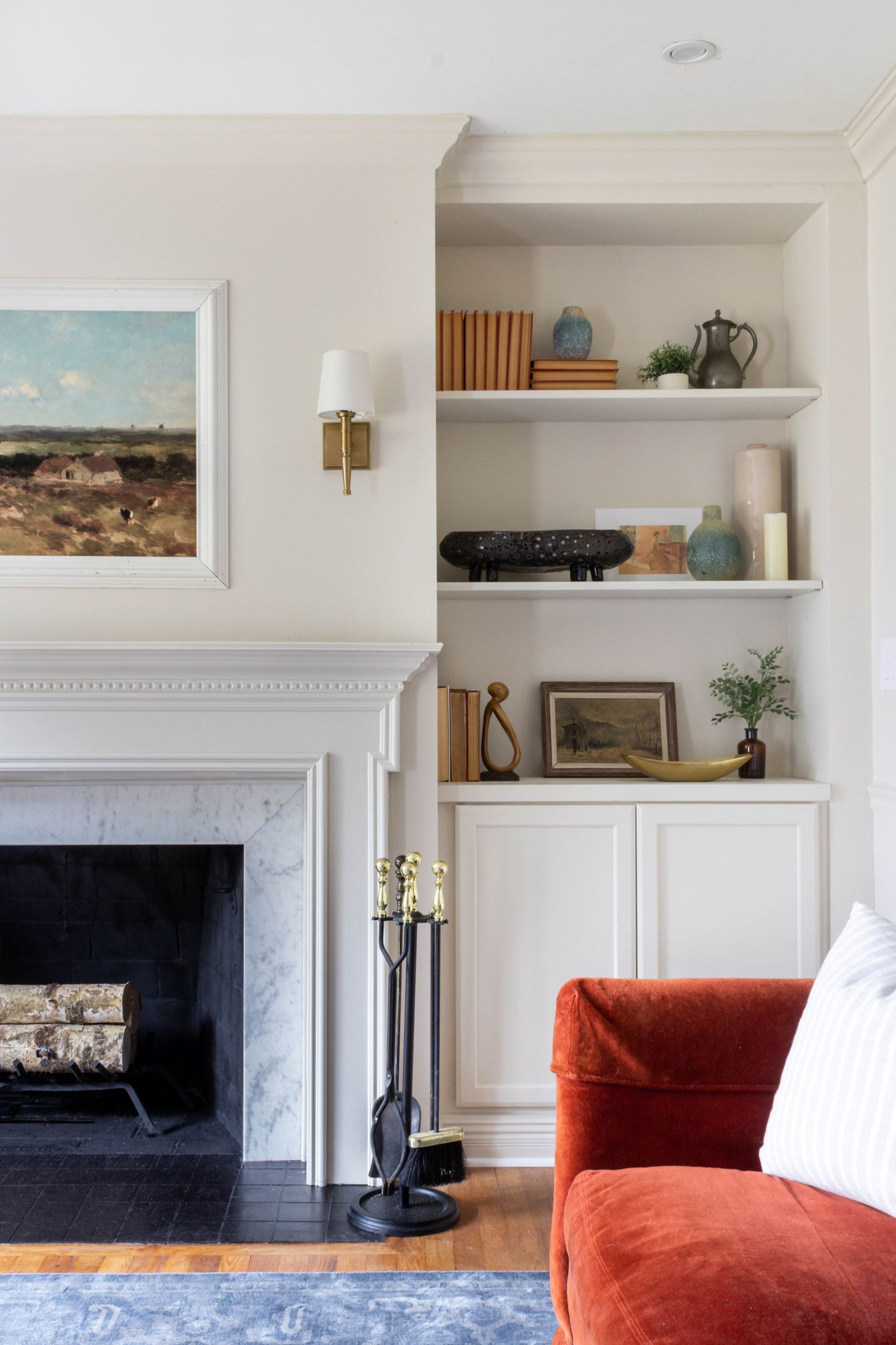
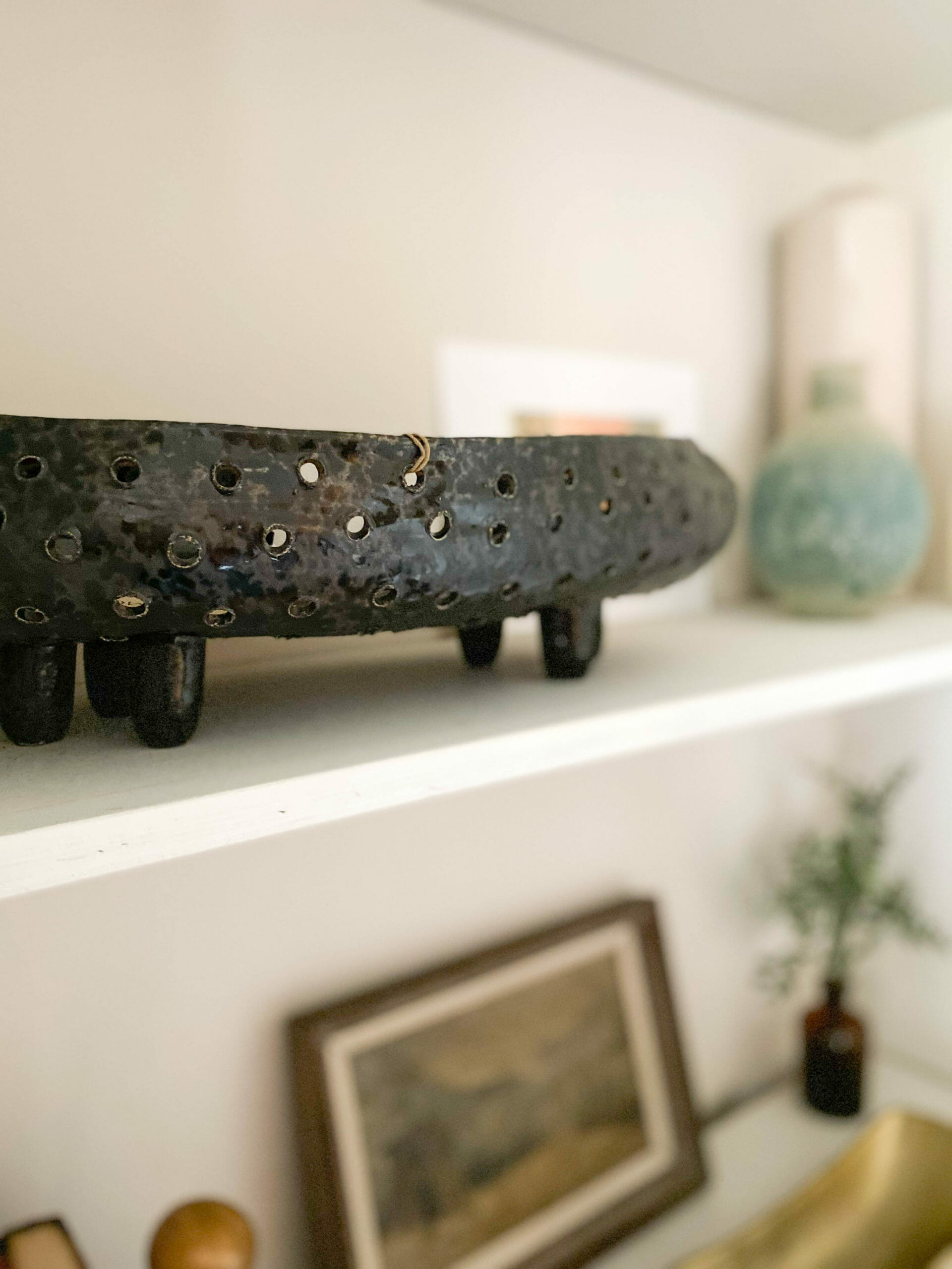
rug // sconces // cabinets // black footed bowl // brass bowl // blue vases
Remember when it looked like this? Removing the soffit at the top added about 16″ of shelf space and visually makes the room look larger.

Lowe’s carries a brand called Global Direct, which has pieces with a collected, organic look. I was really surprised by the quality, and I love that they don’t look like they’re off-the-shelf from a big box store (if you know what I mean).
black/silver bowl // blue vase // black footed bowl
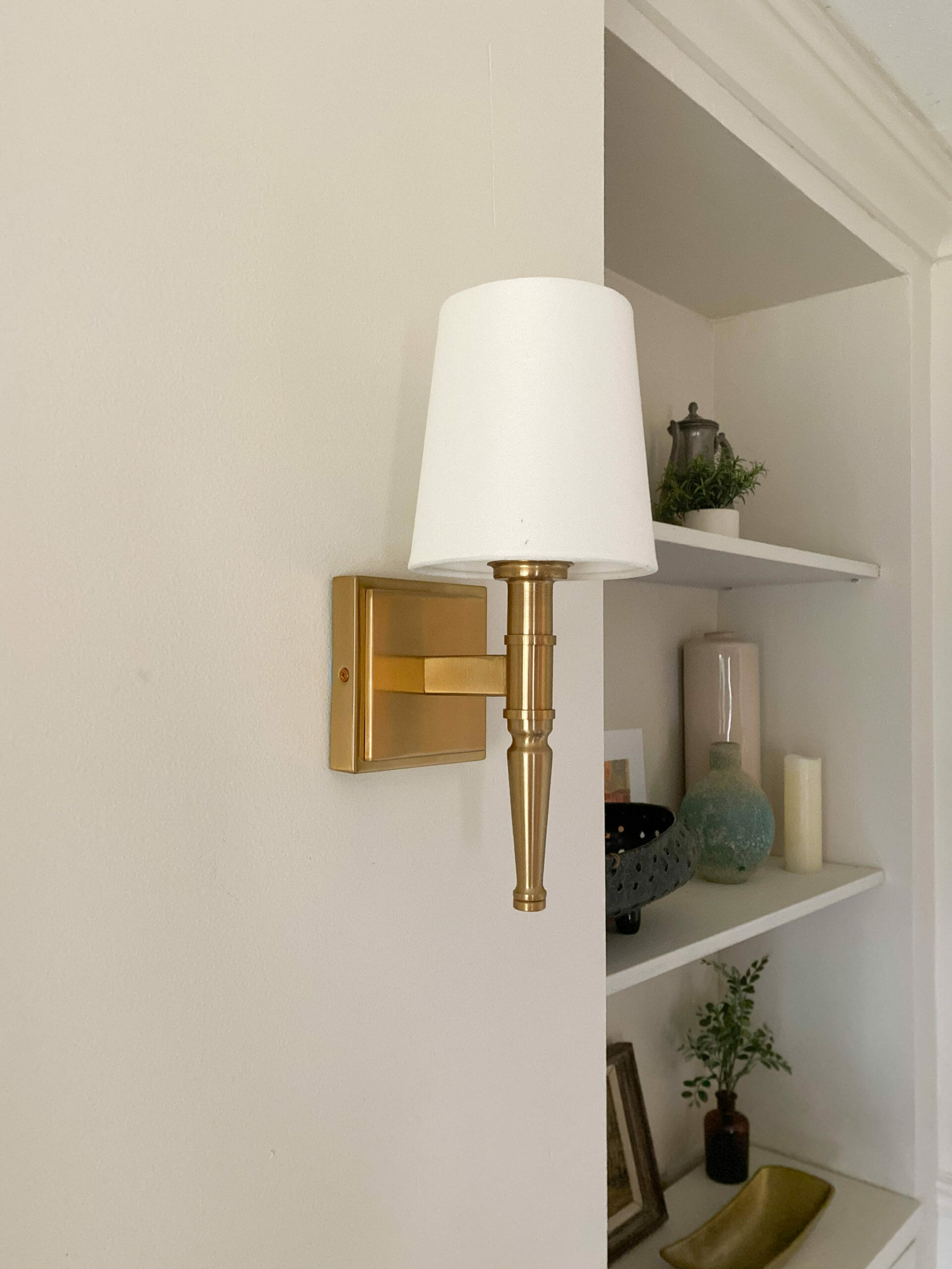
Let’s talk sconces. The fireplace is almost 80″ wide, and adding these brass beauties helped break up all of the space a bit. Sconces are a softer lighting option, which I love in a living room setting.
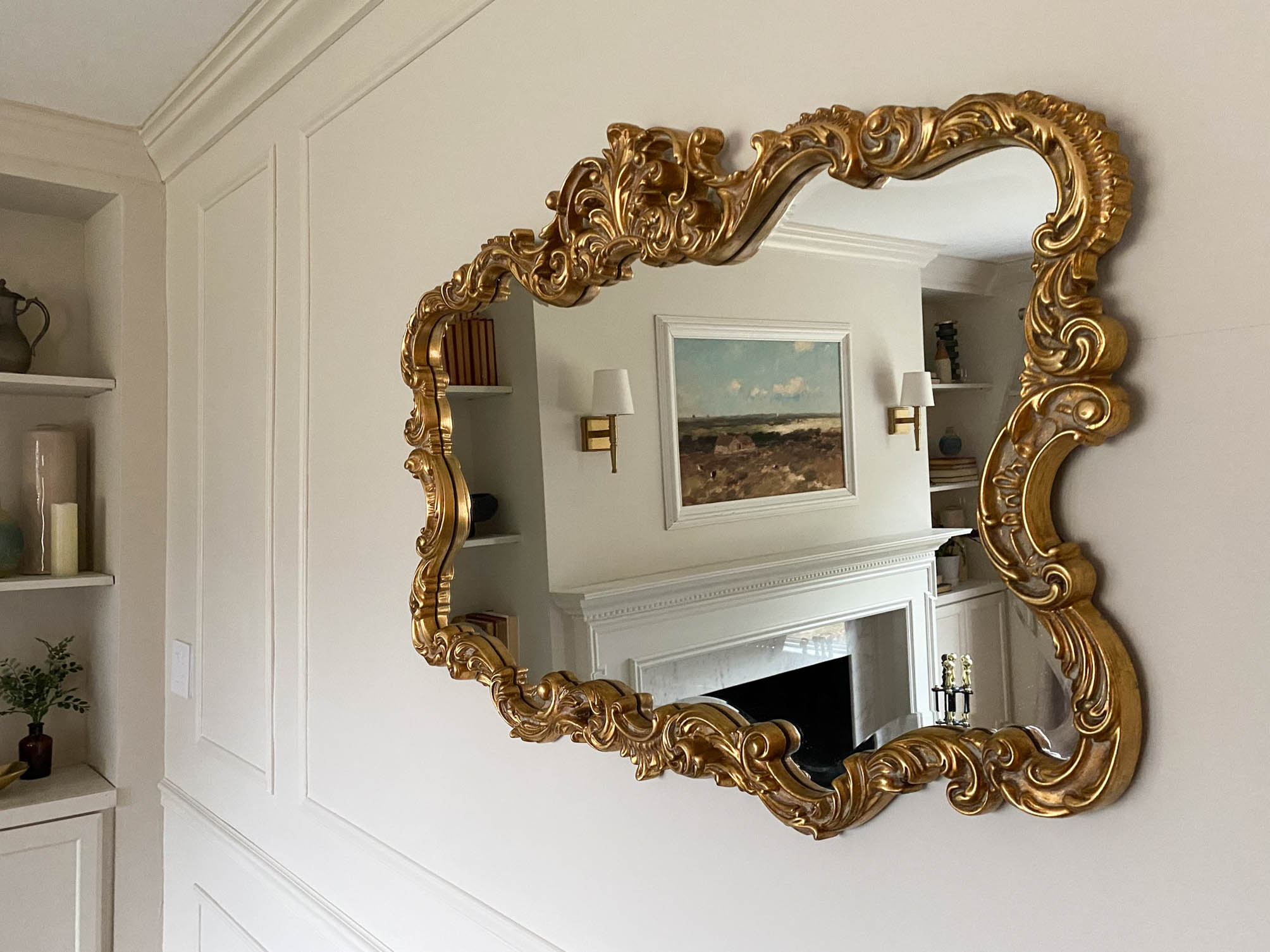
We found this antique-look mirror that we originally intended to hang over the fireplace, but it looked too busy next to the sconces. We found a new home for it above the vintage sofa from my grandparents’. I love that it reflects light coming in from the large window across from it.
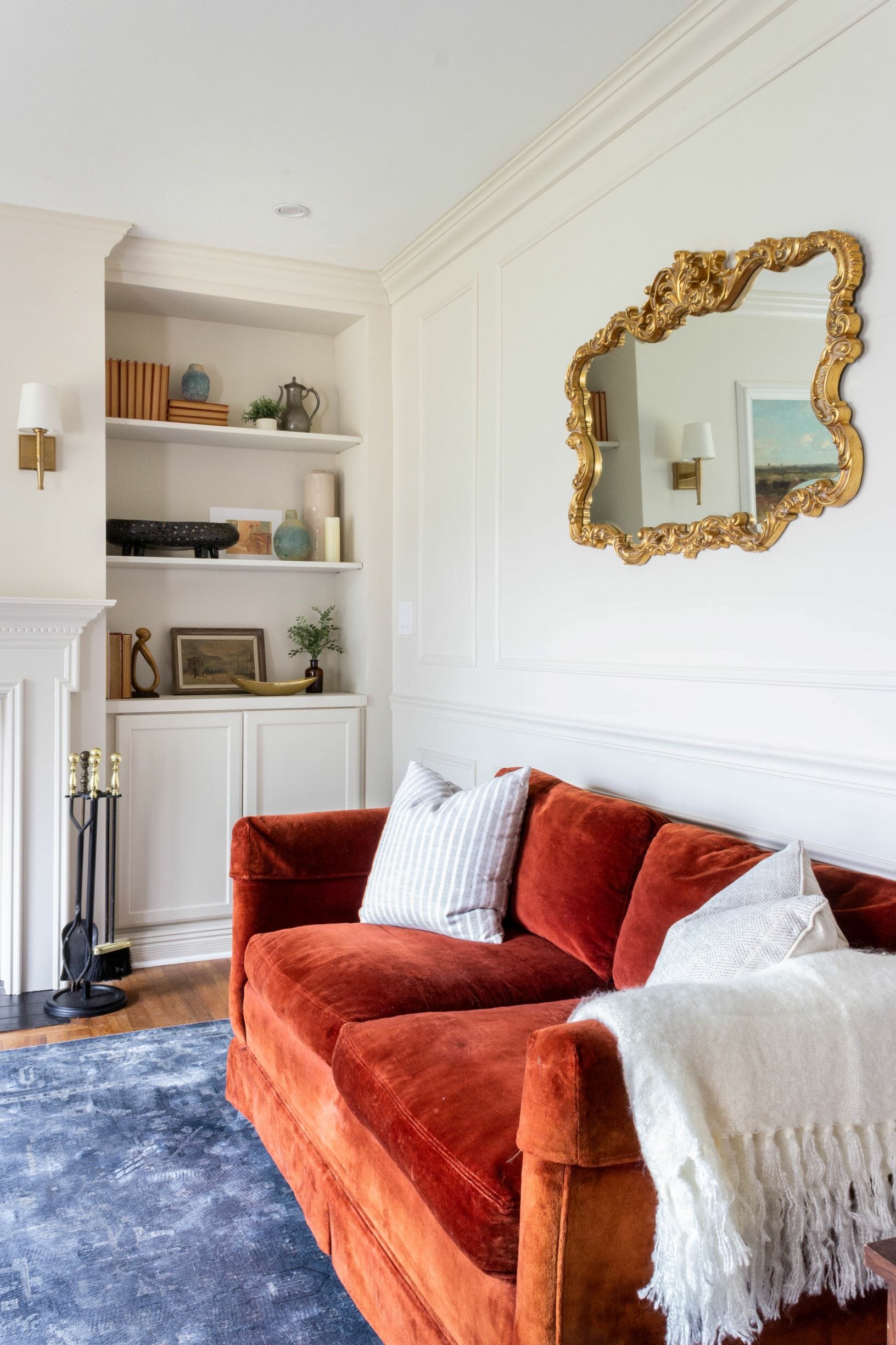
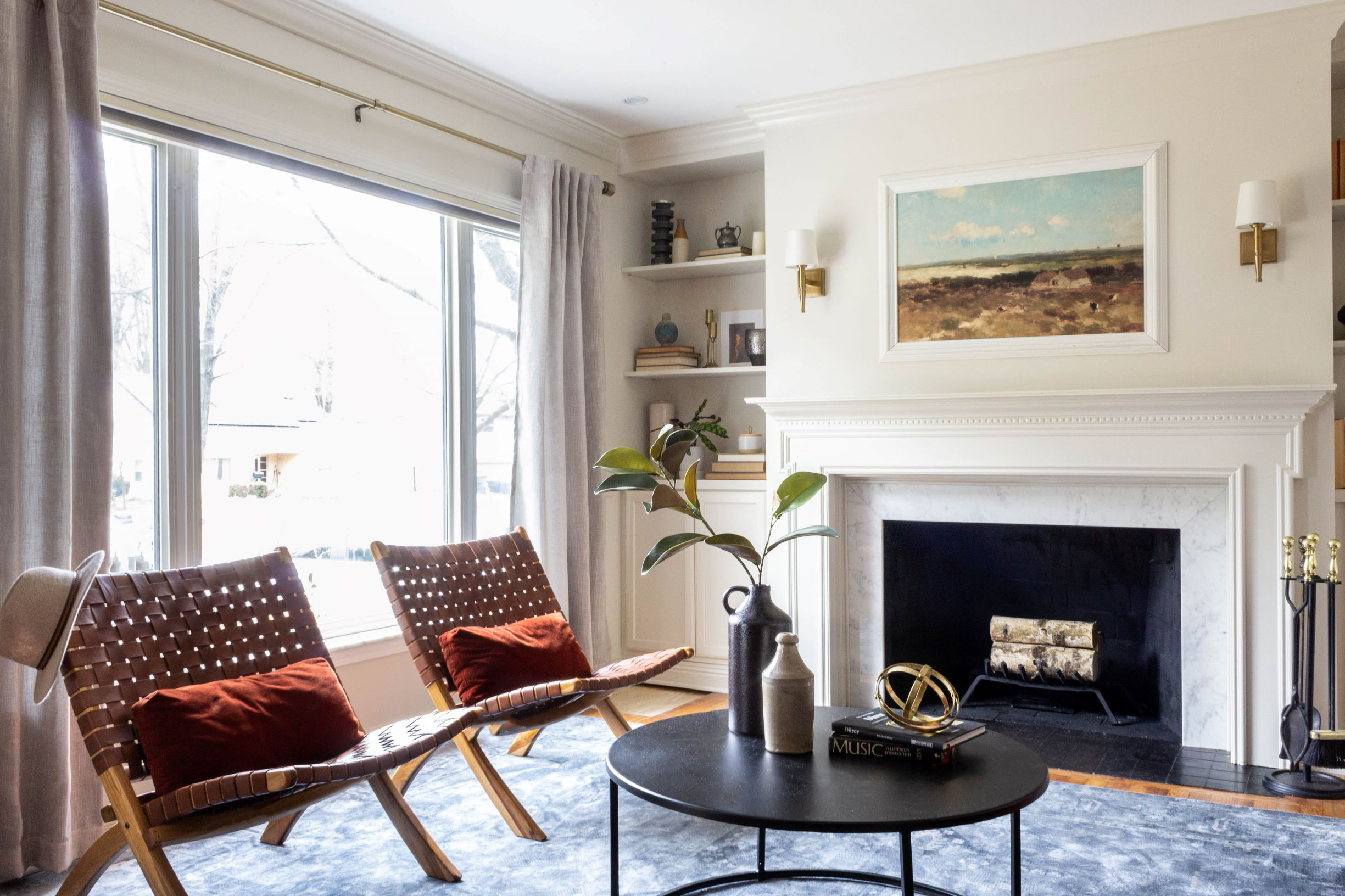
Here’s one more peek at the other side of the room. This window faces east and lets in the best light!
the look
We wanted this room to feel traditional, but not TOO traditional. We painted the walls Valspar Natural Tan (a new favorite!) in a flat finish and the trim the same color, but in a semigloss finish for a monochromatic look. Because we went neutral on the walls, we searched for decor with lots of color and texture. We gathered vintage pieces we had at home, and added some new pieces from Lowe’s to complete the space. We love, love how it turned out!
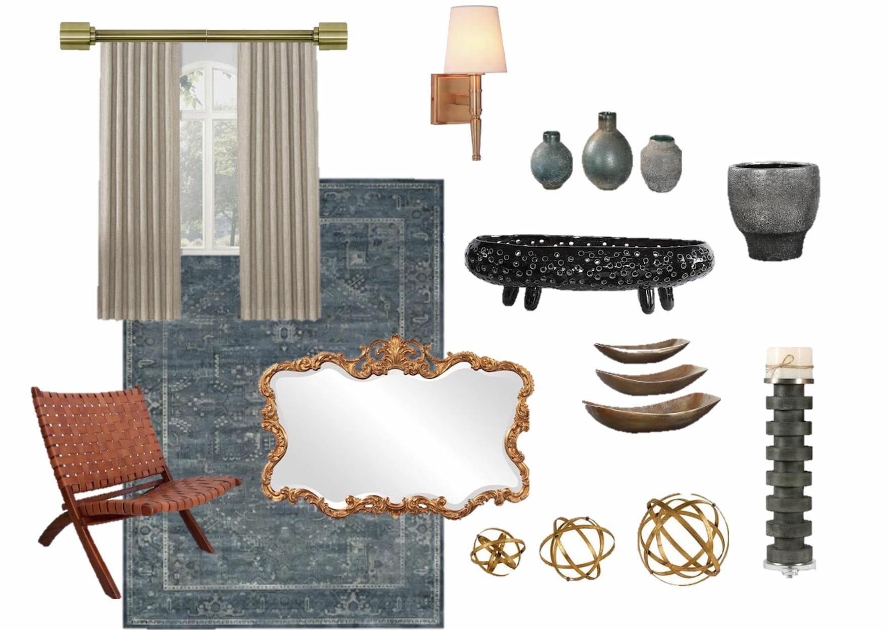
chairs // rug // sconces // curtains // brass curtain rod // curtains // gold sphere // pillar candle holder // gold mirror // black footed bowl // brass bowl // blue vases // picture frame molding // black + silver bowl







This is incredible! It’s gorgeous and what a transformation!!
Thank you Kelsey!! <3
Beautiful. I assume it is not the TV room? I always wonder how do people watch TV. cos we all do :). It is amazing how you have turned such an ugly wall into such a beauty. Love the wall trim and colour. Lots of inspiration.
Thanks Vicki! When my parents move in, they’ll likely hang a TV over the fireplace (we’re trying to convince them to get The Frame – we have it at home and it’s the best!)
Wow, you guys turned that into something gorgeous! Looks beautiful now!
Thanks so much, Diane!
The wall looks great, but is the fireplace still functional? The wood crib looks very exposed without a screen of some sort.
Thanks! Yes, fully functional. My parents aren’t moving for another few months, so they have time to get a screen before next winter.
You’re a genious! So beautiful. Did you have to have the marble cut specifically for your dimensions?
thank you! we knew the dimensions of the marble we’d be using, so we cut the fireplace mantel to fit it.
Those sconces are great and the price is fantastic! I love the wall color as well..would you be willing to share it?
Thank you – they were a good find! The paint color is Natural Tan (we got the HGTV by Sherwin Williams paint at Lowe’s)
Wow Amazing.
Very nice idea. thanks for the sharing