It’s been 5 years since we bought The Blonde Vic from a local real estate investor & Instagram follower. During renovations, we gutted the whole house and made a few floor plan changes to increase functionality, but left the majority of the layout as-is. One of those changes involved converting one of the original bedrooms into a bathroom. We have never shared this bathroom project before and we’re excited to tell you about it!
This is what the bathroom space looked like when we bought the house. It was part of one of the bedrooms.
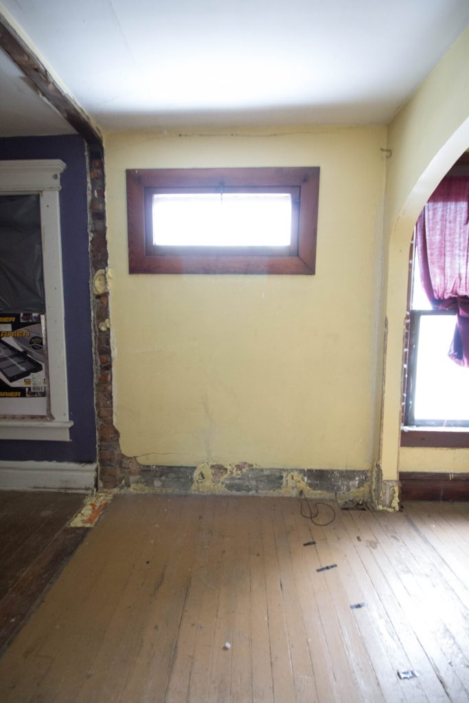
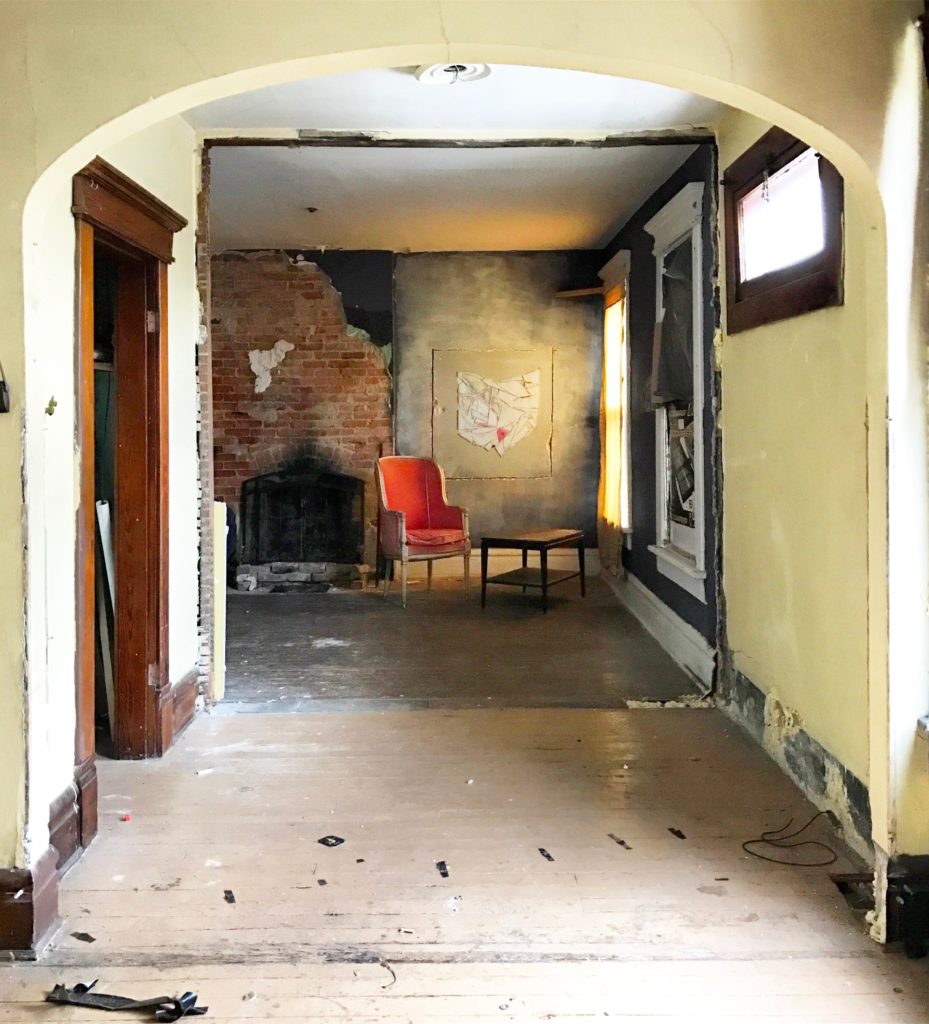
Sidenote: we loved the original arch on the right so much that we kept it exposed in the adjacent bedroom.
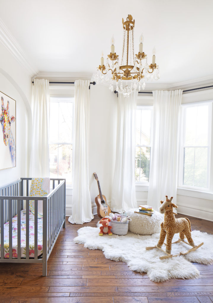
… I digress. Back to the bathroom! This is what it looked like right before starting this project, minus those paint samples on the wall. Got a little ahead of myself with testing colors before making sure my before photos were set 😉
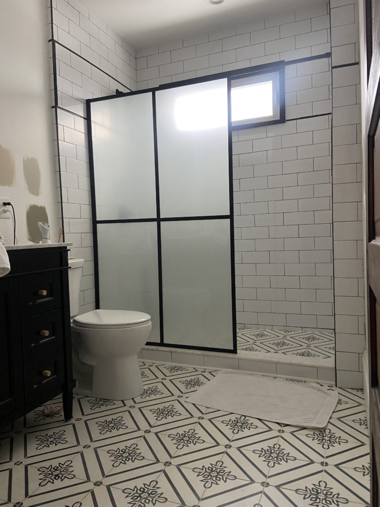
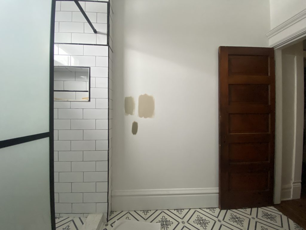
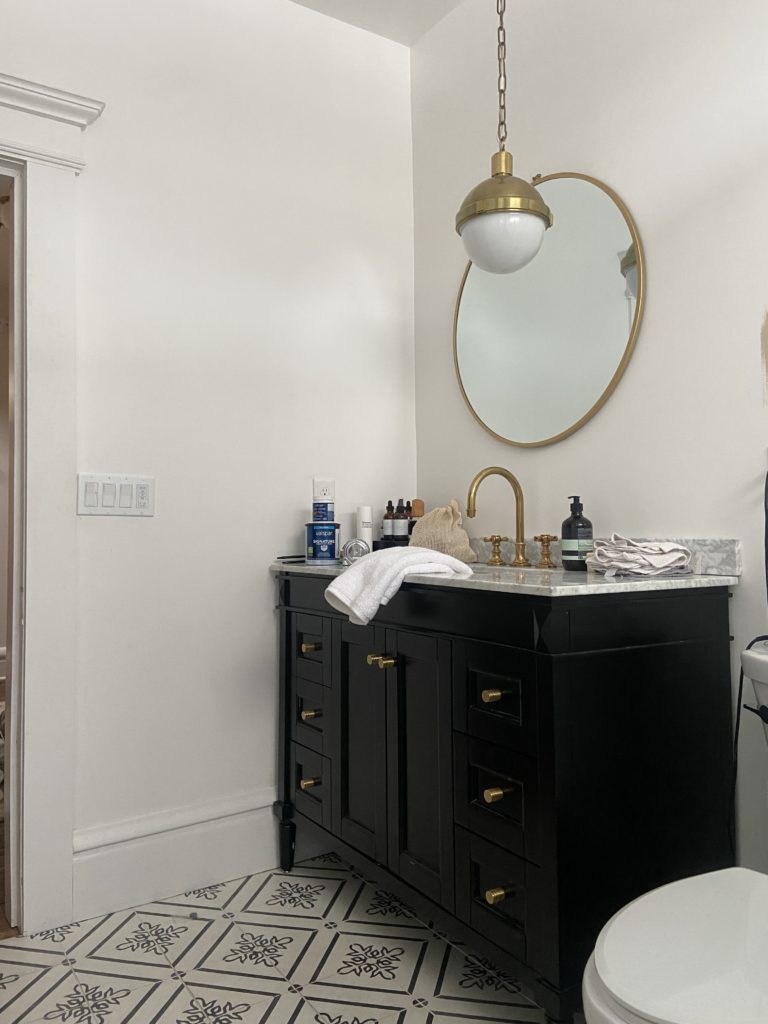
At the time we were renovating (2017-2018), our focus was on getting the house finished ASAP so we could get our final inspection and move in. We weren’t thinking about how we really wanted each room to feel (if I’m being honest, we didn’t know), especially in this bathroom and the other rooms on the second and third floors. Now that we’ve been living here for three years, it feels good to begin making small updates that are more reflective of our current style.
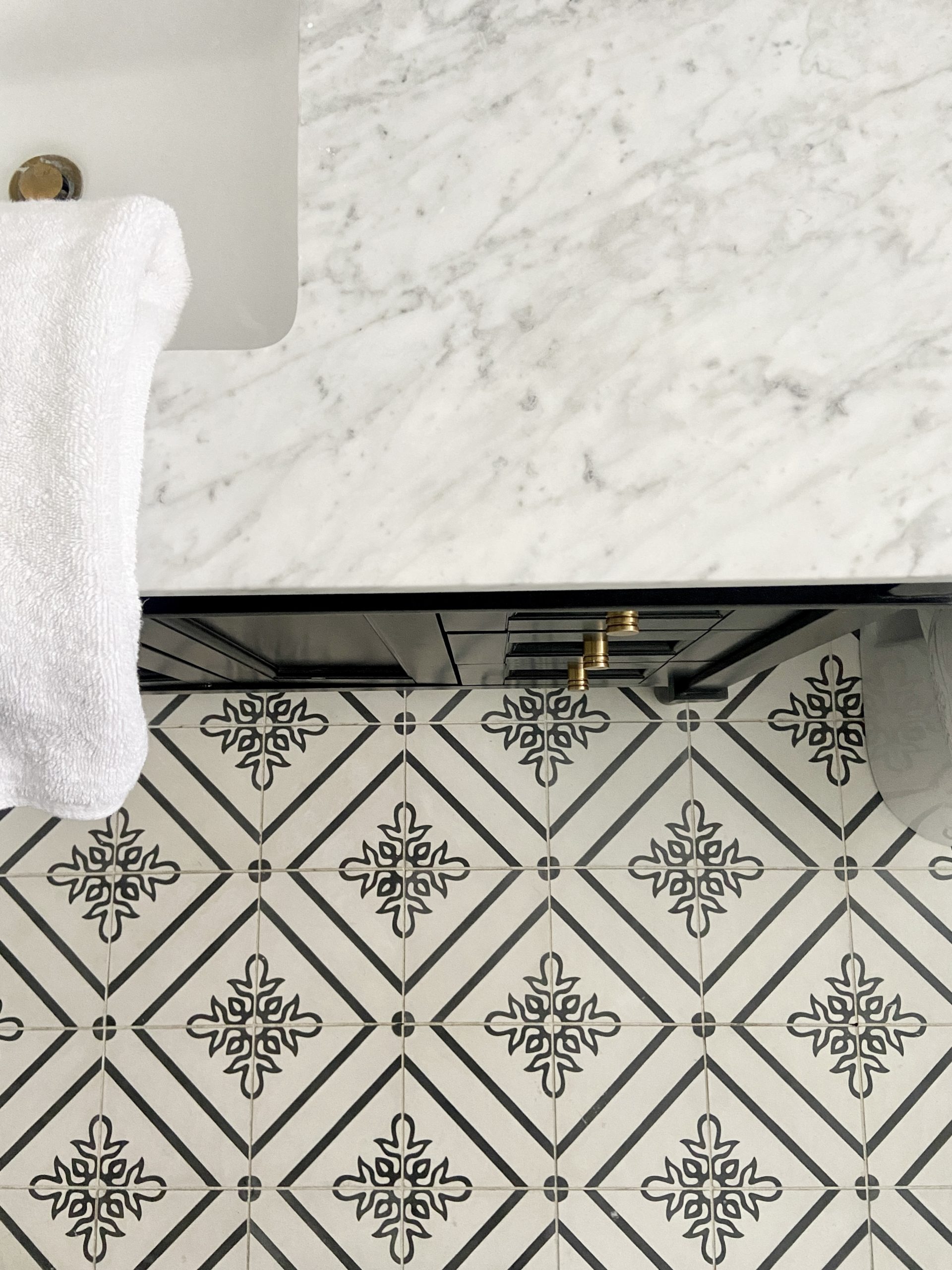
planning considerations
Here are a few things we thought through as we planned our scope of work and design choices for this project:
- We purchased the shower glass a few years ago online and DIY’d the install to save money. In addition to being wobbly, it’s visually busy and too short for the space. This bathroom needs something soft to offset all of the more edgy geometric black & white pattern. So we’re taking it down and swapping it for a shower curtain.
- I would love to add an arch to the shower, but we’re all in on our B&B renovation right now and can’t manage to do one at home. Ixnay on the arch… for now 😉
- The paint color on the walls now is Valspar Swiss Coffee (7002-16)– a true white that pairs very well with white tile, which is why we chose it. Usually we’re into white paint (it’s in almost every other room in our house!), but this bathroom is feeling too cool and falling a bit flat.
- Outlets! Our outlets and switches are white throughout the house, but because our walls are also white, I never think anything of them. As soon as we start introducing color on the walls, the plastic outlet covers pop in a not-so-attractive way. There are some beautiful brass and clear options out there, but do we want this to be the only room in the house with non-white outlets? Maybe… maybe not? We decided to leave them as-is for now.
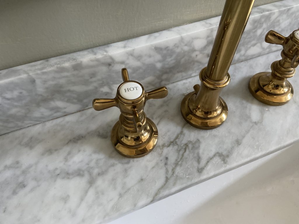
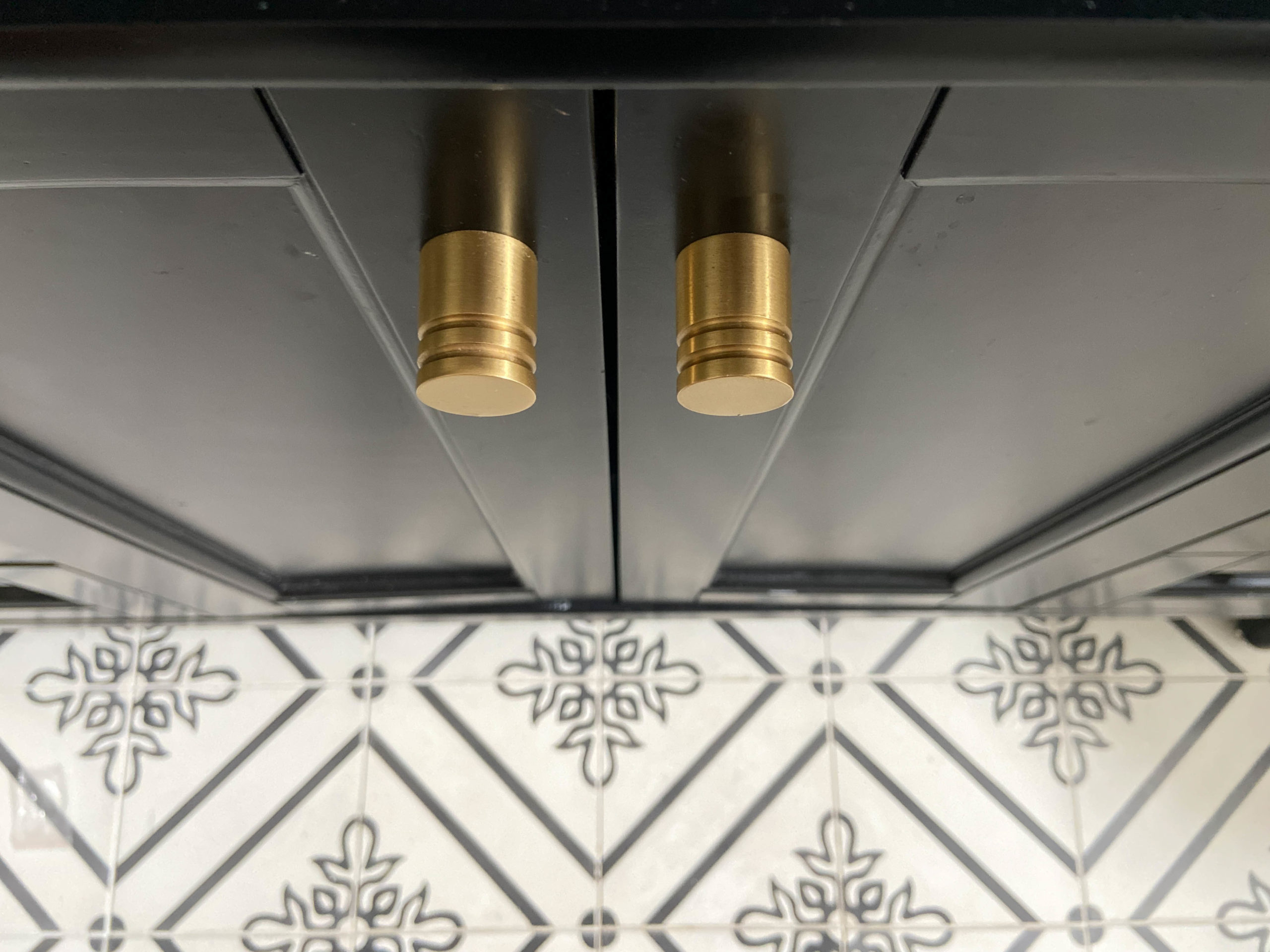
- Mixed metals. We originally had a brass faucet, mirror and vanity knobs, and black shower trim and shower door. We want to streamline all (most?) of the black hardware and fixtures to brass — this will inject warmth into the black & white space.
selecting the right color
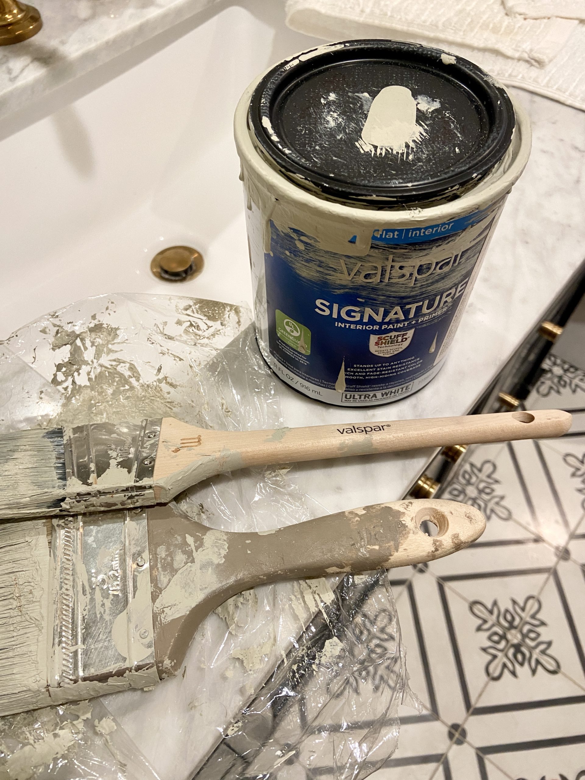
I wanted the color for this bathroom to be neutral, earthy, and compliment the black & white. I didn’t want to go with something too trendy as this is a room we use frequently, and we’d ideally like to avoid having to repaint anytime soon. After ordering free color chips on Valspar.com, I narrowed down our choices to three Valspar colors: Thunderstorm (CI54 – right), Lamb’s Ear (CI145 – left), and Chimney Stone (CI52 – center).
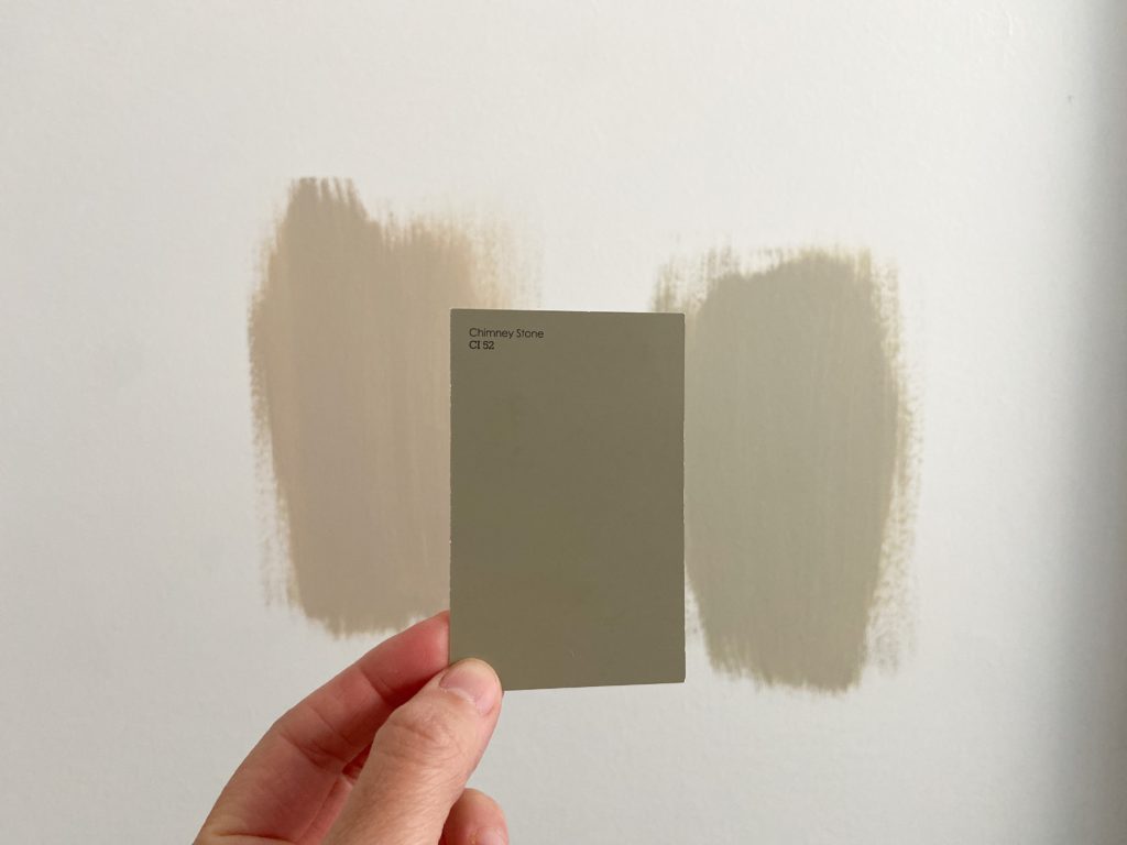
I thought Chimney Stone might be the one, but Thunderstorm was the winner! It’s described as a warm gray, but reads as more of a dusty green in here. A good reminder to always try samples on the wall in your specific space.
mixing sheens
We love doing monochrome walls and trim, but switching up the sheen on different surfaces. In this bathroom, we painted the walls Valspar Thunderstorm in flat and used a brush to apply the paint, which added a barely-there texture to the walls.
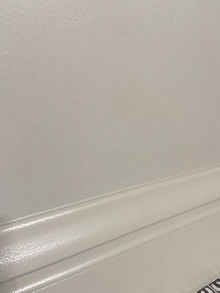
I chose to paint the baseboards and door trim in semi-gloss for a subtle contrast. At first glance, you don’t notice it, but when the light hits each surface differently throughout the day, it reminds me that little details like this make a difference in how we experience spaces. Details matter!
Here’s what the flat looked like after one coat next to the semi-gloss trim.
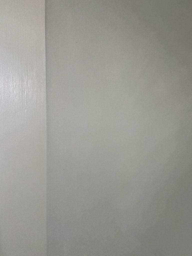
And here’s the same wall, just at a different time of day. Love seeing that little bit of shine.
It’s ok to change the plan
Originally, the plan in here was to just paint the lower half of the wall, so that’s what I started with. After getting the paint on the wall, I could tell pretty quickly that it wasn’t what I was going for. It was reading as yet another accent in a room full of accents, competing with the floor and wall patterns which I wanted to shine.
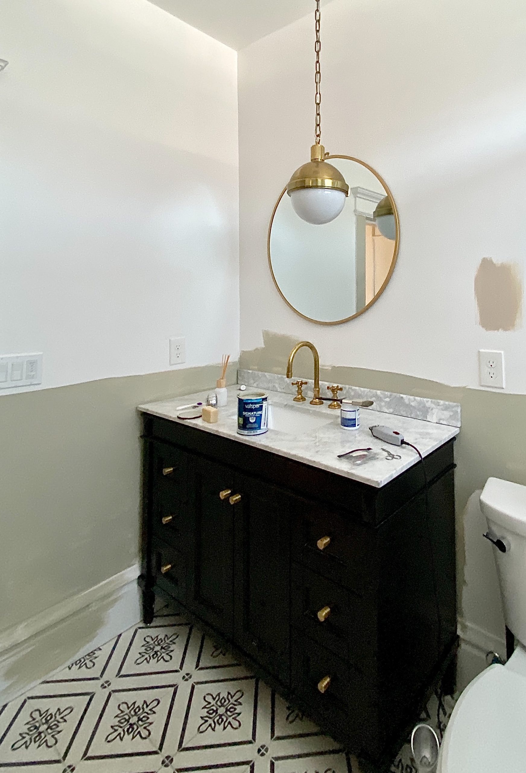
I took the paint up to the ceiling and everything started to come together from there.
reveal
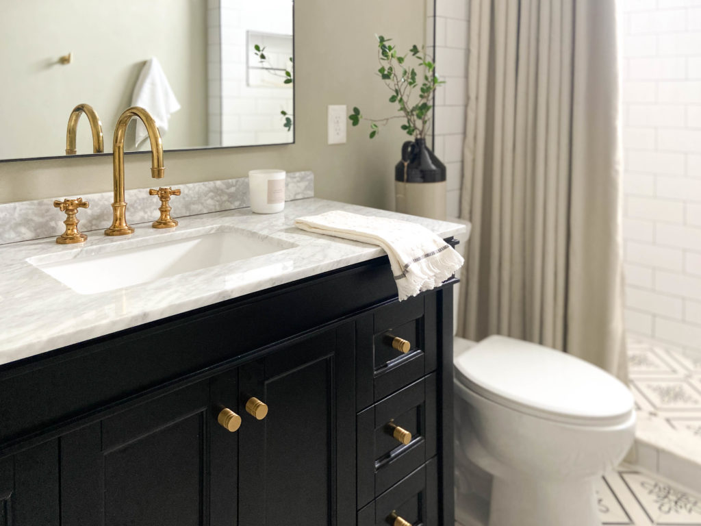
I meannn… doesn’t it feel like a whole new version of its former self?
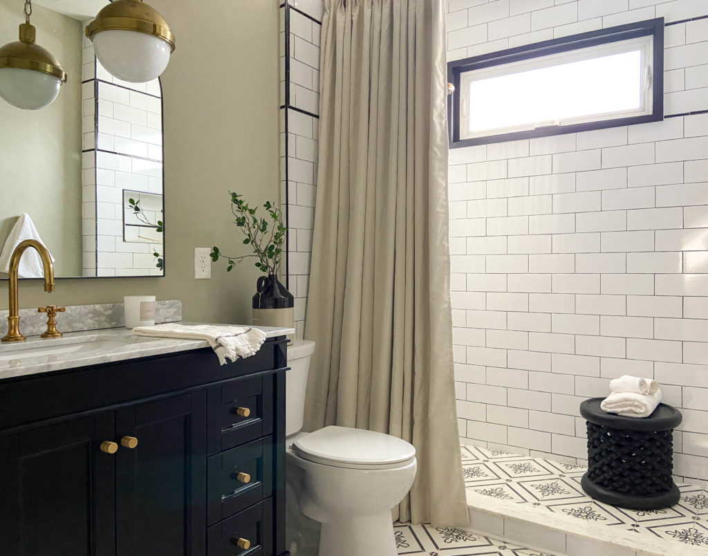
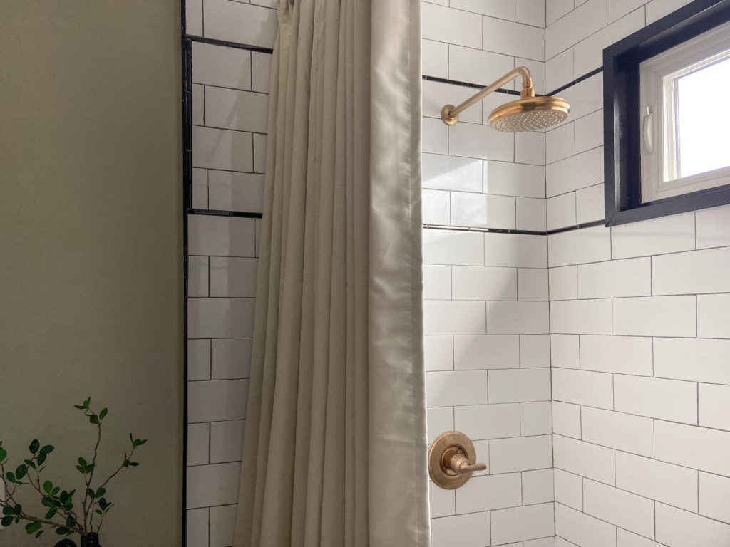
The curtain was the right move in here – the soft folds, creamy color, and the height all add so much to this room. Visually, I like being able to open the curtain and expose more of the shower, too.
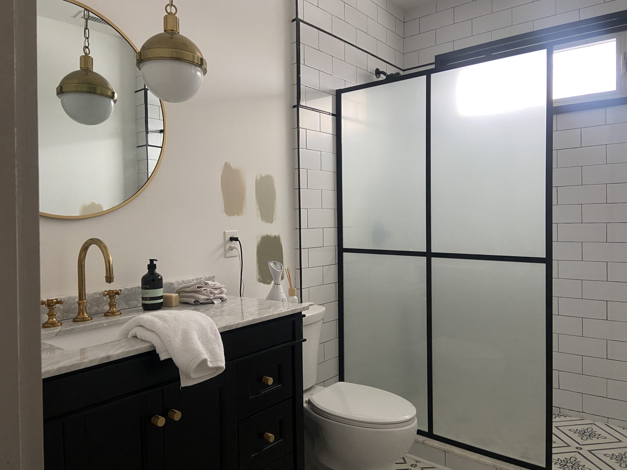
The glass wasn’t terrible, but I love how it gives the room a totally different feel. Bonus: it’s a lot taller than the glass and draws your eye up, so it makes the room feel bigger. I ordered a beige pinch pleat curtain and a warm brass tension rod that coordinates perfectly with the other brass tones in the room. This isn’t a true shower curtain, so my plan is to add a second curtain rod with a liner behind this one.
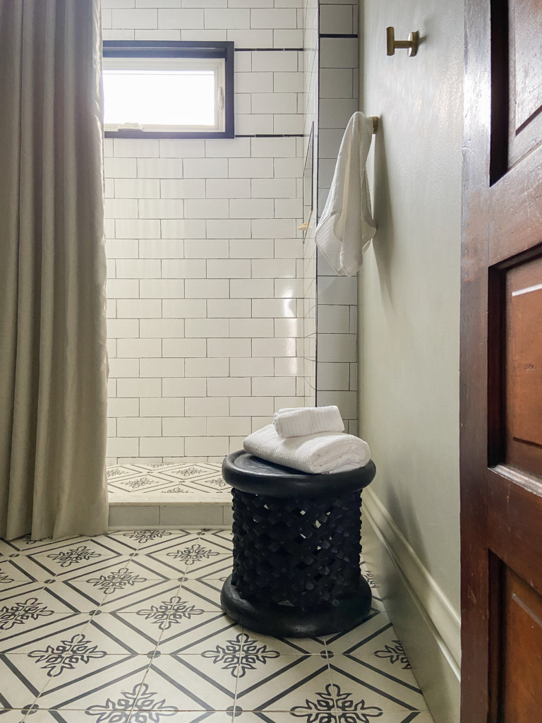
Fun fact: we haven’t had towel bars in our houses for the past 8 years, and never put them in our bathrooms at The Vic. Not necessarily on purpose, but we’ve gotten used to living without them and don’t mind it. In lieu of a towel bar, I brought in a carved African stool sourced from Lagom Loft here in Columbus. It’s absolutely beautiful!
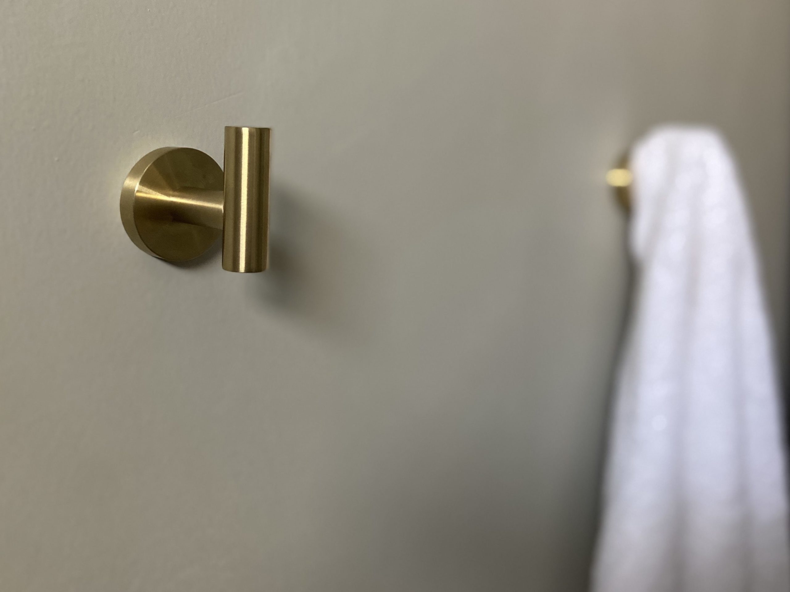
The paint adds such a warmth to this space, and I especially love the way it looks against all of the brass accents.
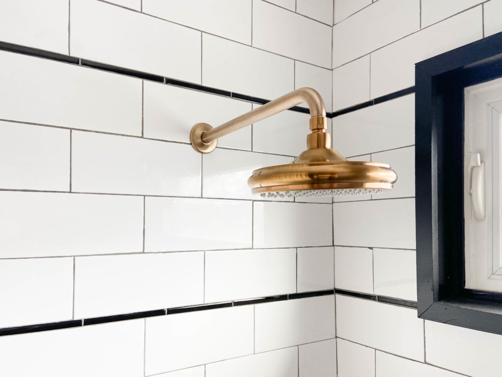
Another thing we did was swap the black shower fixtures for brass ones. This is what it looked like before.
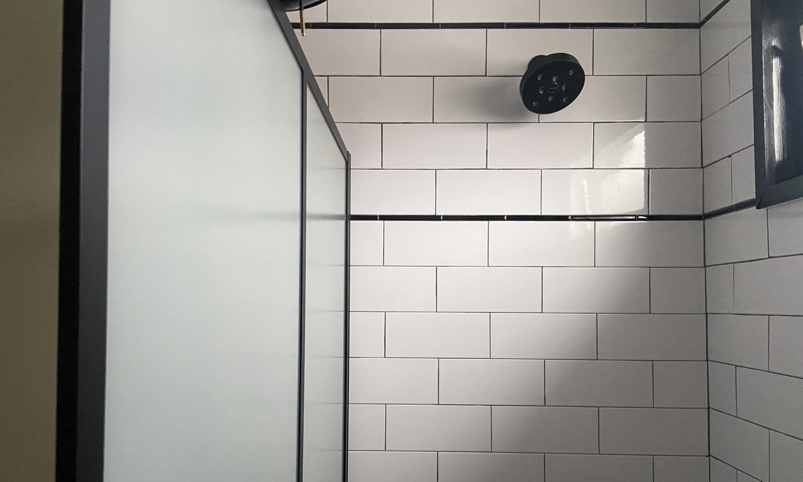
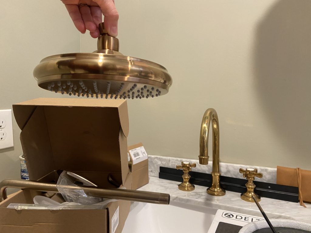
We had a spare Delta valve trim in our basement, so I just had to order a shower arm and shower head. The brass shower head actually is a different brand, but is super close to the Champagne Bronze finish we have for the shower arm and valve trim. The water pressure and flow is AMAZING, and it’s heavier than most of the other shower heads I’ve held!
Last but not least… the mirror. It’s the only dark finish we incorporated into this refresh, and that was by design. I felt that since the vanity is dark, the mirror would almost be an extension of it if it was dark too. This one fits the scale of the vanity much better than the smaller 30″ round one we had there before. I may not have gotten my arch in the shower, but I got it here!
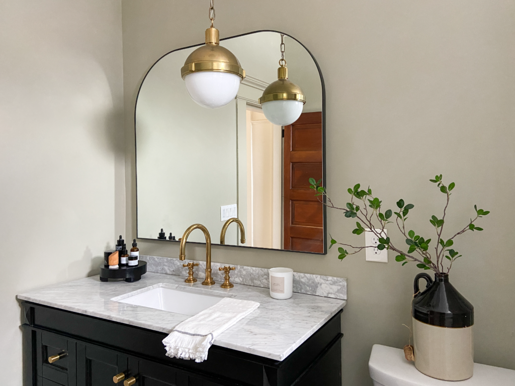
Doesn’t this space feel warmer and cozier now? It’s become a room that I really love walking into and spending time in. Seeing how well this turned out is encouraging me to carve out more time for small, impactful updates in other rooms in our house. Ah, the power of good design!
Did I miss anything? Leave a comment below!
Do you mind telling me where the mirror and hardware are from?
Sure! Here are the links: MIRROR LINK | HARDWARE LINK
Great re-Reno. Such a leap in style and cohesive look. Thanks for sharing!
Thank you so much!
Oh my gosh, so pretty! I love black and white but this is even better. Great color choice. I also prefer a shower curtain to glass because I don’t like to squeegee every time I use the shower. And of course textiles add so much. I also admire your restraint in the tile work–it’s usually easy to tell what year tile went in, but this is timeless. That pencil line of black! Yum.
Thank you so much Karin!
This looks really nice!
My bathroom also has really tall ceilings so it makes everything look short… or like only the bottom half of the room is filled. I wasn’t sure how to work with that… but now I’m going to borrow your much taller curtain idea and just leave the liner where it currently is. 🙂
Yessss! It’ll make a big difference. We have also bought extra long liners on Amazon if you ever need one. 🙂