We’re really excited to reveal one of our favorite Mix kitchen projects from last year! You may have seen a peak or two on Instagram Stories, but other than that we didn’t show you too much progress. Let’s start with some before photos, shall we?
BEFORE
Here is the old view from the dining room into the kitchen.
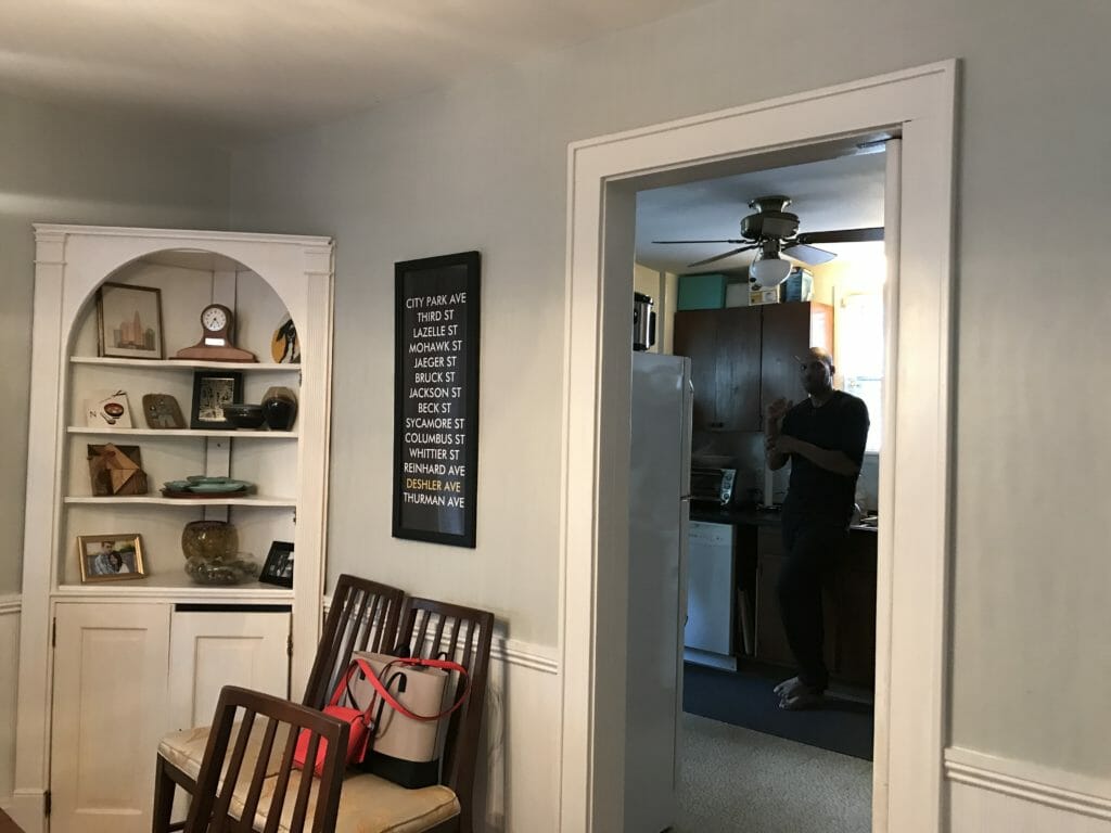
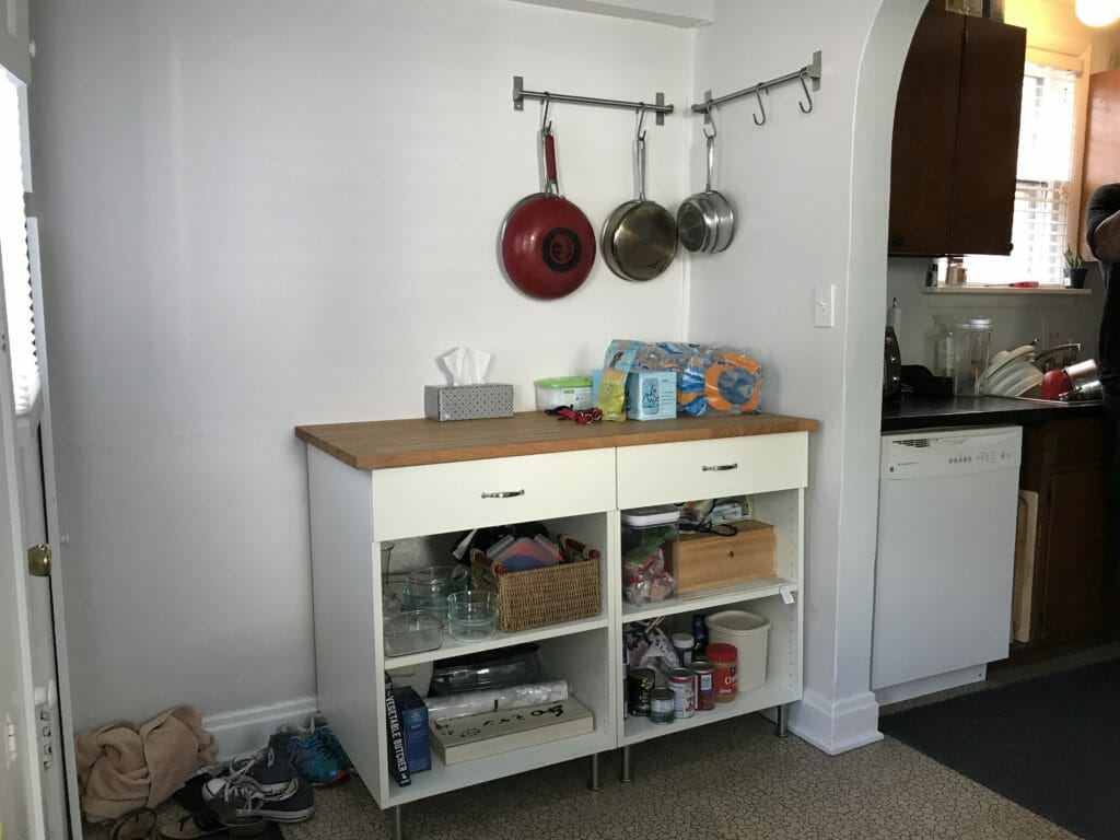
The kitchen was separated by a structural wall (the part beyond the wall was likely added on at some point in the last 100 years). The front part, where our clients are standing, was the main functional part of the kitchen w/the sink and appliances.
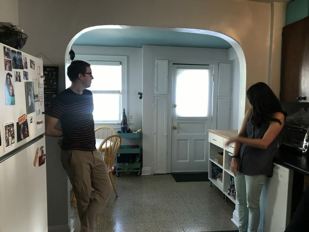
Here’s the view from the back door looking toward the front.
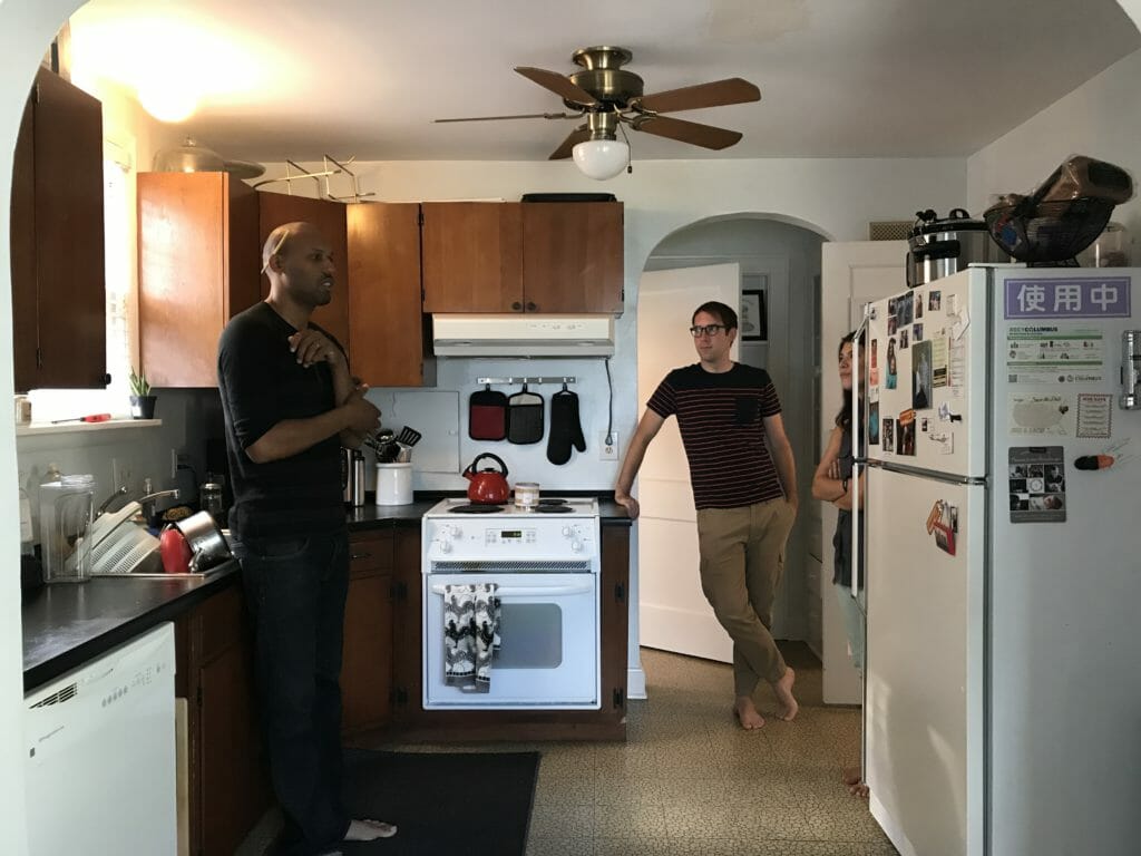
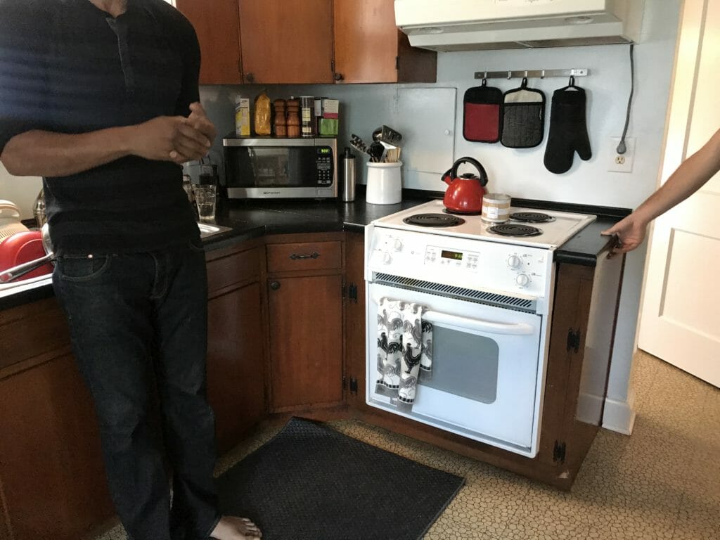
We had lots of lovely, dated finishes to work with.
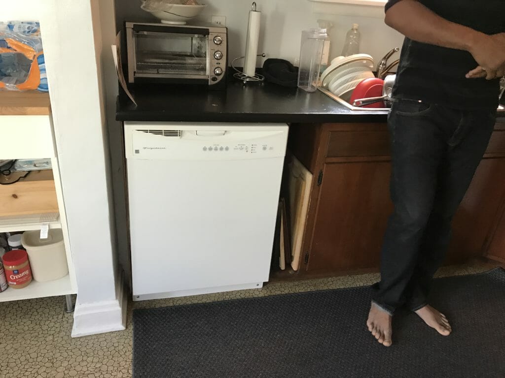
And lovely lighting, too (our clients were excited to get rid of the fan!)
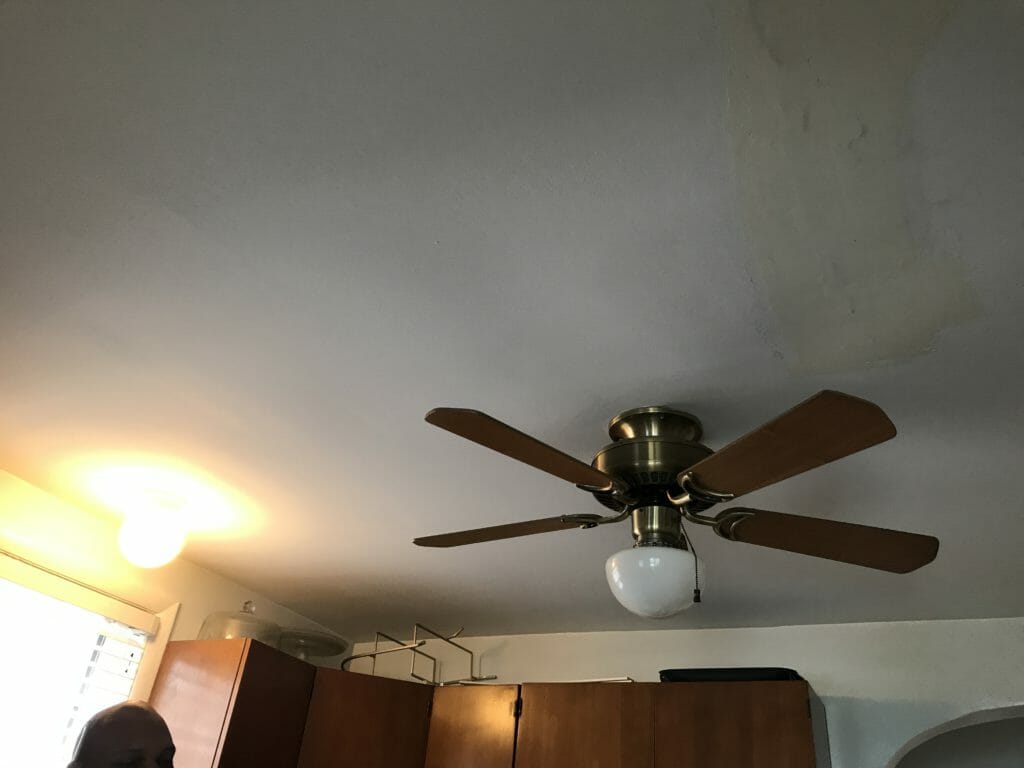
Here’s another view of the two kitchen sections from the back door.
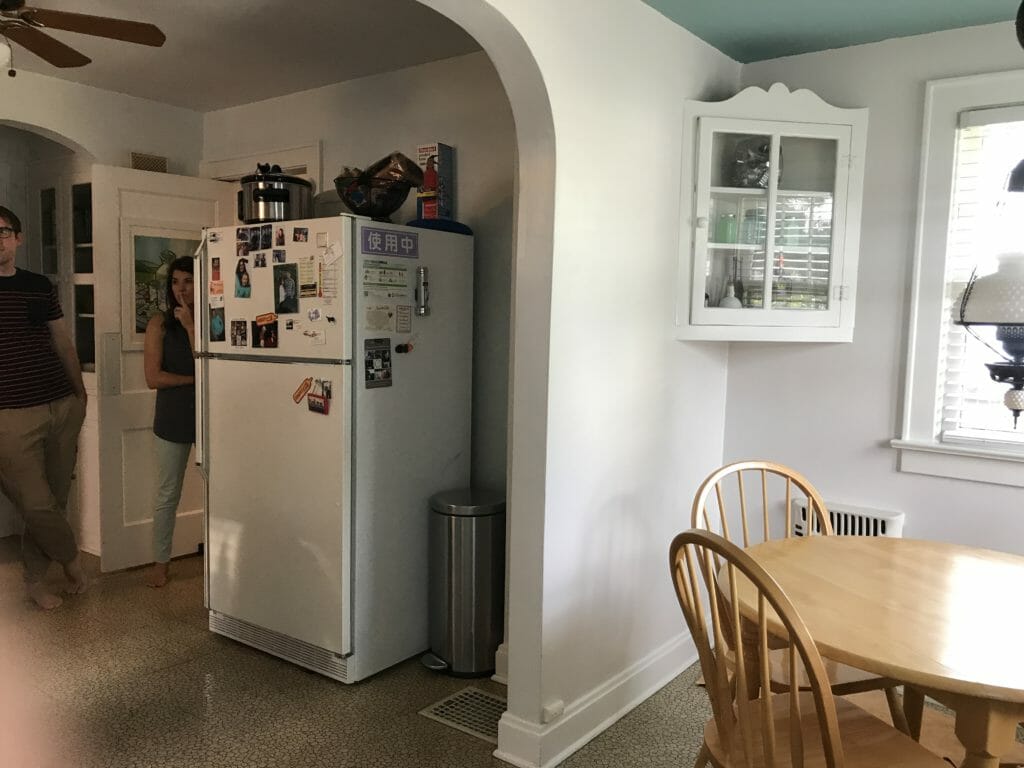
Aaand the other side.
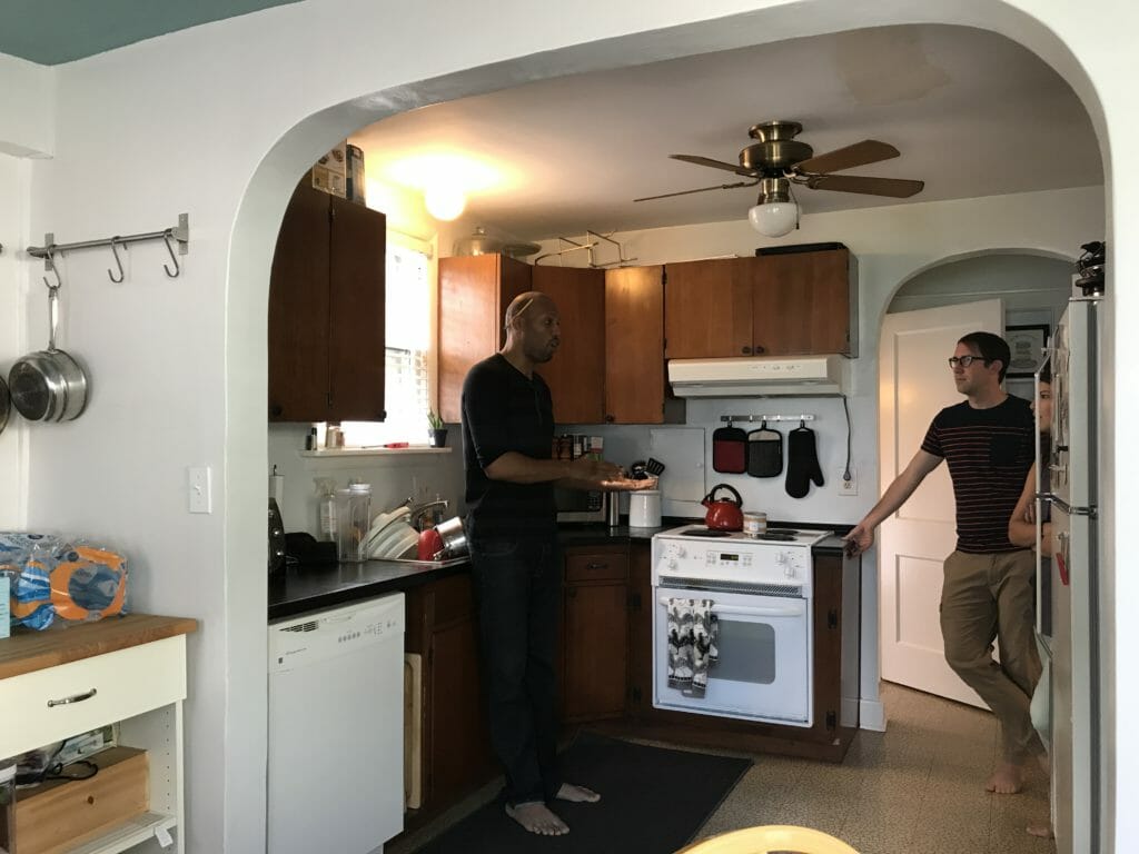
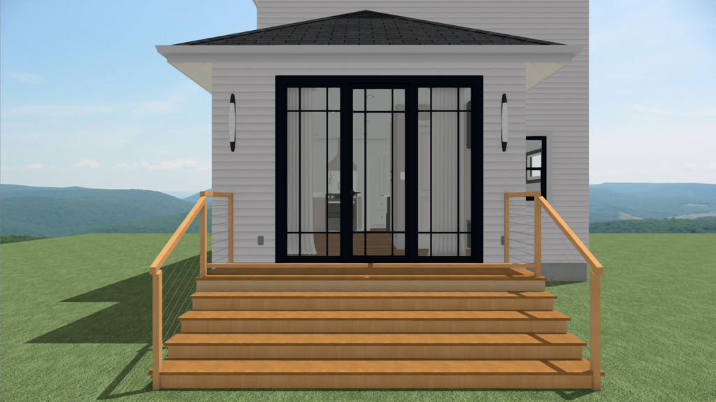
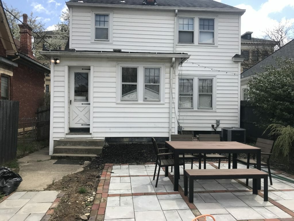
This was the old view of the back of the home. The back door was inset and there was a small stoop leading up to it.
SPACE PLANNING & RENDERINGS
This is what our client’s first floor layout used to look like. For reference, the front entrance is on the right, and the back entrance is on the left.
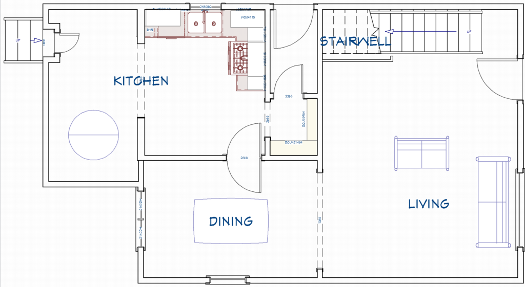
We start all of our projects by nailing down our client’s wish list, and learning more about what they want to change & why. At the top of the list? More natural light, a half bath incorporated into the space (if we could work it in), all new cabinetry, appliances and finishes (YES), and removing the wall between the dining room & kitchen to create a better flow. After many iterations, we were able to create a layout that ticked most of our client’s wish list.
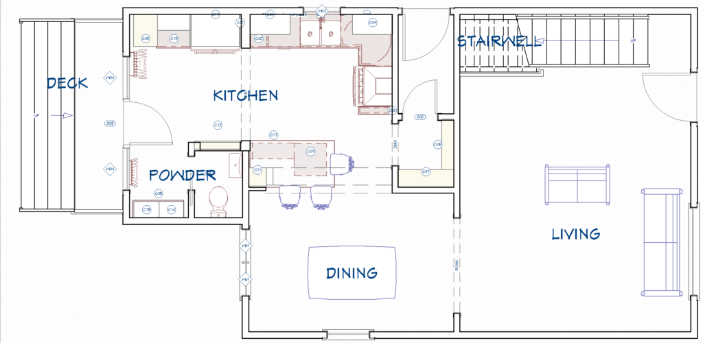
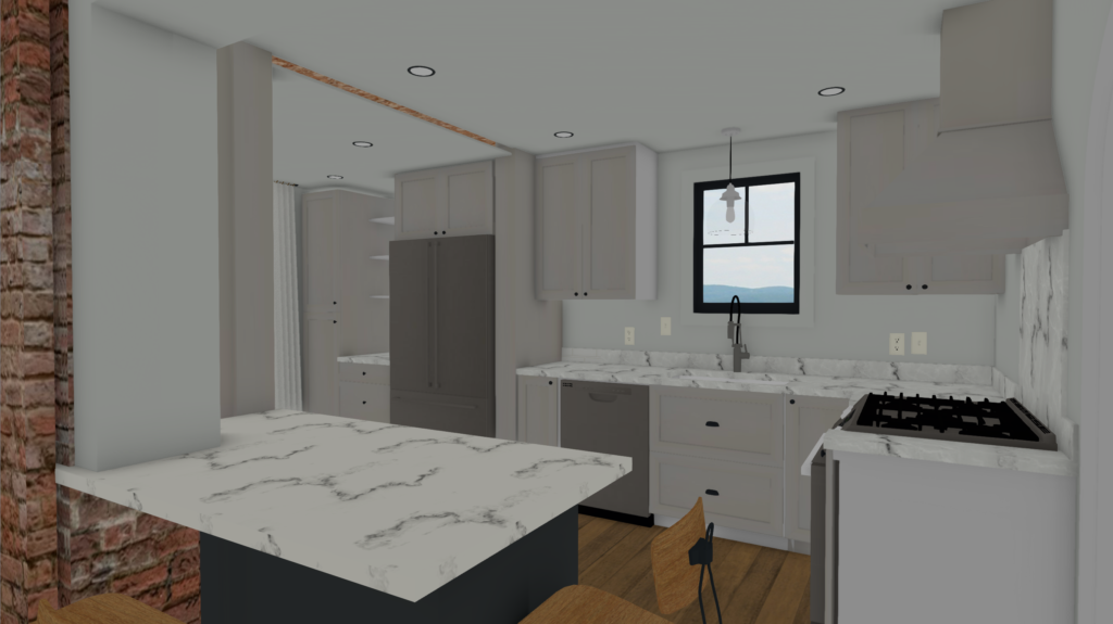
This new plan involved a few big changes, which we mocked up in our renderings:
- Add a 9′ custom door in the back of the house, with a hinged panel in the middle and two fixed glass panels flanking it. Our client’s detached garage is in the back of their home, so they use this back entrance heavily and wanted it to be very functional.
- Extend cabinetry to the back of the house, where the back door used to be, to create additional storage space.
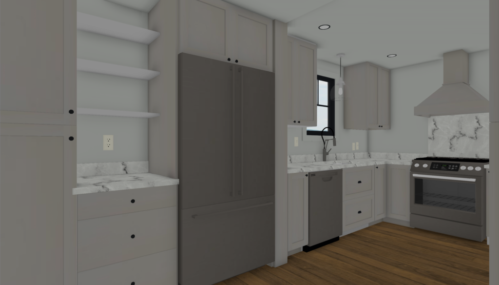
- Add a small powder room and mudroom area where the old circular dining table was.
- Incorporate a custom shallow pantry cabinet around the corner from the powder room entrance.
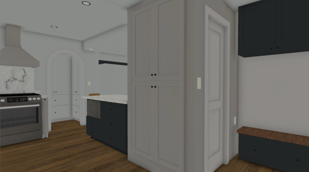
- Remove the wall between the living room and dining room to create better flow for entertaining & enhance natural light.
THE REVEAL
The kitchen came out even better than we had planned! The view from the dining room into the kitchen looks just a bit different these days… (thank you Allie from The Wonder Jam for capturing these photos for us).
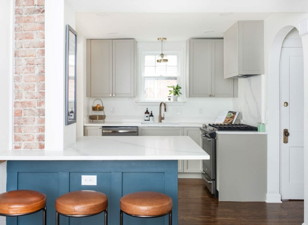
Here’s the new view from the kitchen into the dining room. So bright!
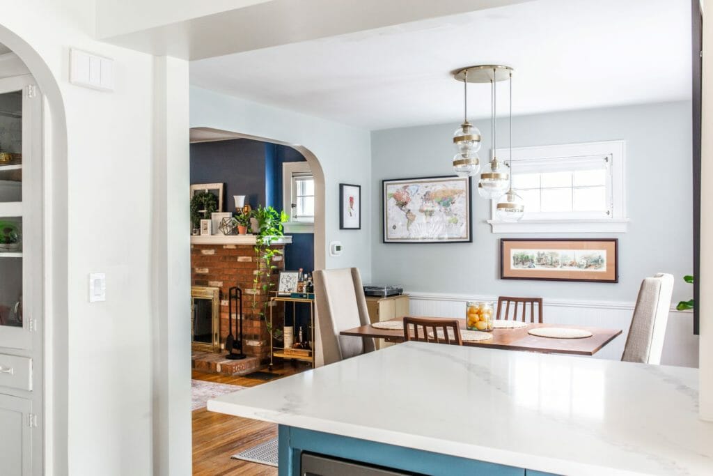
We squared off the arch that was separating the two kitchen sections to further open up the space. We love archways, but in this space it created a more dramatic division between the two sections and felt awkward. By squaring it off and raising it up, it feels integrated and creates a better flow between the two sections.
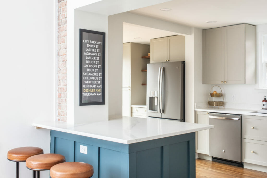
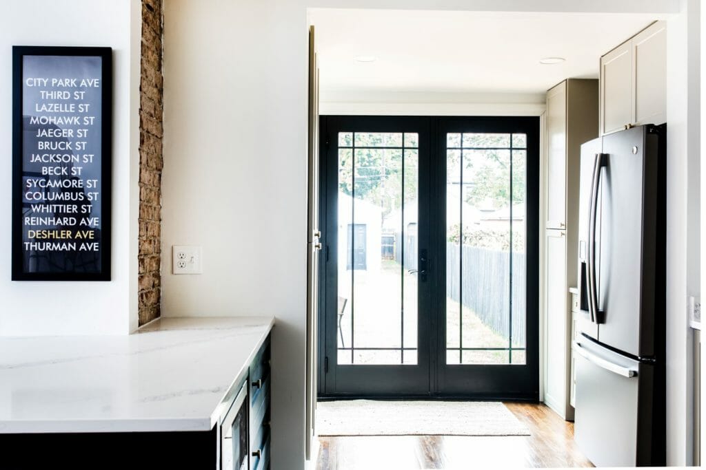
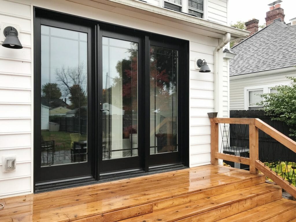
Our favorite change may be the back of the house. The new doors totally make the kitchen. Even though there’s just one functional door out of the three panels, we designed it to appear like all three functioned the same. We framed it so that two of the three panels would be centered between the fridge & powder room walls. Love how they line up almost perfectly in the space.
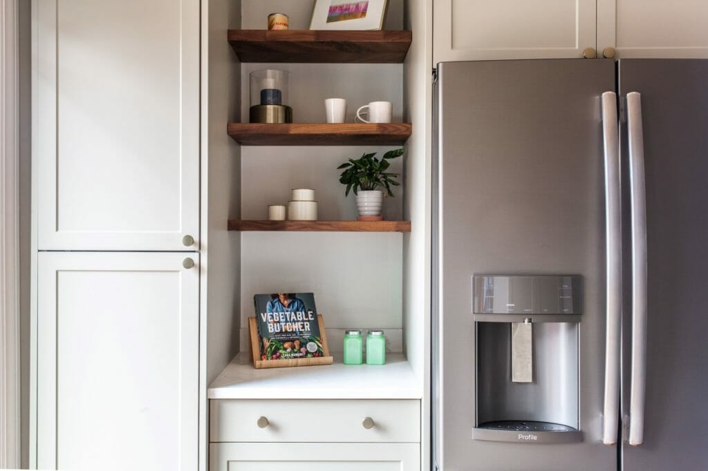
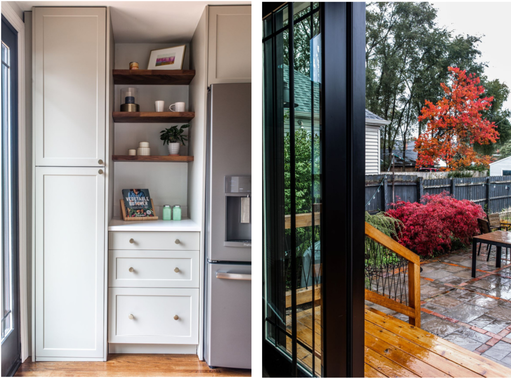
In the rear part of the kitchen, we added three shelves between the fridge & pantry cabinet to balance out all of the uppers.
We kept the original built-ins on the side of the kitchen (how charming are they?), stove and sink in place to stay on budget. We relocated to fridge to the other side of the structural wall in order to open up the wall between the dining room & kitchen.
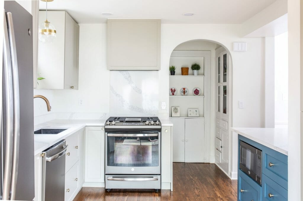
We wanted to maximize storage as much as possible in this small space, so we incorporated a few custom solutions. To the right of the range, we added a skinny pull-out spice rack inside the base cabinet. We also added the full-height skinny storage cabinet built into the powder room wall. It’s about 7′ high and 3′ wide, and is perfect for storing smaller items like jars, cans, and snacks.
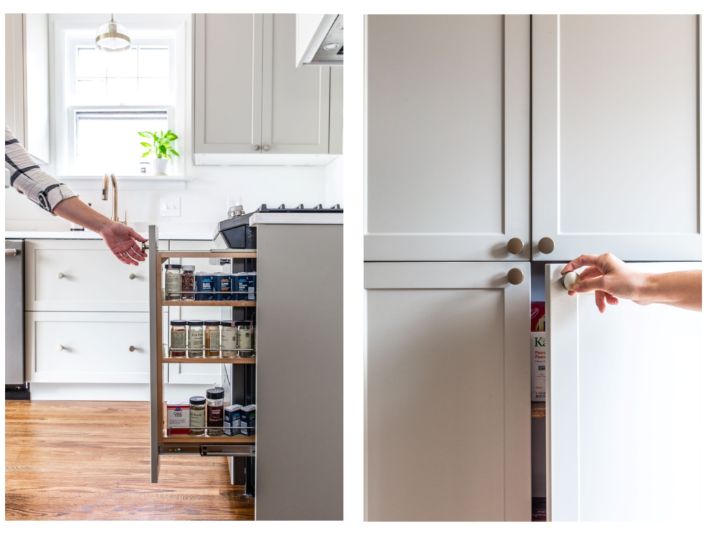
The view from the back door looking in is so different. We used 2×6 studs on the kitchen-facing powder room wall to create the storage space we needed for the skinny pantry cabinet. Around the corner, we placed the pocket door framing to allow enough room for a small storage bench & cabinet outside.
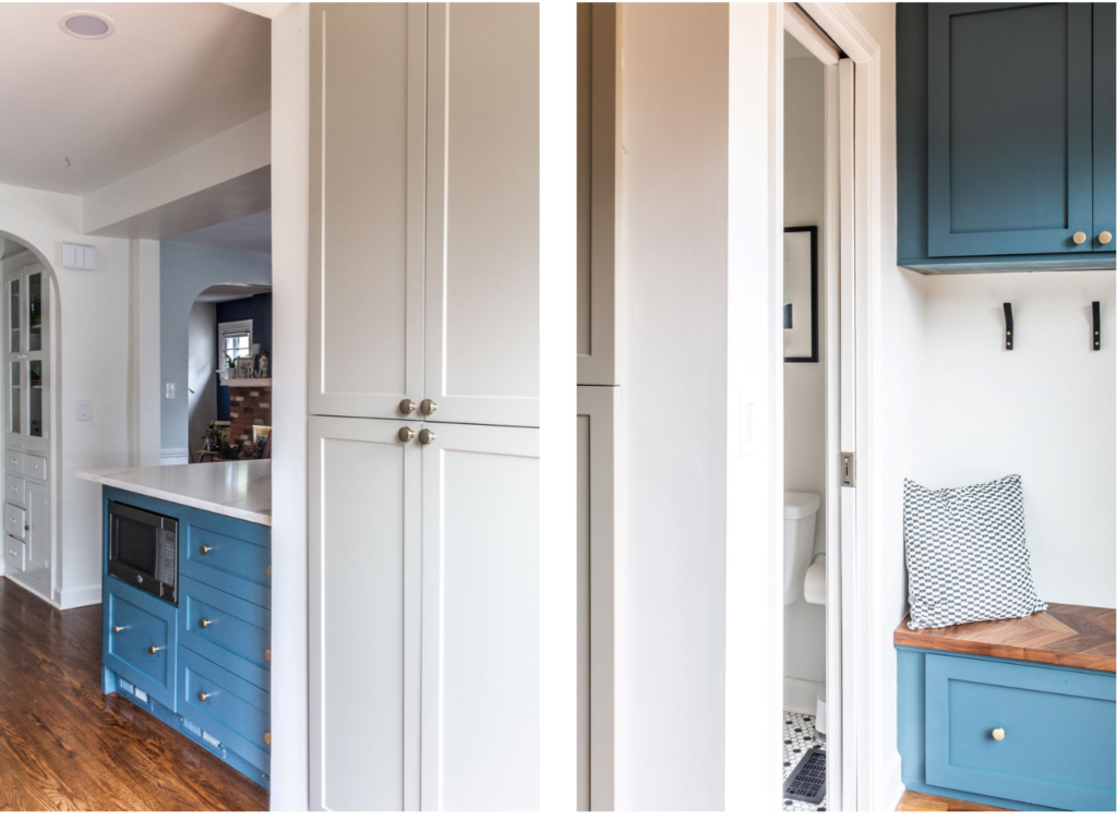
Here’s another peak at the storage area, and inside the powder room. Because this nook is tucked around the corner, coats and other things that may be left out aren’t visible from the main kitchen or dining space.
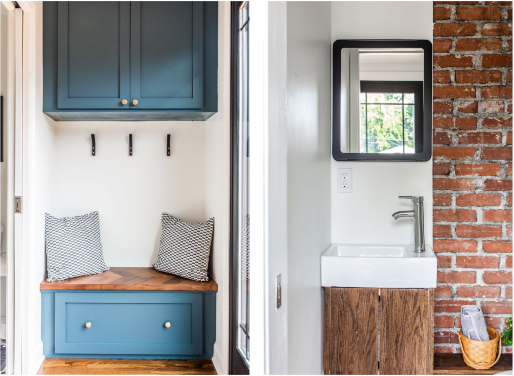
Our clients finished working on a new patio and have some beautiful shrubs in their back yard, which they can now see from their kitchen.
The back of the house got a mini face lift, too! We designed & built a custom X railing out cedar and black painted steel rods to tie in with the black doors, and added new lighting that framed the new doors.
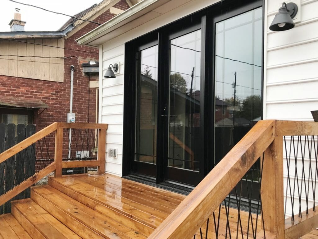
The black & white & wood combo looks so good and really elevates the backyard area!
Before & After
My favorite part…
Before:
After!

Before:

After!

Before:

After!

We love how this project turned out, but even better, love that our clients love it!
Hi could you tell
Me what
Colour stain was
Used on the outside
Deck/ stairs please?
Thanks!
This looks beautiful! So impressed by use of space and how efficient the kitchen now is! Out of curiosity how large is the powder room in this layout?
Thank you! It’s tiny, about 3′ x 5′.
It’s gorgeous! Love everything about this space!
Thanks Michele!
So I say you nailed it. Only thought is that landing outside back door appears rather narrow. Probably a space issue with smaller back yard. That said it is a tremendous job. Just top drawer.
What a transformation. I love all the added light with the new setup.
May I ask the dimensions of the kitchen square with bar and sink stove (not the newly added area to the left with fridge?). I ask because I’m aiming for a similar setup with a small bar area but have more of a square kitchen (9’ and change by 10’ and change) and am trying to envision what it would look like.
Thanks! It’s about 8×8.
It looks gorgeous. Thanks for sharing this 🙂
[…] Before and after kitchen remodel // Beginning in the Middle […]
Beautiful!! Love the teal paint. What’s the brand and color name?
thank you! it’s benjamin moore newburg green.
Love this transformation! So much more light & awesome flow. Would you happen to have a source on the round leather topped barstools?
Thanks Amber!! Here’s the link – they’re very comfy!
So pretty. Love the island color! Where did you get the stools?
Thanks Missy!! Here’s the link to the stools 🙂
You mention staying on budget. Can you share what the budget was for this project? Thanks!
Amazing project! I was wondering the mushroom tan color of the cabinets. Did you order that color cabinets? Or is it a pint color you could share? Thanks!
We ordered them from Semihandmade. They’re the Clay color (prefinished). It’s gorgeous!
Love this transformation!!!
I love the warm grey color. Do you mind sharing the color?
The cabinet fronts are Semihandmade’s Clay color (prefinished!)
Hi there! SO happy that I came across your blog! My house is very similar in layout and I wanted to know how you were able to vent the overhead vent for the stove? Is it an undermount that vents back into the house? I noticed that that wall is shared with the stairs to the side of the house. Your input is greatly appreciated. Looking forward to reading more about the Blonde Vic and your future homes! Congrats from one Jersey girl to another!!!!
It vents out the back of the house. We used this vent hood insert. I hope this helps!