We’re starting renovations on the other side of our Pearl duplex this fall and can hardly contain our excitement! We’ve been living in one half of the duplex for a few years now, and have been slowly renovating it over time. You have probably seen photos of our master suite, our little guest suite, and our One Room Challenge this past spring where we finished our living & dining rooms. But we’ve never shown you the other side of the duplex! It’s been sitting vacant for about 3 years because we kept taking on other projects & putting it on the back burner. Having the other side renovated is a big part of our business plan and it feels so good to be taking a step toward getting it done. (PS – at the end of the post we’re sharing our plans for it when it’s finished!)
the duplex layout
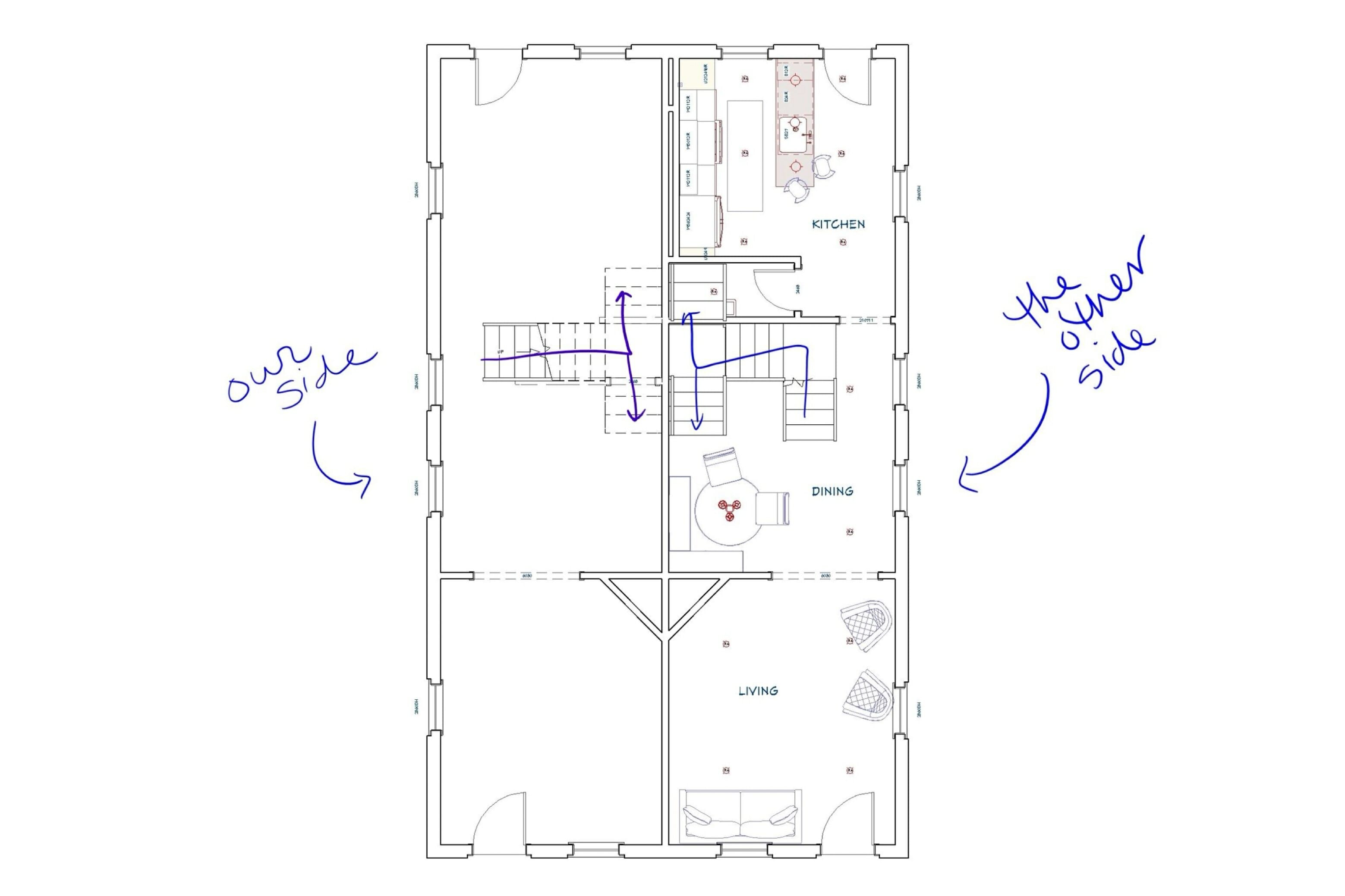
The duplex was built around 1900 and the layout is different than any other property we’ve been inside, but it’s kind of fun. The first floor on each side has a living room, dining room and kitchen in the back of the house. On the second floor, the staircase splits like a Y — going one way takes you to one suite, and going the other way takes you to the other. Here’s a peak at the floor plan for the first floor. We’ll share the second floor in a later post once we have it finalized.
BEFORE photos
the kitchen
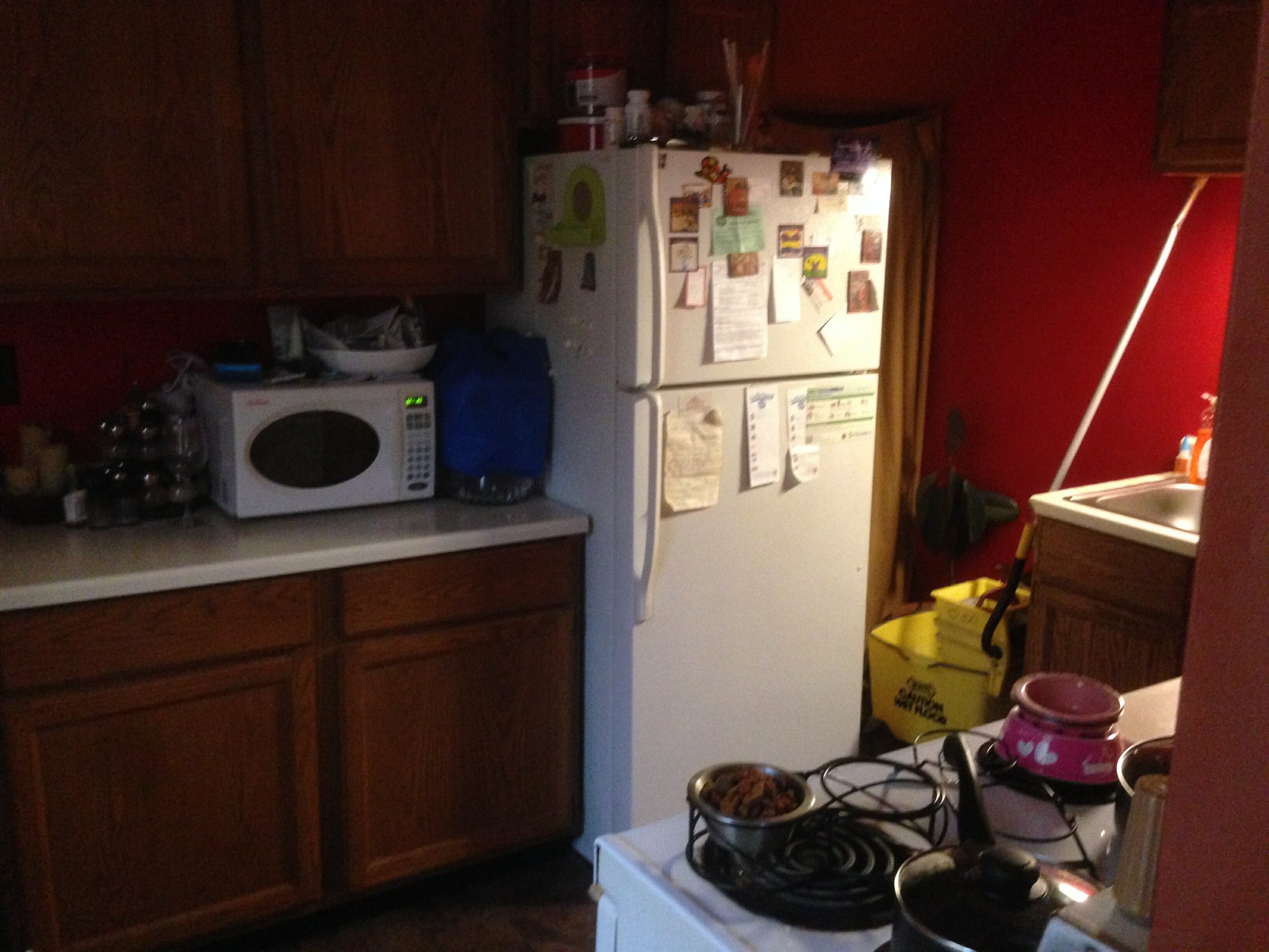
The first room we’ll be tackling on the other side of the duplex is the kitchen! This is what the view was like from the back door looking into the kitchen. The basement entrance was to the right of the fridge, and everything was super cramped.
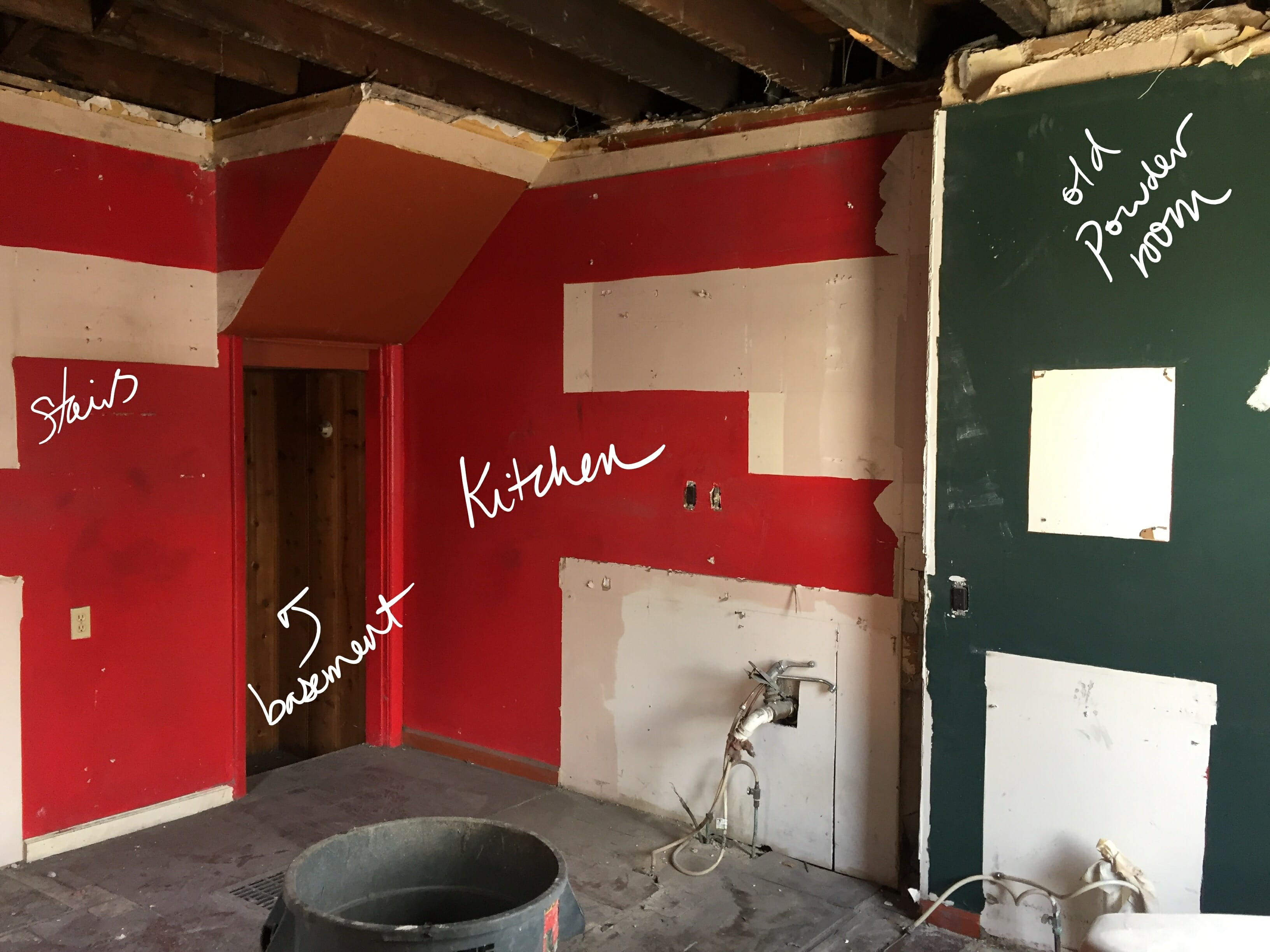
Progress: The red painted area is where the kitchen space was, and the green painted area was where the powder room was. We’ll be moving the basement entrance to the dining room side so we can utilize that space for a small powder room.
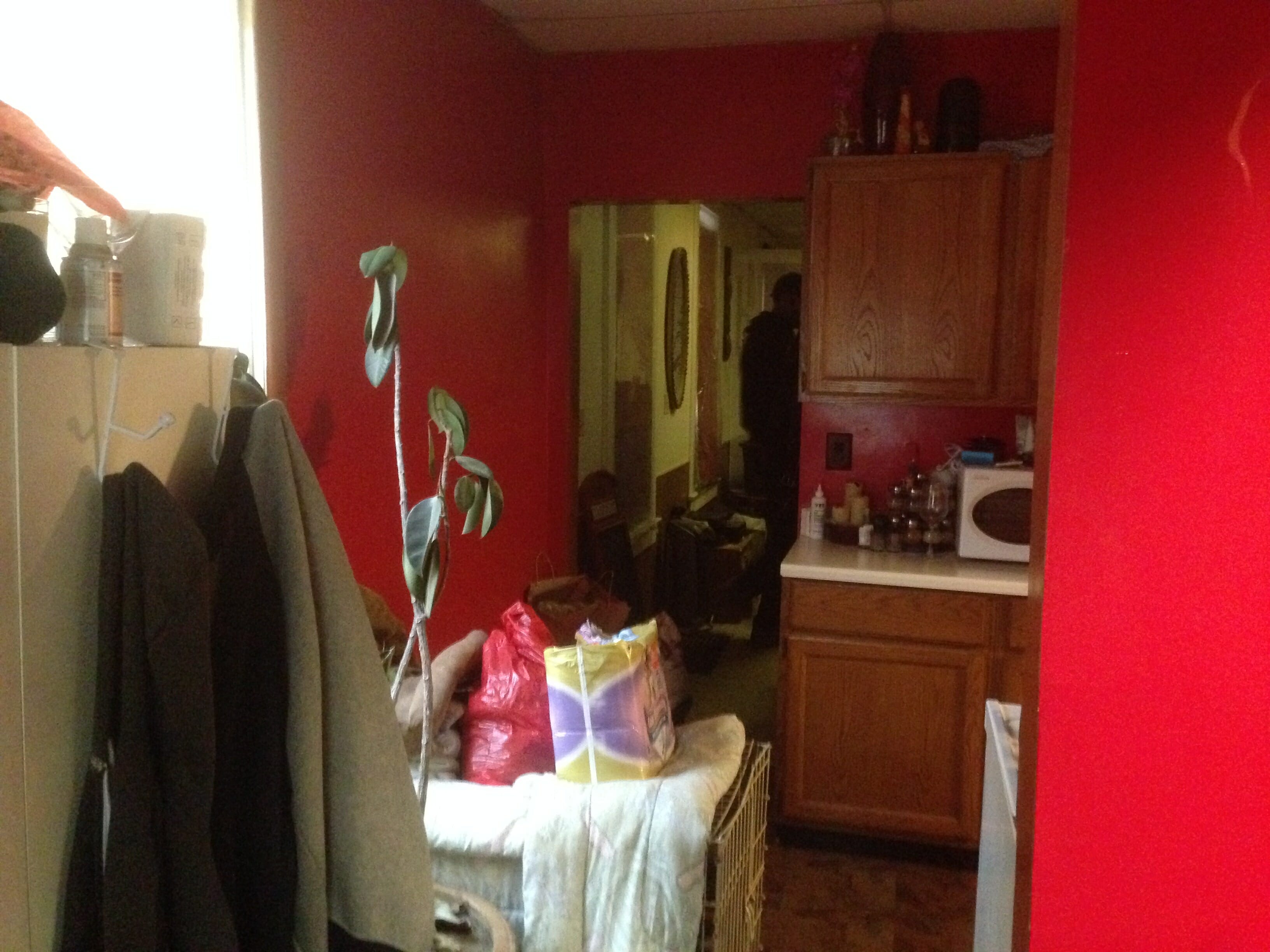
Here’s the view from the old kitchen into the dining room.
Better…
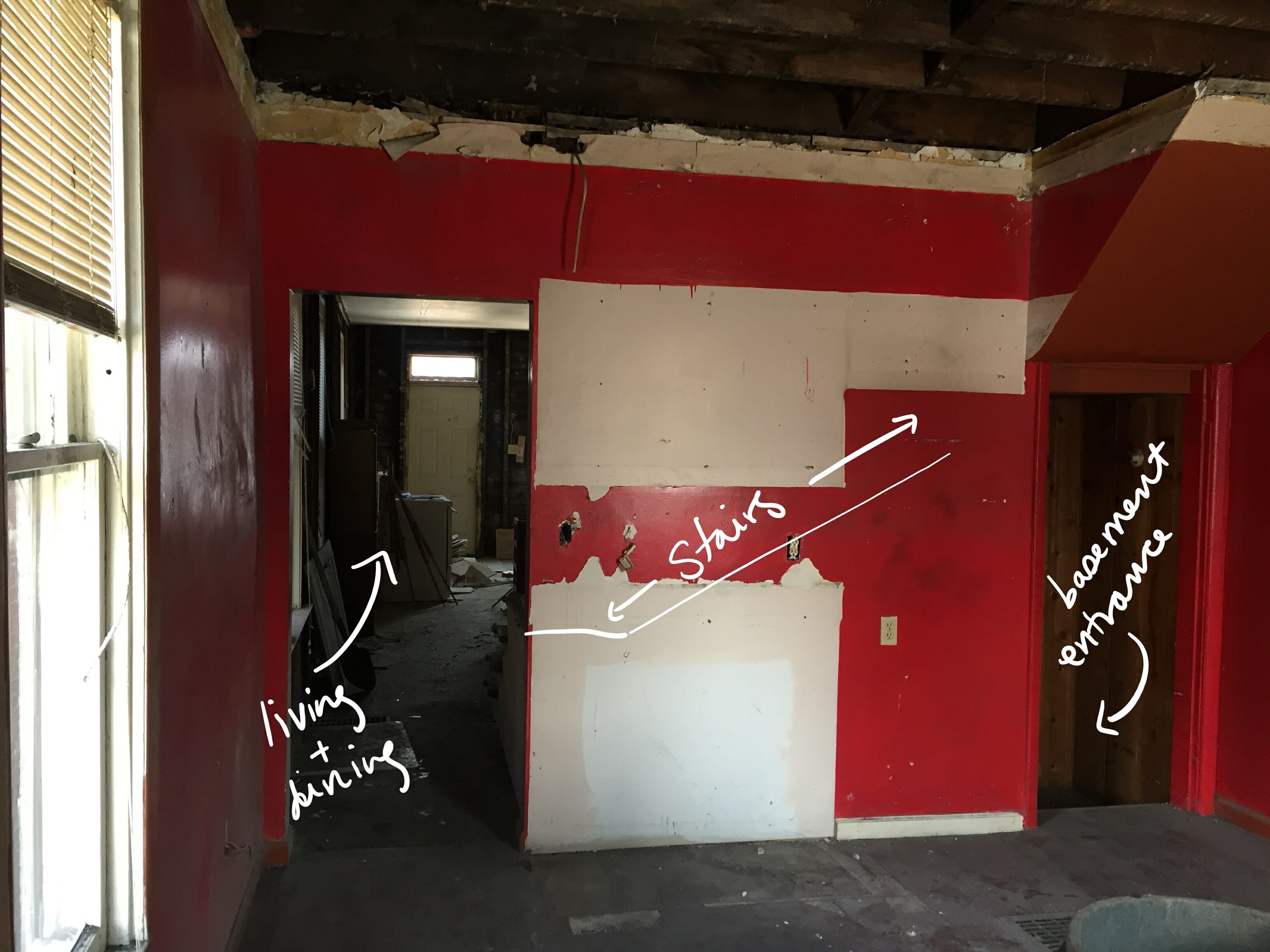
And here is the big old powder room. Why it was so big in such a small space, I do not know.
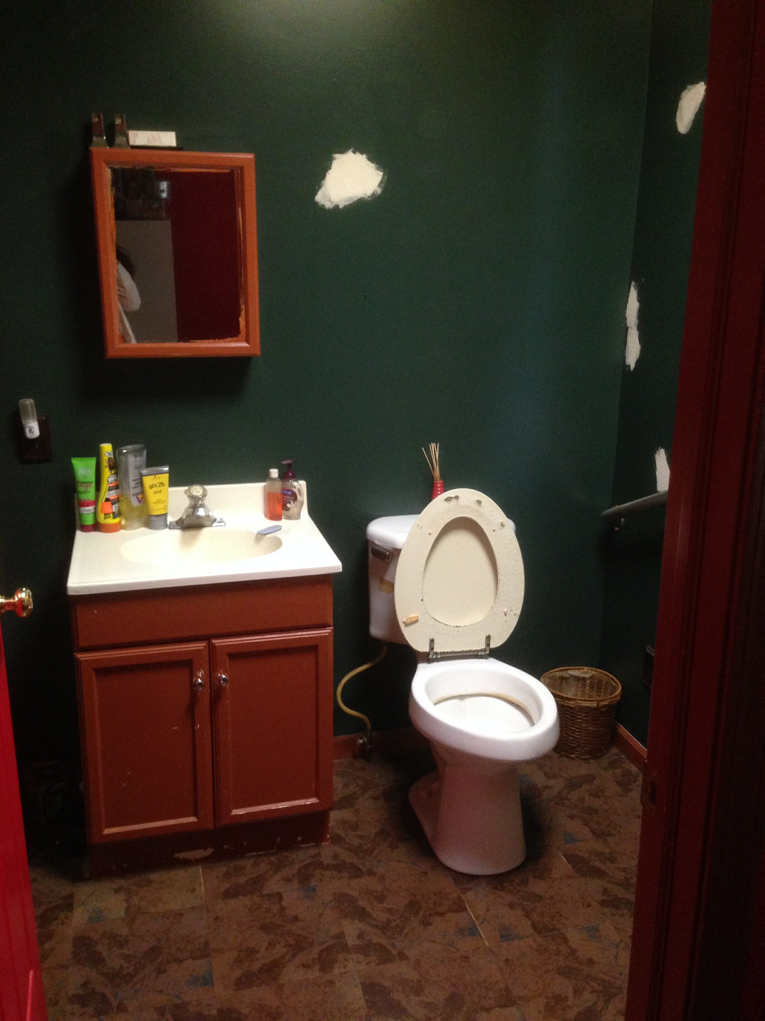
Progress. It really did take up almost half of the kitchen space. We’ll be changing that!
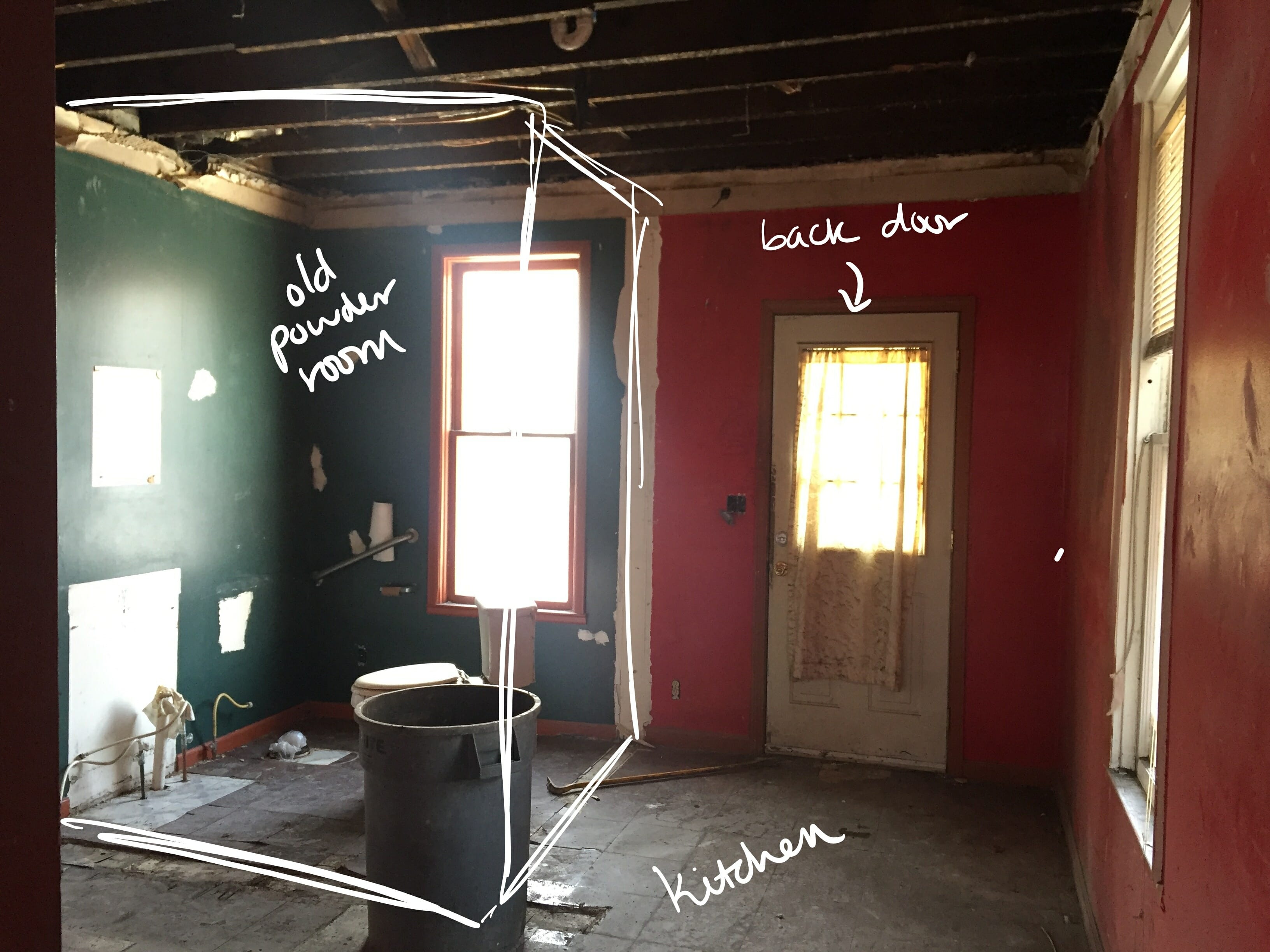
the Living & dining space
We’re envisioning this space to be simple, bright & airy with modern furniture and lots of plants.
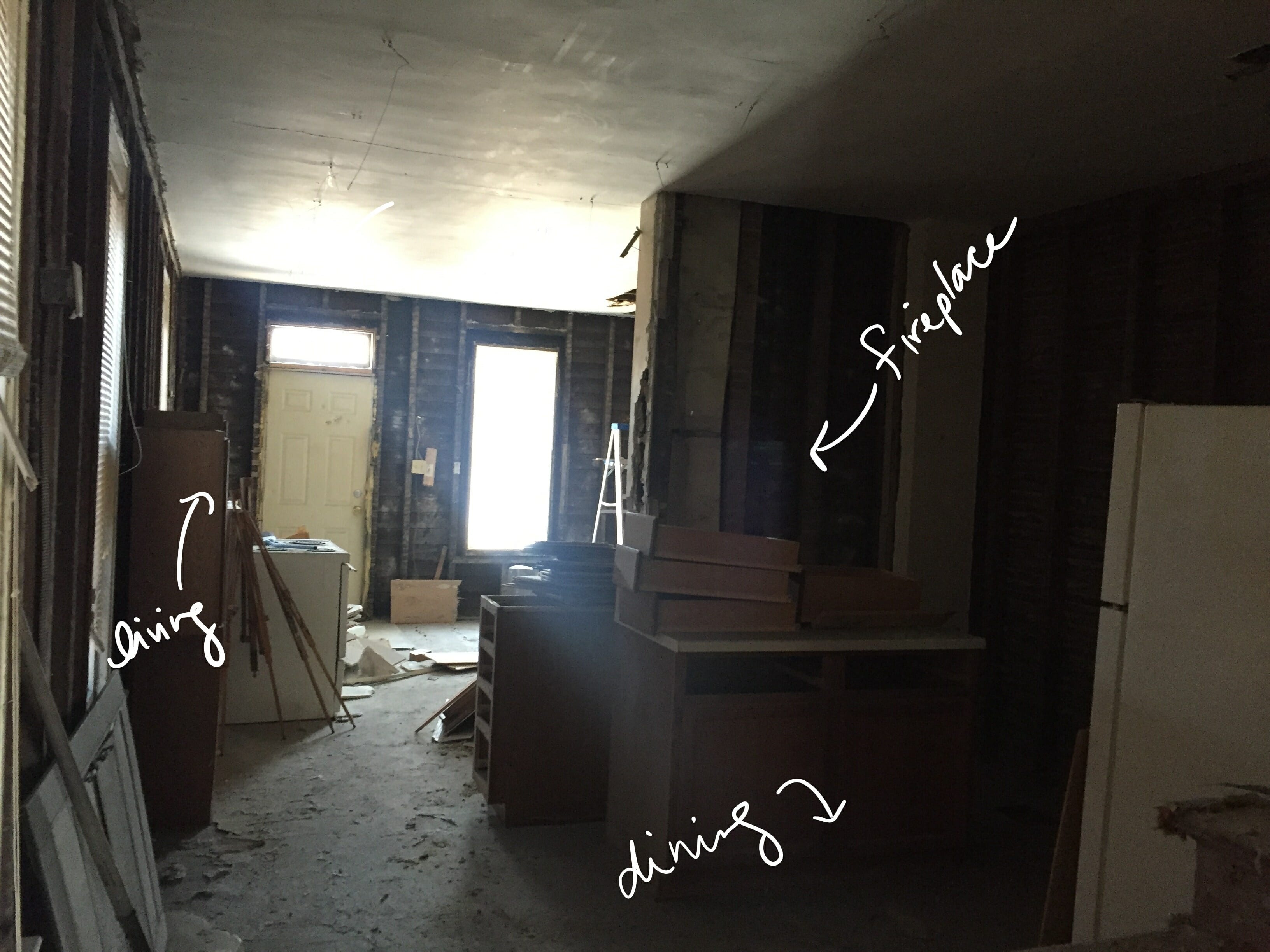
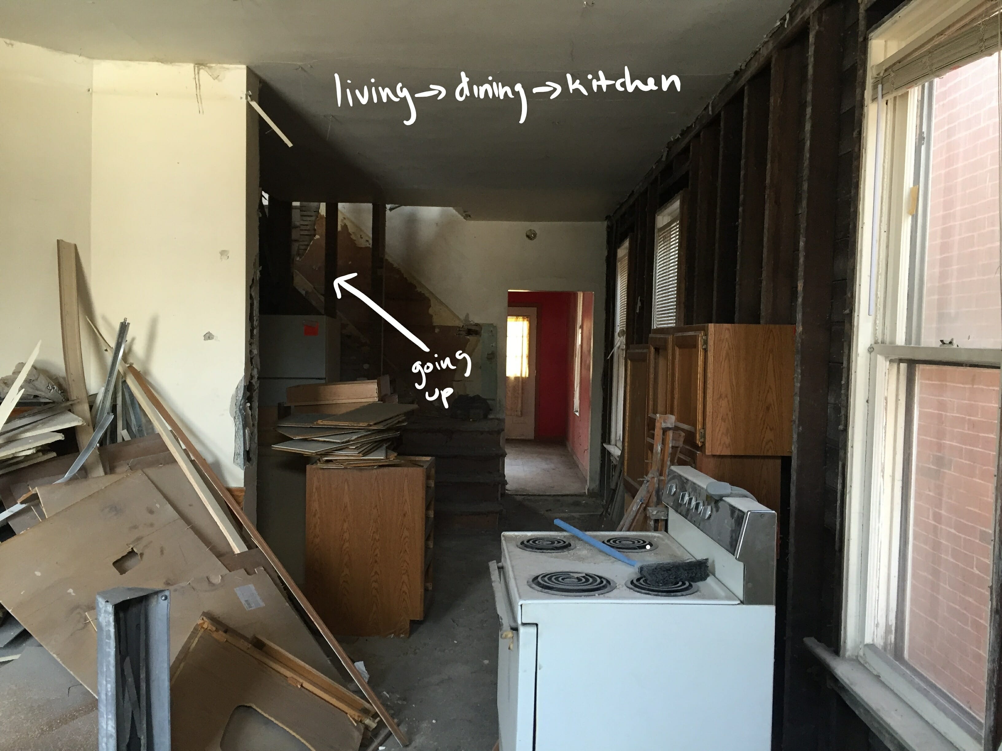
We seriously debated moving the stairs and opening up the wall between the kitchen & dining rooms, because it would make the dining room feel way bigger. But, we decided against it because we don’t think the benefit will outweigh the cost to reconfigure the floor plan on this one (given a lot of different factors). Instead, the plan is to work with the space we have and try to make the most of what’s there. We have some ideas for how we can get creative with finishes and add character. Choosing furnishings that fit the scale of the each room will be key, too.
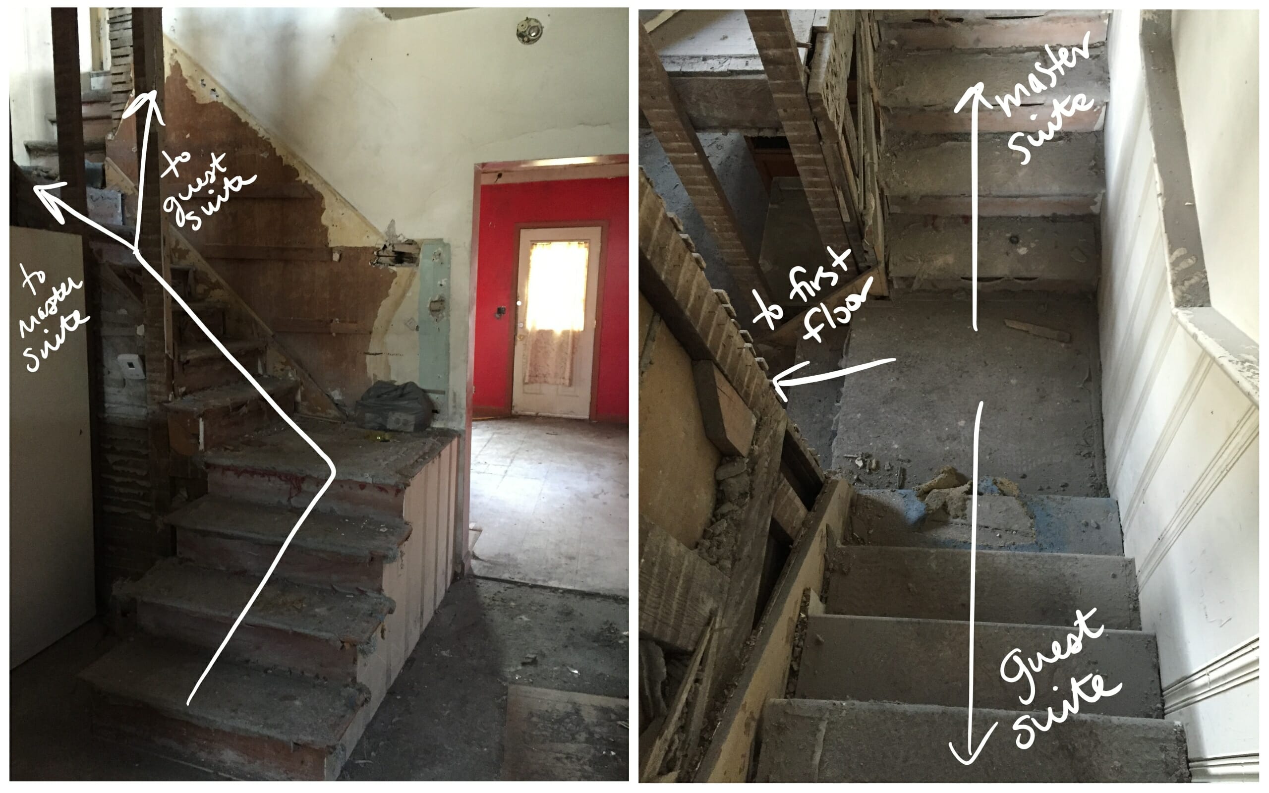
the guest suite
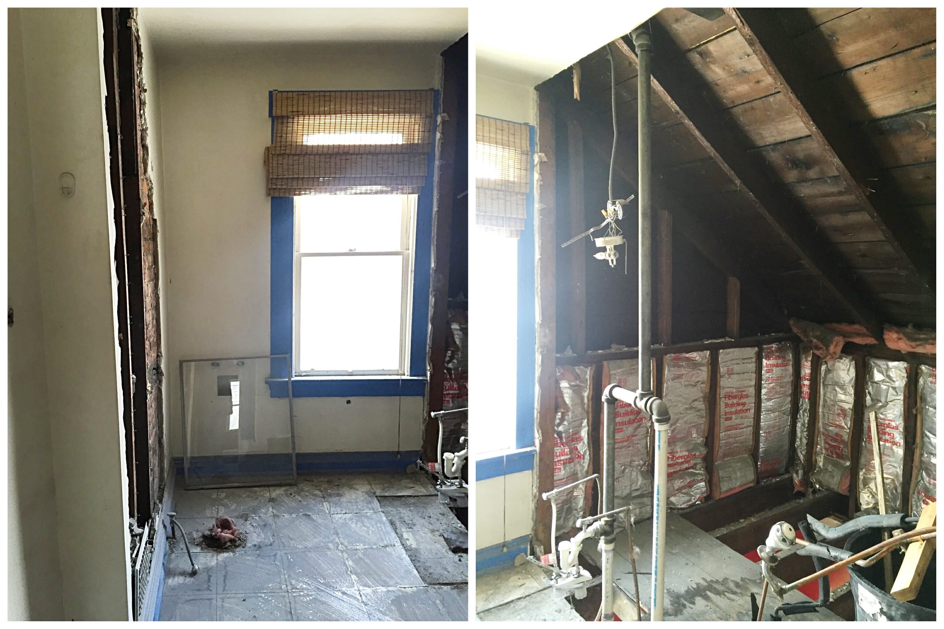
This space is small and used to be the only bathroom in the home. The plan is to do something similar to what we did in The Tiny Suite and convert this space into a small bedroom + full bathroom. Here’s the view from the entrance looking into the room.
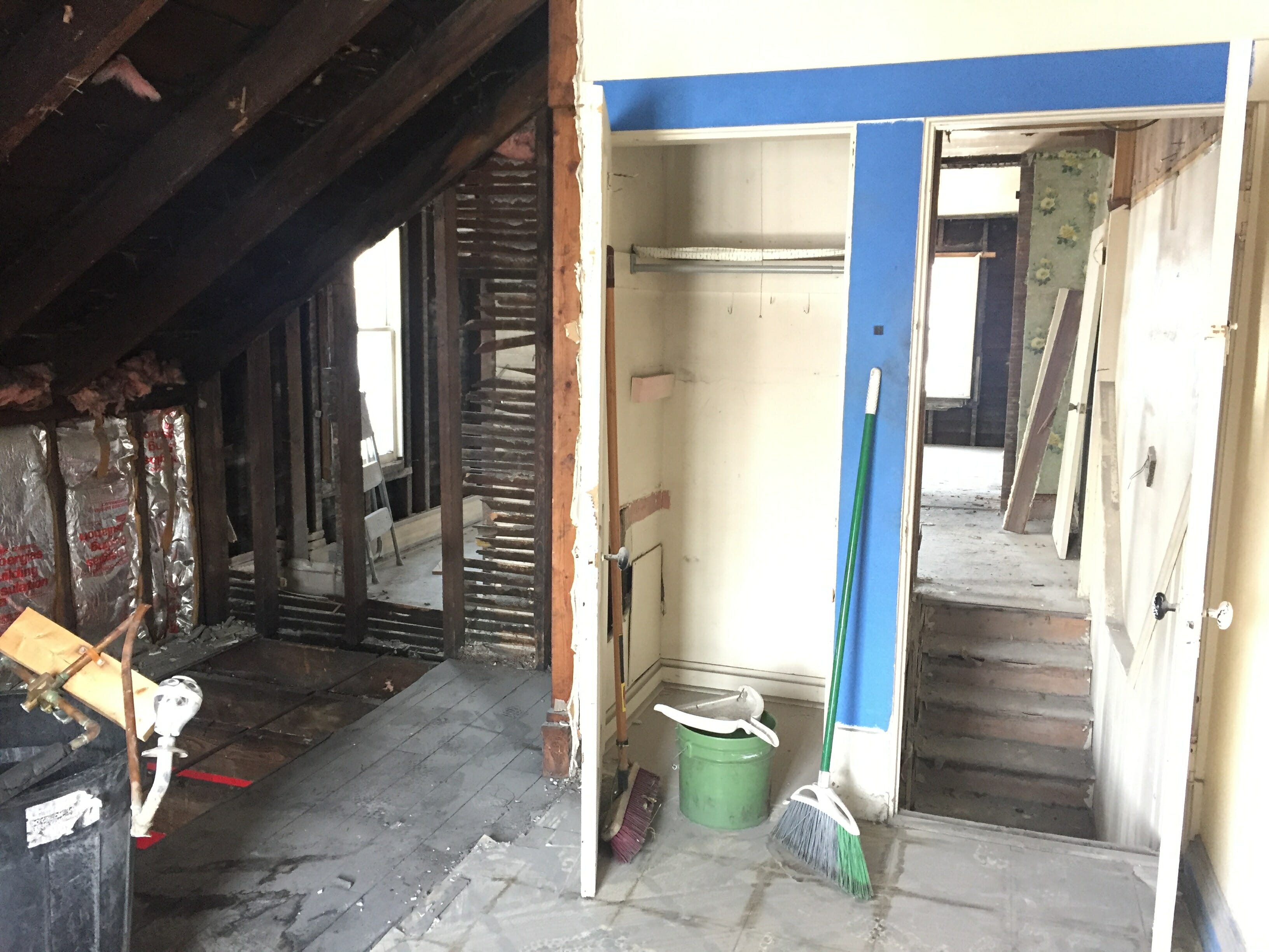
And here’s the view from inside the room looking out toward the stairs. Across the stairs is the master suite.
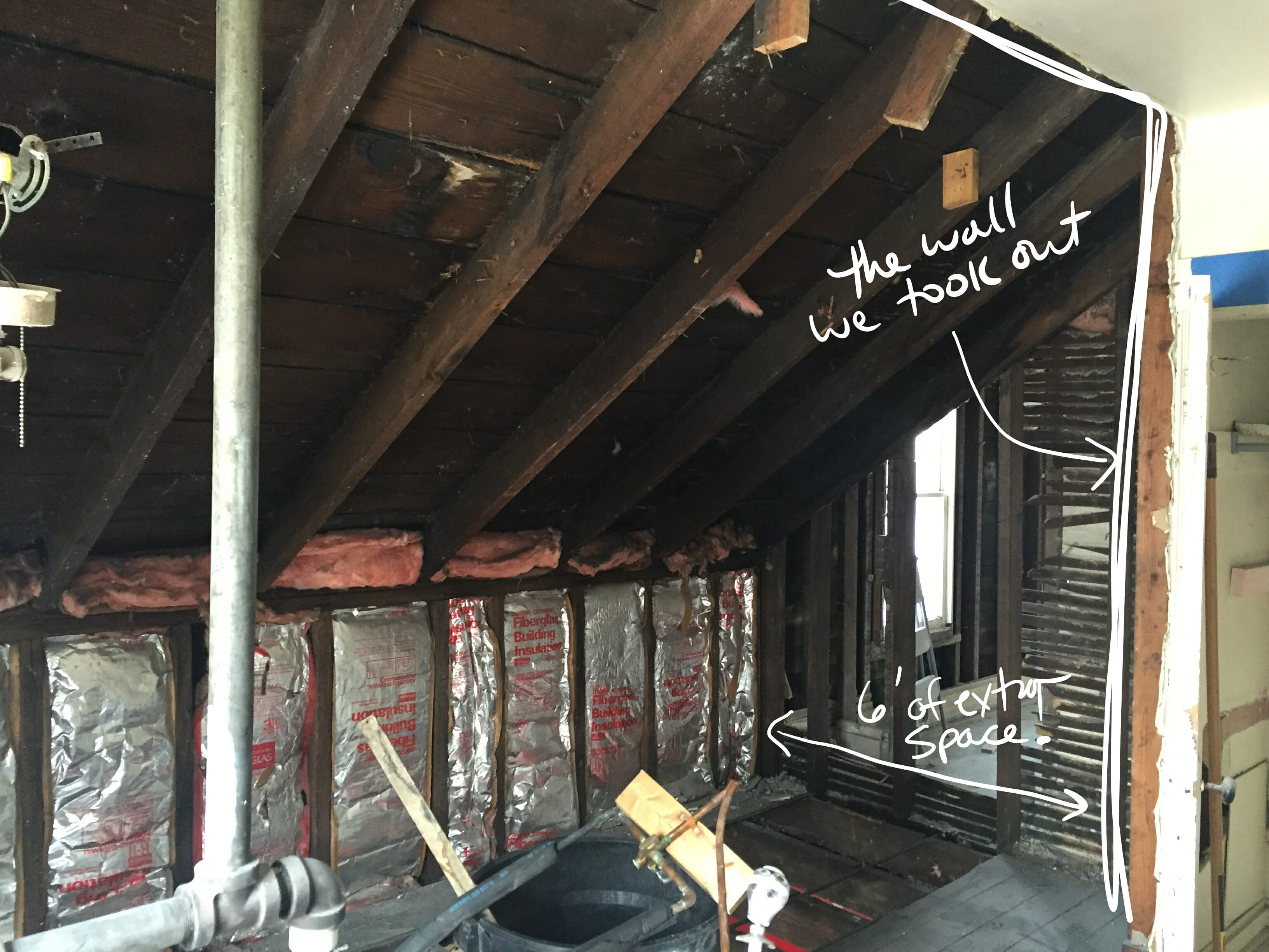
the master suite
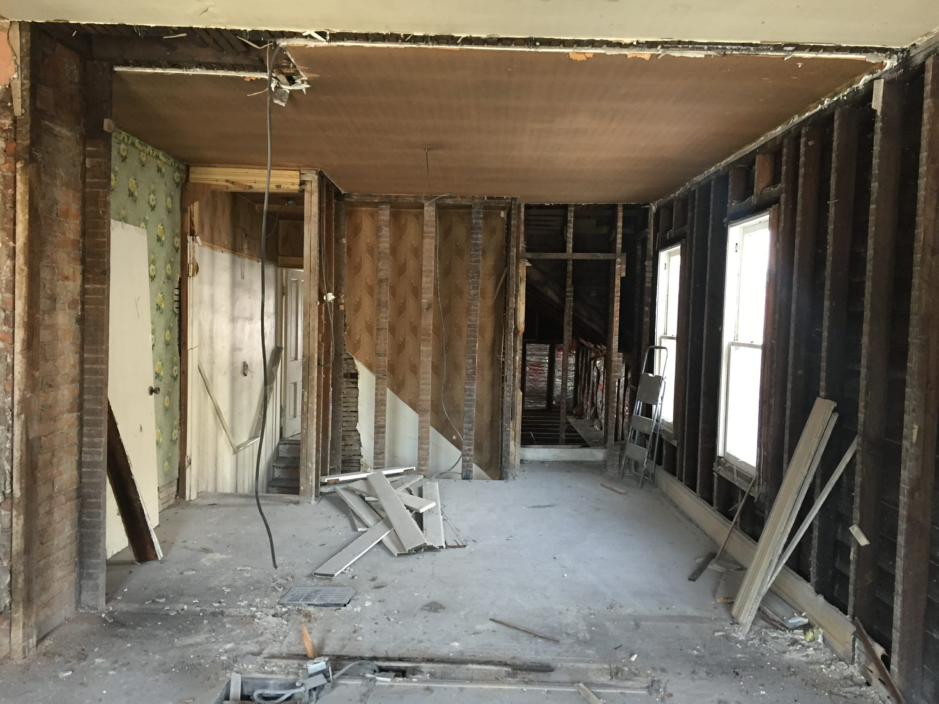
The master has a ton of potential and might be the space we’re most excited about. We’ll split the space up into a big bathroom w/shower, soaking tub & double vanity + bedroom + ???.
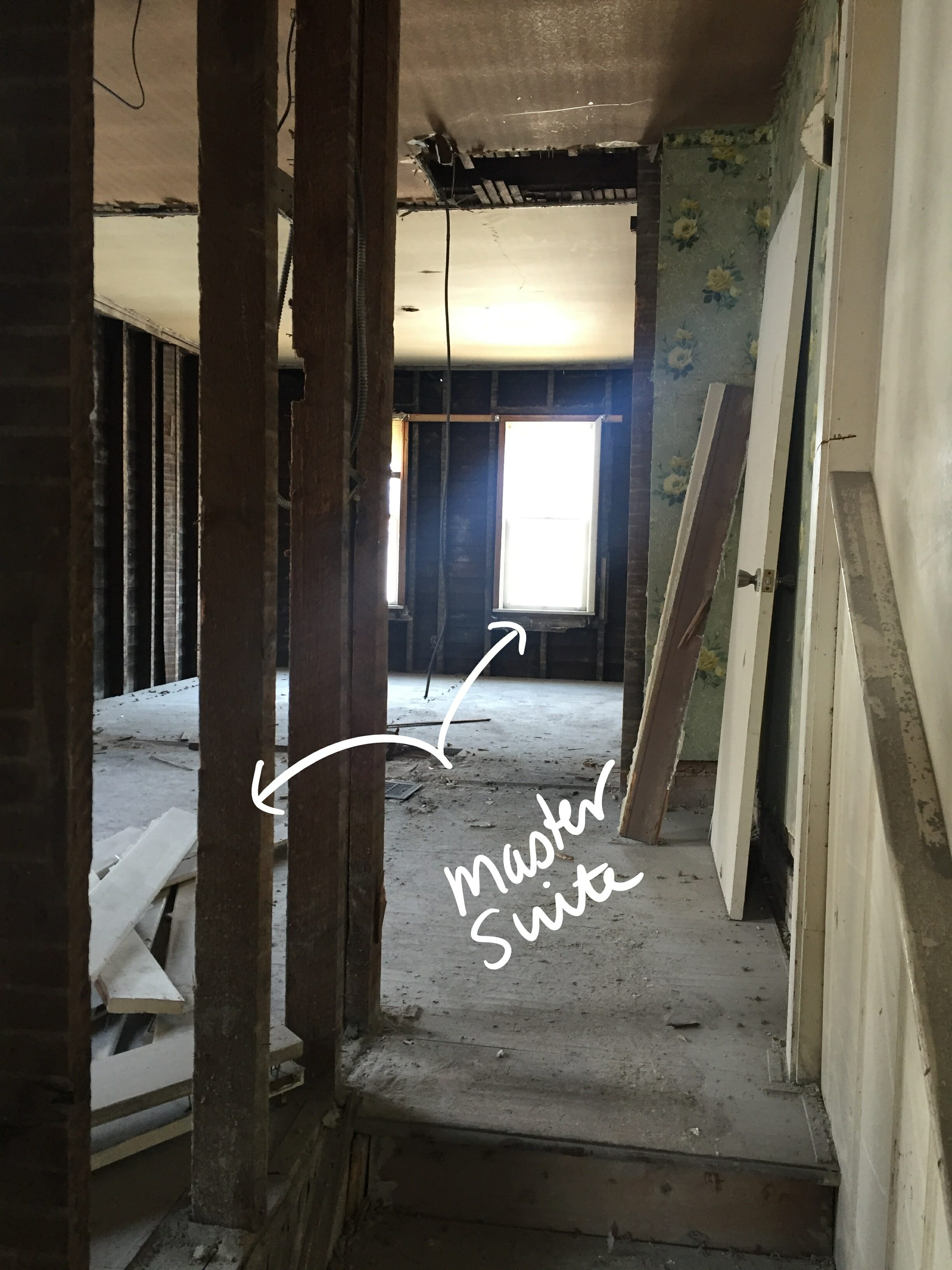
On our side of the duplex, we have the bathroom toward the front of the house where the two windows are…
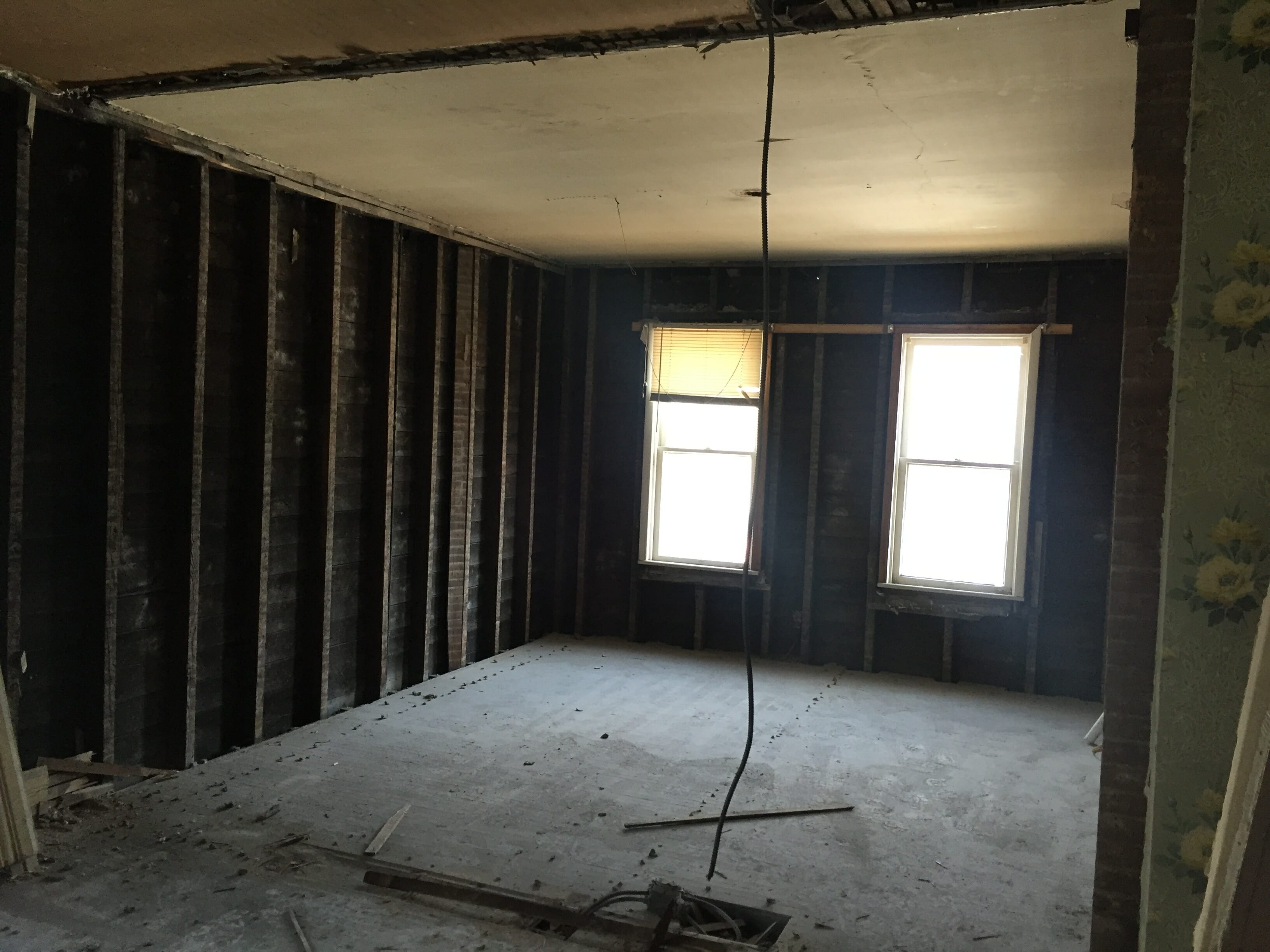
And the bedroom is in the middle, which works out kind of nice because we’re removed from street noise. We never had the whole space opened up like this, though, so we’re planning on starting the design plan from scratch to see what we come up with!
Initial design direction
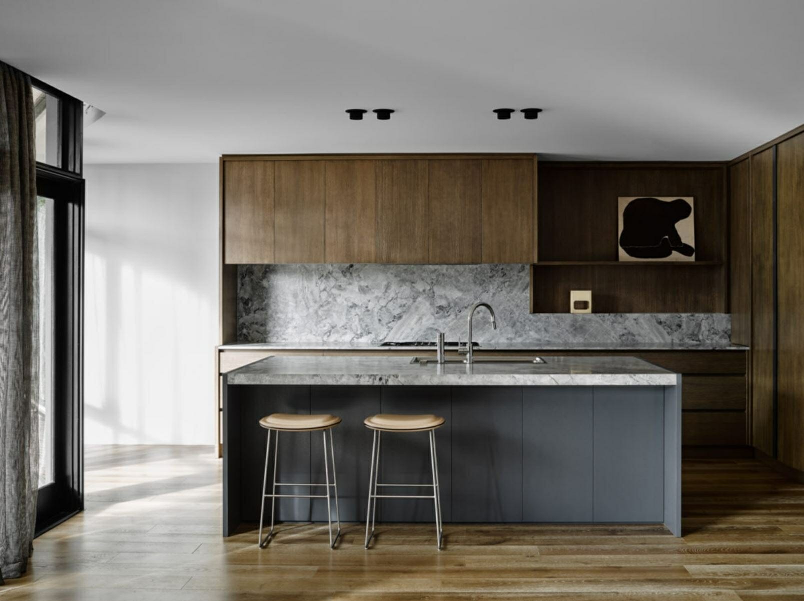
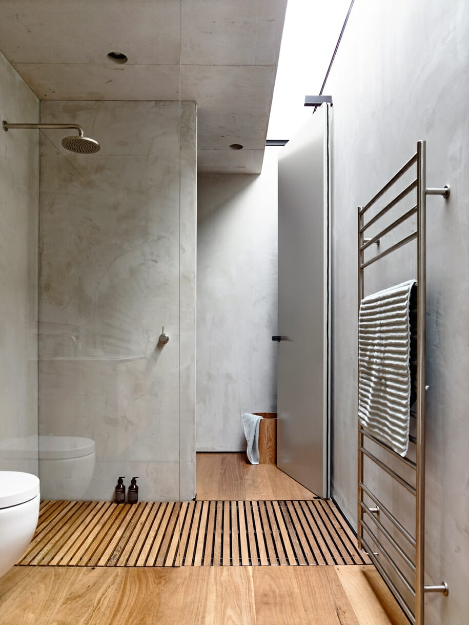
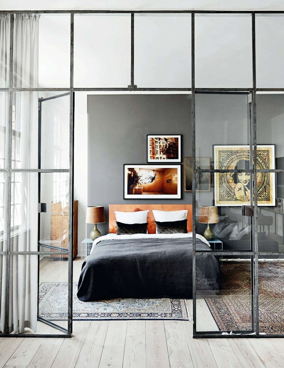
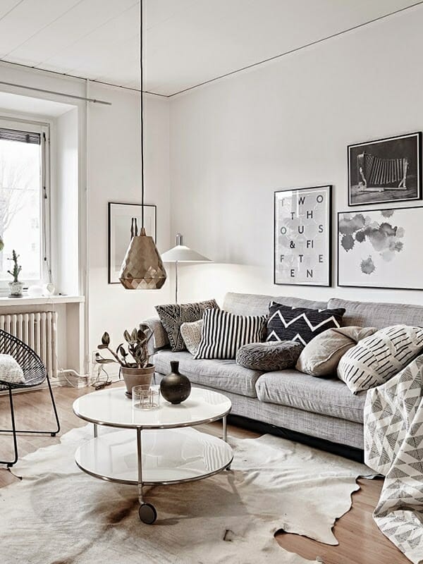
All of the homes Bryan & I have worked were built before 1920 except for one, and we’ve catered our design plans toward fitting those homes. Most of them had some character to play off of, and it would have felt wrong to go ultra modern or contemporary in those spaces. The Pearl duplex is a bit different. Even though it was built in 1900, there’s really no character in here at all other than tall ceilings and big windows, so we’re taking this as an opportunity to go in a different direction than we ever have before. It’ll be a mix of modern / Scandinavian / minimalist, with lots of natural materials, clean lines, bright walls and greenery.
OUR PLANS FOR THE DUPLEX when renovations are complete
When we’re finished with renovations in 2019, we’ll be listing it on our vacation rental site, The Village Host! We’ve been Airbnb hosts for almost 5 years now and have found it to be a perfect blend of all of the things we love: design, renovation, decor, hospitality, and showing people how awesome Columbus is. The location of this property is really great – it’s in German Village close to High St, so it’s a short walk to Schiller Park, restaurants & bars on High, and everything else that German Village & Brewery District have to offer. Knowing that we’ll be renting out this property helps us make smart decisions while renovating. We have an idea of what our target nightly rate is, so we know that we’ll want our renovations to be in line with that to avoid over-investing. We also want to make sure that the finishes we select are durable & can stand the test of time.
We’ll be back soon with updates on progress! It’s going to be a busy fall getting The Blonde Vic wrapped up & this project started, and we wouldn’t have it any other way!
[…] Remember this rendering we shared of the #pearlround2 kitchen design? (If you didn’t, you can catch up here and get the DL on the whole project here). […]
[…] a very, very exciting day! We finished renovating the first space on the other side of our Pearl duplex, which means that we’re one step closer to having it listed as our newest vacation rental […]
[…] comprised of a mixture of rental income from our 3 vacation rentals (we’re in the middle of renovating our 4th and recently revealed the kitchen!), brand sponsorships on Instagram & our blog, and our […]
[…] you missed the before tour of this whole home, you can catch up here. Here’s a wide angle shot of the space looking from the bedroom into the […]
[…] Did you hear the news? We’re starting renovations on the other side of our Pearl duplex this fall! Last week, we posted a peak of the current state of the property for the first time ever (hint: it’s ugly, but has potential), our design inspo, and plans for it when it’s finished in 2019. If you missed the post, you can catch up here. […]