Update: Our bathroom renovation was featured on House Beautiful and Country Living!
Hello again! It’s been a long time. A really long time. For the past few months, Bryan and I have been spending all of our time on the Pearl St. master suite renovation. Instagram has been the only thing that has saved us from completely dropping off of the face of the earth! But guess what? We’re finally finished, which means we get to share fun before & after photos with you.
Here’s a little drawing of what our 2nd floor layout used to look like. (If you missed our full “before” tour of the house, check it out here).
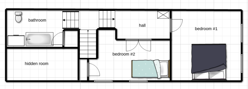 The layout was quirky, and it was obvious that more than one renovation had already happened between when the house was built in 1900 and now. Vents were half covered by the walls, doorways were patched, and ceilings were dropped. The biggest issue we had with the existing layout, though, was the Y staircase. The two bedrooms were on one side of the Y and the only bathroom was on the other side of the Y, which meant a mini stair workout was in order every time someone needed to get from the bathroom to one of the bedrooms.
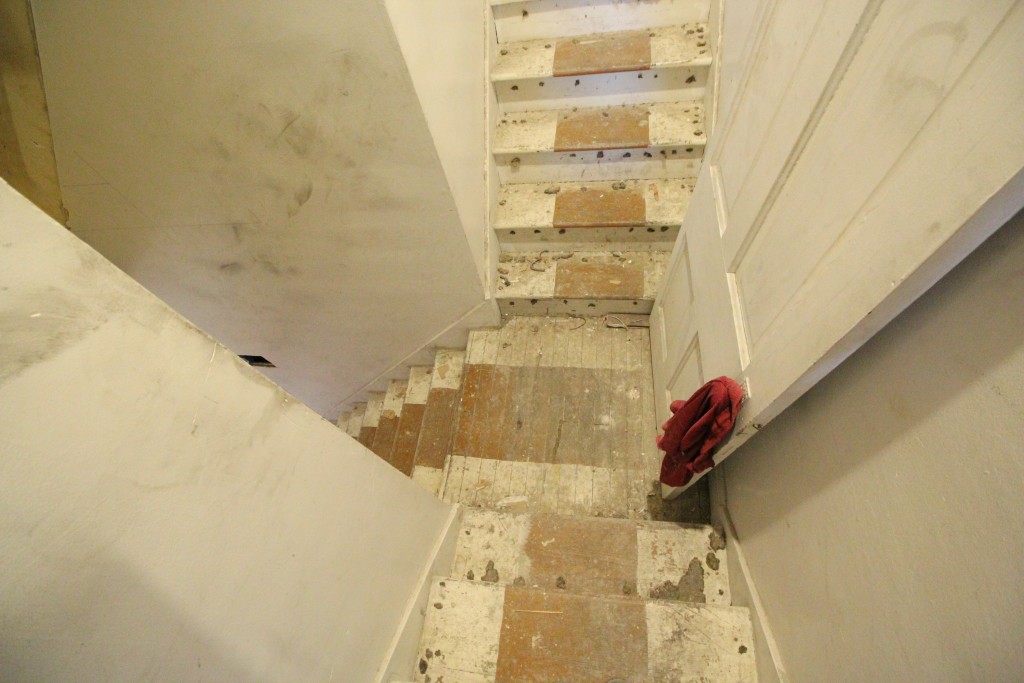 We didn’t have the funds to move the stairs and completely change the structure of the house, so we tried to get really creative and figure out a way to make it work. After a lot of thought, we decided to turn the existing two bedrooms into a big master suite.
But what about the second bedroom?
We’re going to relocate it to the other side of the stairs by turning the existing bathroom + hidden room space into another suite. It will look something like this.

By creating two separate suites, the stairs become kind of fun and actually work with the floor plan. They make the suites into their own private mini-wings, and since there will be a bathroom in each of them, no more stair workouts (phew).
We’ll share more about the plan for the other side of the stairs, but for now, here’s a closer look at the master suite layout we came up with to replace the existing two bedrooms.
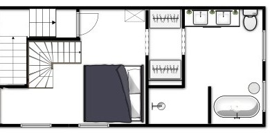
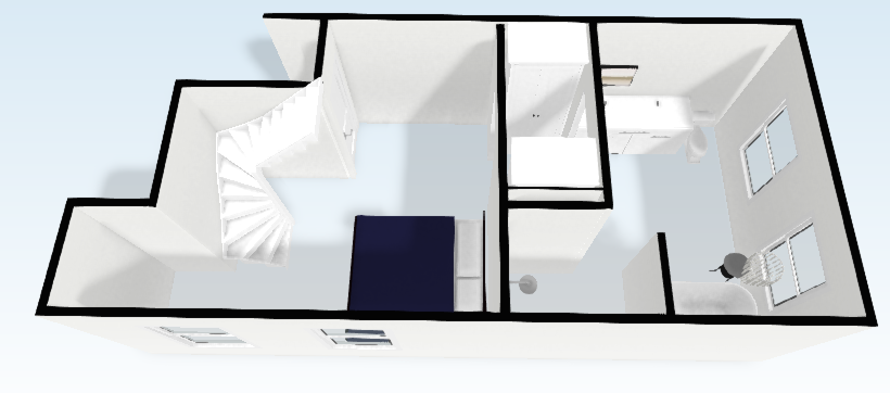
We discovered the attic space was big and unfinished, so we added stairs from the bedroom into a private loft that can be used for watching TV, an office, yoga – whatever. We took out the makeshift hall that had been constructed to open up the bedroom space. We converted the front bedroom into a large master bathroom, and built double wardrobes that create a small corridor between the bedroom and the bathroom.
How did it all end up? We’ll show you.
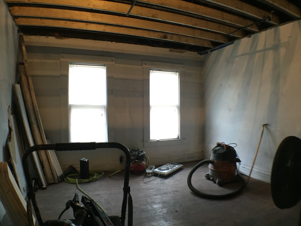
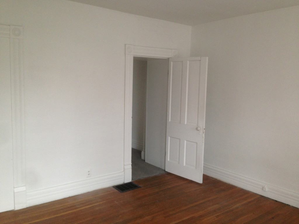
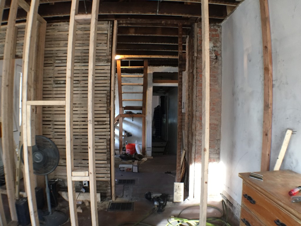
This is what the old entrance to the bedroom (now bathroom) used to look like. During one of the prior renovations, the ceiling was dropped 2′ which brought the doorway height down super low… low enough that whoever did it had to cut the door to fit in the doorway!
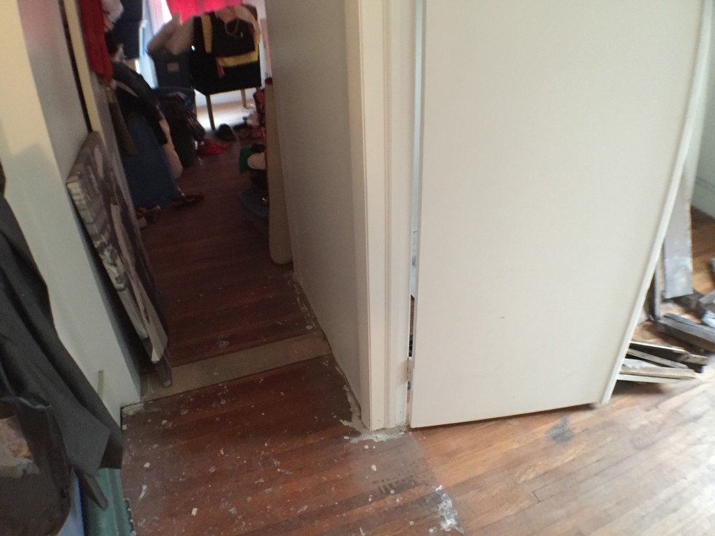
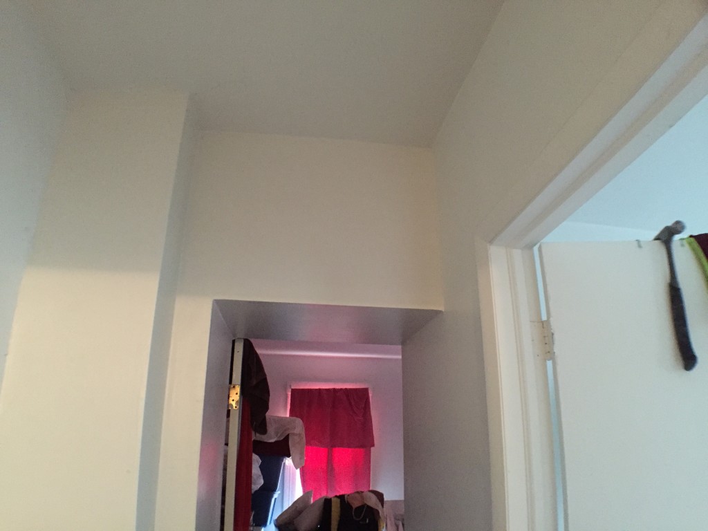 The hall was also really awkward. You can see where the flooring got weird once we took up the carpet.
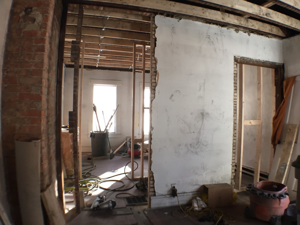
 The layout we chose allowed us to keep the existing doorway in place, which was nice, but we knocked out the dropped ceiling and brought the height of the doorway up to 8′. To the right of the room there was another doorway that had been closed off with drywall (but the trim was left – ?!) so we took off the trim and closed it up properly.
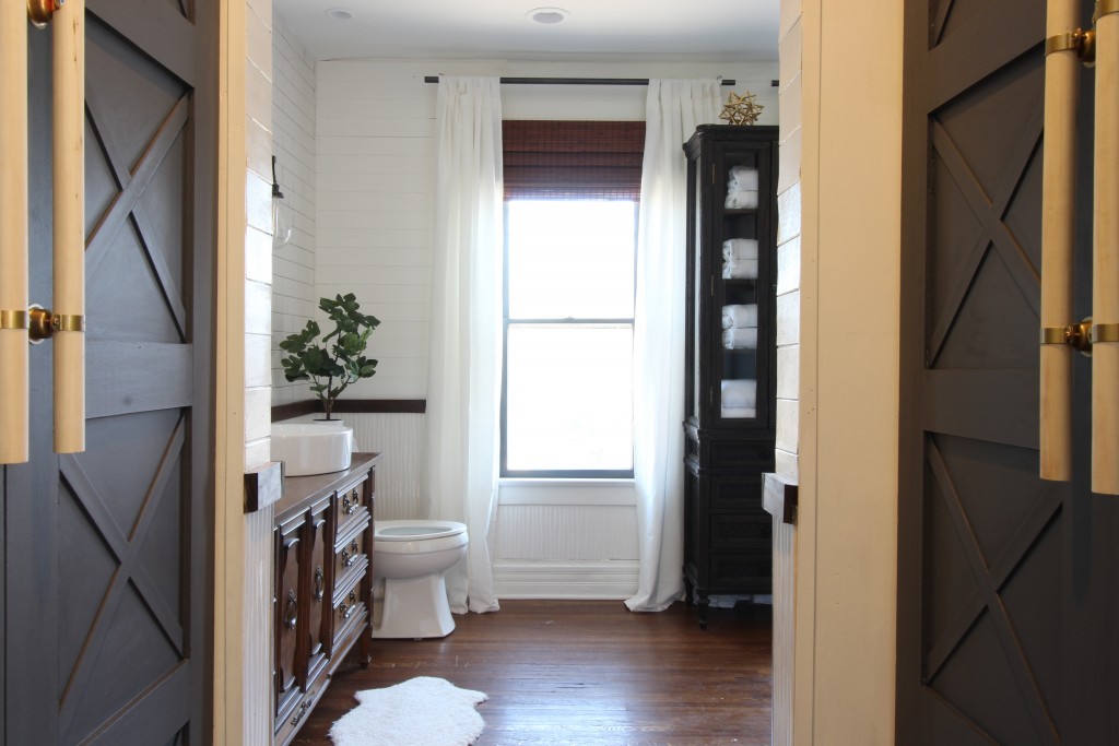
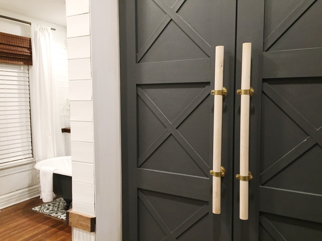
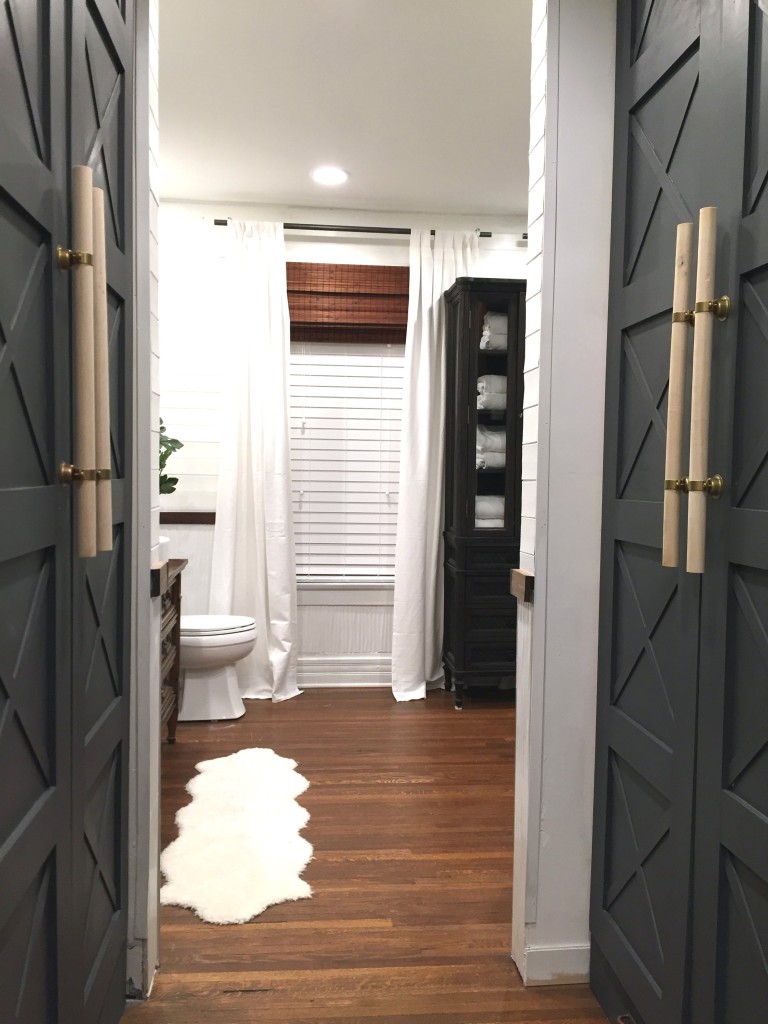
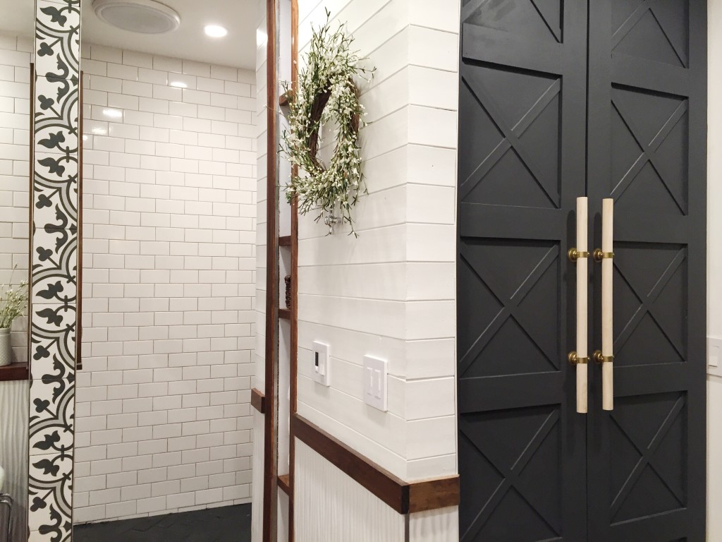
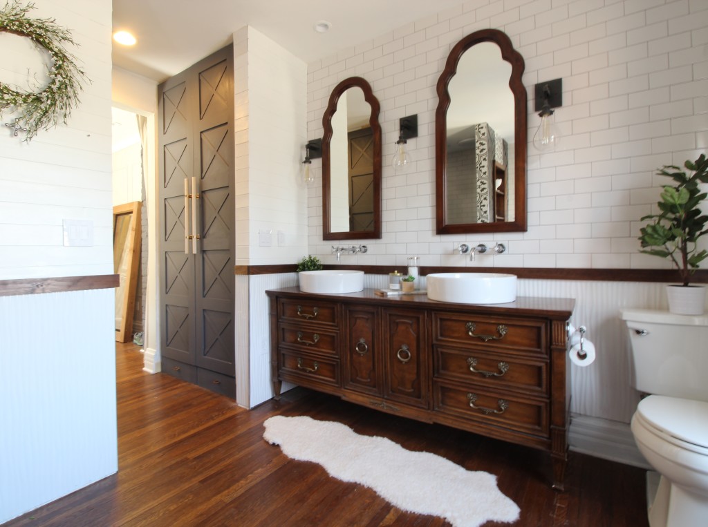
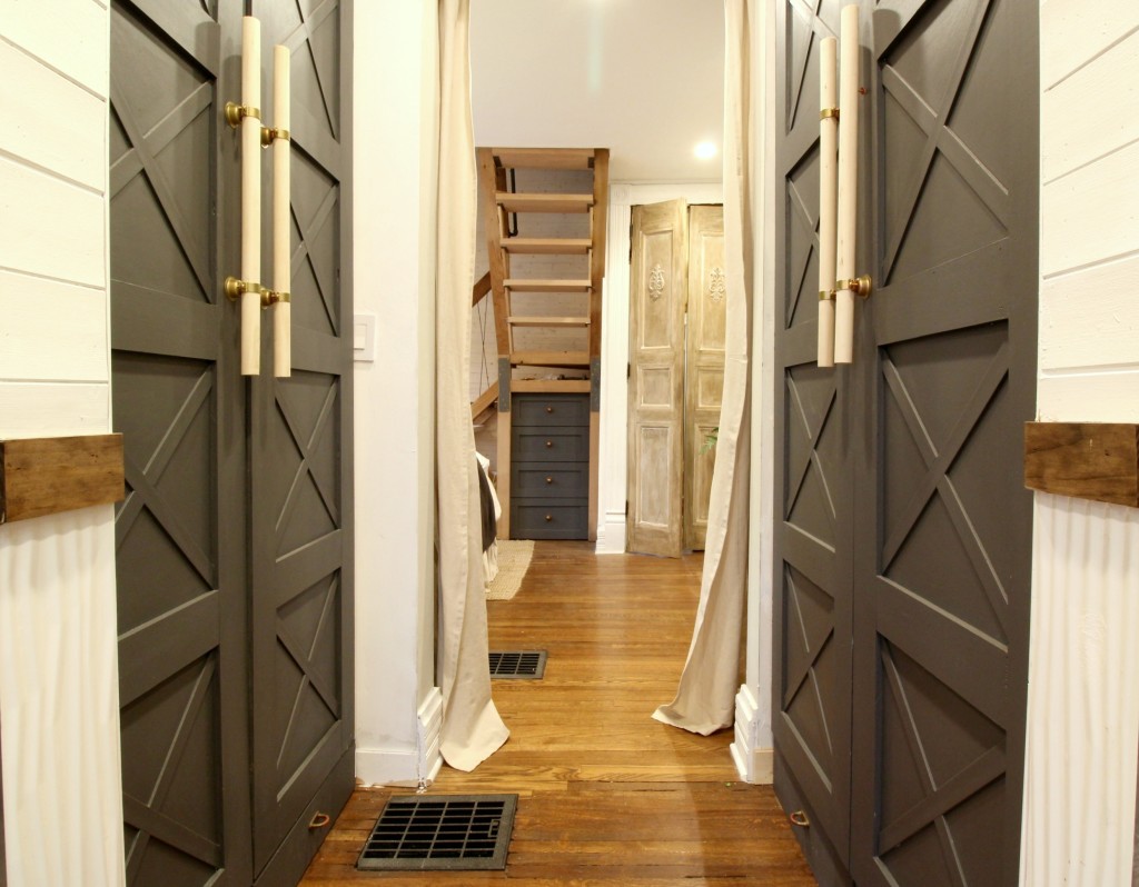
 This is what it looks like now. We designed and built the floor-to-ceiling wardrobes and painted them Benjamin Moore Gray (2121-10). We haven’t decided what type of door we want yet, so we hung curtains for privacy.
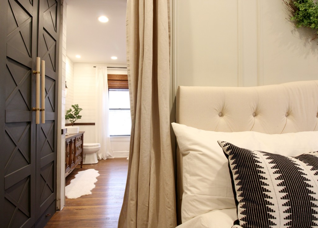
 We made the hardware from copper bell hangers, brass spray paint, and unfinished wooden dowels from home improvement stores.
 We couldn’t decide between the look of bamboo shades and functionality of blinds, so we did both. The white blinds blend with the planked wall when they’re closed and are inside mounted, so they can be pulled up all the way and hidden behind the bamboo shades. The bamboo adds a touch of warmth to the space, and we mounted them above the window to make the windows appear larger.
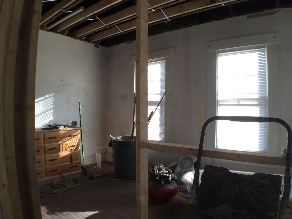
 The room was a good size and has great natural light. It got worse before it got better!
 One of the perks of having space in the middle of the bathroom is that we’re able to use it as a dressing room when it’s not being used as a bathroom. The wardrobes are located right off of the bathroom, so it has been convenient – especially when one of us is still sleeping in the bedroom.
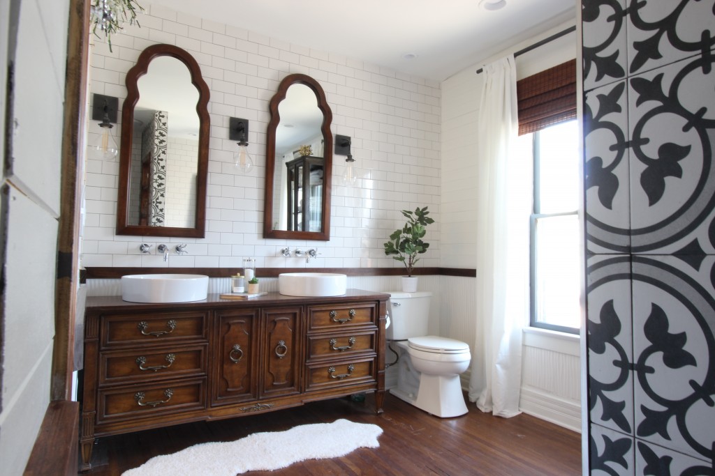
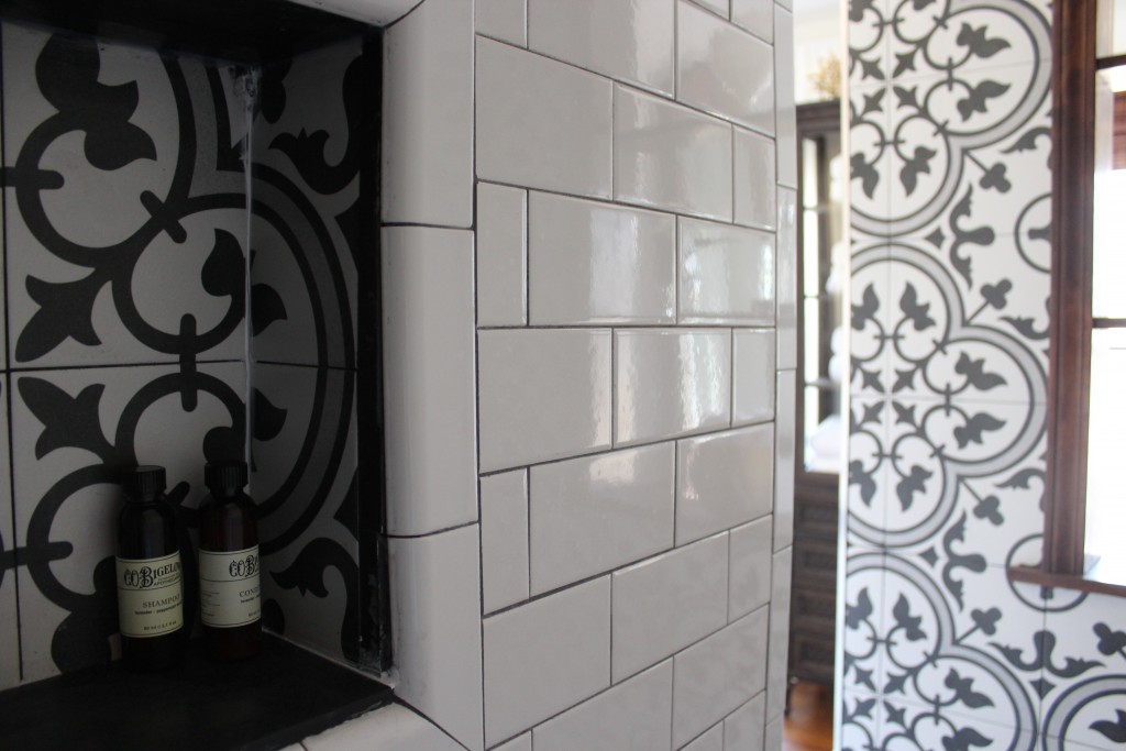
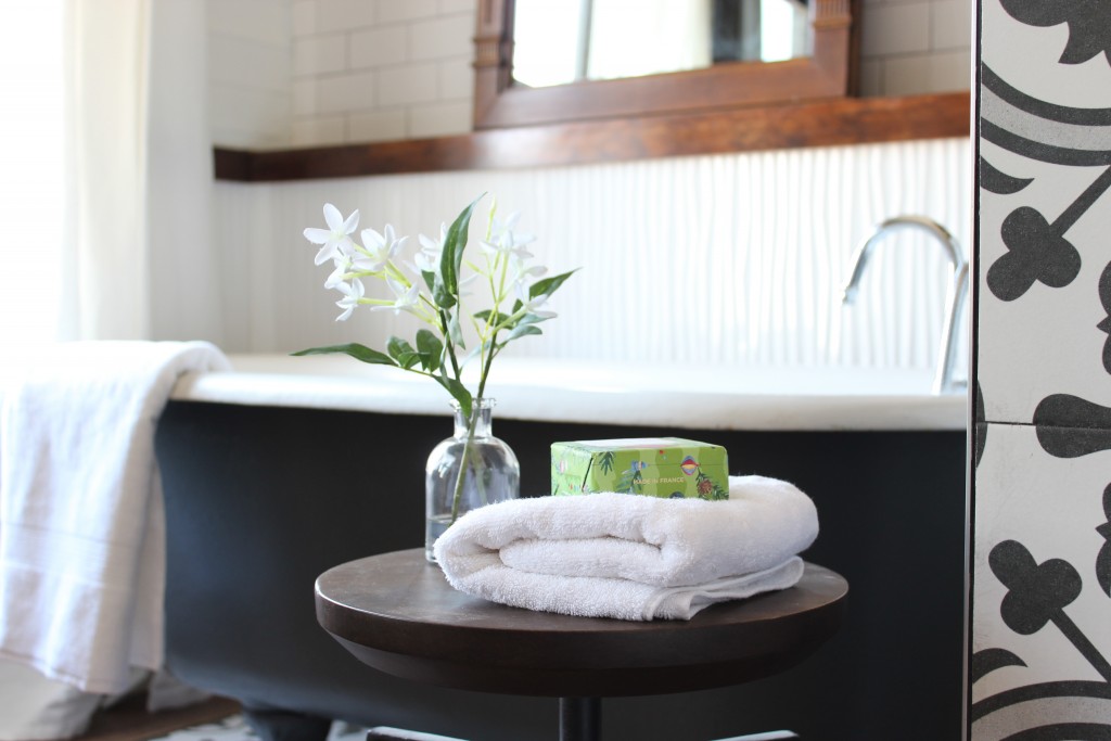
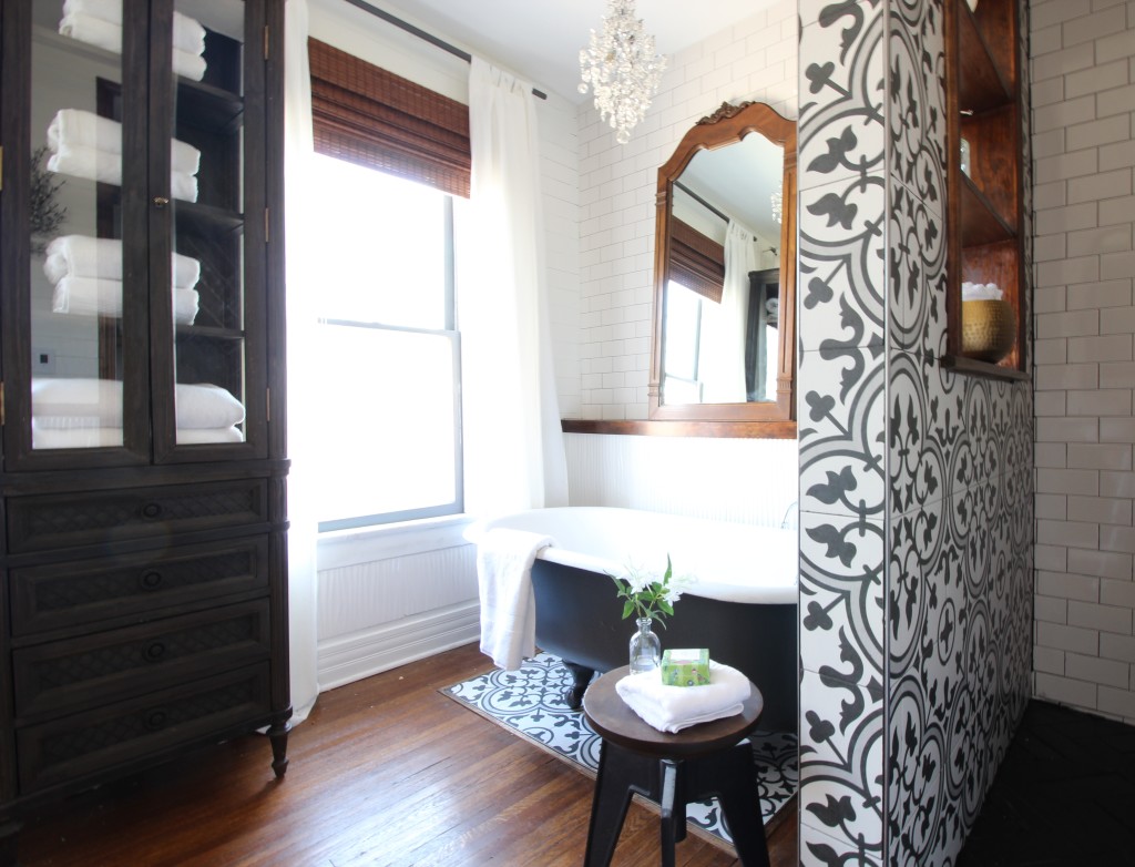
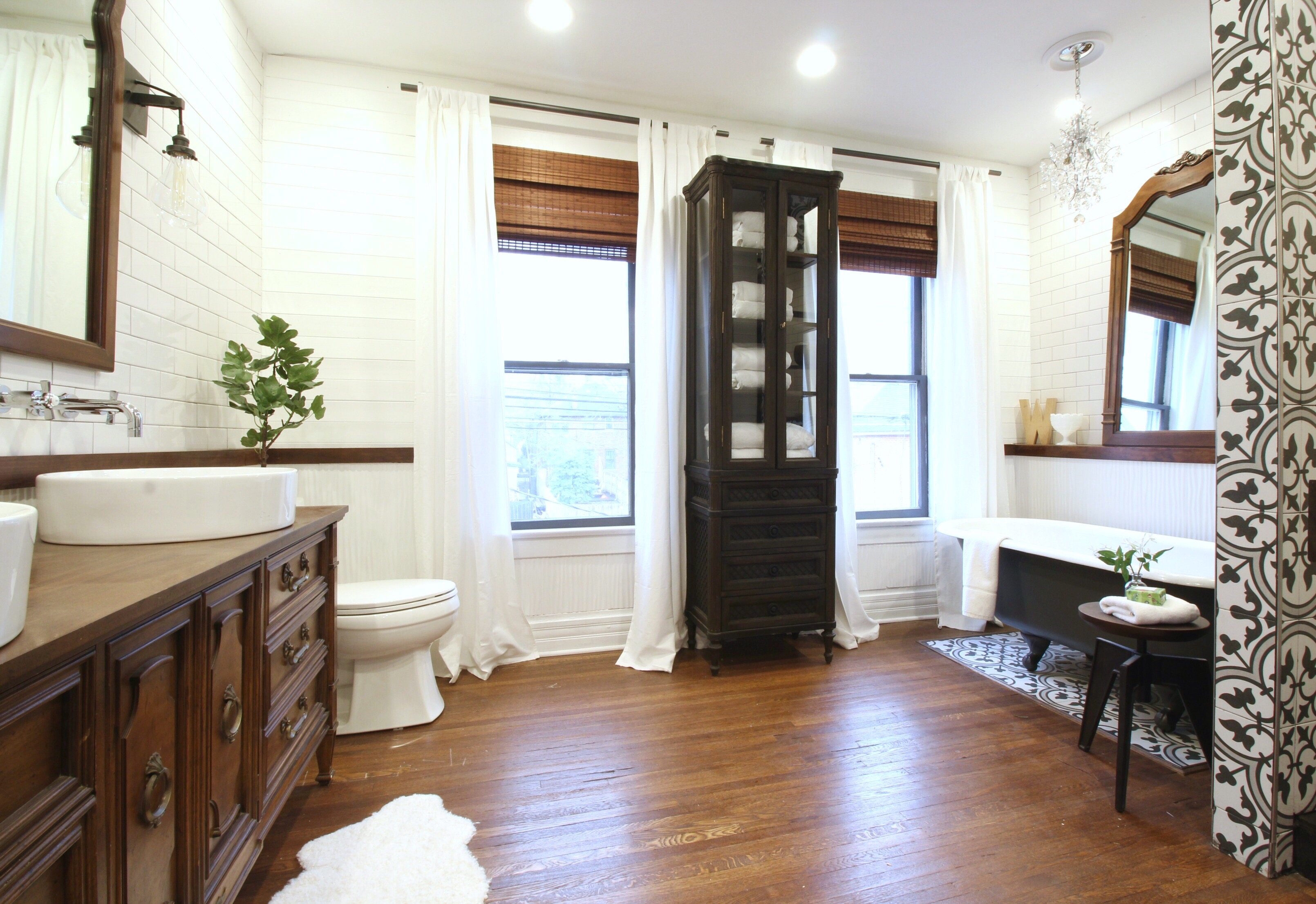
We wanted this bathroom to feel classic and unique at the same time. We refinished the original oak floors and tiled the walls with a mixture of subway tile, wavy white tile run vertically as contemporary wainscoting, slate tile, and porcelain patterned tile. We loved the patterned tile so much that we added an inlay below the clawfoot tub.
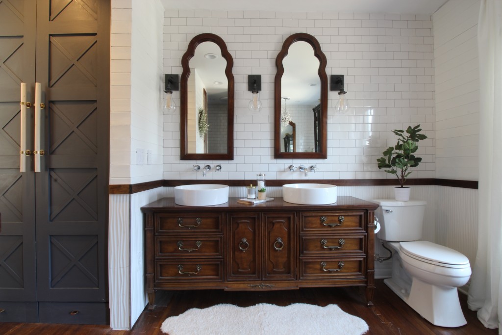
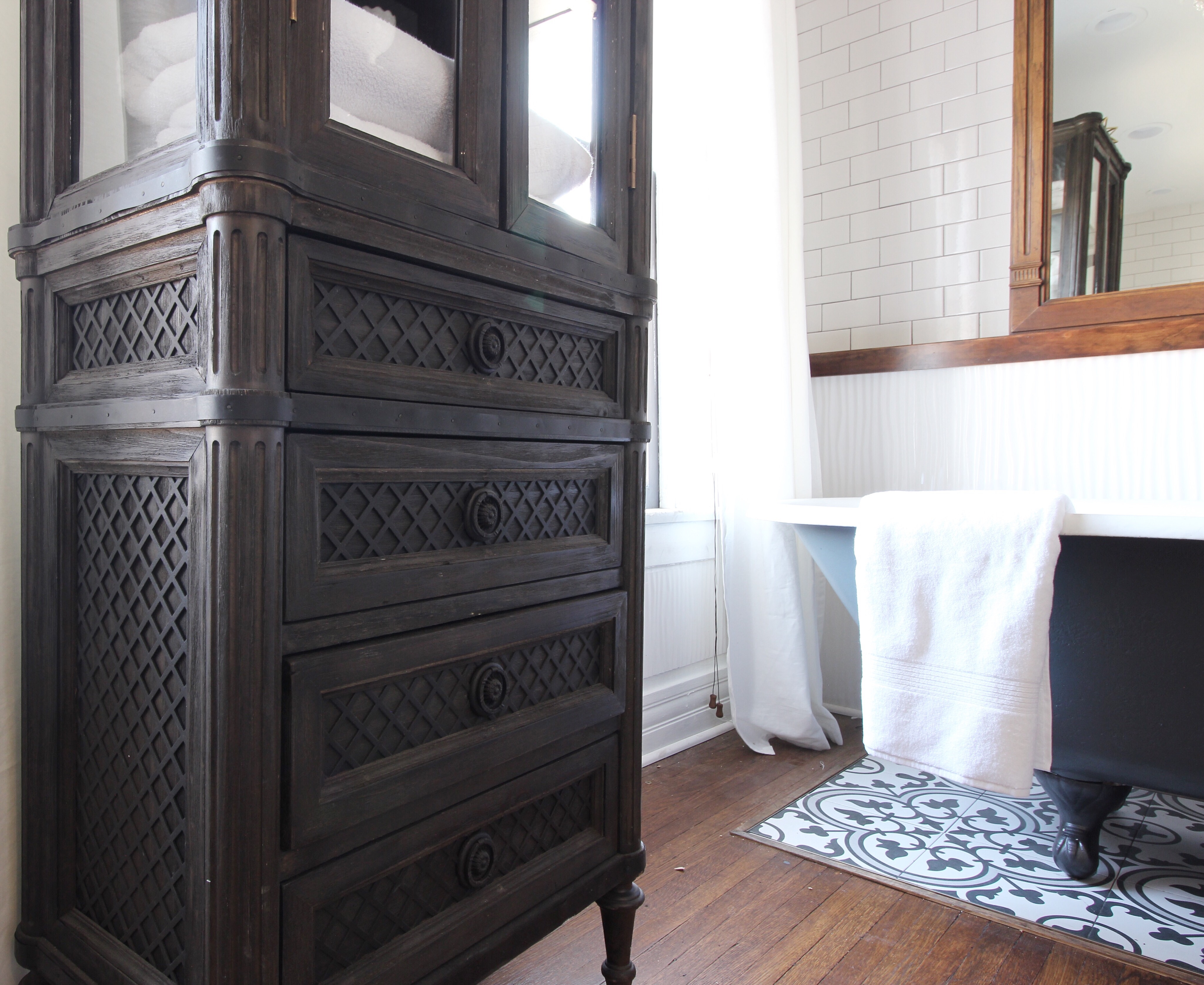
The bath cabinet is from Restoration Hardware Outlet (one just opened in Ohio a few months ago and we are so excited!) It fits perfectly in the space and provides great storage while still looking pretty.
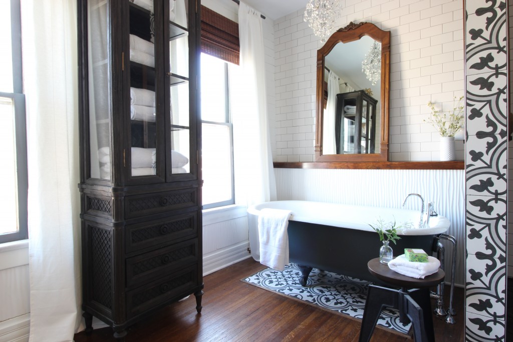
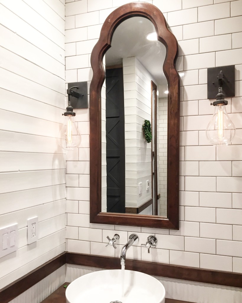
The vanity mirrors are old dresser mirrors that we bought for $60 on Craigslist. The Drexel Francesca antique dresser was also a Craiglist find, and came with a mirror that we placed on the shelf we framed out in back of the tub.
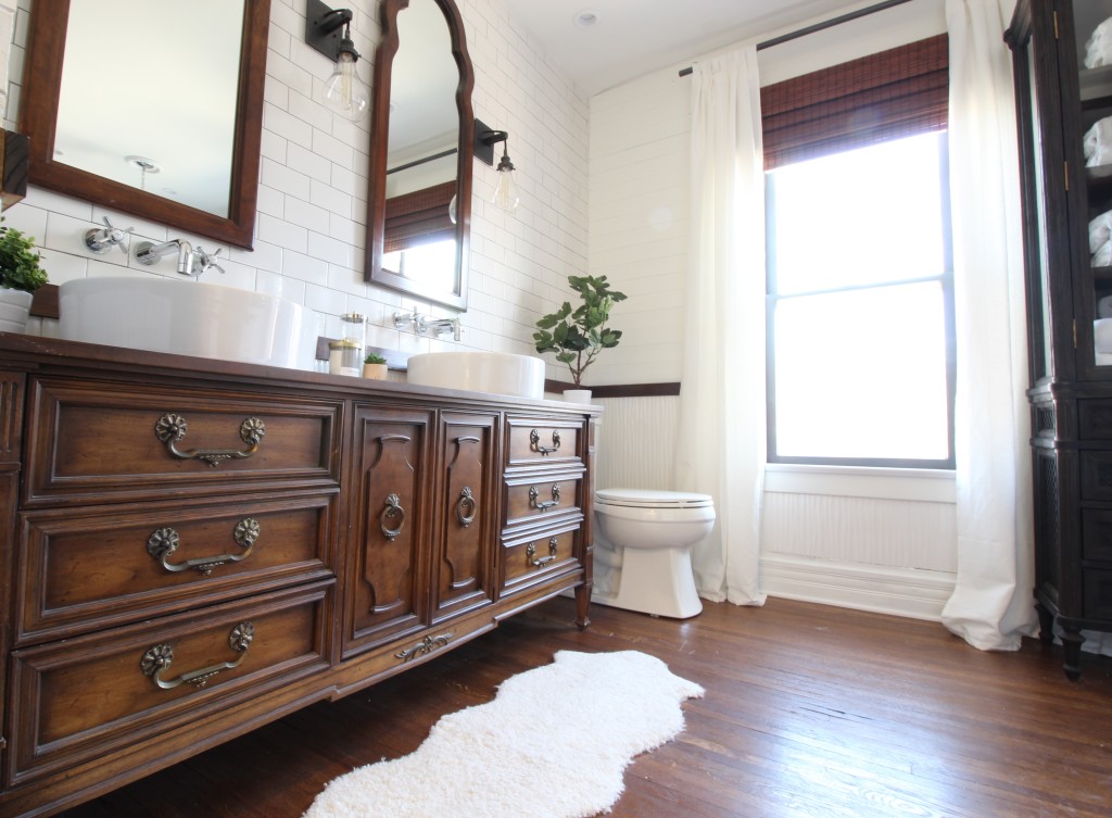
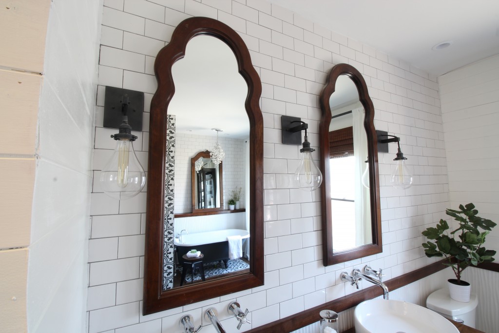 We chose simple, round vessel sinks and wall-mounted fixtures to save space. These fixtures were a perfect blend of contemporary and vintage, and were just about the only ones Bryan and I could agree on!
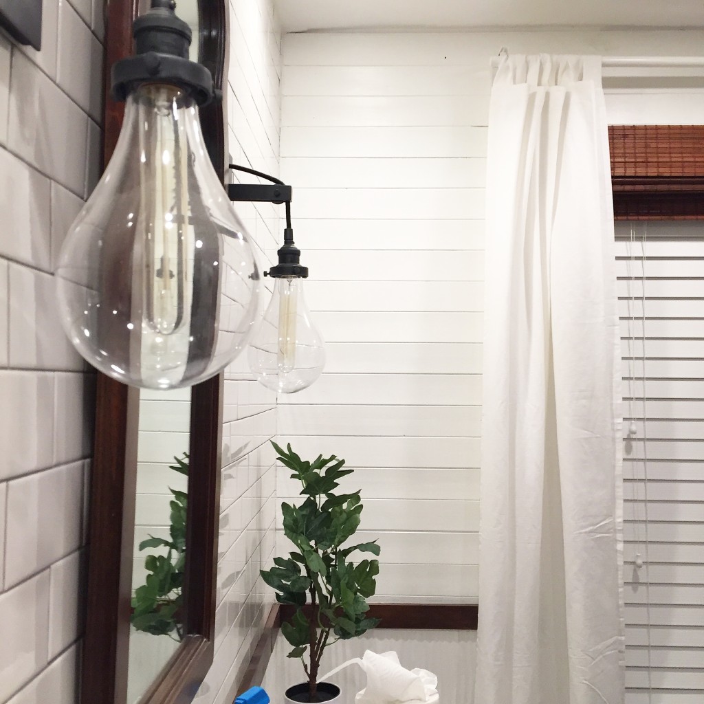
The sconces add an industrial element to the bathroom and give off soft light. We found them on sale at Restoration Hardware.
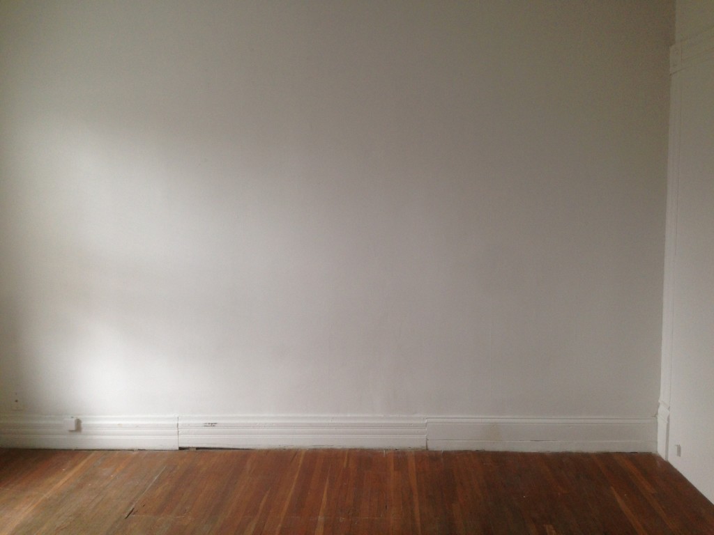
 This is what the wall to the right of the room looked like when we bought the house. Gotta love patched baseboards, right? If you look to the right, you can see the old semi-covered old doorway.
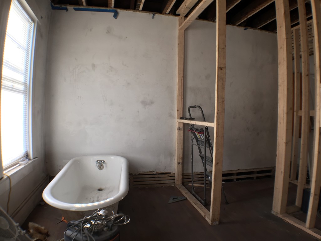
 We framed out a 48 x 72″ shower on the right, and left room for an antique clawfoot tub that we picked up at Columbus Architectural Salvage. By making the shower large enough, we saved ourselves from having to spend money on a pricey shower door.
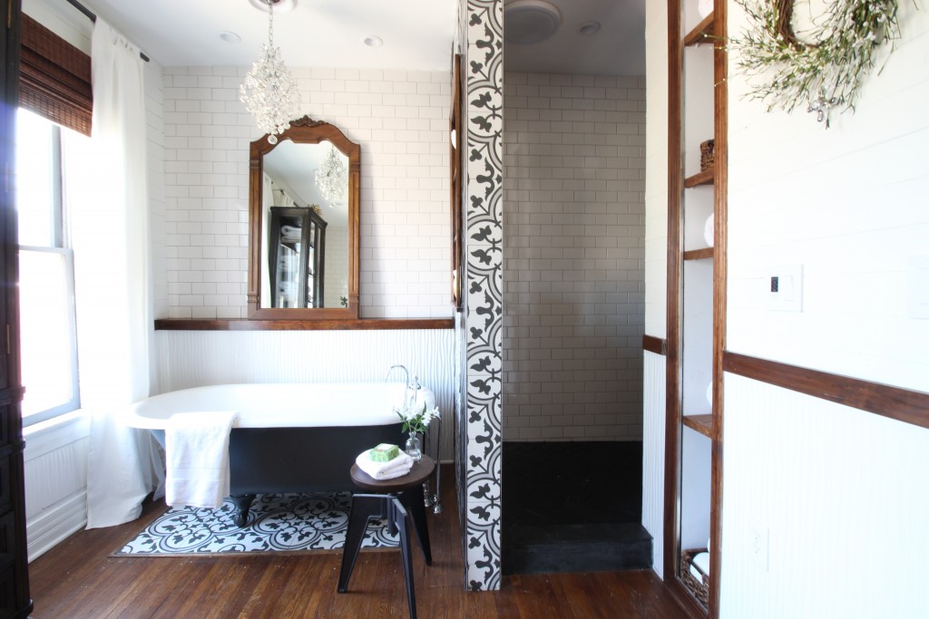 The wavy tile at the bottom continues around the bathroom. Bryan calls it contemporary wainscoting.
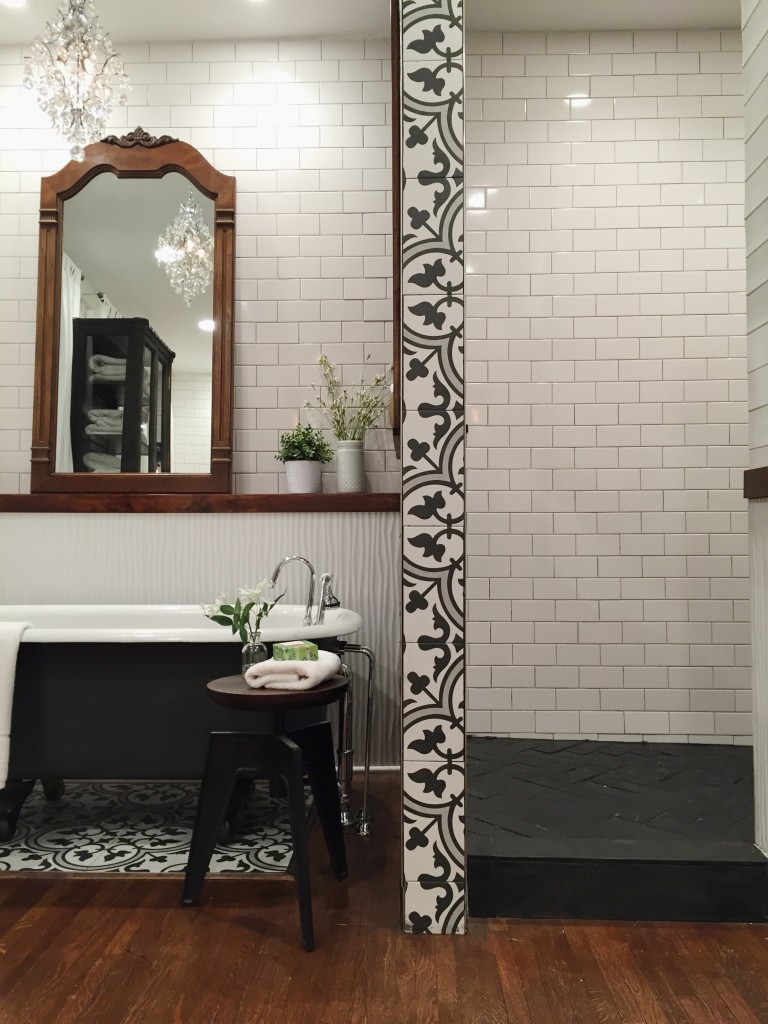 We trimmed the tile “wainscoting” with 1×3″ pine, and stained it with 1 coat of Dark Walnut followed by 2 coats of American Walnut. We added tongue and groove paneling to the top half of the wall and painted it Benjamin Moore Simply White (2143-70). Not only does the paneling give the room more texture, but it covers our uneven plaster walls.
 Here is the view from the shower wall looking at the vanity wall.
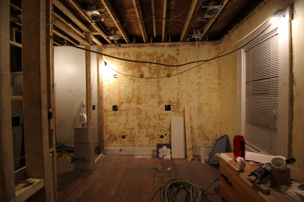
 This is the old entrance, where our wardrobes are now. Do you see the short doorway and cut door, compared with the molding on the left?
 Here’s what the view was like from the shower.
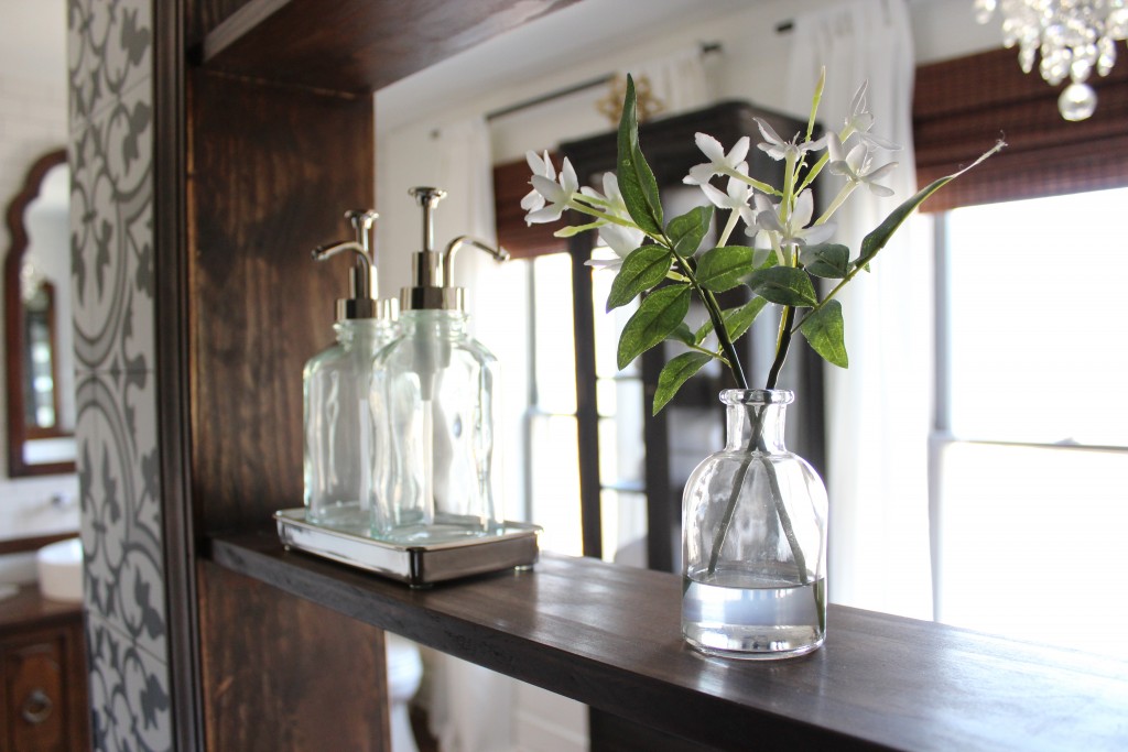
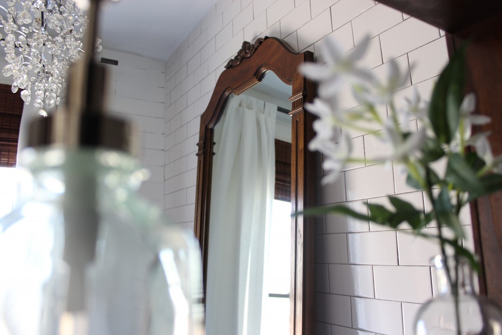
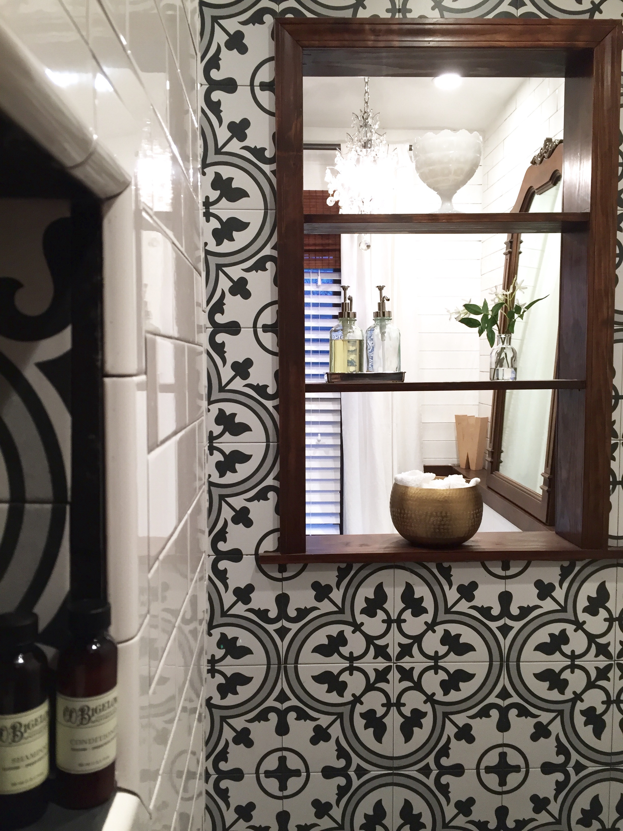
 Instead of putting glass up between the shower and bath, we created an open shelf. Washcloths and soaps can be accessed from both sides, and the wood adds some warmth to the black and white.
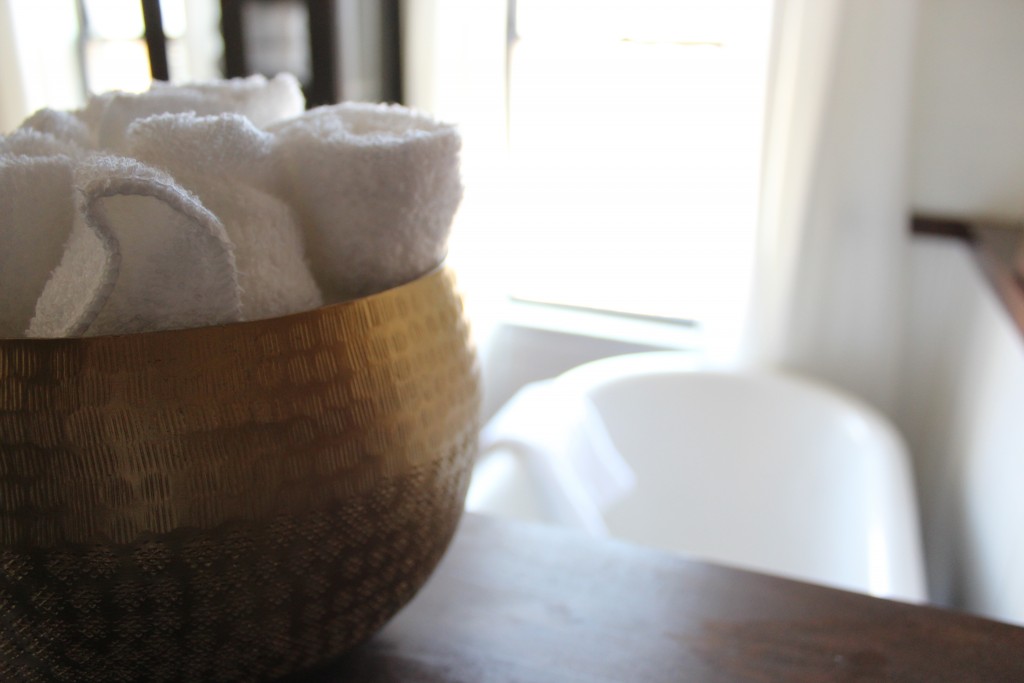 We’re still working on finishing some built-in shelves right outside the shower that we’re hoping will house some towels and other bathroom items.
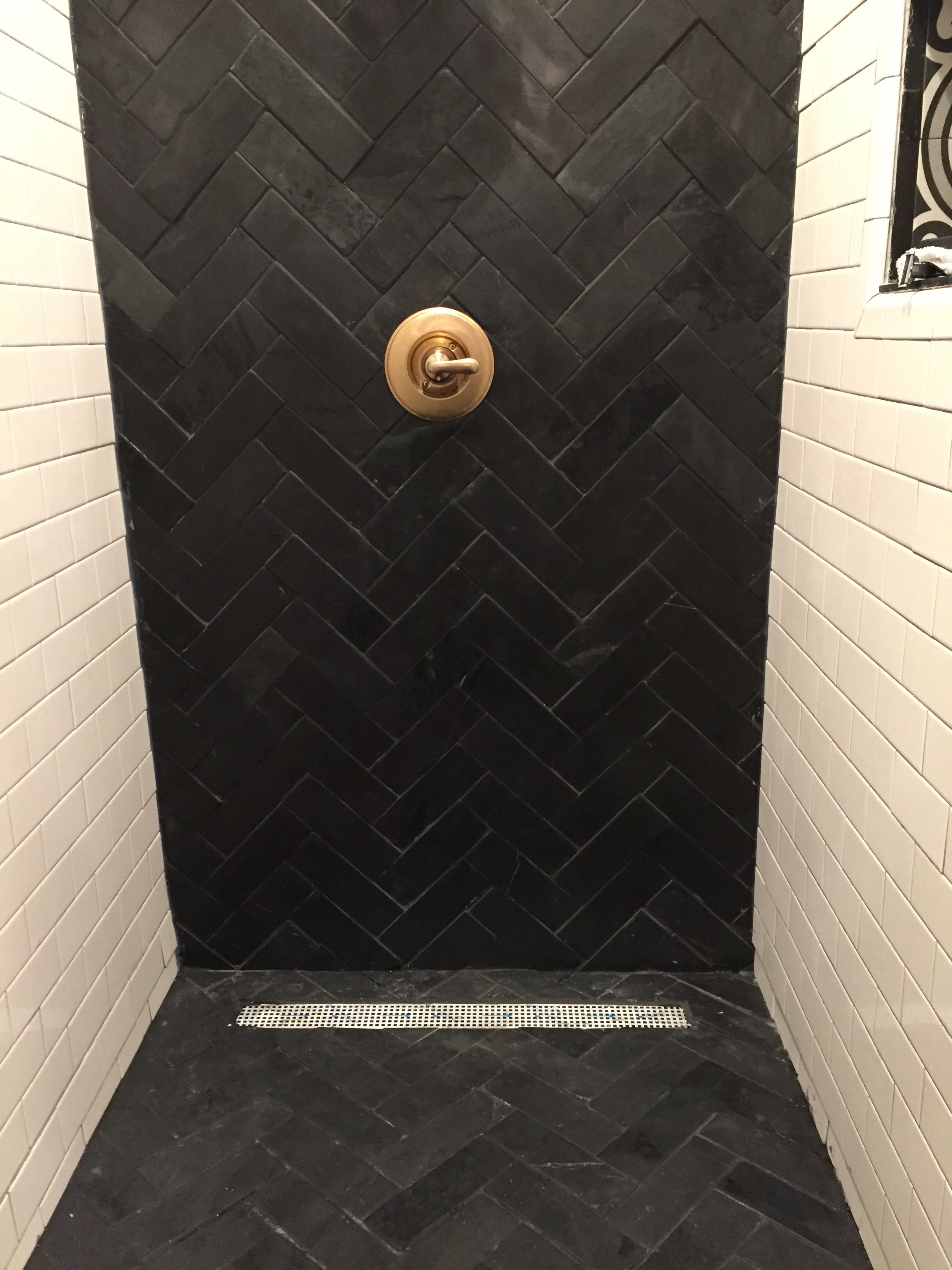
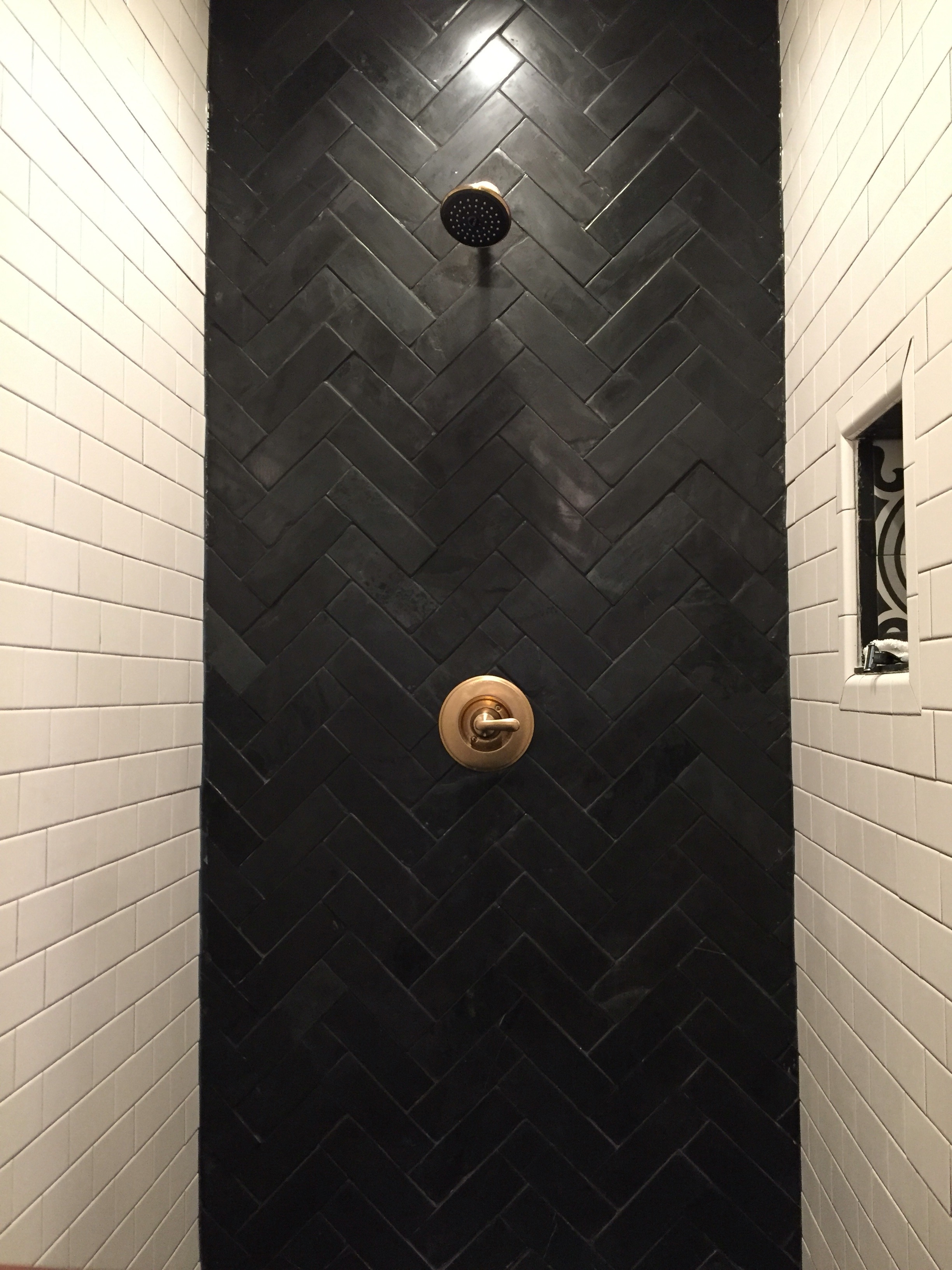
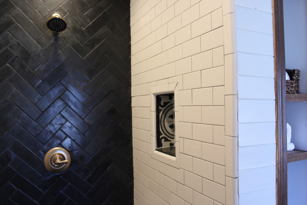 We chose slate tile for the shower floor and faucet wall. Bryan lined up the herringbone pattern in the corner where the wall and floor met and did a great job, despite the fact that the tile was different heights and sizes.
We mixed metals in this bathroom and went with a Delta Champagne Bronze faucet. We love the contrast of the brass and the slate.
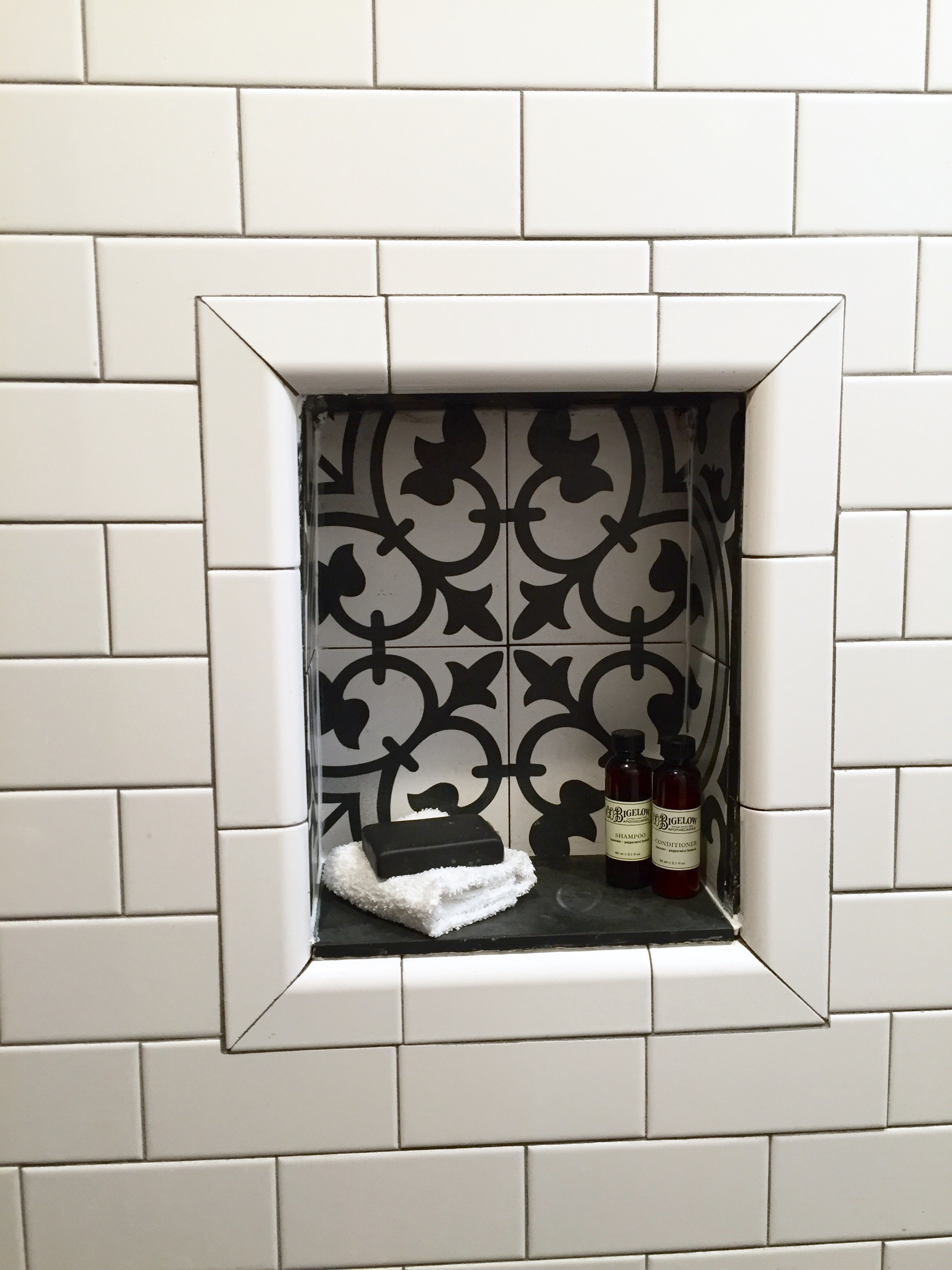
We made a little shelf for extra shower essentials to tie in the patterned tile.
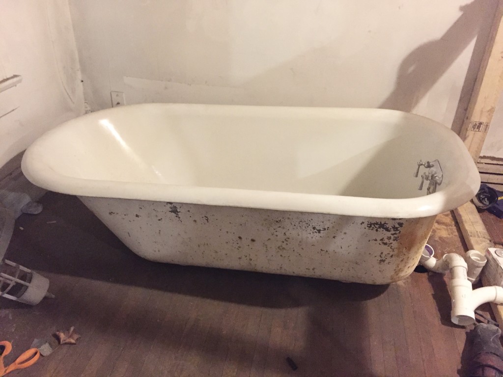
The clawfoot tub we salvaged was in great shape on the inside, but was pretty rough looking on the outside. After flipping it over, we discovered it was made by Kohler in 1914!
 And last but not least, here’s the view looking from the bathroom through the wardrobe hall into the bedroom.
 You can catch a glimpse of the stairs and doors Bryan made!
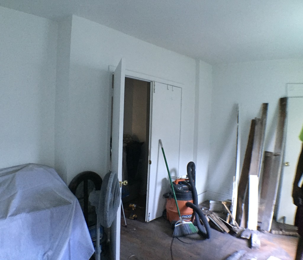
 We’re still working on finishing touches in the bedroom and loft, but here’s a peak of what it used to look like…
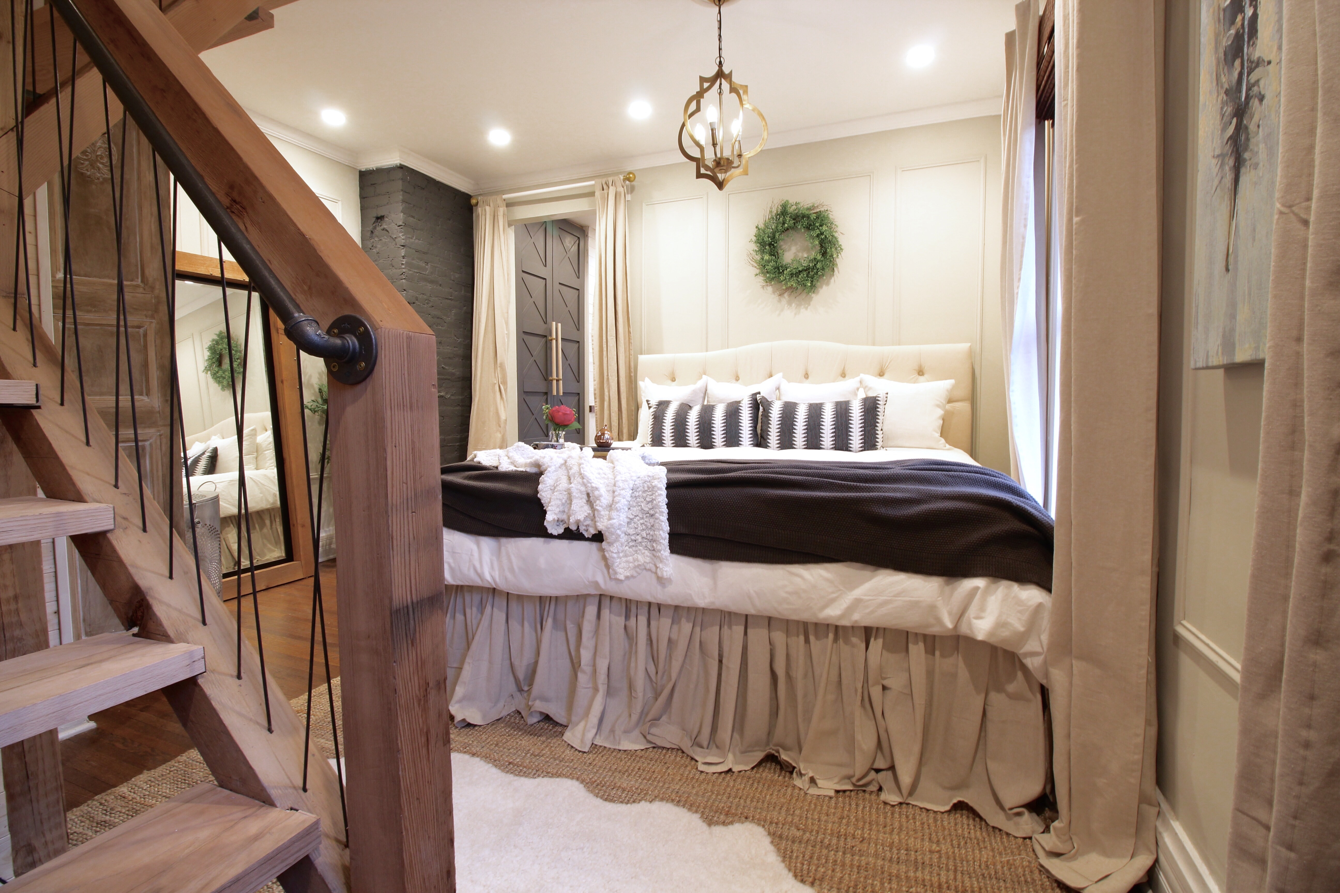
… and here’s a peak of what it looks like now.
We’ll share more photos of the bedroom and the loft soon! Hint: we’ve already posted some on Instagram.
Bathroom product info:
Patterned tile: Merola Arte Grey
Dark herringbone tile: Floor & Decor 3×9″ slate tile
White wavy tile “wainscoting”: Floor & Decor Sublime Blanco
Chandelier above tub: Home Depot Elaisse chandelier
Wood floors: refinished original hardwood by Capital City Floors in Columbus OH
Vanity: Repurposed antique dresser (Drexel – Francesca model)
Sink faucets: Overstock (similar here and here)
Shower faucet: Delta Champagne Bronze plus valve (separate)
Vessel sinks: Kraus KCV-140 White Round Ceramic Bathroom Sink from Amazon
Mirrors: Antique dresser mirrors from Craiglist
Sconces: Restoration Hardware Teardrop Filament Sconce {during lighting sale}
Clawfoot tub: Columbus Architectural Salvage
Wood planked walls: Tongue and groove paneling from Home Depot painted BM Simply White
Plants and pots: Ikea
Sheepskin rug: Ikea
Accessories: Hobby Lobby, Home Goods, and Target
Bedroom
Brass quatrefoil pendant – World Market
Wow – this looks awesome! You guys did a phenomenal job! Love all the texture and that you kept the wood floors! My hubby and I do the same thing as you guys and we are currently in the middle of a huge project as well. Doesn’t it feel SO good when you see the finish line? Love your blog!
Thank you so much Christy! Yes – best feeling ever. 🙂
Where did you get the wavy tile?
Pam – we purchased it at Floor and Decor. Here is the link: https://www.flooranddecor.com/ceramic-tile/sublime-blanco-bright-ceramic-wall-tile-100087246.html#q=Sublime+blanco&start=1
Gorgeous!!!
Thank you!
could you tell me how wide your vanity is? Amazing remodel!
Thanks Jodi! It’s about 70 inches I believe.
Where did you get the door?
Bryan made the wardrobe doors 🙂
Wow. Just. ????????????????????????????
WOAWWWW – this is clearly über-awesome…. We had a very awkward bathroom in our present house and also had it tiled in various combined tiles. I wonder if you could tell me if those black slates do the job, because our tiles, even though they are dried with a towel after every shower, now show the surviving soap and dirt traces as the surface is not even (we got those because they are ‘artisanal’, meaning uneven on the surface and not clearly cut squares but sort of ‘broken slightly’. Then, the joints also collect the soap rests… all of which makes me a bit unhappy. We too had a clever little ‘bath products’ sill integrated on a slightly protruding wall covering the plumbing of the shower – looks great and is practical. Your ‘niche’ is fabulous. Well, EVERYTHING is fabulous – I have just subscribed to your blog. You guys rock! 🙂
[…] If you haven’t seen the blog post about the bathroom that Bryan & Catherine renovated, you *must* click here: Pearl Street Master Suite Renovation […]
Stopping by from the Lettered Cottage. Wow! What an incredible transformation.
Thanks Angela!
I love what you guys do! You are crazy good!!!
Thank you Sandra!
Beautiful! What brand is the subway tile?
It’s from Home Depot!
Fabulously done! A quick question: What preparation is required to install a regular dresser like you have for a bathroom? I thought it may need a marine-grade polyurethane coat (in case of small, moist bathroom). Would love to know what you did. Thank you.
Thank you! We used 2 coats of poly and it’s held up really well over the last 3.5 years, but does need some maintenance. We’ve touched up the surface a few times with Watco danish oil, and have only re-poly’d once. Marine-grade poly definitely wouldn’t hurt, though!
Hello,
Could you explain how you cut out the drawers of the dresser to fit the sink plumbing? We have a Drexel dresser and would love to do this in our master remodel, but we’re not sure how to configure the drawers.. or if your top ones are now dummy ones with just the fronts? Thanks so much. This bathroom is amazing!
Thank you! We cut an opening into the top drawer to allow it to slide in and out around the pipes (it looks like a U on the inside).
[…] You may have seen our posts about this under #thepearlstproject on Instagram, and on the blog here. Here’s a few photos that our friends at UA Creative Studios shot of the new space last […]