 New to BITM? Welcome! We’re Catherine and Bryan Williamson, husband & wife interior designers, renovators and Airbnb Superhosts based in Columbus, OH. We’ve renovated over a dozen houses together since moving to Columbus, and are currently in the middle of upgrading my parents’ new (old) home. It’s a 1950’s cape cod that we’ve dubbed White Cape Cottage. We’re looking forward to having you along for the ride these next few weeks as we tackle the One Room Challenge. Make sure you’re following us on Instagram and subscribed to our email list for the latest updates on our progress!
Catch up on progress here: Week 1 | Week 2 | Week 3 | Week 4 | Week 5/6 | Week 7
Have 8 weeks really come and gone already?! Our project started out as a much simpler version of what it ultimately became (hello, dormers!) but turned out so well. It’s hard to believe it’s the same space. Let’s take a walk down memory lane, shall we?
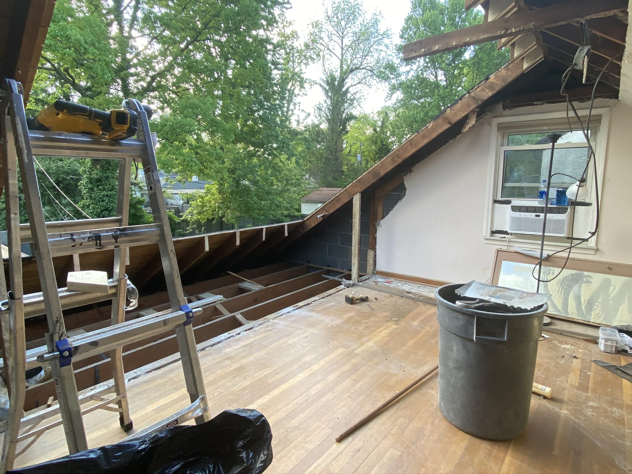
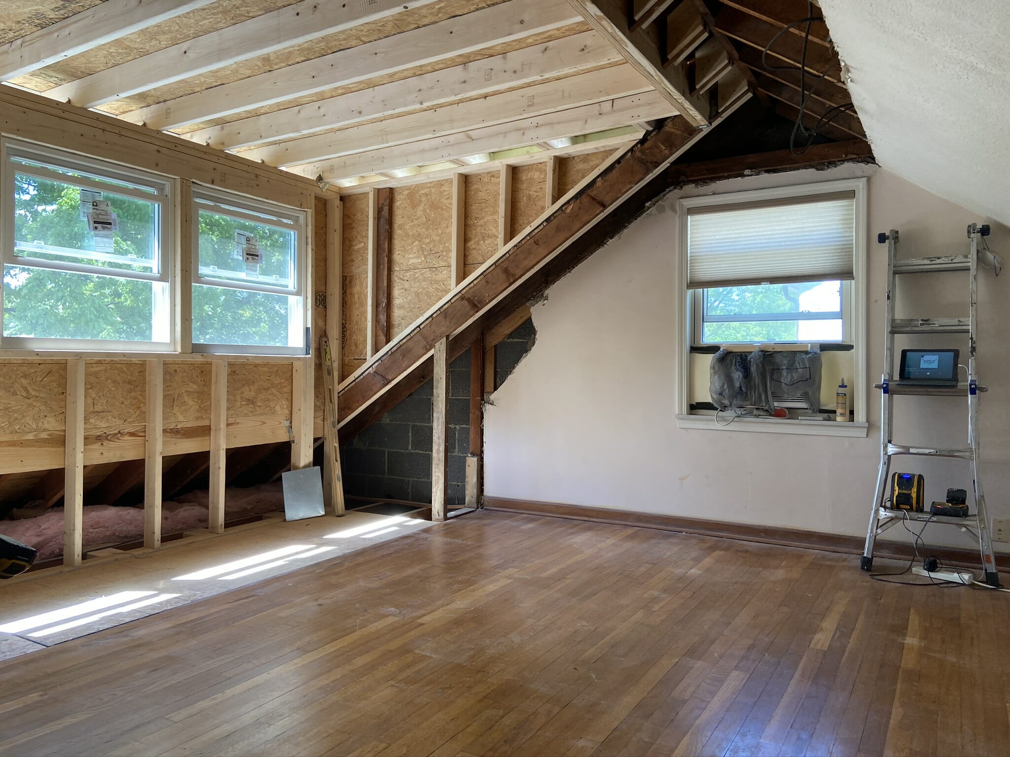
Here’s a quick recap of where we started (you can read more about that and see our initial plans in our Week 1 post).
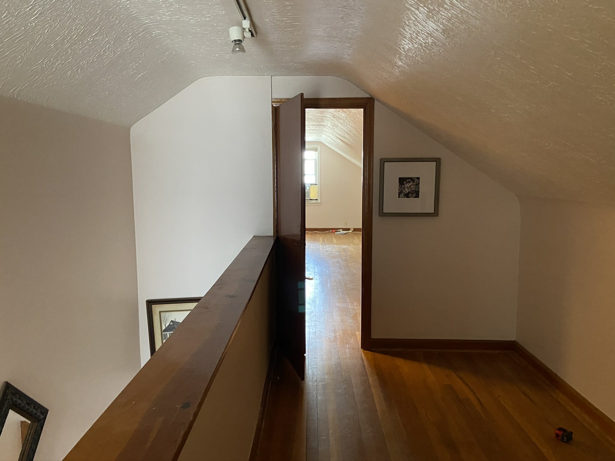
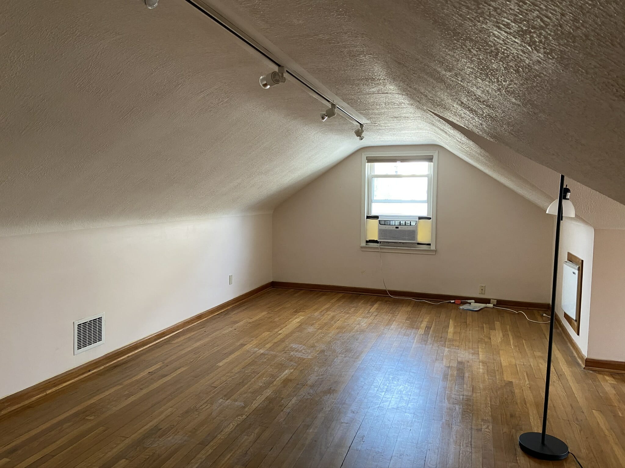 And then, dormer #1 (the bathroom) happened…
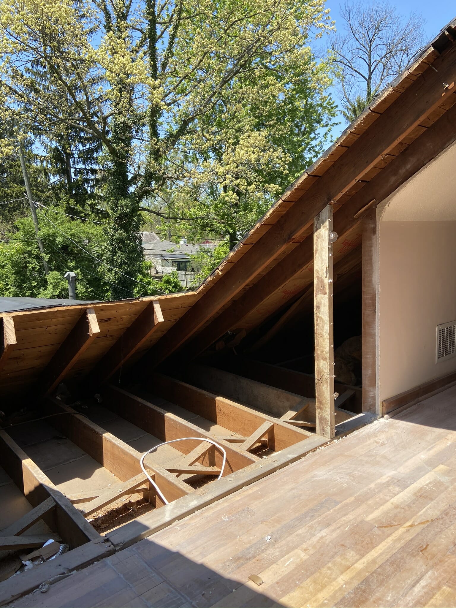
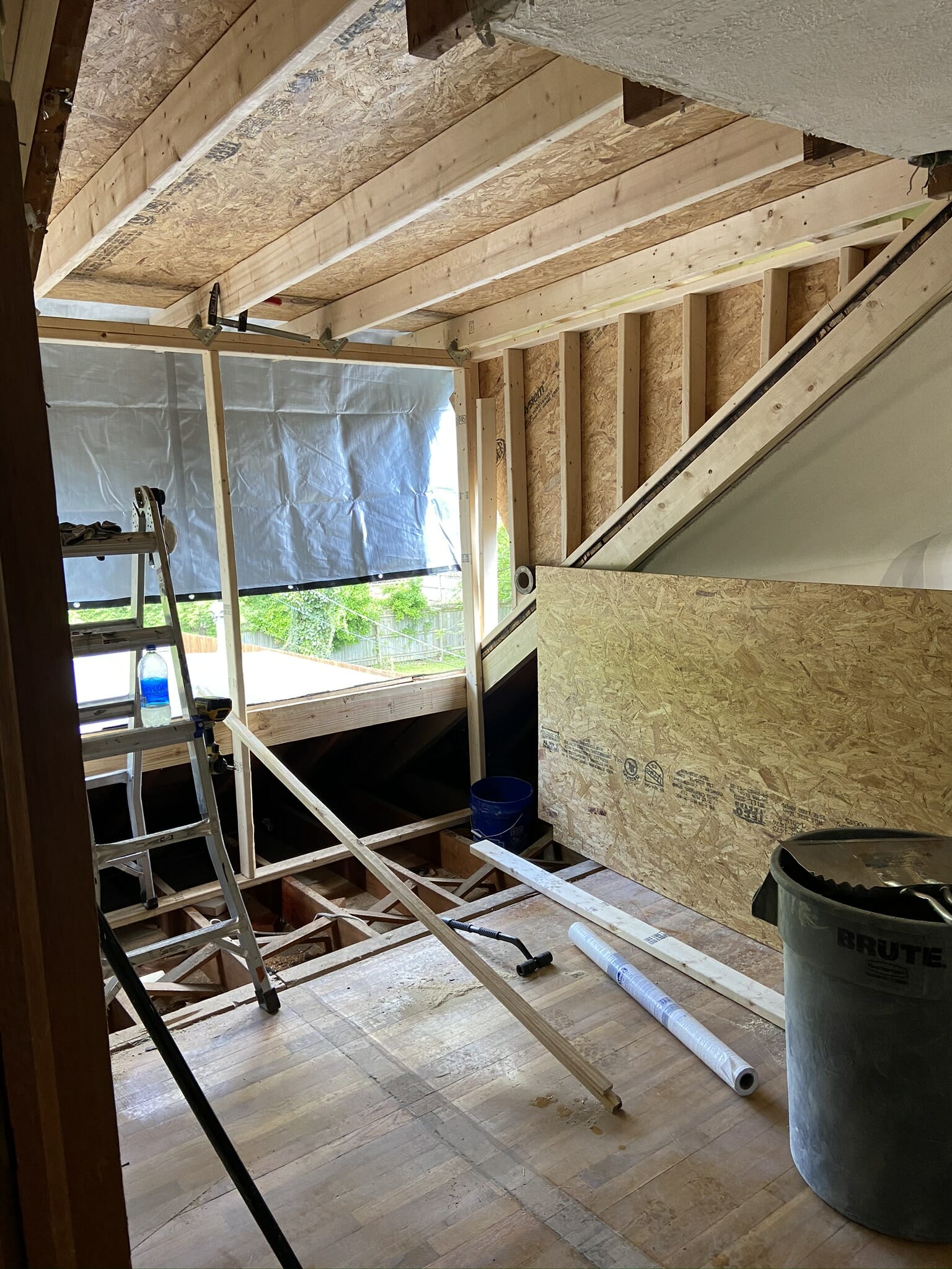
Then came dormer #2 (the bedroom)…
And here we are: FINISHED (well, mostly finished ;)) With last minute order cancellations due to Covid and construction delays, we had to pull a few all nighters to get everything photo-ready in time. We’re expecting a few more furniture pieces to arrive in the coming weeks, so we’ll update this post with new photos when we receive the items.
Let’s dive in!
Bathroom
Creating a bathroom with a double vanity, shower and tub is something we didn’t think was in the cards at the beginning of the project. After going back and forth between multiple different layouts (none of which felt quite right), we decided to add a dormer to create more usable space. Now this bathroom is not only classic and elegant, but it’s also functional for my parents to use everyday.
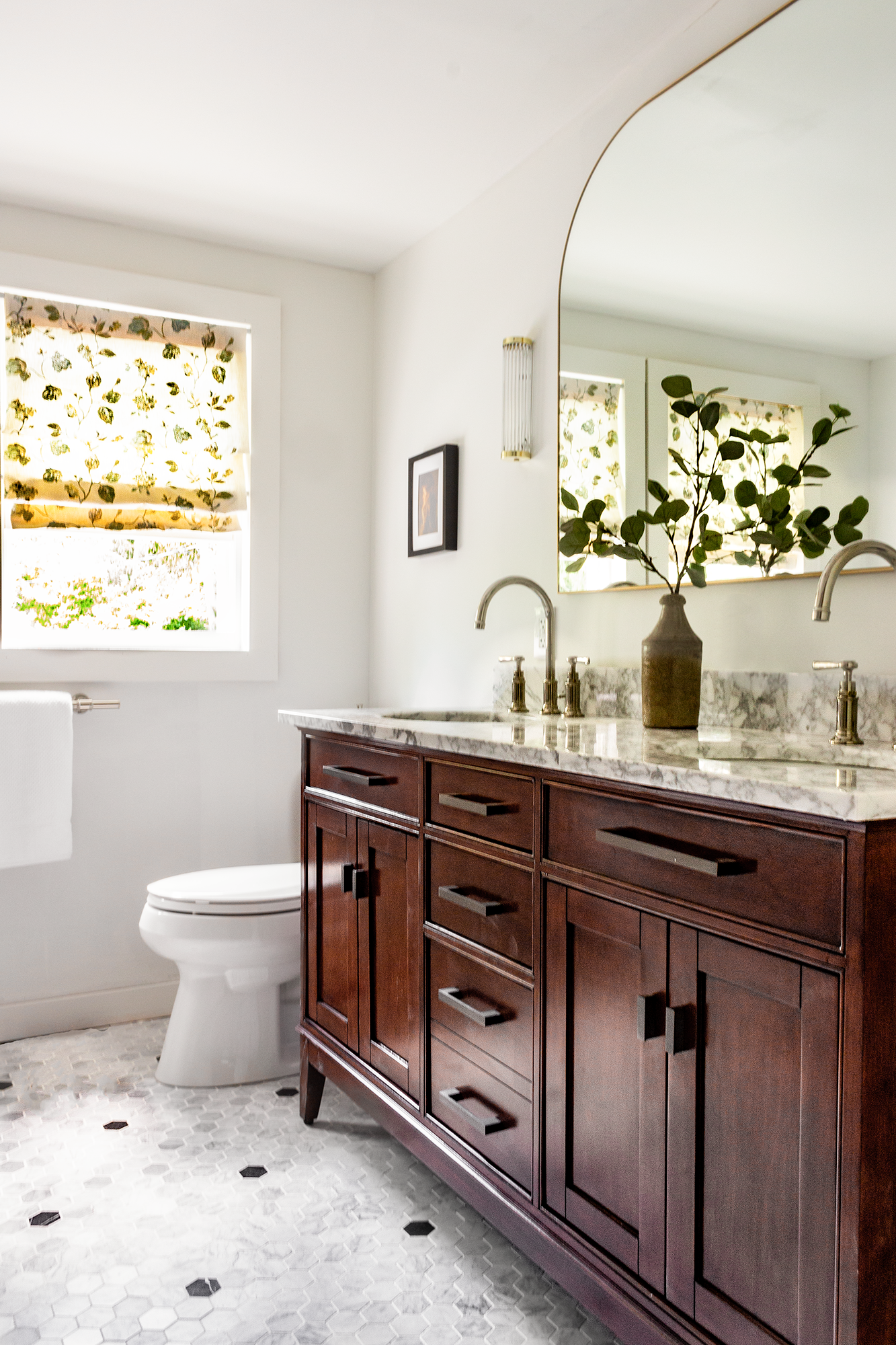
Overstock provided the gorgeous wood double vanity for this space, and WOW, the tone of the wood adds a rich warmth that compliments the marble tile so well. It’s a stunning combo that we never get sick of. We love that the middle drawer bank is wider than other vanities we’ve seen – extra storage space is never a bad thing!
We decided to keep the window trim and baseboards simple and low profile. We sourced 1×4 and 1×3 pine boards from Novo Building Products for the project, and used the same wood for the new windows in the bedroom as well. We have a few leftover 1x3s from Novo that we’re considering installing as board and batten on the walls. A little texture on the walls would go a long way!
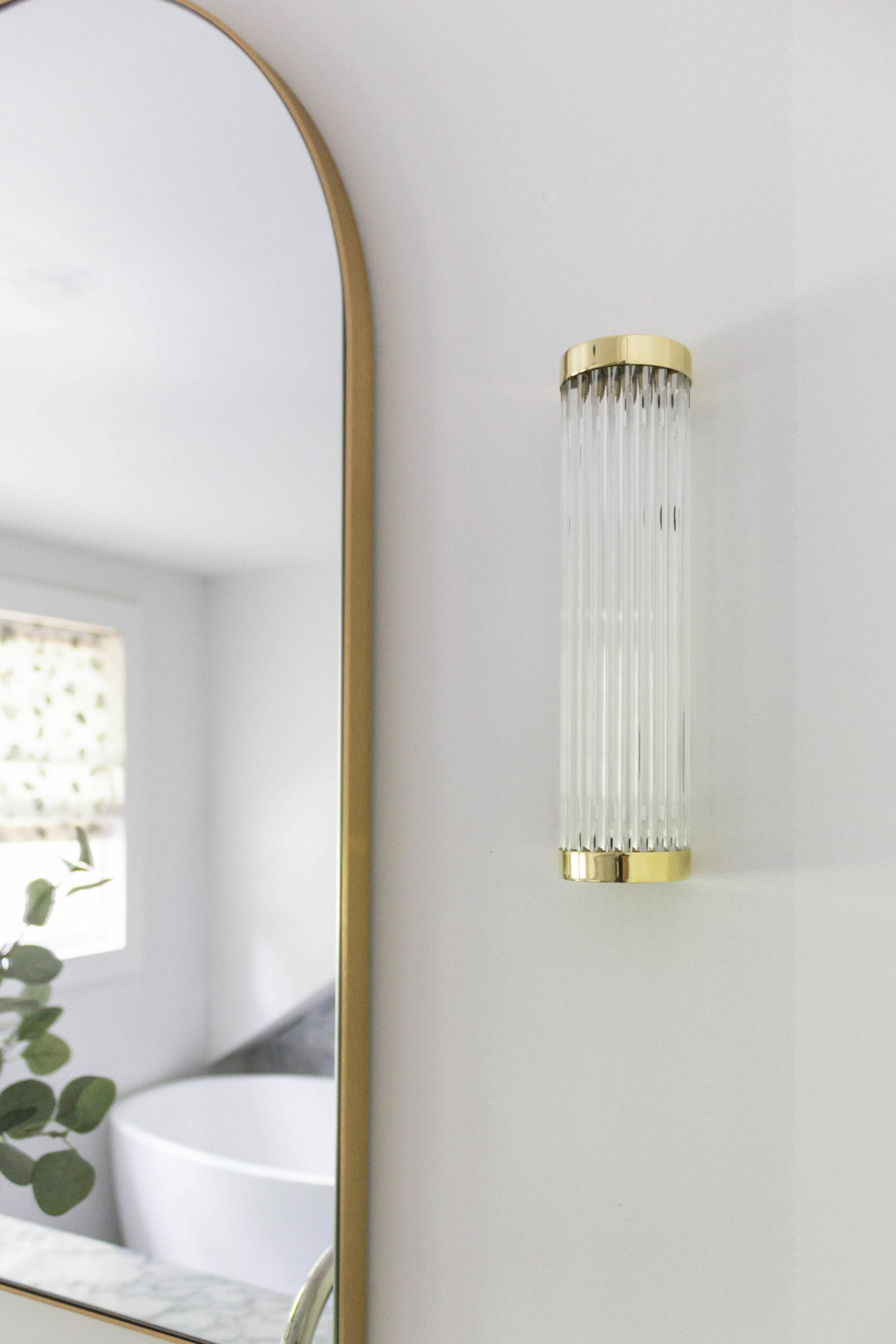
We purchased the arched mirror from CB2. It’s actually a mantel mirror meant to go above a fireplace, but works so well for this double vanity because of its size.
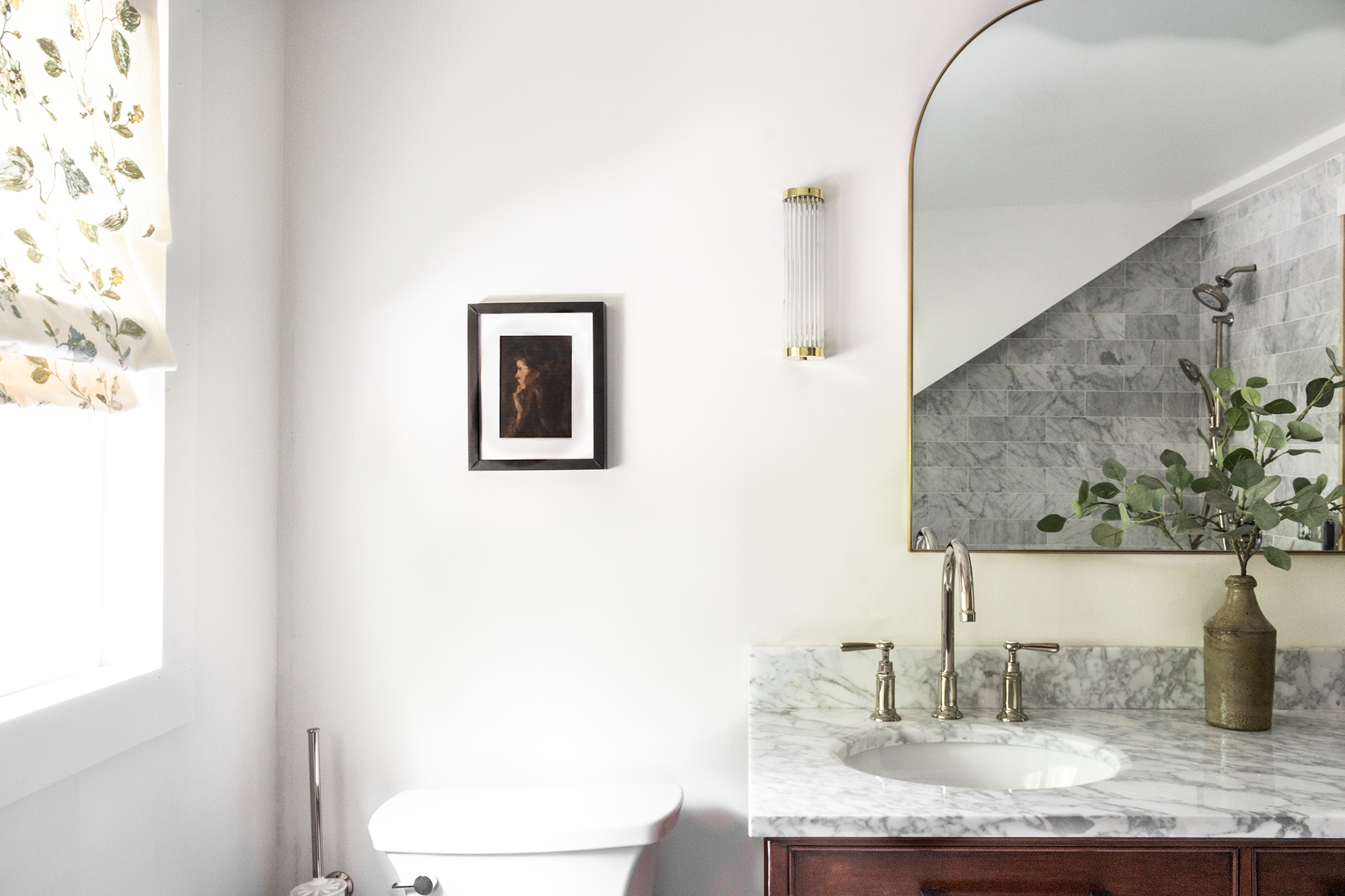
Let’s talk lighting. Original BTC provided the Extra Narrow Pillar Lights that we have flanking the mirror. They’re 3″ wide x 11″ tall, so they’re perfect for small spaces (there is also a larger version available). These fixtures add a touch of modern to this bathroom and couldn’t be more perfect. All of Original BTC’s lighting is handmade in England – we were so excited to discover them and LOVE their lighting designs.
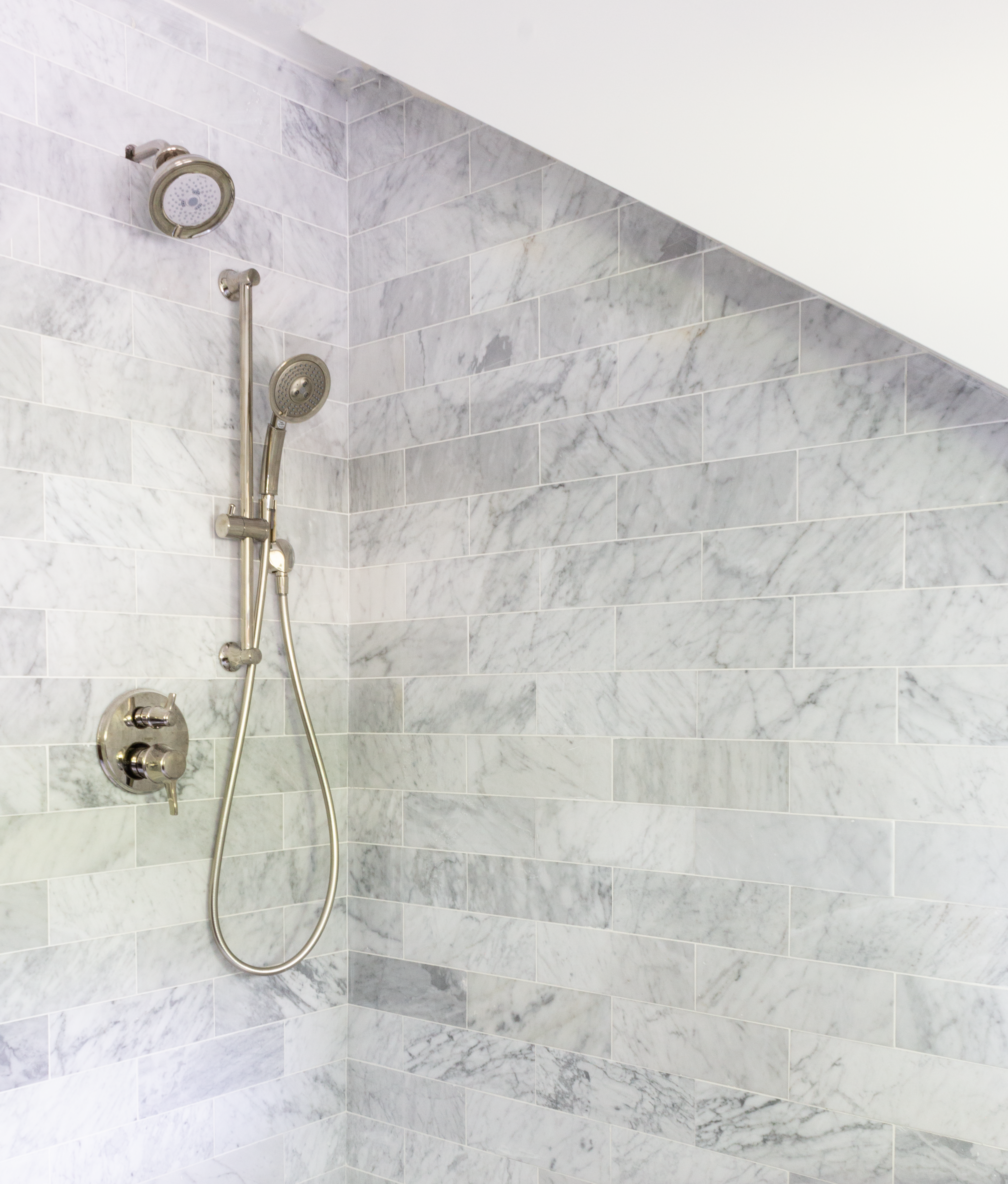
Onto tile, which was provided by The Tile Shop. We’re so happy with how our marble hexagon floors came out! We created a custom pattern by mixing two different types of marble – the Firenze Carrara and the Black Marquina Polished Marble (both 2″).

Amanda, the Columbus store contact we worked with, was so helpful in helping us choose tile that would allow us to execute our vision. We love that The Tile Shop has several different shapes and sizes of each type of stone, so it’s easy to know what’ll match and what won’t. We ordered the same type of marble that we used on the floors for the walls (Firenze Carrara). It’s f a n c y!
Hansgrohe and Axor provided the plumbing fixtures in our bathroom. They all have a polished nickel finish that is warm and classy and looks equally gorgeous against the wood vanity and the marble. The Montreux line is our favorite. The sink faucets we sourced are over a foot tall, leaving lots of room under for using the sink.
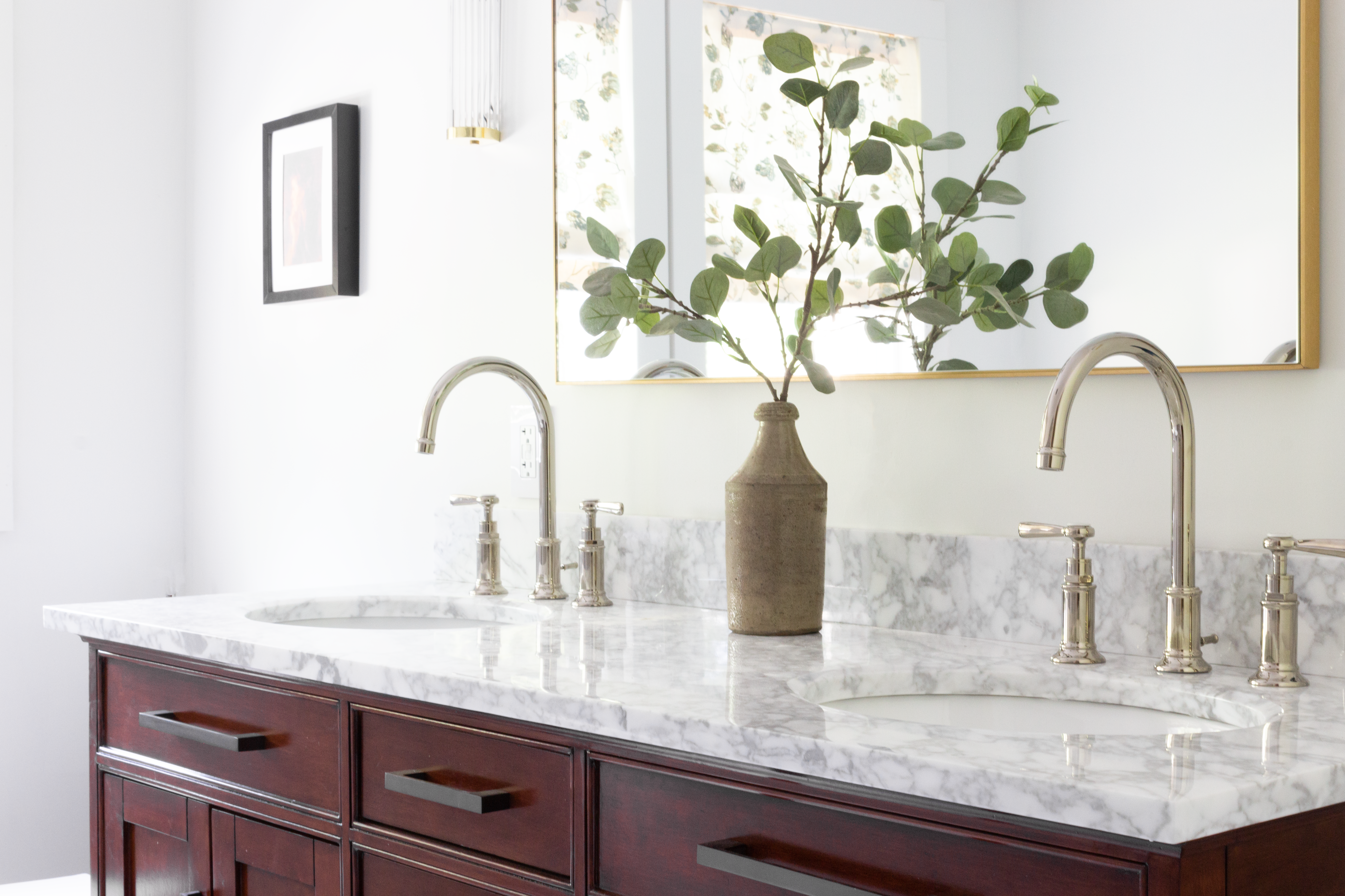
Does it get any better than these little hot & cold details?

We sourced the tub from Overstock. It’s 55″ long (5″ shorter than a standard tub), which we needed in order to fit a good sized shower next to it. I was a little nervous that it’d feel like a mini tub, but honestly, we can’t really tell it’s not full size. I love that it’s tall, too – almost 24″! Once shower glass gets installed, there will be some separation between the shower area and tub area.
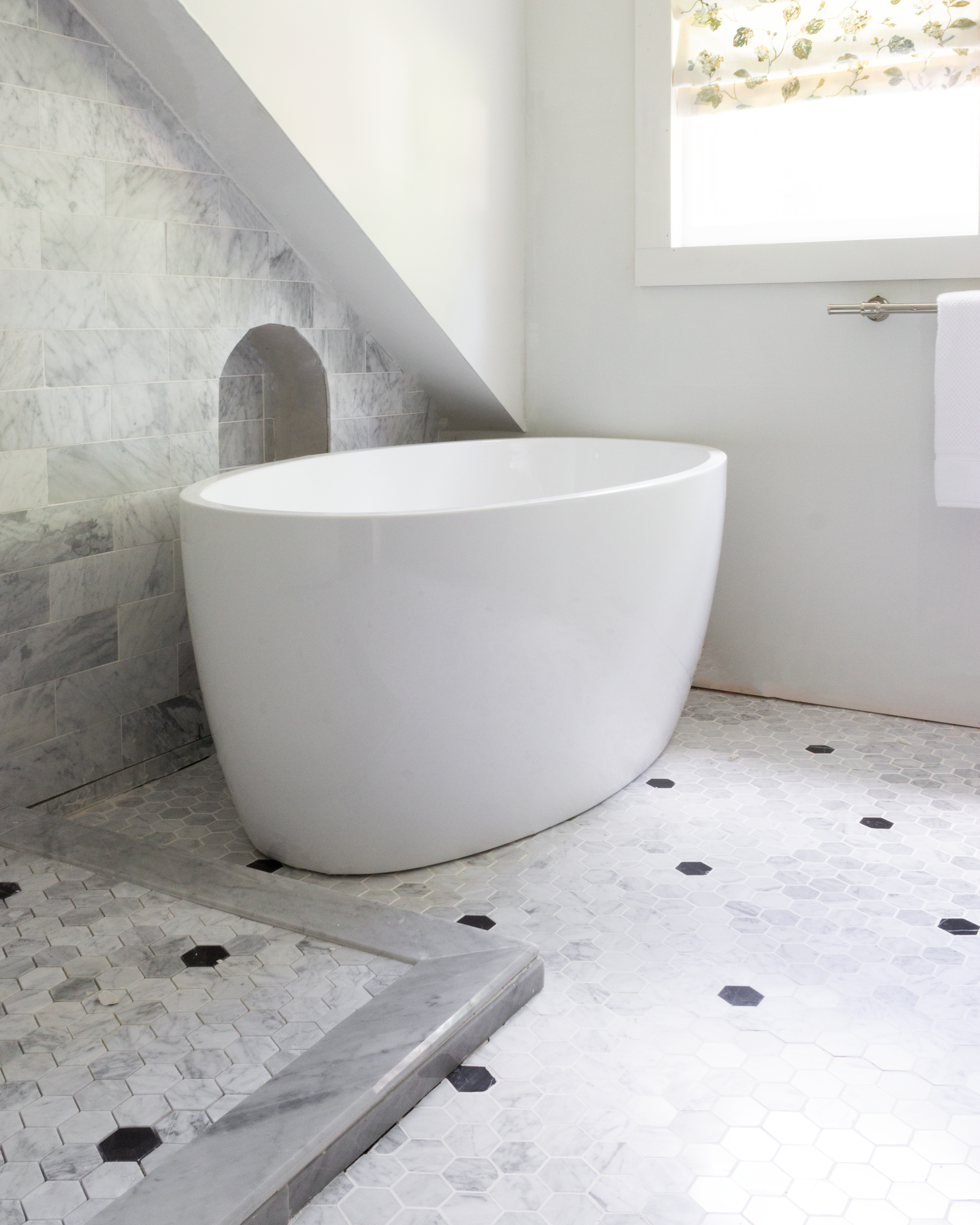
We had to make a change to our plumbing plans which impacted the tub filler we chose. We switched to the Axor Montreux Floor Mounted Tub Filler which is GORGEOUS, but haven’t installed it yet because of plumbing issues. It’ll go into that cute little arched alcove behind the tub. Can you seeeee it? 
We ordered fabric from the Trend line at Fabricut for the Roman shades. This design is called Niya Floral Mediterranean – it adds an elegant pop of color to the room among lots of neutrals. The fabric is beautiful and tip top quality!
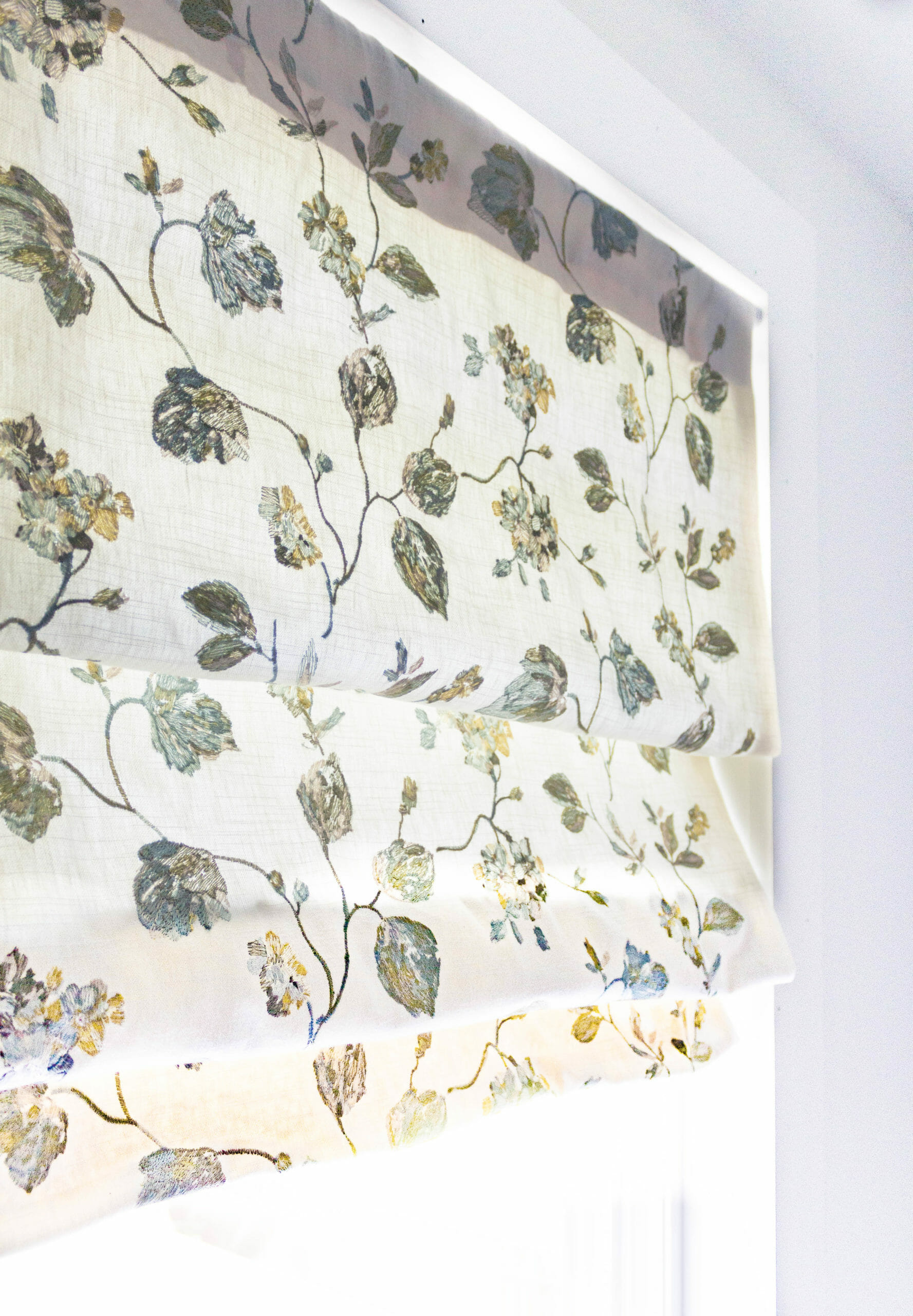
Here’s another angle. The texture is gorgeous.
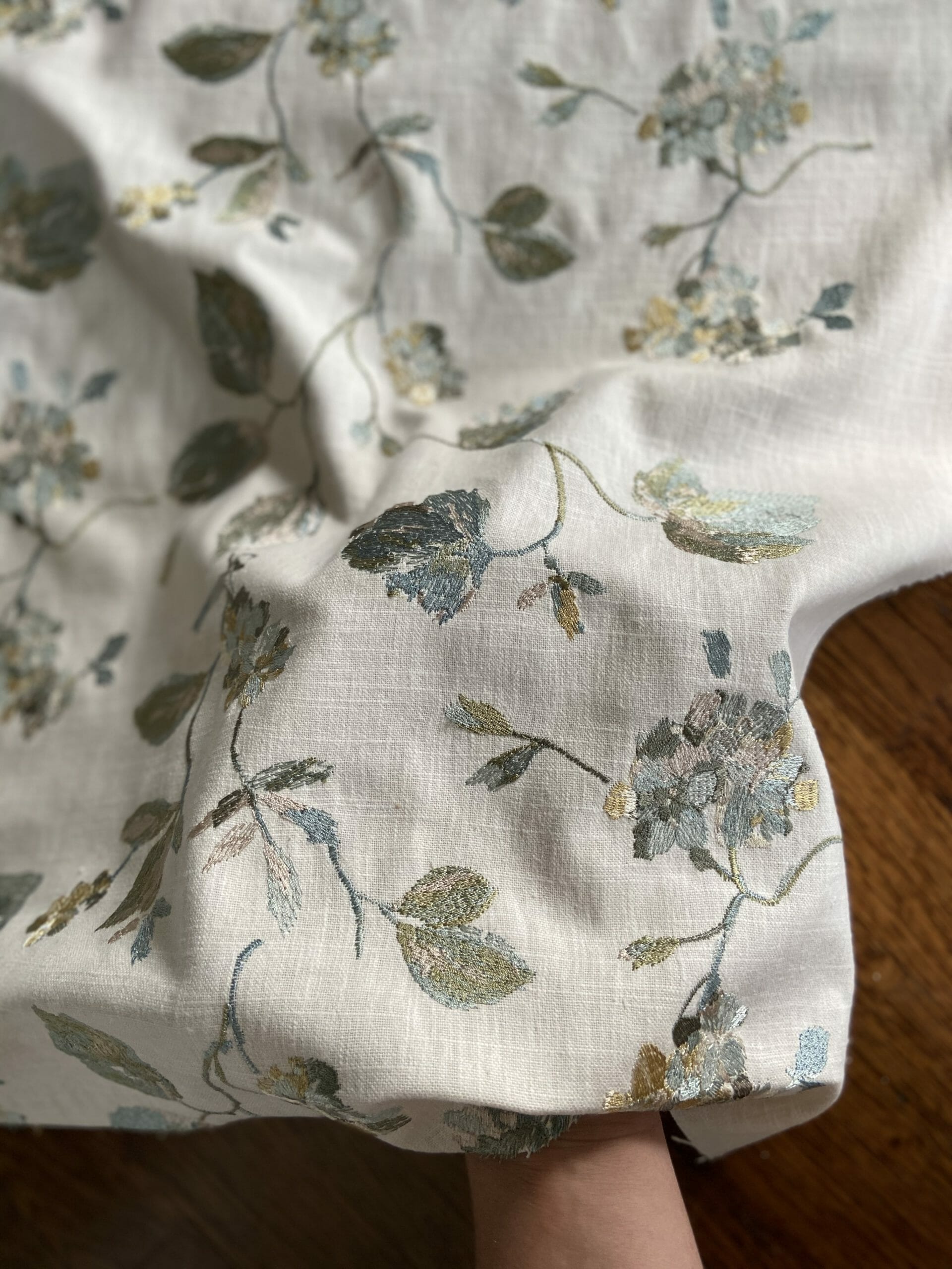
We’re having shower glass installed within the next few weeks and have some other loose ends to tie up in here before my parents move this summer. We’re planning on taking new photos once these last details are all done, so stay tuned. We can’t wait for my parents to see the space in person!
Bedroom
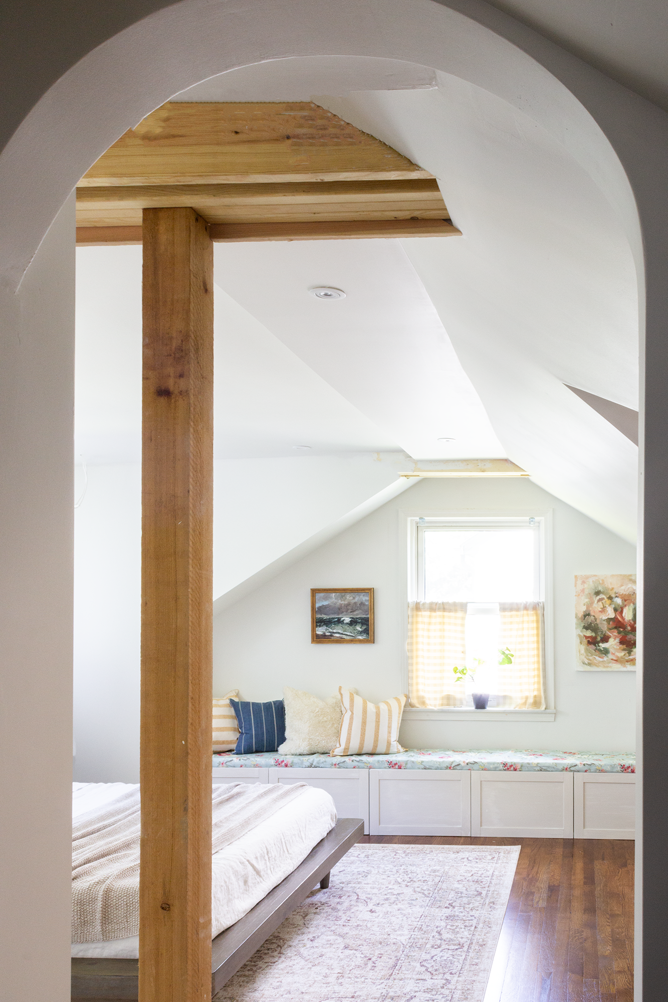
This second floor suite feels like it doubled in size with the added dormer, especially in the bedroom area. It’s incredibly comfortable and airy and cozy, and the natural light is perfect! We especially love this view through the new archways we added. Full disclosure: about half of our furniture is still on its way so we feel like this isn’t 100% finished, but we did our best to capture the new space and are excited to show off all of the goodies we received from our generous sponsors! Similar to the bathroom, we’ll be reshooting this space when the rest of our furniture arrives (hopefully within a few weeks!) and will update this post after.
This is the new view from the arched hallway looking into the bedroom.
Does your eye go straight to the art, too? The piece on the right is from Amy Lauren Studio, who we discovered on Instagram a few weeks ago. The palette in this piece is what we’ve been working with throughout the whole home! It felt like it was meant to be. Amy is a super talented artist based in Nashville and creates the most beautiful pieces! The piece on the left is from McGee and Co. – we borrowed it from our kitchen for this shoot.
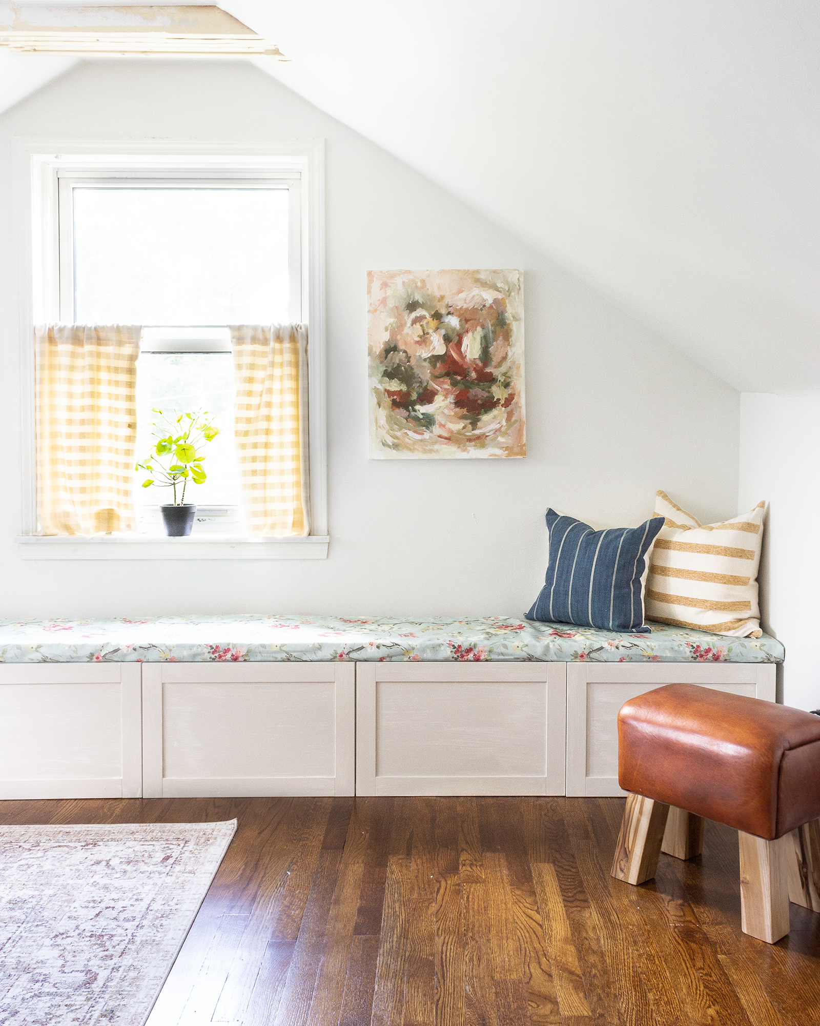
The little leather stool from Overstock is small enough to scoot around the room to use as a foot rest or extra seat by the bathtub during grandkids’ baths. It’s firm but comfortable!
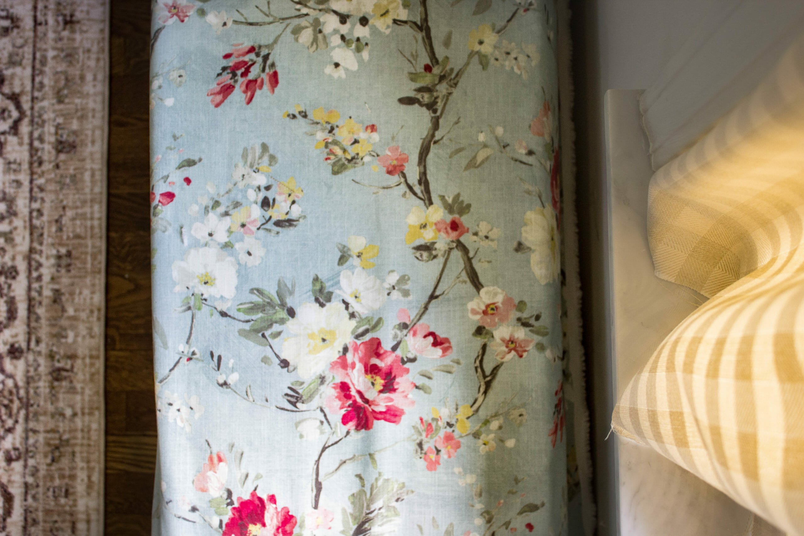
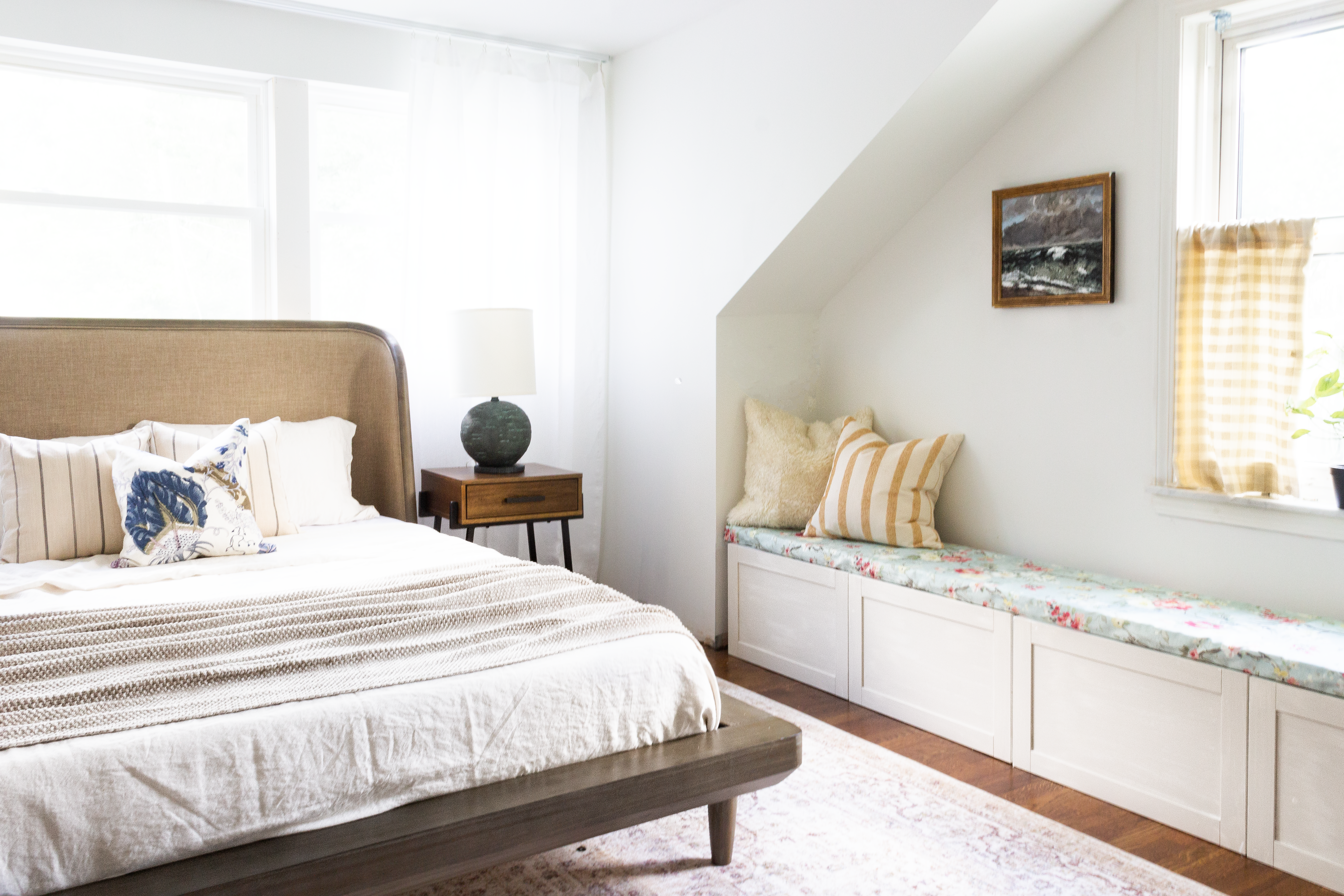
We used the Ikea Besta system to create a storage bench in the room. Each drawer is 24″ wide and will be convenient for storing extra blankets and bedding. The bench fabric is called Celestial from Fabricut and has the prettiest floral mix of yellows, greens, reds and blues. The curtain fabric is from Fabricut as well.
Brass knobs from Emtek are on their way to finish off the bench – we’ll share photos when they arrive!
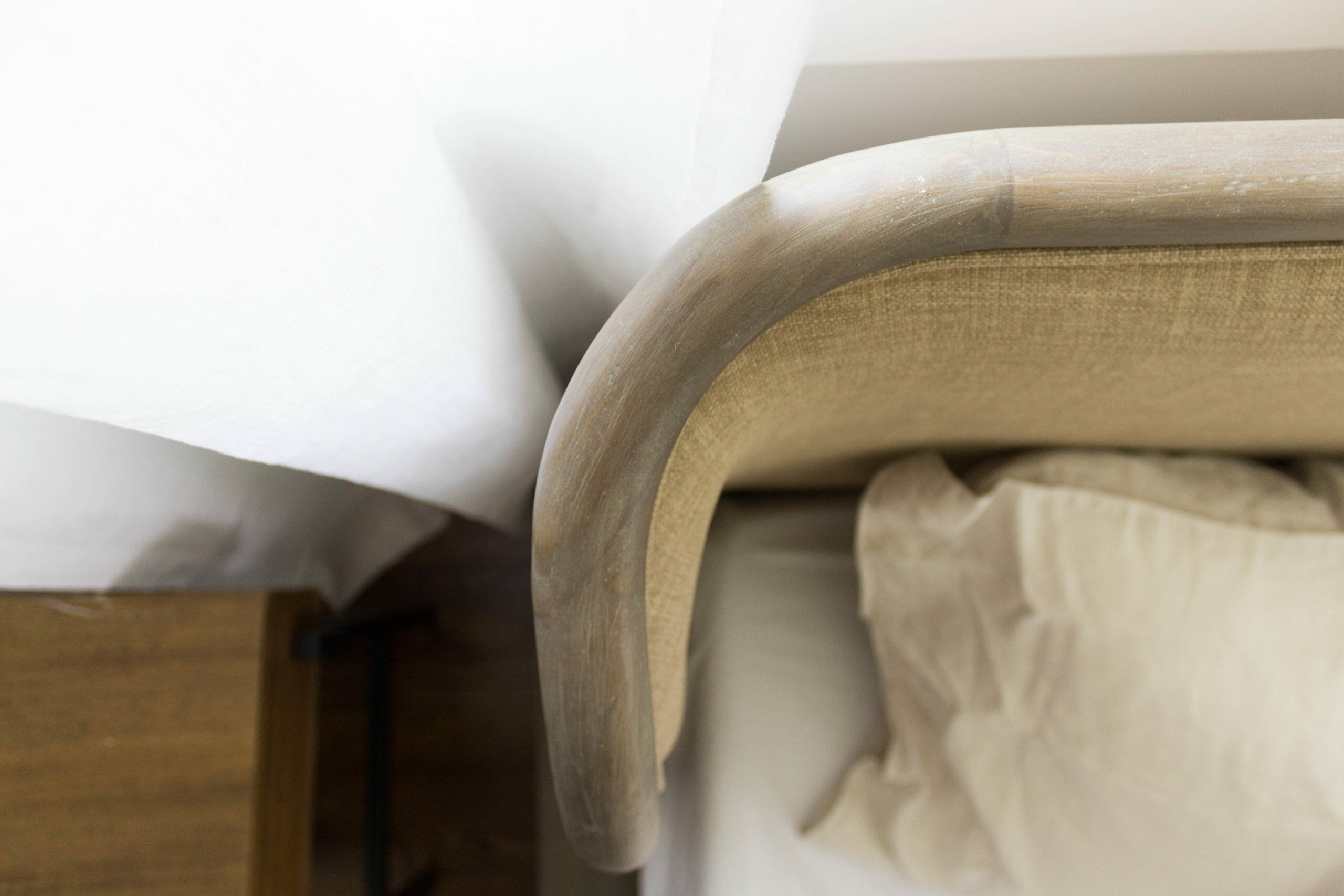
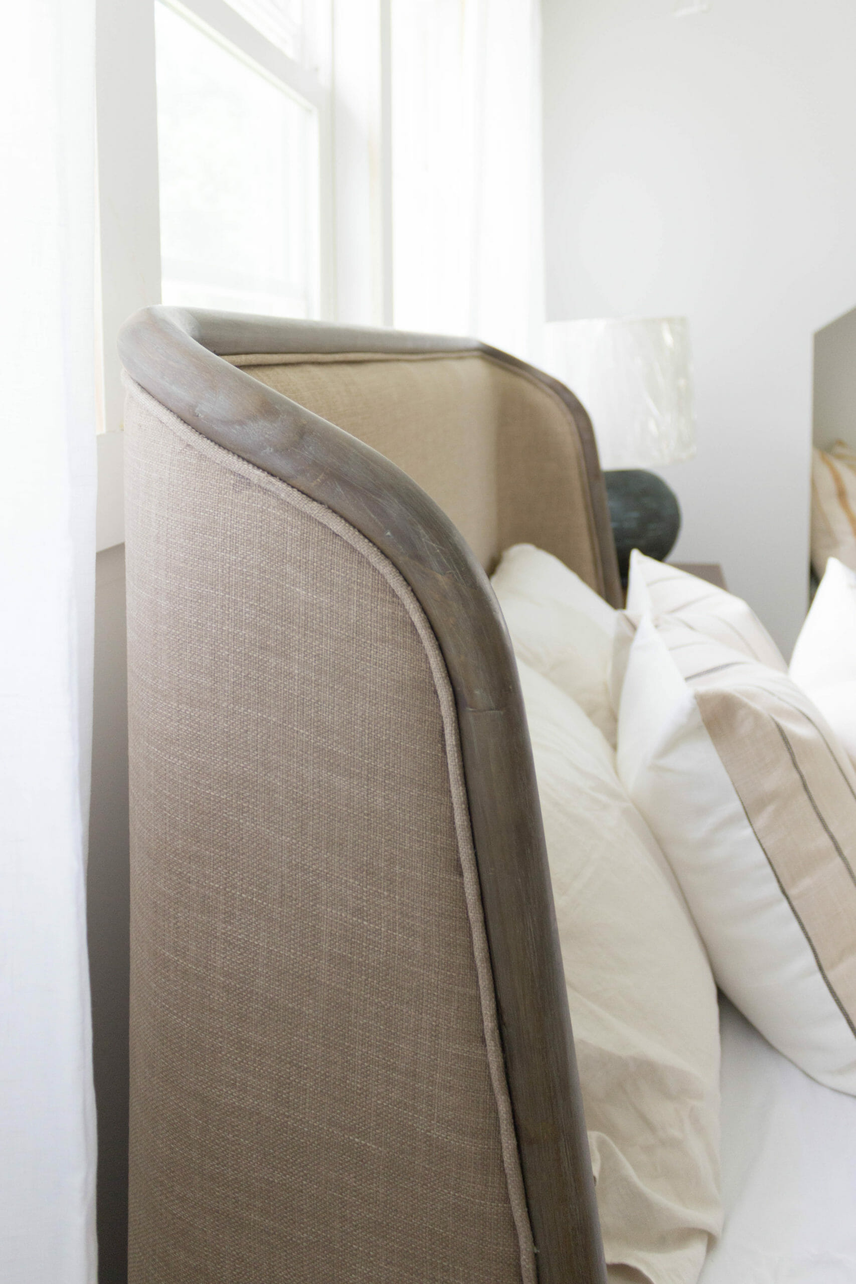
The bed from Apt2B is one of our favorite pieces. We love their organic, irregular shape and muted blue/green color. We ordered it pre-dormer because the height of the headboard would fit under the slope (it’s surprisingly difficult to find a headboard that’s under 48″ tall), but it actually works just as well now because it lines up with the bottom of the windows perfectly.
We love how the curve plays off of the other arches in the hallway and bathroom.
It’s just beautiful. We want one for ourselves!!
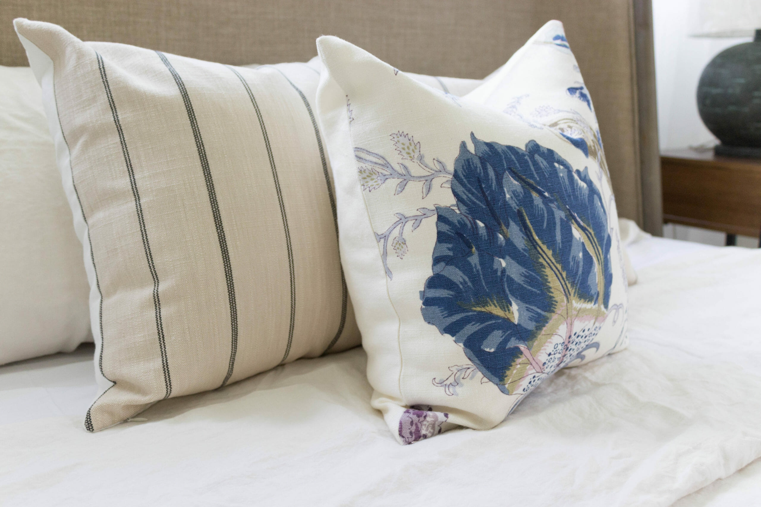
These pillow covers are from SWD Studio and are incredibly well made. We paired the Fritz Glacier with the Indian Arbre Hyacinth here, and used the Fritz Indigo on the bench. We used our favorite 20″ pillow insert from Ikea on these 18″ covers, which helps give them a fuller shape.
The table lamps from Troy Lighting. We LOVE their organic shape and muted blue/gray color. (Troy has several other table lamps that are similar to this one with lovely organic shapes and textures. Most were out of stock for our One Room Challenge timing, but we’ll be keeping an eye on them for future projects. Loving the whole line!)
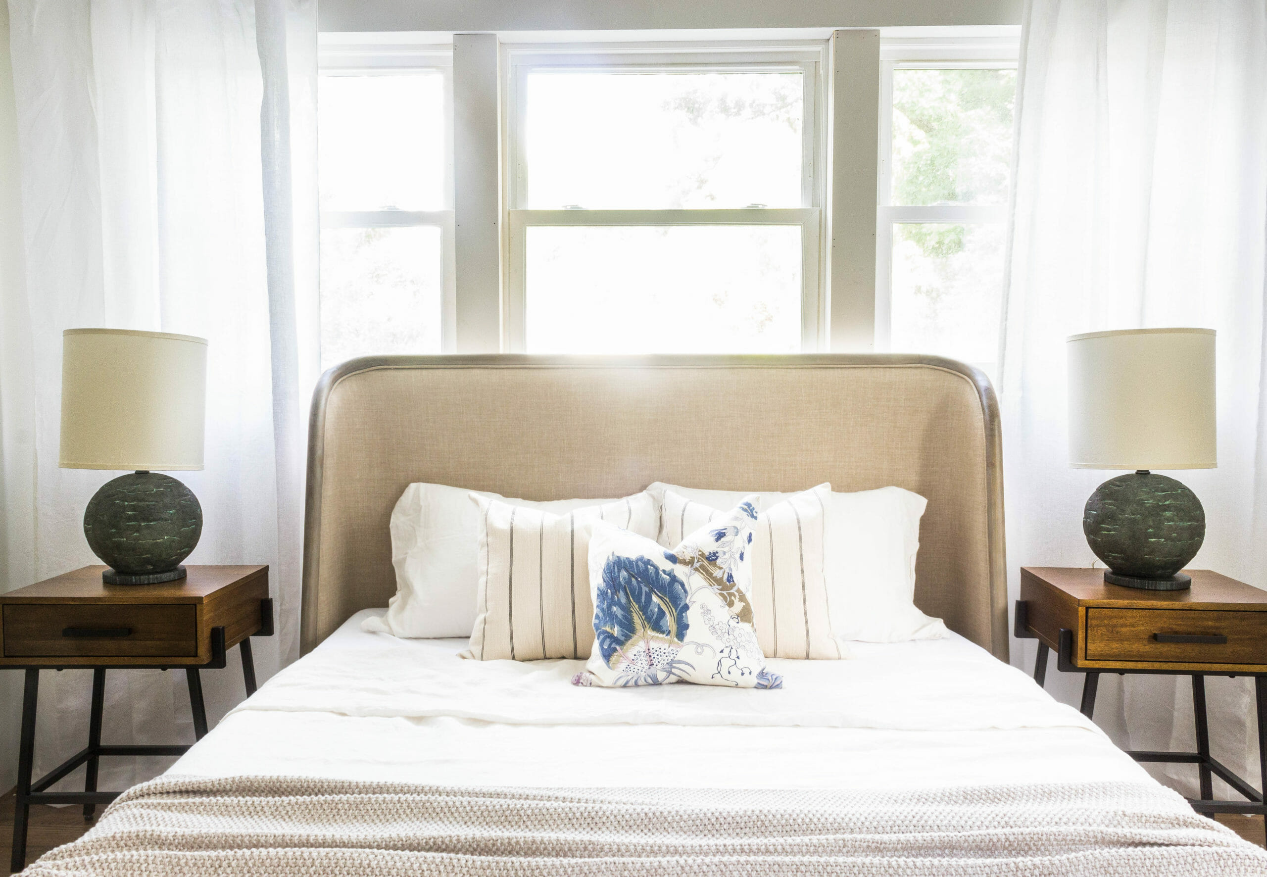
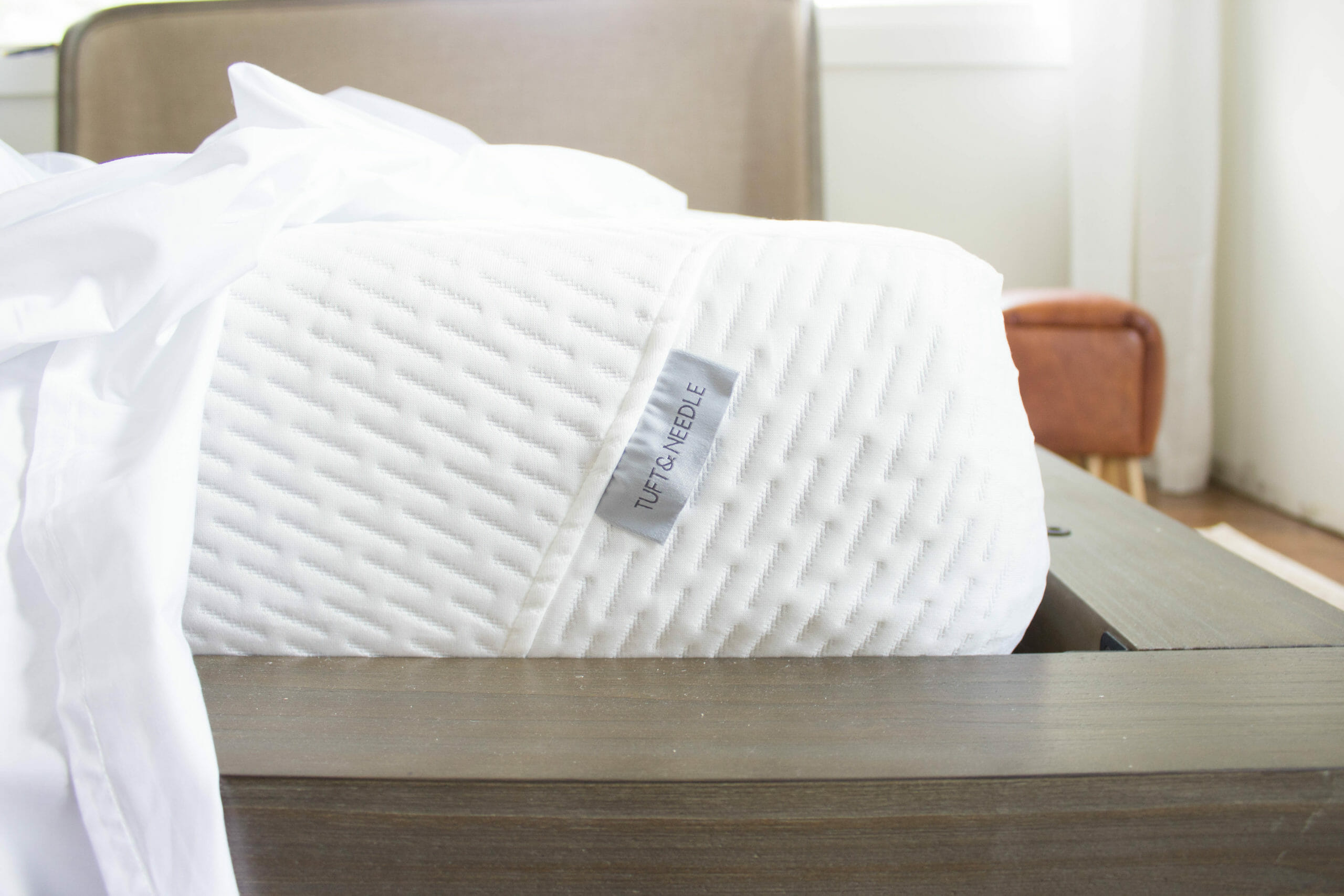
Onto bedding! The mattress, sheets, pillows and linen duvet cover are all from Tuft & Needle. We have their Original Mattress in our Pearl Airbnb rental and they are super comfy. For anyone who isn’t familiar, Tuft & Needle is one of the first memory foam mattress companies with over 20k reviews and really exceptional customer service (not just saying that – it’s true!) We’re big fans of memory foam mattresses because they’re affordable, comfortable, and easy to move into tight spaces because they come in a box. We knew to expect a comfy mattress, but weren’t sure what to expect with the rest of the bedding. Let’s just say we were blown away by the quality and know my parents are going to LOVE all of it!
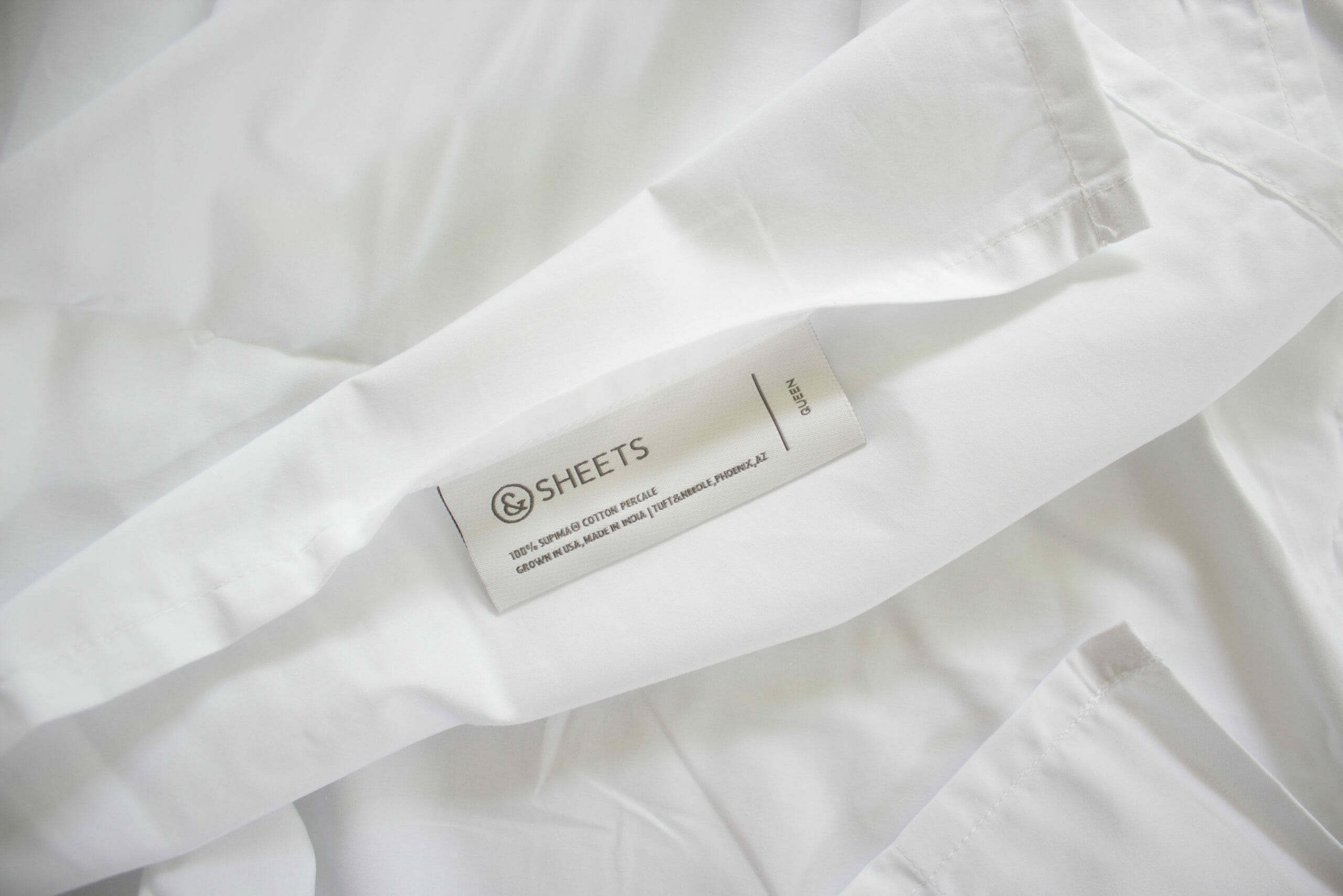
The sheets are percale cotton and are so soft and crisp. When buying sheets for ourselves and for our Airbnbs, we usually stick to 200-300 threadcount because we love the feeling of crisp, freshly washed cotton. Higher threadcount sheets tend to be more satiny and although many people loooove it, it’s not our jam. These ones are 215 threadcount, which is a great balance between breathability and softness. They’re softer than any other sheets we’ve felt with the same threadcount and will keep getting softer with each wash.
The linen duvet cover is soft and light, but so substantial at the same time. We opted for the Sand color for this space, which is the prettiest off white / light beige tone that adds just a bit of contrast to the white percale sheets. It would be perfect with a thin insert inside, but also feels like it can stand alone during the summer as more of a coverlet. We have a linen blend duvet cover at home, but are now 100% convinced that we need to buy a real one for ourselves because there’s a noticeable difference in texture. Linen is a bit of a splurge (you get what you pay for), but getting to sleep in this amazingness every night is worth every cent!
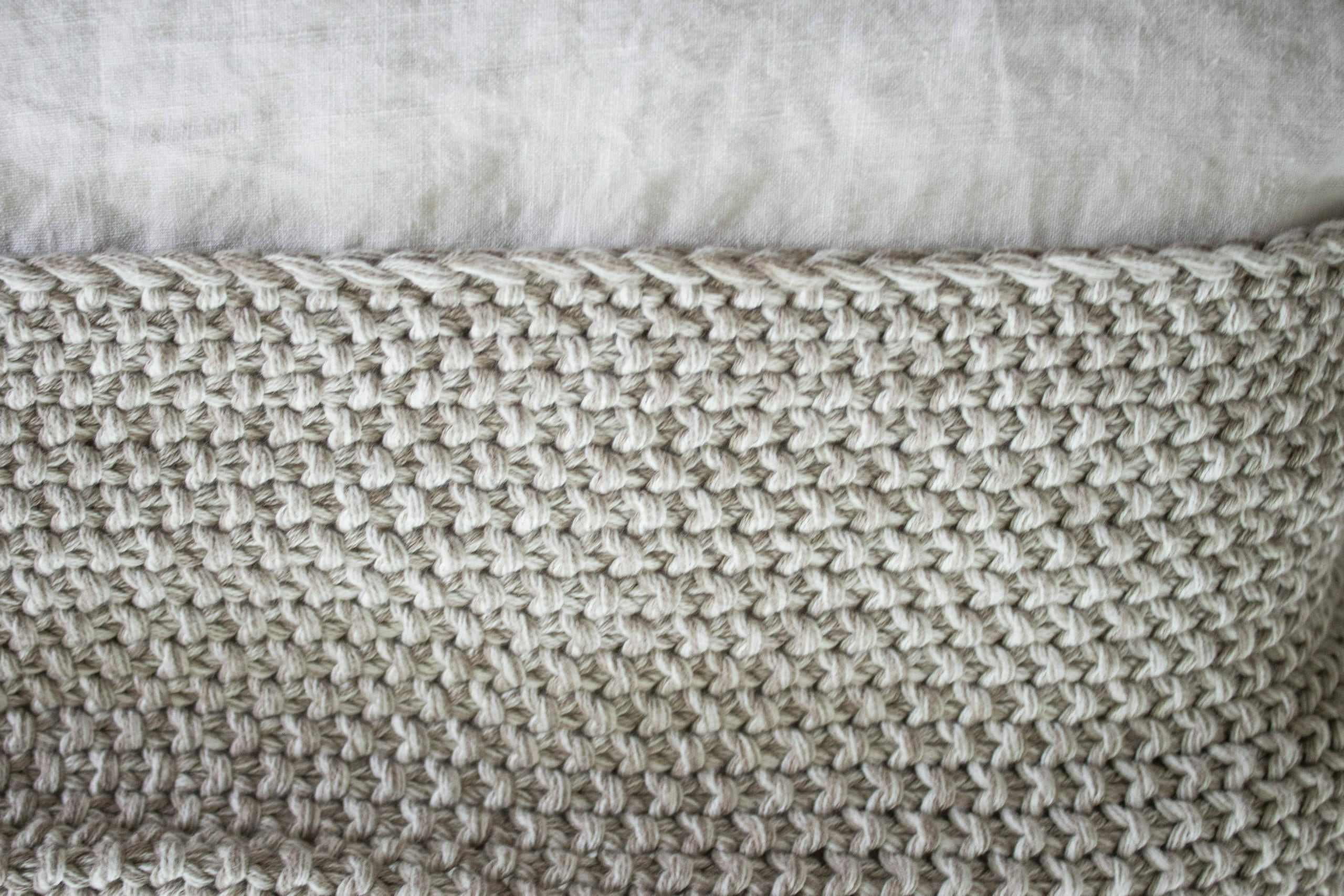
The knit throw draped at the foot of the bed is from Overstock. I love that it looks cozy but it’s actually cotton and can be used year round.
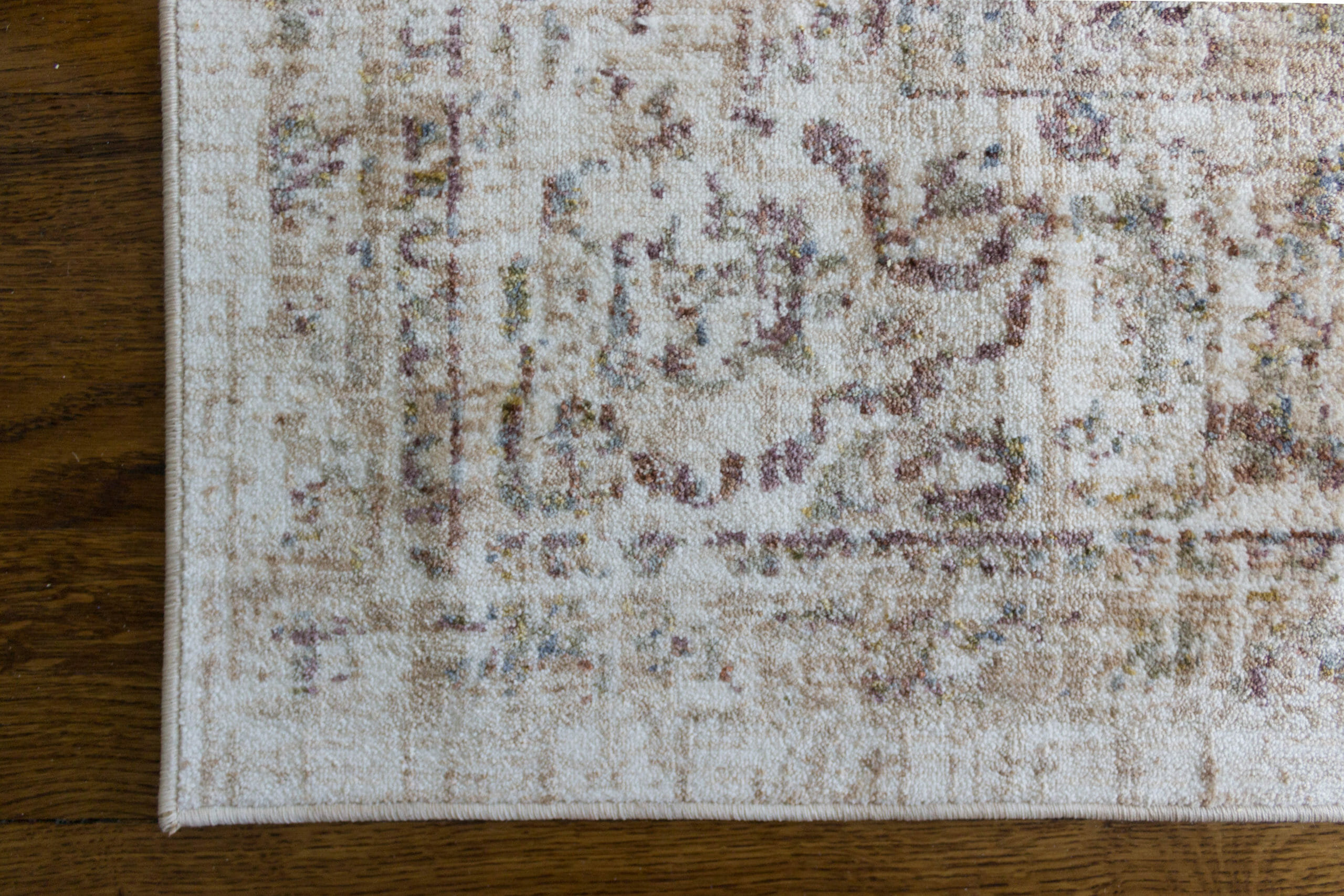
Loloi provided a beautiful rug from their Revere collection, which has a mix of cream and berry and hints of blue and green. It’s incredibly soft and the colors are perfect!
That’s all for now. What do you think? Thank you so much to Linda for inviting us back for the ORC. Have you checked out everyone else’s reveals yet? Here are all of the links!
A Glass of Bovino | Beth Diana Smith | Clark + Aldine | Coco & Jack | Deeply Southern Home | Design Maze | Dwell by Cheryl | Erika Ward | Home Made by Carmona | House of Hipsters | Hunted Interior | Kandrac & Kole | Kate Pearce | Katrina Blair | Liz Kamarul | Veneer Designs | Rambling Renovators | Renovation Husbands | Studio Plumb | Media BH&G

Okay, I had no idea how much the dormers would change the layout – holy tamoly! It looks great, especially the added light too 🙂
Thank you! It’s pretty incredible!
It’s a gorgeous space. Love it all.
Thanks so much Deb!
you guys did a FABULOUS job!!!
Thank you so much! YOU DID TOO!
Oh my goodness! What a gorgeous space! Such a stunning transformation!
Thank you Julie!
Congrats on creating an absolutely beautiful space!! The bathroom looks like spa heaven!!
Thanks Jamala for your kind words! <3
There are so many lovely and subtle details in the bathroom – like that arched bathtub niche and that gorgeous marble shower curb – that I just adore
Thank you for noticing these!!
Looks so good, guys! So much work! Way to go!
Thanks Haneen!
What a sweet renovation and to think your parents are the ones who will enjoy the fruits of your labor makes my heart so happy. Many congrats on all you’ve accomplished—and so beautifully in eight weeks!
Thank you so much Erika! We can’t wait for them to see it in person.
This is absolutely amazing! The dormers are definitely a game changer, and those arches are the perfect touch. It truly is unrecognizable from the before pictures – my goodness what the two of you can do to a space!
Thank you so much, Catherine! You’re so kind! It sure does feel great in here now… 😉
what a gorgeous space! love that built in bench!
Thank you so much!
Love this!! Do you mind sharing what ceiling track you used for the curtains behind the bed?
Sure – here you go: Ceiling Track Link. We have used it in a few projects now & really like it.
What an incredible transformation! The dormers make such a difference and I am head over heels for that bathroom. Beautiful job!
Thanks Stephanie!
Hi there. This turned out amazing. Have you (or can you) share what the roofline looks like before and after? Neighbors did a dormer near us and it looks like a prison from the outside now.
[…] months ago, we revealed our One Room Challenge space to the world. Since then, we’ve finished for real and have a whole new batch of […]