It’s Week 4 already, and time is flying. It’s hard to believe that this time 2 weeks from now, we’ll be sharing our FINISHED living & dining spaces!! If you missed our previous ORC posts, you can catch up here:
We are definitely going to be cutting it verrry close on this one because we ( = I) were late in getting our orders finalized. But, we did it. Here’s what we chose.
Paint & Wallpaper
Dark trim + white walls in both rooms, and wallpaper in the dining room. We chose Farrow & Ball Railings (No. 31) for trim, which is a really pretty greyish/blueish/ off-black. We went with a creamy white called Wimborne White (No. 239) for the walls, and Brocade (BP03) for wallpaper.


Our plan is to install the wallpaper on the bottom half of the wall in the dining room instead of the top. There’s 2 reasons for that:
1- The staircase cuts into part of 2 of the walls, which creates some interesting ceiling lines that we don’t really want to highlight. Wallpapering the bottom allows us to paint the walls & ceiling above the wallpaper white so it all blends together seamlessly.
2- We like the way the art we chose looks against a solid wall color vs pattern.
Here’s what the living room looks like after 1 coat of paint. Progress!!
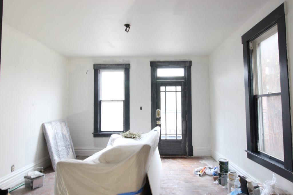
We decided to keep the stone on the fireplace because we were afraid demoing it might create more work than we have time for. Our compromise is to paint it & fill in all of the cracks to give it a subtle, monotone texture that blends in with the walls. This way, the mantel is highlighted instead of the stone.
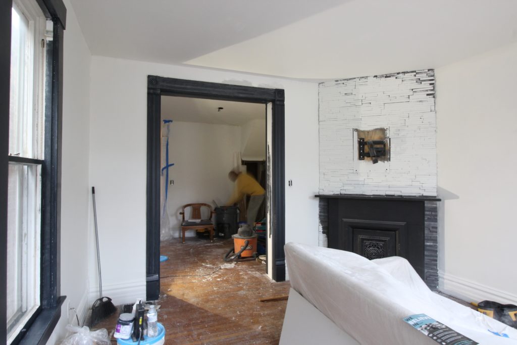
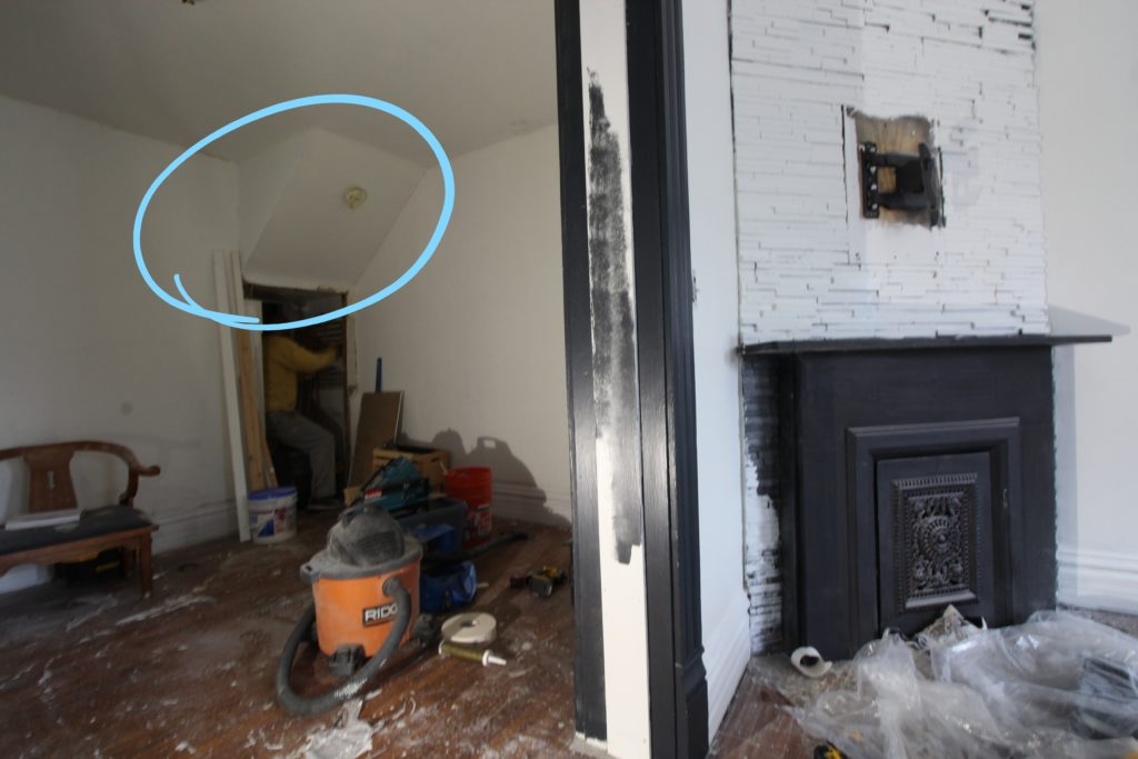
Here’s a reminder of what the dining room ceiling looks like on the left. I caught Bryan in action patching more drywall in the basement 😉
Trim
We started installing our Metrie panel molding in the living room, and weren’t sure whether to do three rectangles or two. We layed them against the wall to try to get a feel for what each option would be like. Here it was with 3…
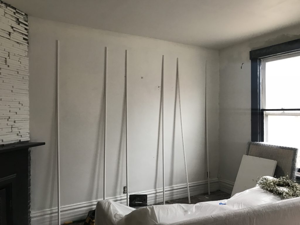
And with 2.
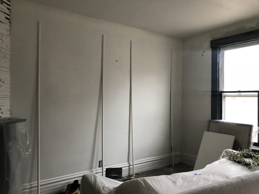
We decided to do 3 — it felt like it filled the space better. To get the right measurements, we took the entire wall length (130″), subtracted all of the spaces (40″ – 10″ space btwn. fireplace + rectangle 1, 10″ btwn. rectangles 1+2, 10″ btwn. 2+3, and 10″ btwn rectangle 3 + the right corner), and then divided the remainder by the # of triangles we wanted. 130 – 40 = 90 / 3 = 30″ wide per rectangle.
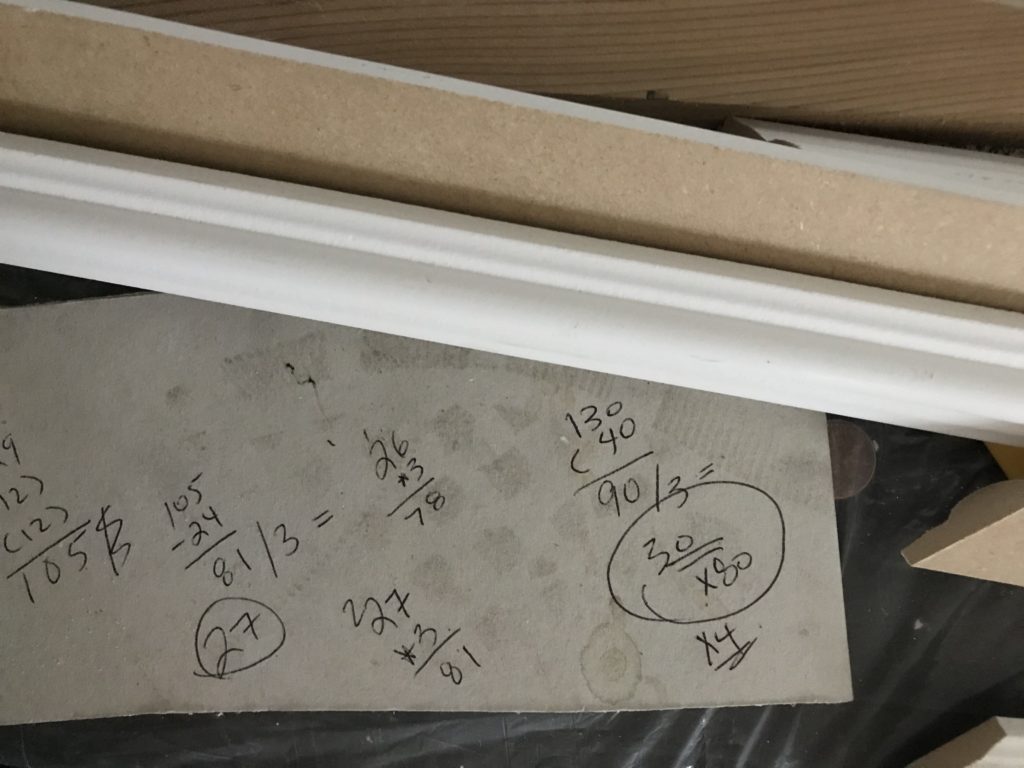
Like this…
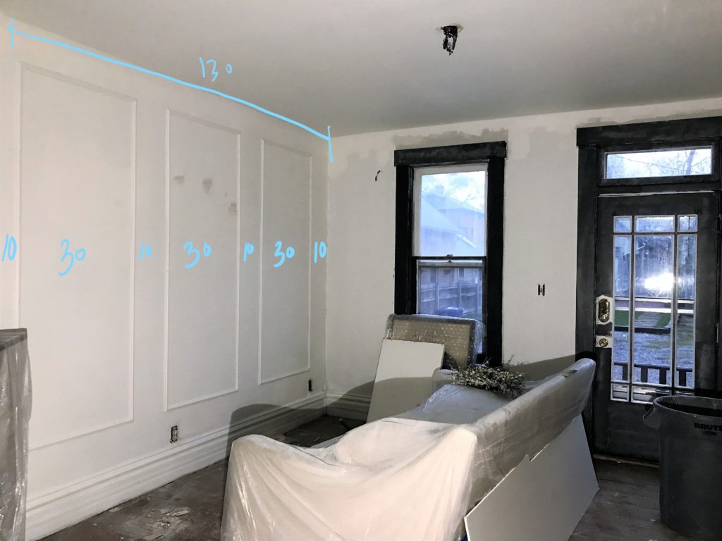
As for the height, we decided to mirror it to the window, which was about 80″ tall.
FURNITURE
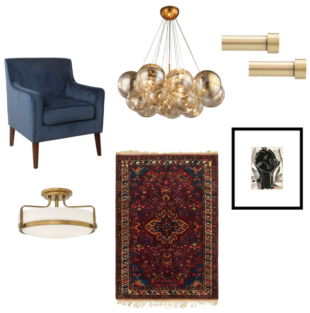
We shared mood boards for our decor in our Week 3 post, but are making some changes. We chose a rug from eSaleRugs, which is a company we learned about through the One Room Challenge. They have so many wonderful rug options at affordable prices. We’re excited to see what it’ll look like with the white walls & dark trim! We also chose mid-century blue velvet accent chairs from HomePop, a fun art print from the new Chairish print shop, a light fixture for the living room, and chandelier for the dining room (which I am SO EXCITED ABOUT) — both from Bellacor.
We’re also leaning toward purchasing this dining table — it has a deco vibe that could be really great in the space. Also, the size is perfect! We’ll update you next week on whether we go for it or not.
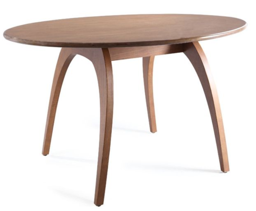
We’re expecting to receive lots of goodies this week & can’t wait to share it all with you! Before our next post, our goal is to start installing our new Tecwood floors from Mohawk, finish our trim install, and finish painting & installing our wallpaper. So much to do, so little time, but we are SO thankful for this opportunity. It’s encouraging to be included with such a talented bunch of designers — it kind of feels like we’re on a team and gives us the accountability we need to get this project finished (3 years later!). Be sure to check out the other designers’ progress & see what they’re up to — everyone is linked below.
Apartment 34 | Coco & Jack | The English Room | The Gold Hive
Gray Malin | Jenna Sue Design | Jojotastic | Kelly Rogers Int. | Linda Holt | Marcus Design
Michelle Gage | Natasha Habermann | The Painted House | Rambling Renovators
Sacramento Street | Shannon Claire | Sketch 42 | Stephanie Kraus | Bisou Style
Media Partner House Beautiful | TM by ORC

you’ve done so much!! and that black trim is calling my name… sooooo pretty.
thank you!! it’s going to be a mad rush to the finish line but it’ll be so nice to have the space done.
[…] 34 | Beginning in the Middle | Coco & Jack | The English Room | The Gold […]
[…] 34 | Beginning in the Middle | Coco & Jack | The English Room | The Gold […]
[…] 34 | Beginning in the Middle | Coco & Jack | The English Room | The Gold […]
[…] 34 | Beginning in the Middle | Coco & Jack | The English Room | The Gold […]