If you’re new to BITM, welcome! We’re Catherine & Bryan Williamson, a husband-wife design team based in Columbus, OH. We invest in real estate, own an interior design studio, and have a couple of Airbnb rentals. We share it all on our blog & Instagram. You can find out more about our story here, the big Victorian home we’re restoring here, and our interior design studio here!
Last week, we announced that we were participating in the One Room Challenge along with 19 other talented designers. We’re tackling the living & dining room at Pearl duplex and are so excited about it because it’s been a neglected space in our home for over 2 years!! If you missed the first post, you can catch up here.
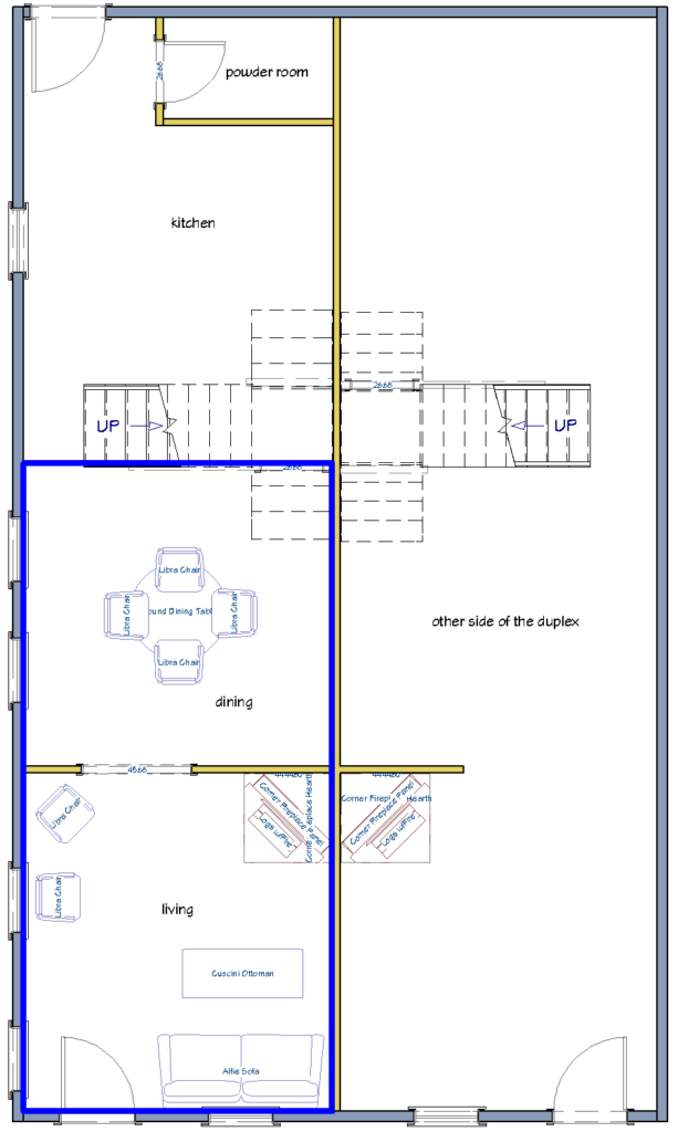
Here is the floorplan of the duplex we’re living in (we’re on the left side), and the blue highlighted area is the living/dining space we’re working on for the challenge.
PROGRESS
Since last week, we made major progress clearing out all of the stuff we had been storing in both rooms. The best thing we found while clearing stuff out was old photos of Bryan when he was little. He was so cute!!

This is what the living room looks like now. The plan is to remove all of the ledger stone from the fireplace wall, but keep the mantel in place.
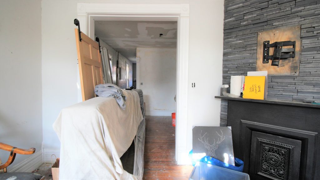
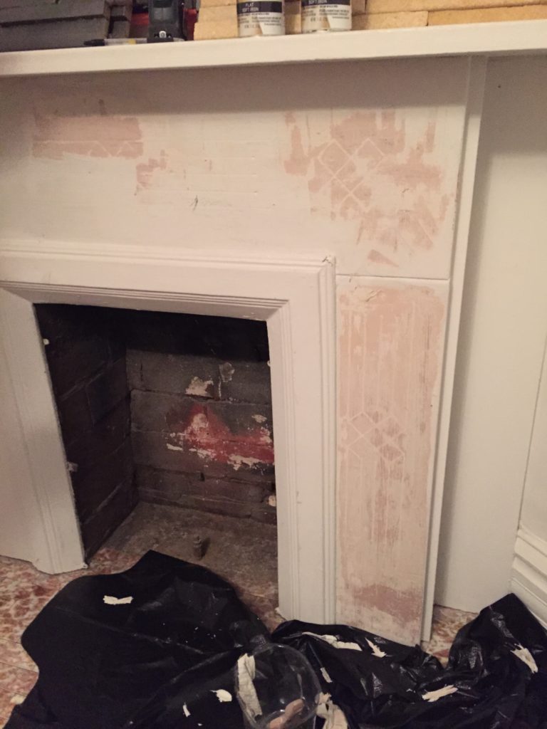
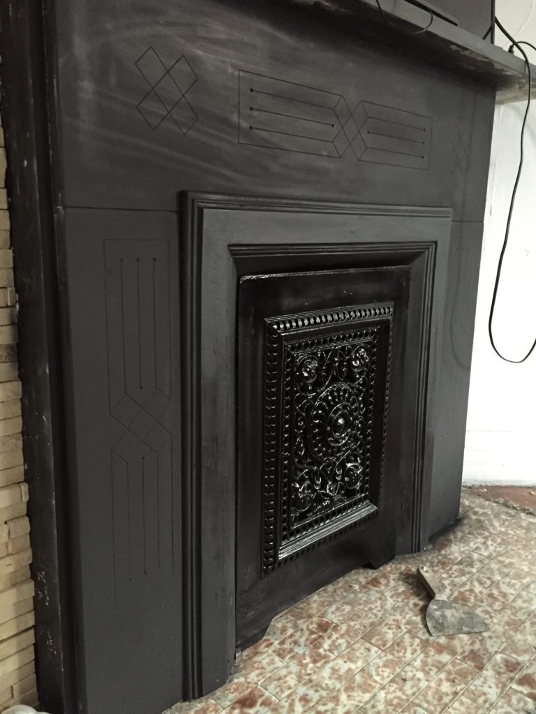
The duplex was built around 1900 and the mantel is original. We previously stripped all of the white paint off of it & love the way it is now.
The natural light in the living room is amazing, especially in the morning because the house is east facing. It’s one of our favorite things about this space.
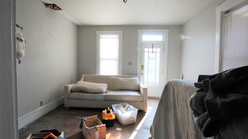
As for the dining room… our biggest challenge in the dining room will be to figure out a way to add a hidden door into the basement. It looks like a hobbit door in this photo but it’s really about 6′ tall. We’ll be making something custom, but what and how is still up in the air 🙂
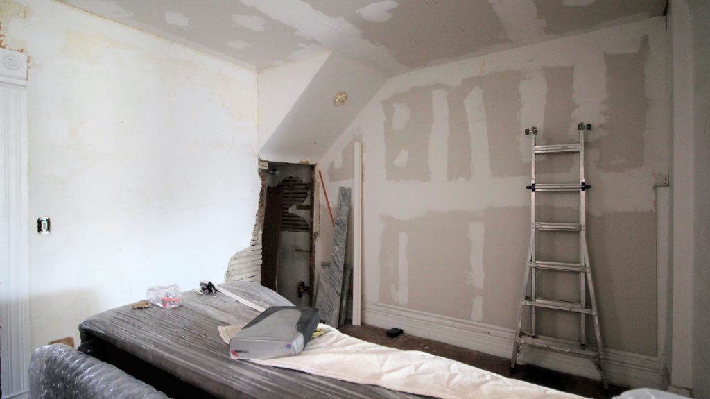
MOLDING plans
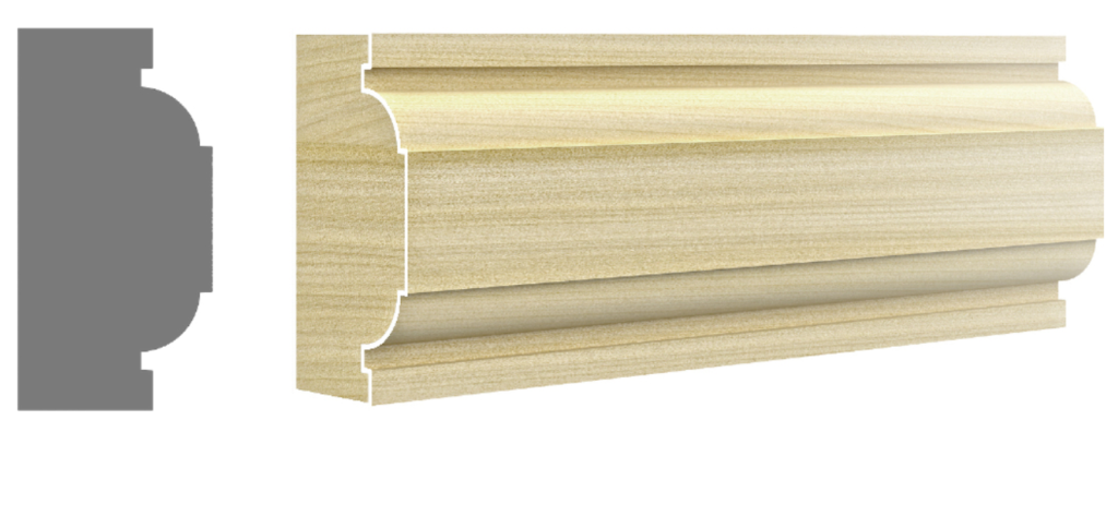
We are using Metrie molding, which is going to make a huge impact on the space. We worked with Metrie before on The Vic (stay tuned for those photos – it’s going to be goooood), and are really excited to be working with them again on our Pearl space. We chose to go with the Fashion Forward line this time, which has a fun twist on classic panel molding.

FLOORing plans
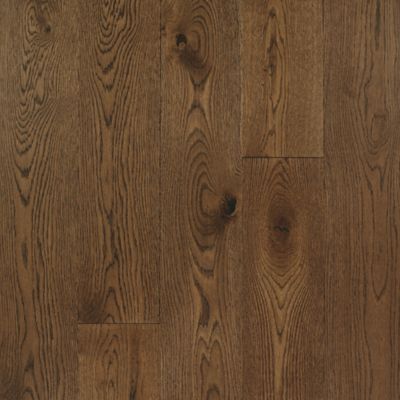
For the floors, we’re working with Mohawk to lay new TecWood engineered hardwood floors in both spaces. We chose the Midtown Oak color as part of the Metropolitan Collection — we love that it looks close to what might have been there originally, and what’s in the rest of the home. We’re opting to do nail-down installation (vs floating) because we’ve found that nail-down feels more sturdy.
FIREPLACE HEARTH tile
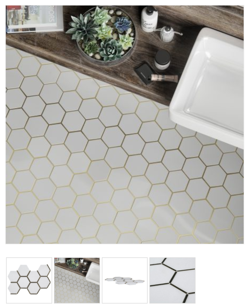
We chose an amazing Jeffrey Court mosaic tile for the fireplace hearth. It’s called Laurel Brass. Guys, it has brass in it. Need I say more??
Wall plans
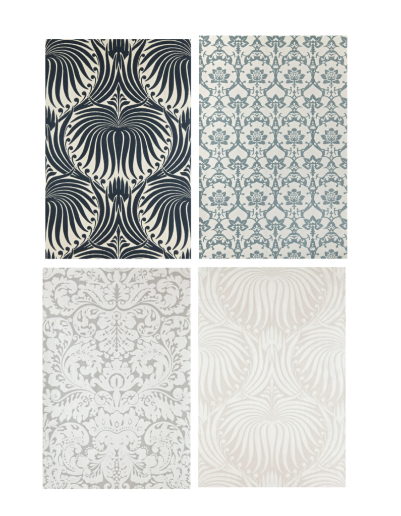
For paint & wallpaper, we’re going to be working with Farrow & Ball. We’ve been admiring their wallpapers & paint colors for years and are so excited to install it. We’re leaning toward one of these, which are all different but SO BEAUTIFUL. It’s going to be hard to choose just one!
Also, wallpaper sidenote, this photo is stunning & makes me want to go bold. This one is Hegemone BP 5705. What do you think?

Farrow & Ball has suggested paint colors on their website that coordinate with each wallpaper, so we’ll let you know which ones we choose next week.
what’s next?
Next up, after we clear the rest of the furniture & other stuff out, we’ll demo the fireplace ledger stone (not the mantel!) and finish all of the drywall so we have a smooth surface to work with. Then we’ll paint & start installing molding! We’ll be back next week with mood boards & other furniture/decor selections. Can’t wait!
Check out everyone else’s Week 2 progress here. There are some amazing transformations happening!!
Apartment 34 | Beginning in the Middle | Coco & Jack | The English Room | The Gold Hive
Gray Malin | Jenna Sue Design | Jojotastic | Kelly Rogers Int. | Linda Holt | Marcus Design
Michelle Gage | Natasha Habermann | The Painted House | Rambling Renovators
Sacramento Street | Shannon Claire | Sketch 42 | Stephanie Kraus | Style Me Pretty Living
Media Partner House Beautiful | TM by ORC

That mantel is what dreams are made of! And finding that picture of ‘lil Bryan is too cute. I removed some door casing during my ORC this week and hoped to find treasures in the wall. Alas, just plaster!
Thanks lady!! I know, the pic was my fave part ☺️ I’m looking fwd to checking out your Week 2 post today too!
I love how it’s coming… but that childhood photo!! Love that even more 😉
Right?! You and me both ????
Man I saw that tile in person and I was in love! Can’t wait to see it in your space. Gold for the win.
That’s so great to hear!!
I loVe that tile with the brass in it for the fireplace!! And really excited to see how the hidden door ends up coming together. 🙂
Thanks Rachel! We can’t wait to see what it looks like in person!
I LOVE the wallpaper in the top left corner. I was just looking at it on their website last week. I hope you pick that one because I would love to see it in a room. I’m excitd to see how it turns out!
Thanks Kristen! It’s one of our faves.
I just found your blog thanks to One Room Challenge and look forward to reading it all. Just fyi, however, when I go to “reader view” (which I find really helpful) it only goes to “About Us” regardless of which post I’m trying to read.
Thanks for letting us know, Nancy! We’re happy to have you along for the ride.
[…] 34 | Beginning in the Middle | Coco & Jack | The English Room | The Gold […]
[…] 34 | Beginning in the Middle | Coco & Jack | The English Room | The Gold […]
Can’t wait to see how it progresses! I think your original hearth tile is Rookwood. Think about salvaging them when you demo and sell to a Rookwood enthusiast!
Please dish on how you restored your slate mantels. I have been using citristrip on ours and it is taking FOREVER.
[…] 34 | Beginning in the Middle | Coco & Jack | The English Room | The Gold […]