We just wrapped up a fun dining room design project for our sweet clients who recently purchased a new home. They had very little furniture & decor coming from their prior apartment and were looking for help making their new house feel cohesive and homey. Their dining room was the space that needed the most help, so they hired us to design it. After seeing the space, we couldn’t wait to get started!
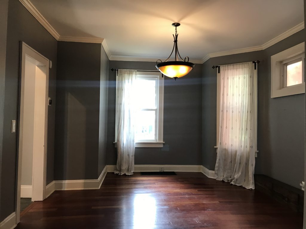
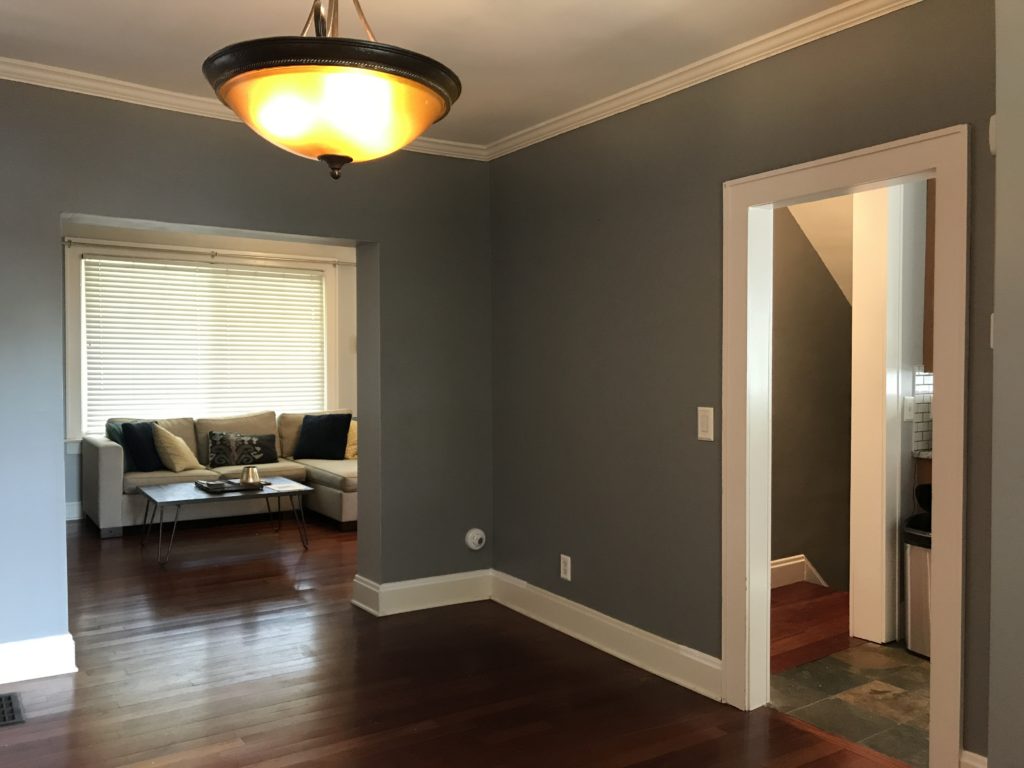
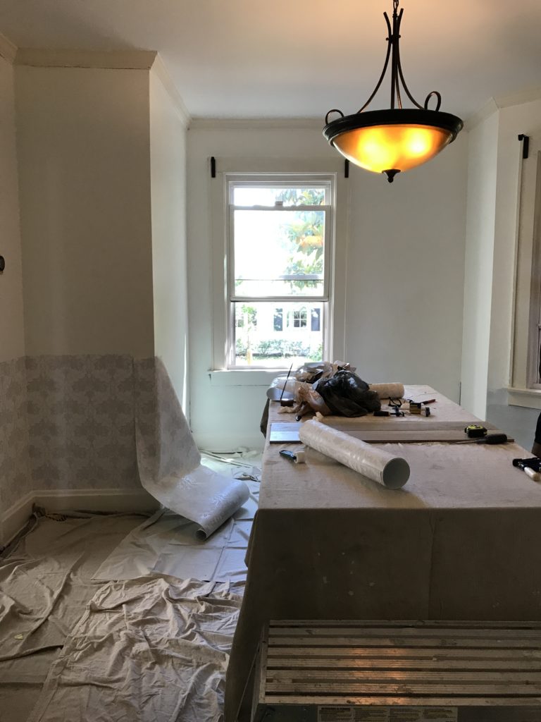
Here are a few before photos. This one is looking into the dining room from the living room. The doorway on the left leads to the kitchen.
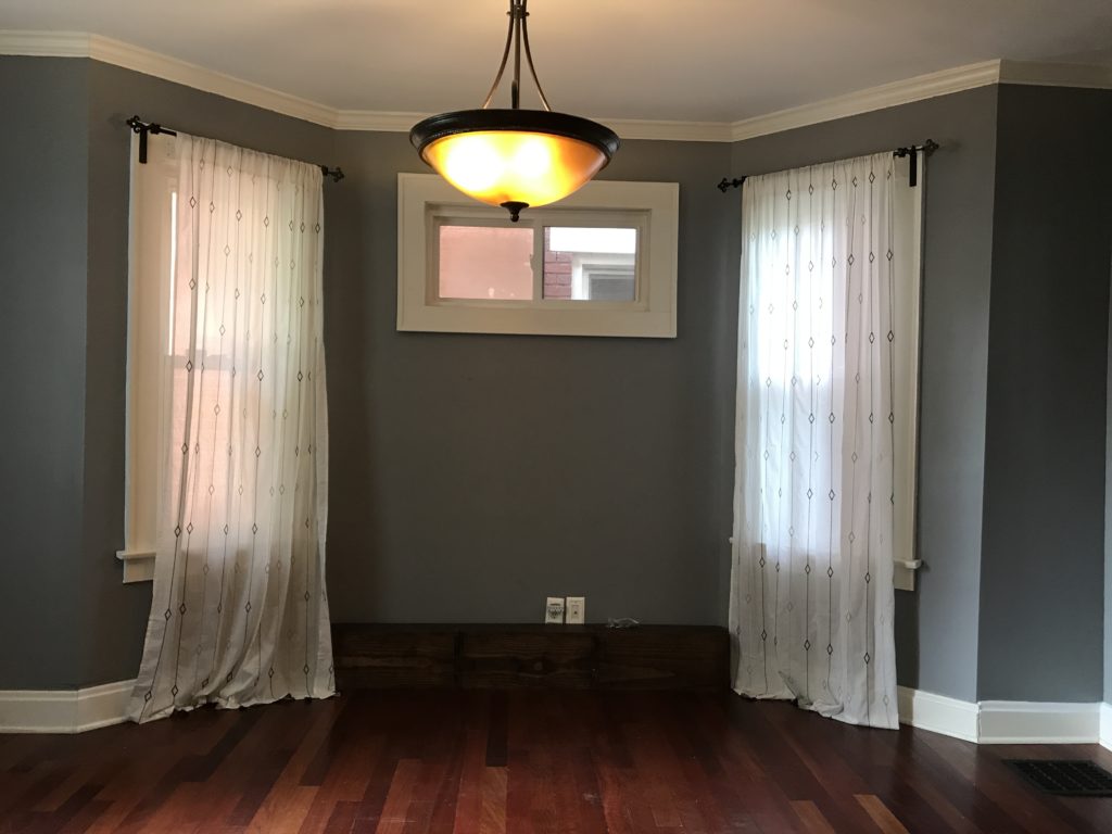
Here’s the right side of the room.
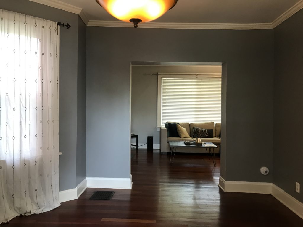
Here’s the view from the dining room looking into the living room.
We started by taking measurements, walking through Pinterest boards and inspiration photos, discussing likes/dislikes, and talking budget. Based on all of this information, we created a mood board of textures and products that we envisioned working well together, as well as some 3D renderings of our clients’ future space.
In this design, we incorporated a mix of industrial and midcentury modern elements with pops of color. We wanted the space to feel light and fun, yet classic because the house is over 100 yrs old. We incorporated neutral wallpaper on the bottom 3′ of the walls capped with a chair rail, white walls and dark windows, and a faux brick accent wall on the side of the room.
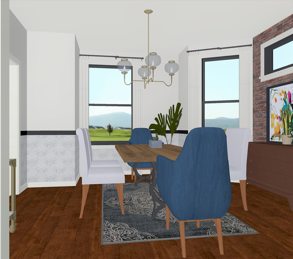
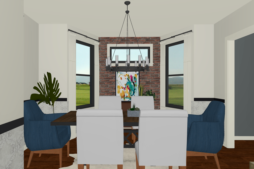
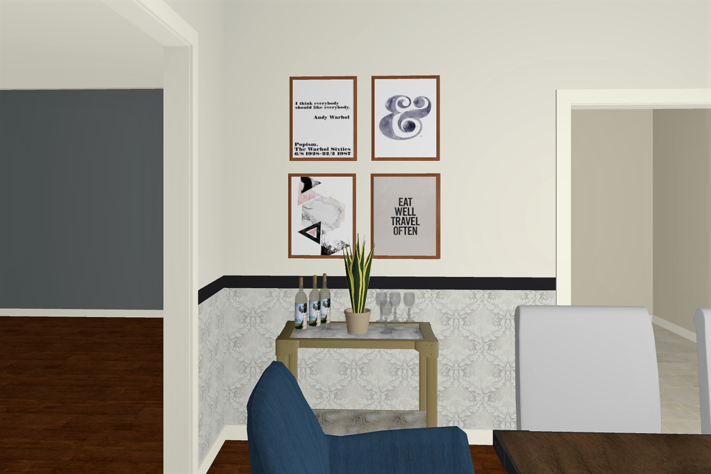
After getting the green light from our clients, we painted the walls Benjamin Moore Simply White and installed this gorgeous wallpaper that we found on Wayfair. We chose the Taupe color and it was perfect. Don’t be surprised if you see it pop up again in a future project!
We also installed brick veneer (the same kind we used in our Chesterfield kitchen remodel) on the side wall of the dining room. Brick veneer is real brick cut into thin pieces that are applied like tile.
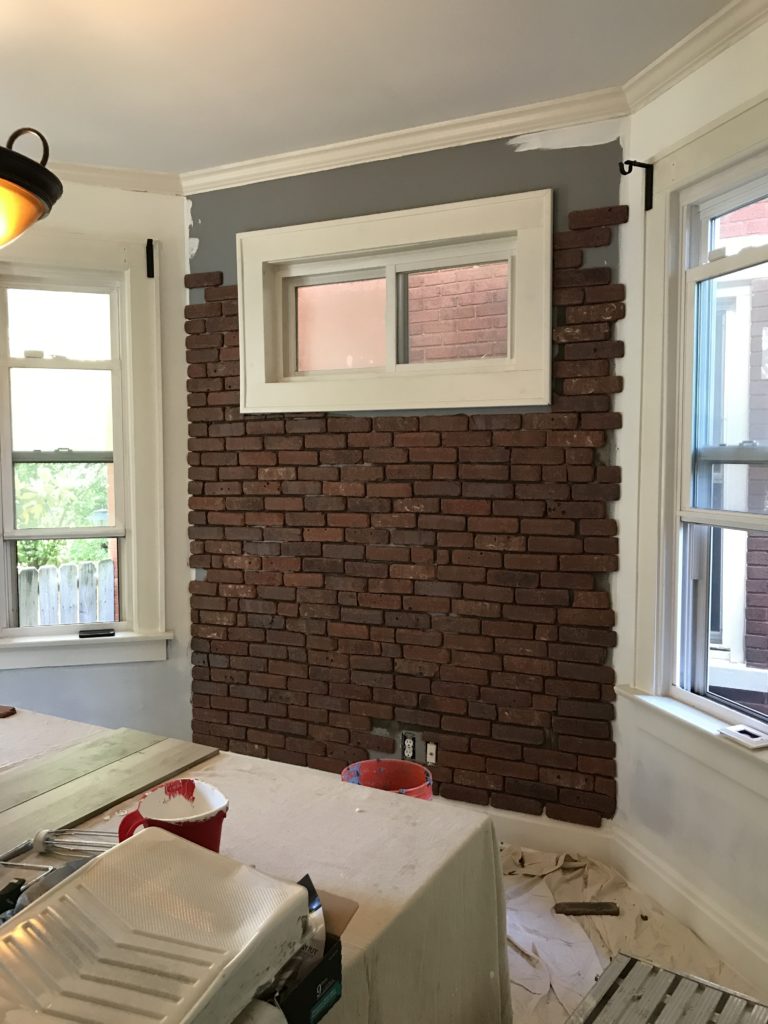
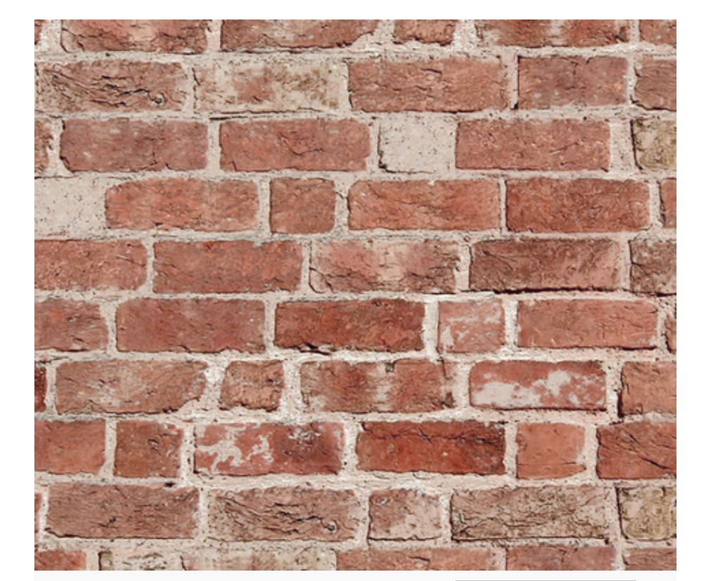
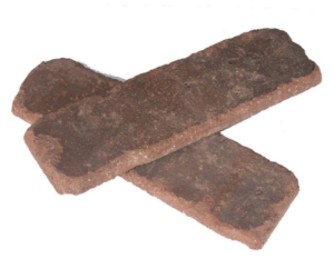
We wanted the brick to look really old and imperfect, so we cut some of the pieces in half and made the spaces uneven, using this photo as inspiration.
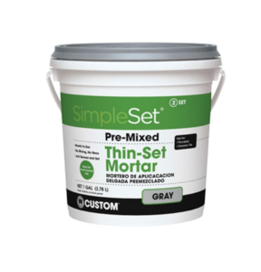
We applied the brick with thin-set mortar & a trowel from Home Depot. To fill in the gaps, we used Quikrete mortar mix applied with a grout bag to keep the mortar from getting all over the bricks, and then finished it off by cleaning & sealing with a masonry sealer once it was dry.
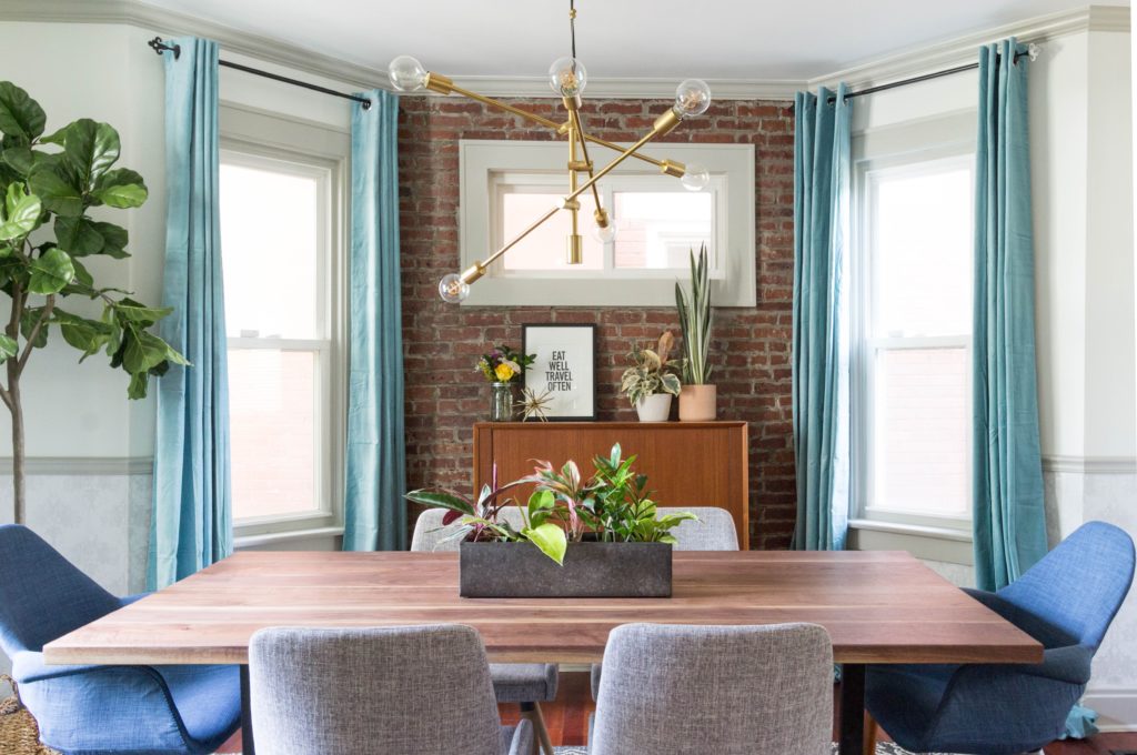
After the walls were ready to go, we installed the furniture, added decor pieces and hung curtains. Here’s how it all came together.
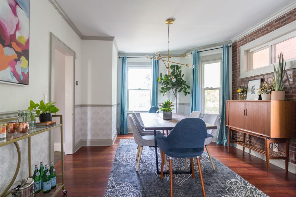 Our client’s walnut and steel dining table was custom made by Josh and his team at A Carpenter’s Son, a woodworking company here in Columbus. A few years ago, Josh and his wife, Laura, struggled to get pregnant and decided to adopt. Through that process, they learned about how involved adoption was (and expensive), so they started an Etsy shop and an Instagram account to raise money to fund the adoption. They called it A Carpenter’s Son. They were able to adopt a beautiful baby boy, and beyond that, grow a business that allowed them to make awesome furniture pieces full time. They continue to support adoption by donating a portion of their profits to adoptive families – how awesome is that?! You can check out A Carpenter’s Son here and read more about their story here.
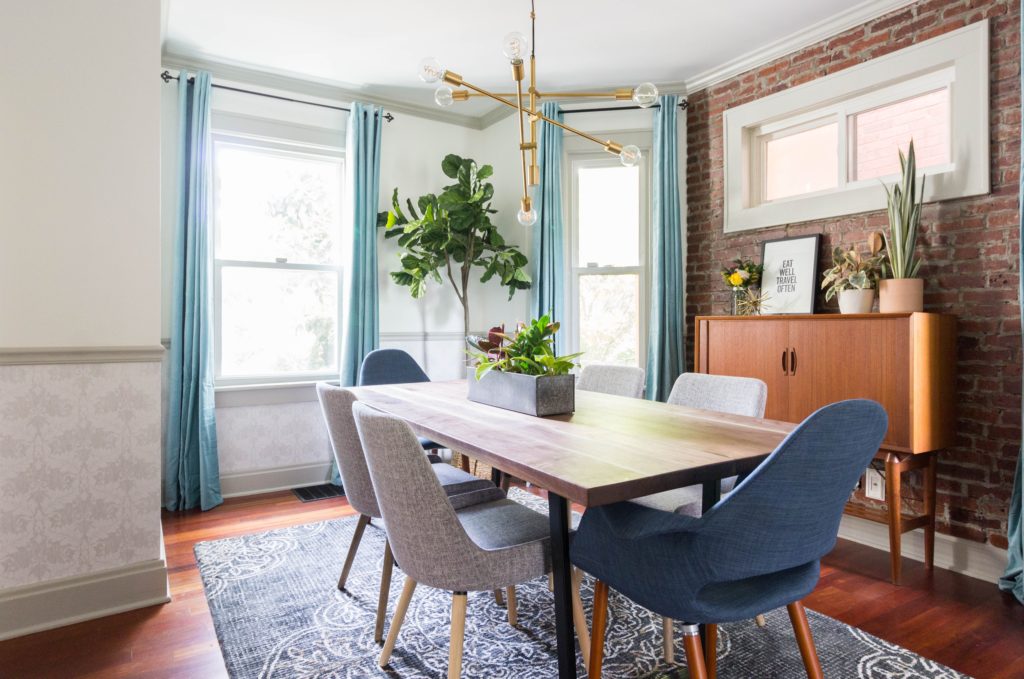
The rug is from World Market. Because it’s a dining room where people will be eating and drinking, we went for something dark with a pattern that would easily conceal drops and spills. We chose a size that allowed enough room for the chairs to be pulled out and still sit on the rug.
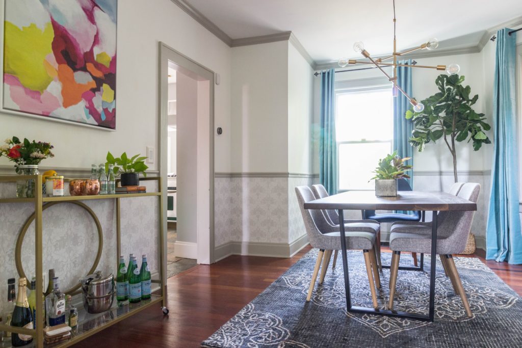
When we started the install, we discovered that the windows were vinyl and couldn’t be painted. We came up with a plan B and painted all of the trim and molding Behr Tanglewood, which is a light grey with taupe undertones. It complimented the taupe damask wallpaper perfectly and added interest to the space. We found fun blue velvet curtains at IKEA, which we mounted on curtain rods that we raised about 12″ higher than they were to make the space appear larger and more open. We added a fiddle leaf fig tree to the corner of the room, because you can never have too much green!
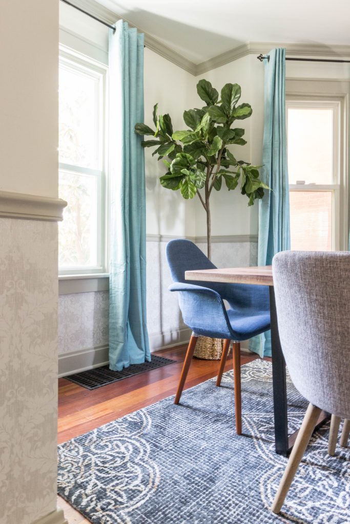
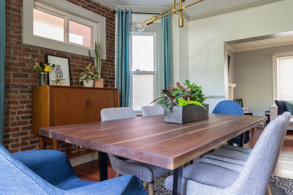
The brick wall came out so well and adds a ton of character to the space. Doesn’t it look like it’s always been there? We ended up purchasing these side chairs and these end chairs, both of which are really comfortable.
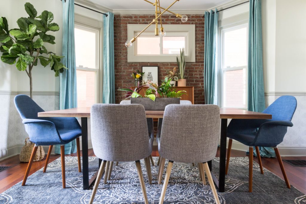
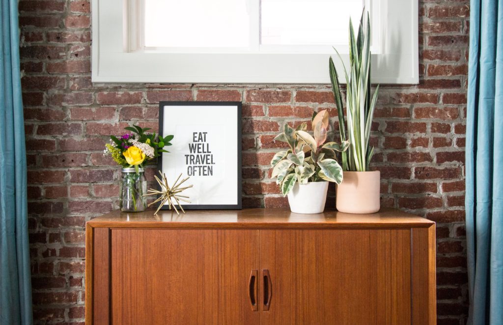
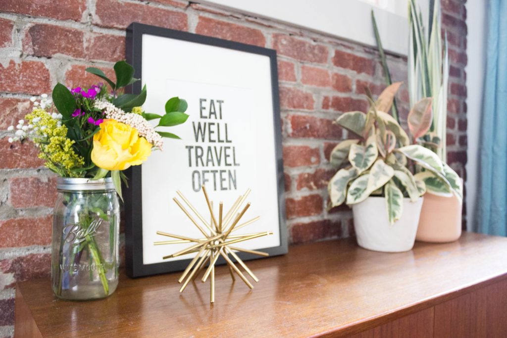
Our client had a vintage buffet from a family member that we used in lieu of purchasing the midcentury piece in our plan. It ended up being so perfect in the space. We decorated it with plants from a local shop called Stump, a print from Etsy, and some fresh flowers.
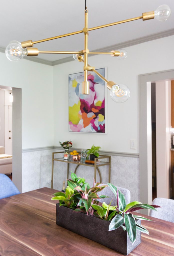
The light fixture from West Elm is one of our favorite pieces in the room (similar budget-friendly versions here and here). It holds six 60W bulbs, which is a big improvement over the old light fixture that used to be here.
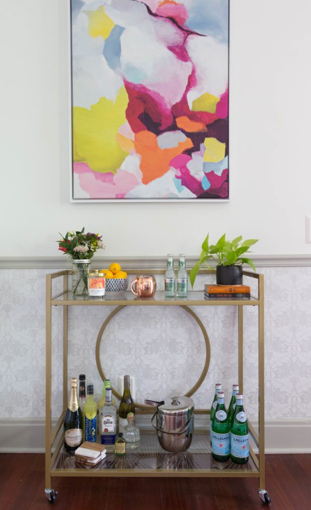
And, the bar cart!
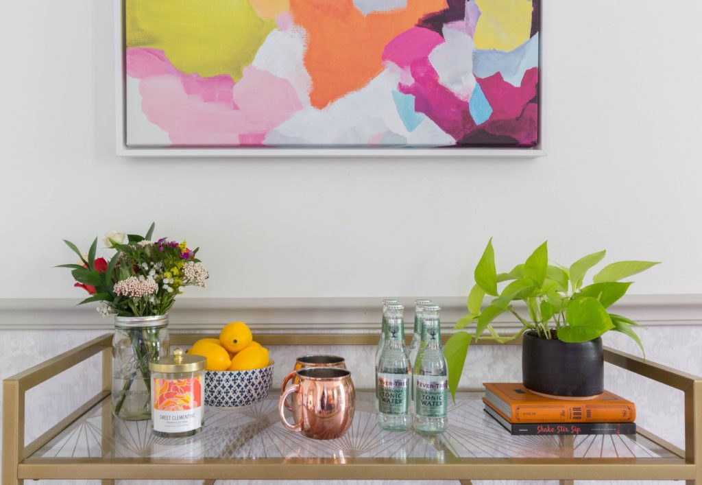
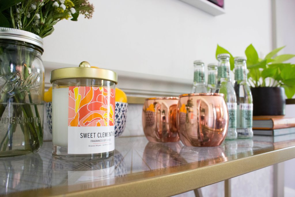
We stocked it with a mix of our client’s liquor and colorful goodies from Target, the Book Loft (a charming book store here in German Village), and Stump. Hanging on the wall is a print from West Elm, which our client found in store on final sale. We turned it on its side to better fit the size of the wall.
Here’s one more look at the transformation.
Before…

After!

Before

After!
That’s all for now. This week, we’re wrapping up another fun client kitchen remodel, getting more done on the Vic, and preparing our Historic Townhome for the German Village home tour this weekend – eek! Make sure you’re following us on Instagram for updates!
*This post contains affiliate links*





What an awesome transformation, Catherine and Bryan. I especially like the brick wall. Wish I could come to the tour this weekend (: Looks like a wonderful neighborhood
Thanks Angela! That means a lot ????
The brick is really a great touch. Great job!
Thank you!