For the past 8 weeks or so, we’ve been working on a project that we’ve been calling Chesterfield Cottage. You may have seen progress photos on Instagram or Facebook (if you missed them, you can check them out here!). We got it on the market this past weekend, and guess what? We received a first day offer and are in contract! Now that we have some time to breathe, we’re excited to share all of the fun details and before & after photos with you.
A bit of background – this home is a 1950s cape cod that has three bedrooms and one bathroom. It’s about 1000 sq ft, which makes it the youngest and smallest house we’ve worked on. It’s in a neighborhood where homes are typically in the $100-150k range, so we had to keep that in mind as we made our design decisions. We couldn’t go overboard, but wanted to make it as nice as we could within our budget. We were excited to take on the challenge and try something new.
Our ultimate goal in designing this home was to make it feel bigger than it actually is. We wanted people to notice the beauty and functionality of each room before size. We put a lot of thought into making sure we used each space in its best capacity, and added details and special custom touches to make it a one of a kind home.
There’s a lot of good stuff to share, so we’re going to split our reveals into three posts. First up, we’ll share the exterior, living/dining space, and the bathroom. Part 2 will be the 2nd floor attic bedroom, and part 3 will be the kitchen.
Exterior – Front
{Before} Here’s what the front of the house used to look like. It had good bones and a nice yard with mature trees. It just needed a facelift.
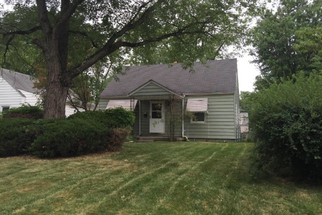
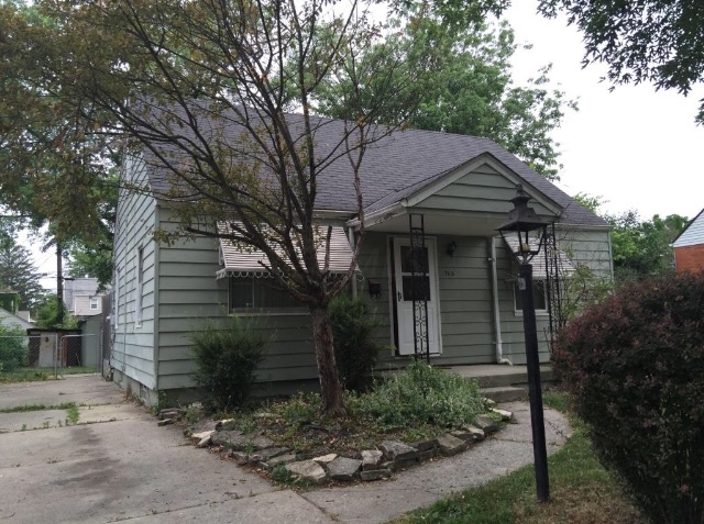
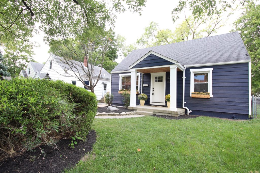
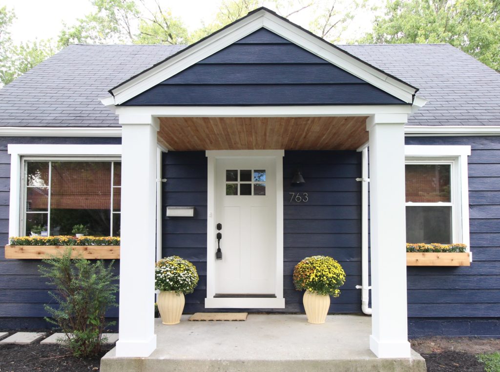
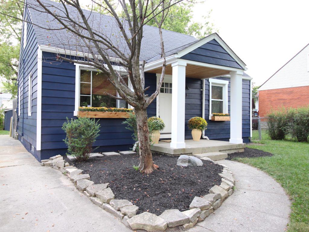
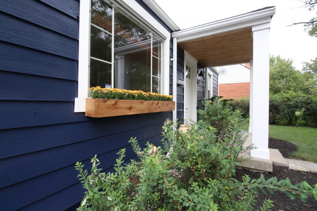
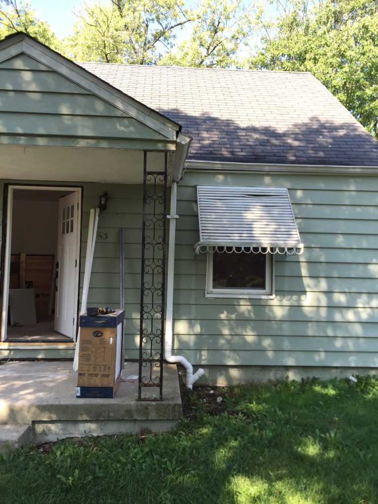 {After} We painted the siding Sherwin Williams Naval, removed the awnings, and wrapped the metal posts with PVC trim. We replaced the dated (and broken) front door, and added white window trim, cedar window boxes, and cedar tongue & groove to the porch ceiling. We also replaced the house numbers. Those details really made the home stand out and gave it the charm factor we were looking for.
Exterior – Back
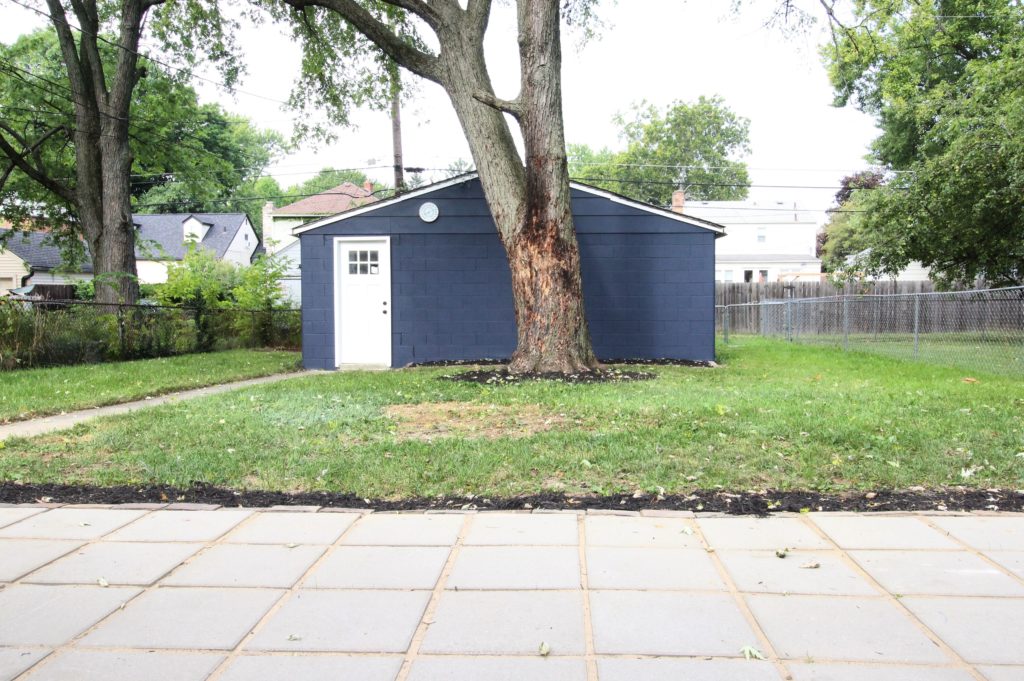
{Before} Part of the garage door was cut off, there was a rusted storage shed in the yard, and there was a large wheelchair ramp that took up a big chunk of the yard.
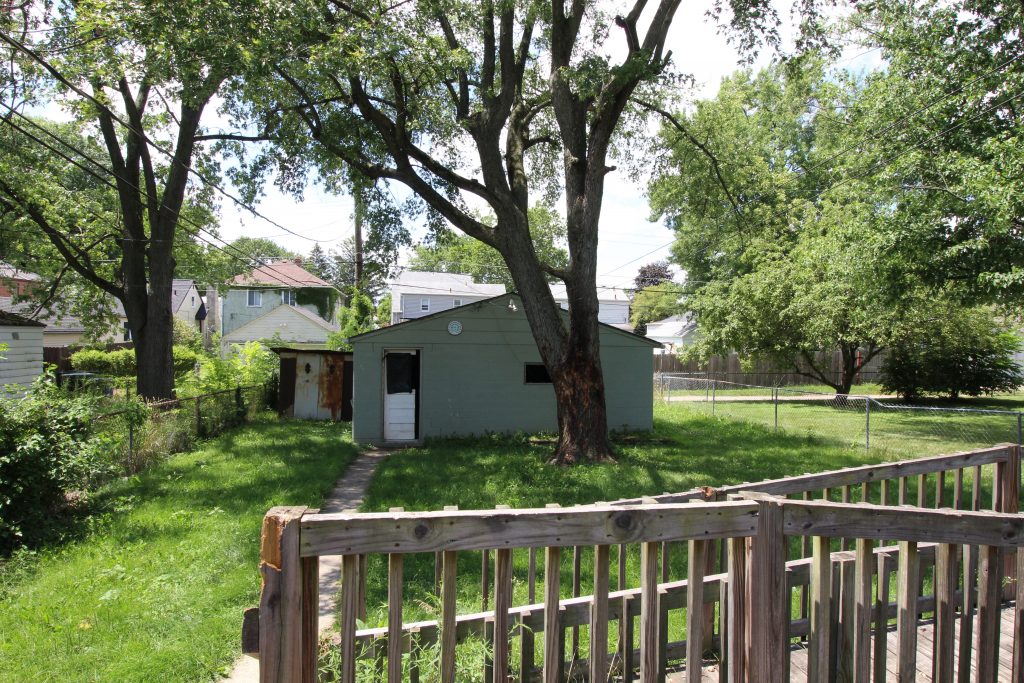 {After} We cleaned up the yard, replaced the wheelchair ramp with a paver patio, replaced the garage door, and gave it a fresh coat of paint
Living Room
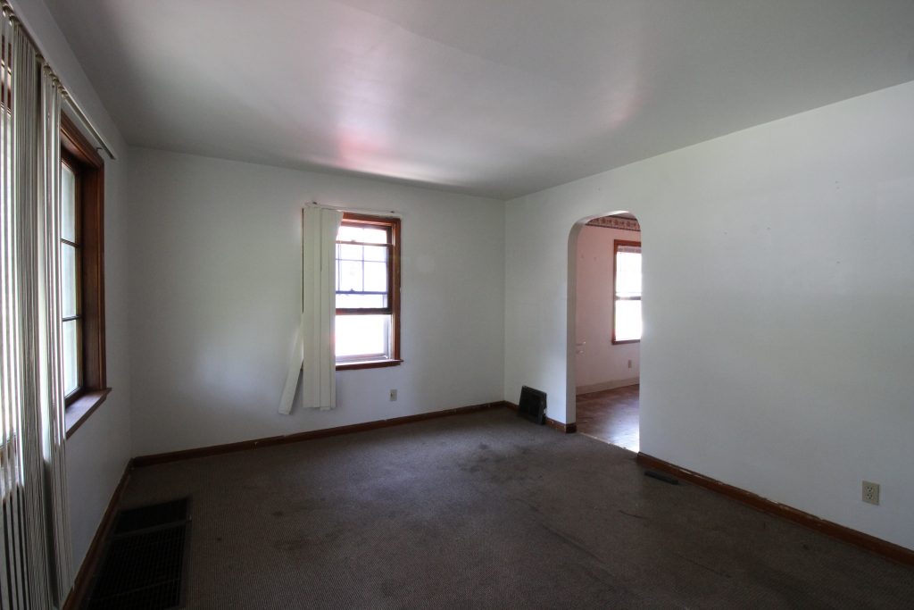
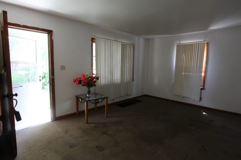
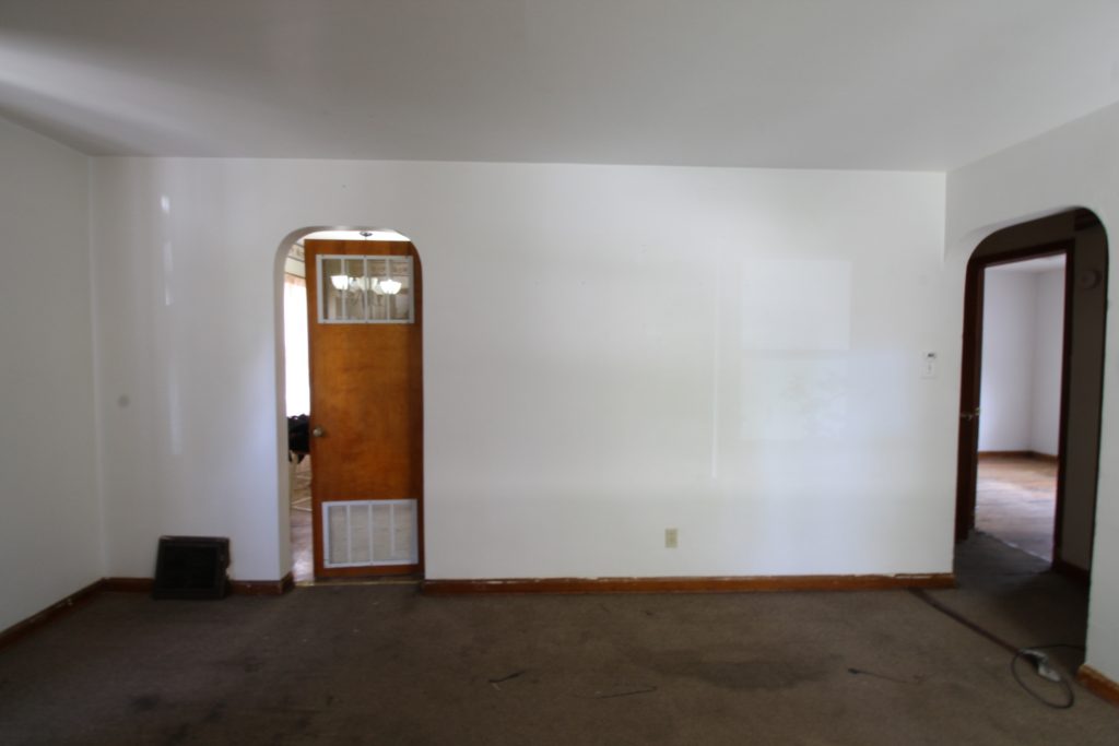
{Before} When you open the front door, you enter into the living/dining space. We loved the archways leading to the kitchen and to the little hallway where the bedrooms and bathroom are, and wanted to work with them in our design. That carpet and those blinds, though…
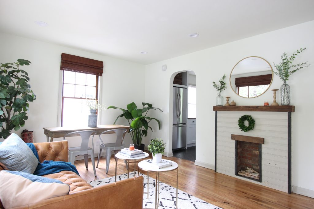
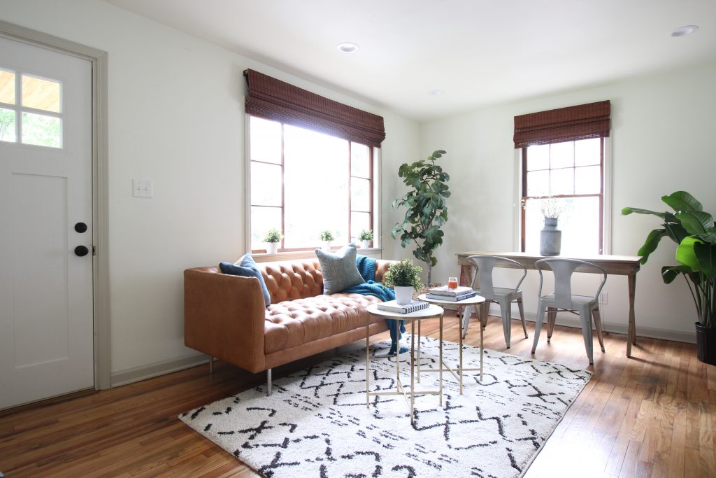
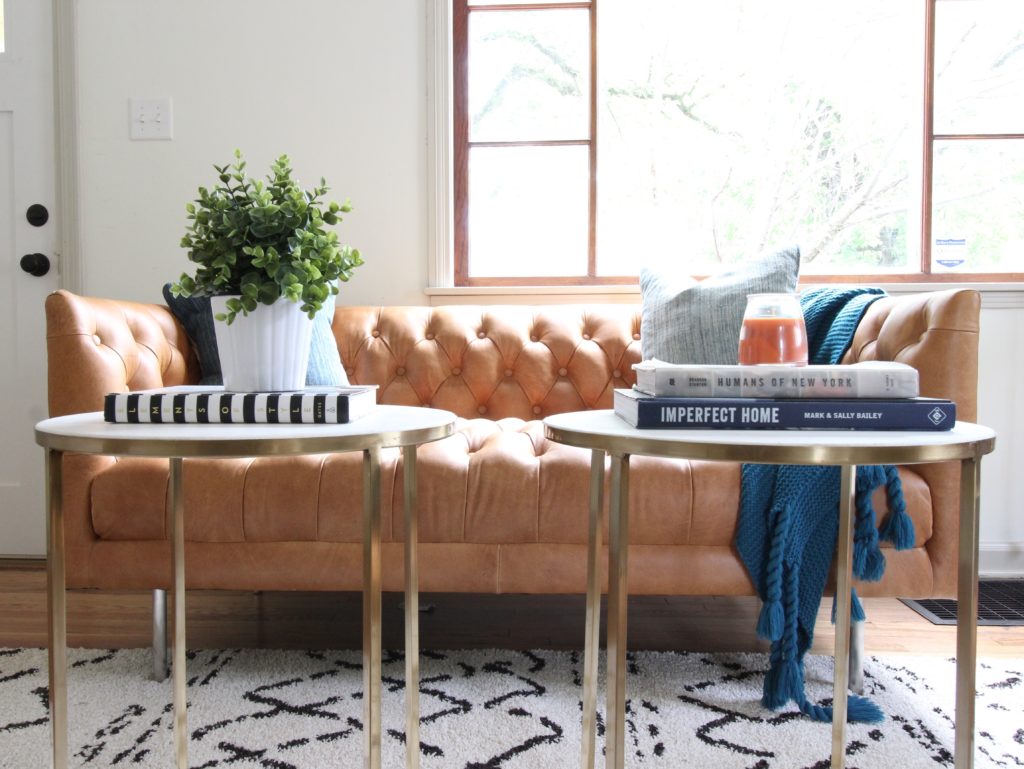
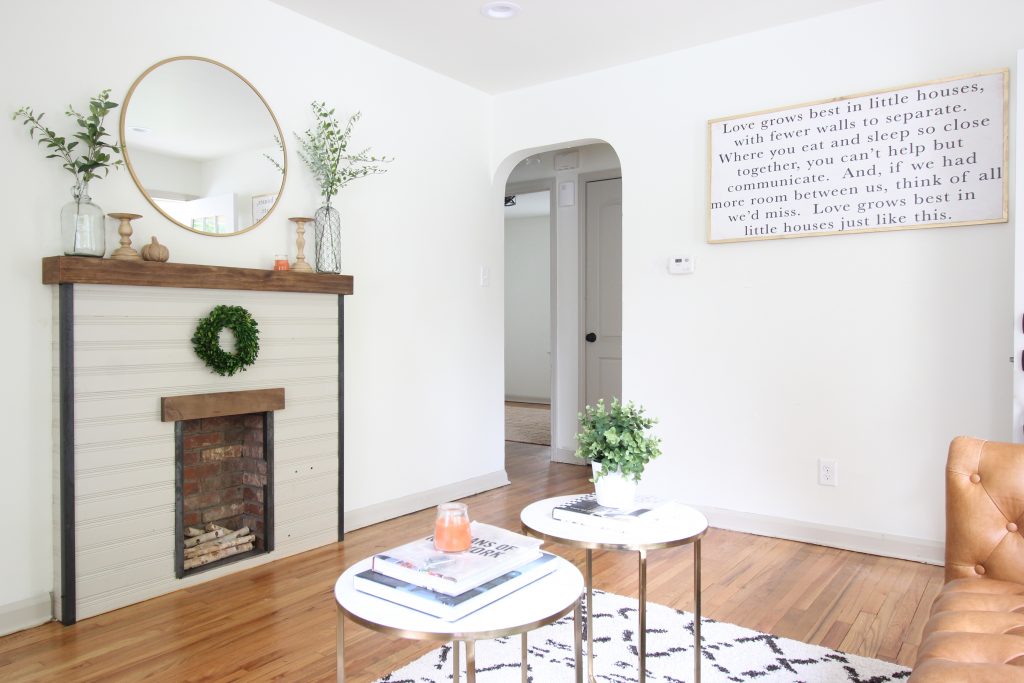
 {After} We built a small decorative fireplace w/TV outlet behind the mirror to create some visual interest in the room and add functionality. We also refinished the original hardwood floors and gave the walls a fresh coat of paint (BM Simply White). Painting the walls and ceilings white helped disguise the imperfect ceiling/wall lines that so many older homes have, and also made the room feel open and airy. We chose a light grey color (BM Revere Pewter) for the doors and trim, but left the windows themselves wood.
{Before}
{After} We replaced the vertical blinds with bamboo shades that we hung about 6″ higher than the window.
{Before}
{After} Through that archway are the bedrooms and bathroom. We found this sign on an Etsy shop called Salted Words. It couldn’t be more perfect for this home!
Bathroom
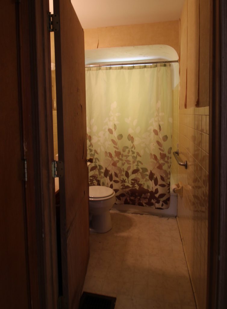
{Before} The bathroom had yellow tile, a sticky linoleum floor, and a door that swung into the vanity.
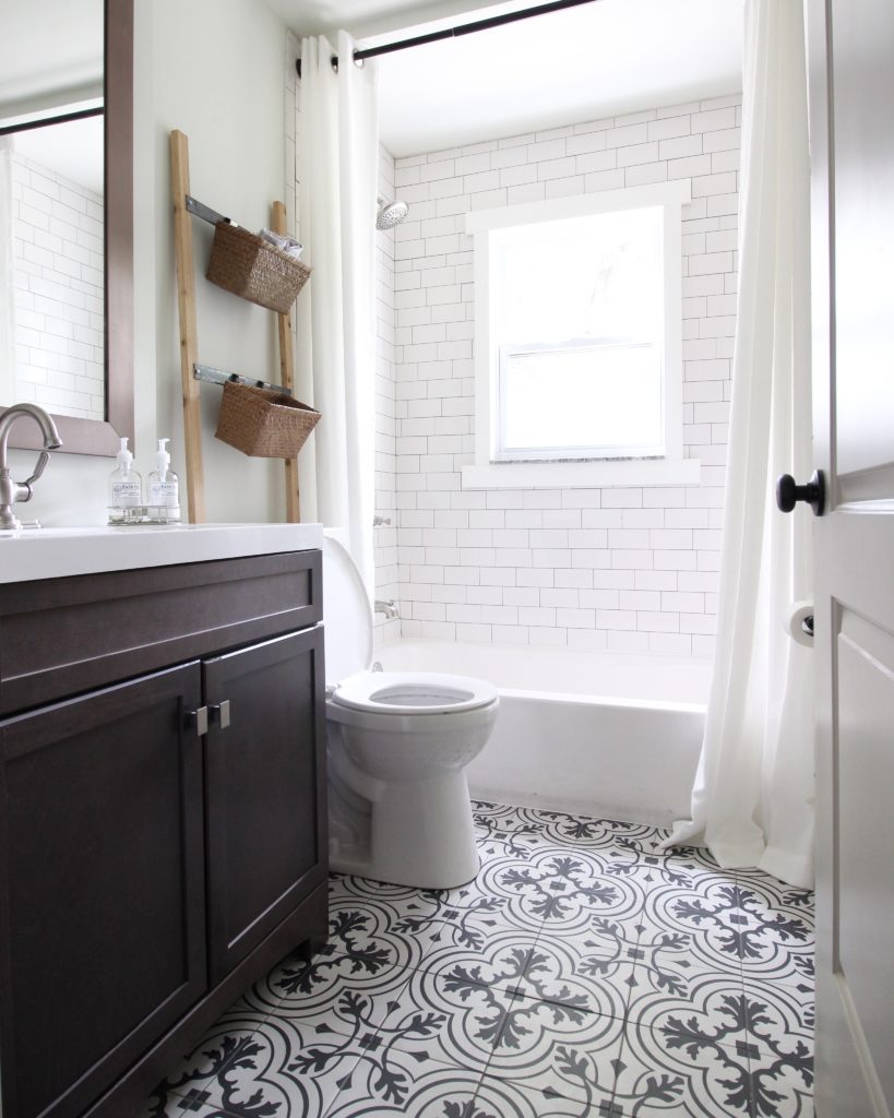
{After} This bathroom was a full gut! We replaced all of the dated tile with white subway tile going up to the ceiling in the shower, and added a fun black & white patterned tile on the floor. We found a vanity and mirror that fit the space perfectly, and made the storage ladder above the toilet out of cedar 1x2s and metal strips. We also switched the door hinge to the other side, and hung the shower curtain rod high to make the room feel larger. Much better, right?
We’ll be back soon with part 2 of our reveal, the kitchen. In the meantime, follow us on Instagram and Facebook for sneak peaks!
Sources (note – contains some affiliate links!):
Exterior
Materials –
Front door – Home Depot
Window boxes – handmade, cedar
Posts (wrapped existing) – PVC trim from Home Depot
House numbers – Lowes
Paint –
Siding: Sherwin Williams Naval
Front Room
Materials –
Round mirror – Target
Small marble / brass tables – Target (similar here, also Target)
Blinds – JC Penney
Desk / table – World Market
Rug – Discontinued, Home Depot (similar here and here and here and here, or search for “tribal rug” / “Moroccan rug” online)
Leather love seat – West Elm on clearance (no longer available, but the normal sized sofa is here).
Silver chairs – lucky Craigslist find (similar here or here, or just search for “metal stackable chairs”)
Vases, candlesticks and greenery on fireplace – Jo-Ann
Vintage Indigo Pillows – Handmade, Bianca & Red
Throw – Home Goods
Sign – Salted Words, Etsy
Paint –
Walls – BM Simply White
Trim, Fireplace, Doors – BM Revere Pewter
Bathroom
Materials –
Floor tile – Homedepot.com (brand is Merola)
Hanging baskets – Target
Storage ladder – handmade from cedar 1x2s and metal strips. Similar from Target is made to go with the baskets.
Vanity – Lowe’s
Shower curtain – We used a regular 96″ curtain for staging purposes. You can purchase 96″ shower curtains here and 84″ shower curtains here.
Paint –
Walls – BM Simply White
Absolute adore this house- especially the exterior paint color- well done!!!
Thank you – really appreciate it!
Spectacular! Source for shower curtain, please?
Thanks Renee! We used a regular 96″ curtain for staging purposes. We updated the source list at the bottom of the post w/two links to real shower curtains (84″ and 96″) that we’ve used on other projects.
Thanks for such a quick response! Your work is so inspiring.
Hi! How wide were or are your front pillars? We really want to wrap but my husband thinks ours are to wide. We have 9.5inch rod iron posts
We don’t live there so I can’t say for sure… I think ours were a similar size though.
A truly inspiring remodeling project! Especially the transformation of the exterior as well as of the bathroom is amazing!
Small world! I live in Columbus and we’re just starting to consider buying our first house. Saw this on Zillow and am amazed to see the before! Thank you for taking the time to share your projects; it’s reassuring to see what a difference some elbow grease and creativity can generate 🙂
Small world indeed! Thanks so much Justine!
I dont know how I am just now seeing this! It is beautiful! I love your blog! Thank you for sharing our sign!
Is the siding aluminum or vinyl? I’m impressed how good it looks after a new coat of paint!
It is! Paint can do wonders 🙂
I know I’m super late to this party but I NEED to know how many rooms this house has!!
It was a 3 bedroom, 1 bathroom home w/living, dining & kitchen 🙂
Hey there guys! I just bought my first home last year and I’m fairly certain it is the same floorplan as this, with a few exceptions. I have been wanting to put in an attic bedroom since I moved in, but haven’t been able to figure out how that would work with the floorplan. I would be so grateful if you could share a rough floorplan (even if it was just a napkin sketch so that I might be able to get this project going). Feel free to email me directly at colejohns94@gmail.com Thanks so much!!
Thanks so much for all your information on this home, I have been fortunate to buy a home similar to this one in Mitchell, IN.
I’m stumped on what product to use on trim the windows/doors out. What product did you use, and how did you attach it to the siding?
Anytime!! We used PVC trim and a nail gun.
The PVC that you wrapped around the posts, what is the column width measurement? 8″ or 10″?