Exciting news! Our bathroom renovation was featured on Apartment Therapy! Click here to check it out.
Hi friends,
We just completed a big bath renovation for some clients here in Columbus, and we’re so excited to share before & after photos with you! If you’ve been following us on Instagram, we’ve been using the hashtag #cmcbathreno to track our progress.
Our clients purchased their beautiful home earlier this year, but there was one room that needed some love: the upstairs bathroom. It’s the only bathroom on the 2nd floor, and has an attic feel because of its sloped ceilings. It is a great size, especially for an old home, but the layout and finishes made it feel awkward and dated.
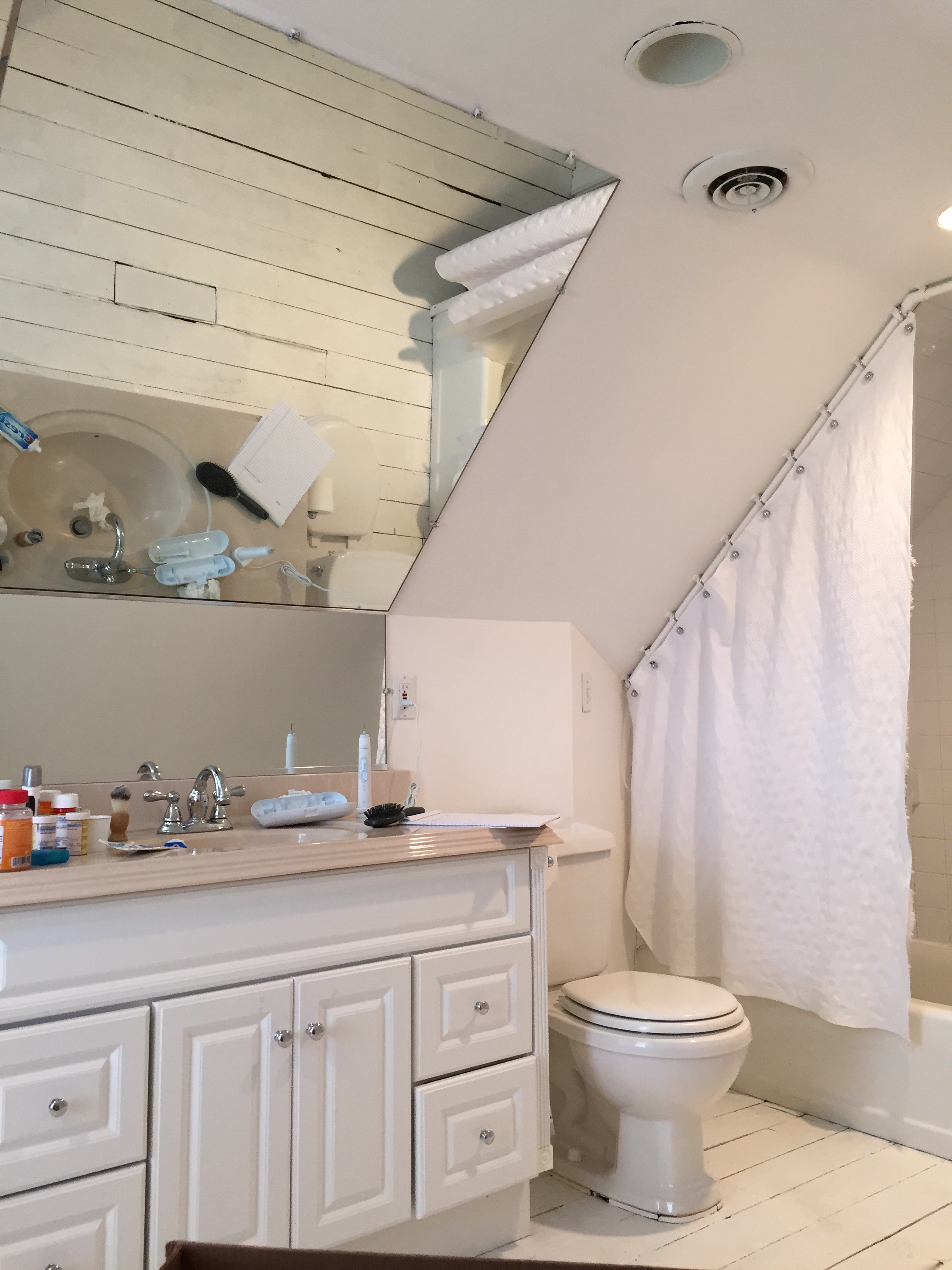
Here’s what the space used to look like from the entrance.
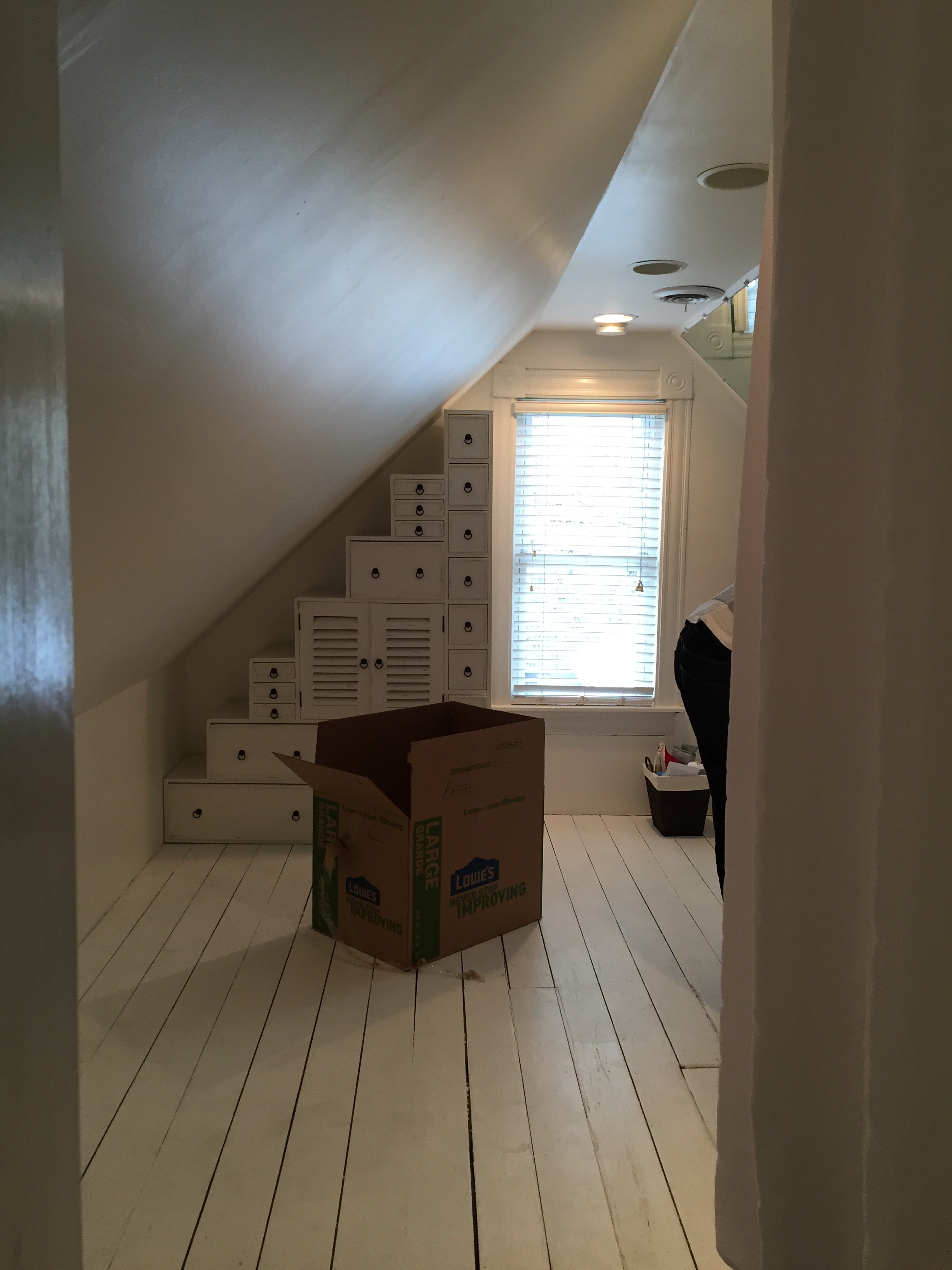 Moving clockwise, you can see the fun vanity/mirror situation they had going on.
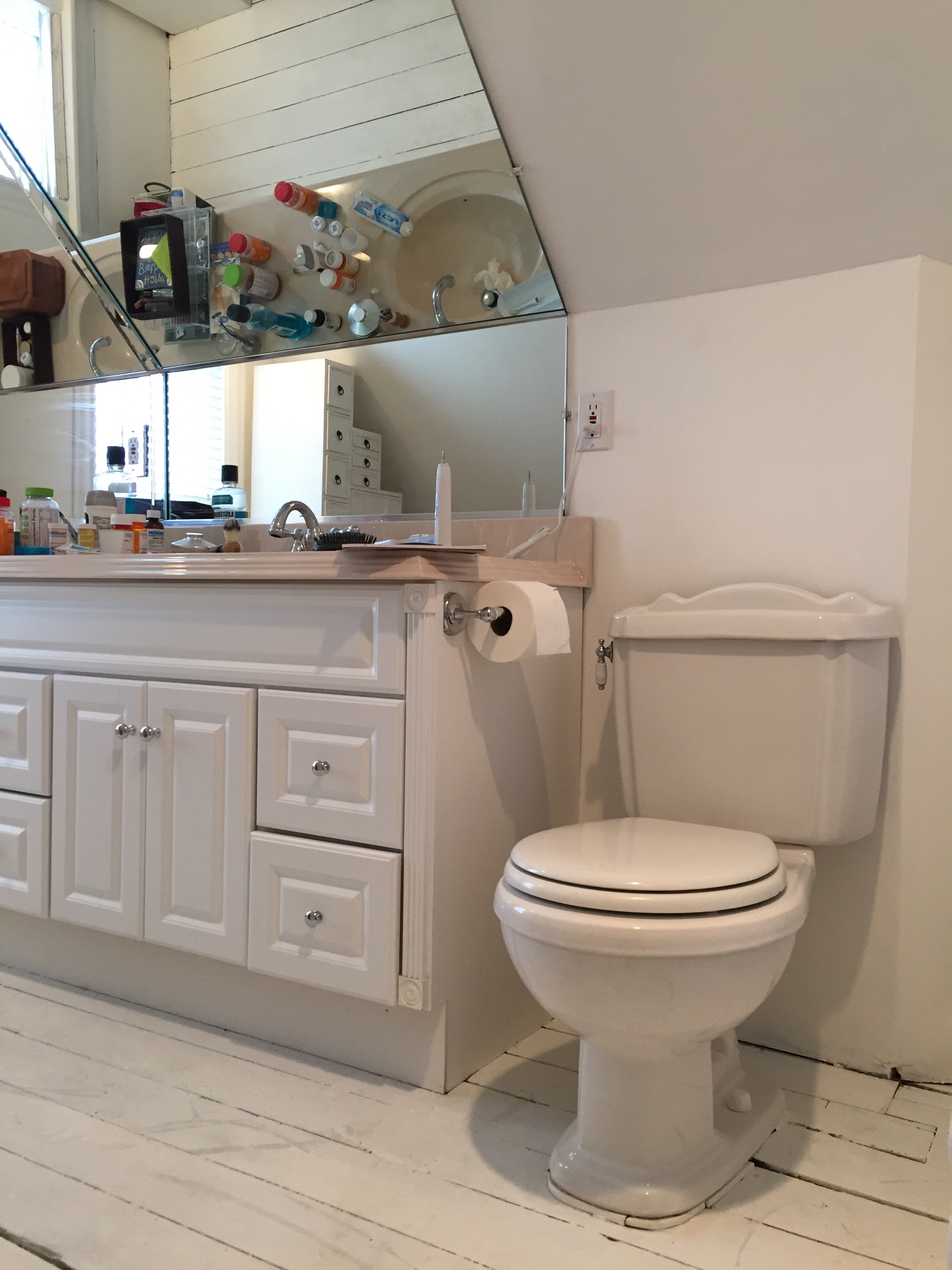
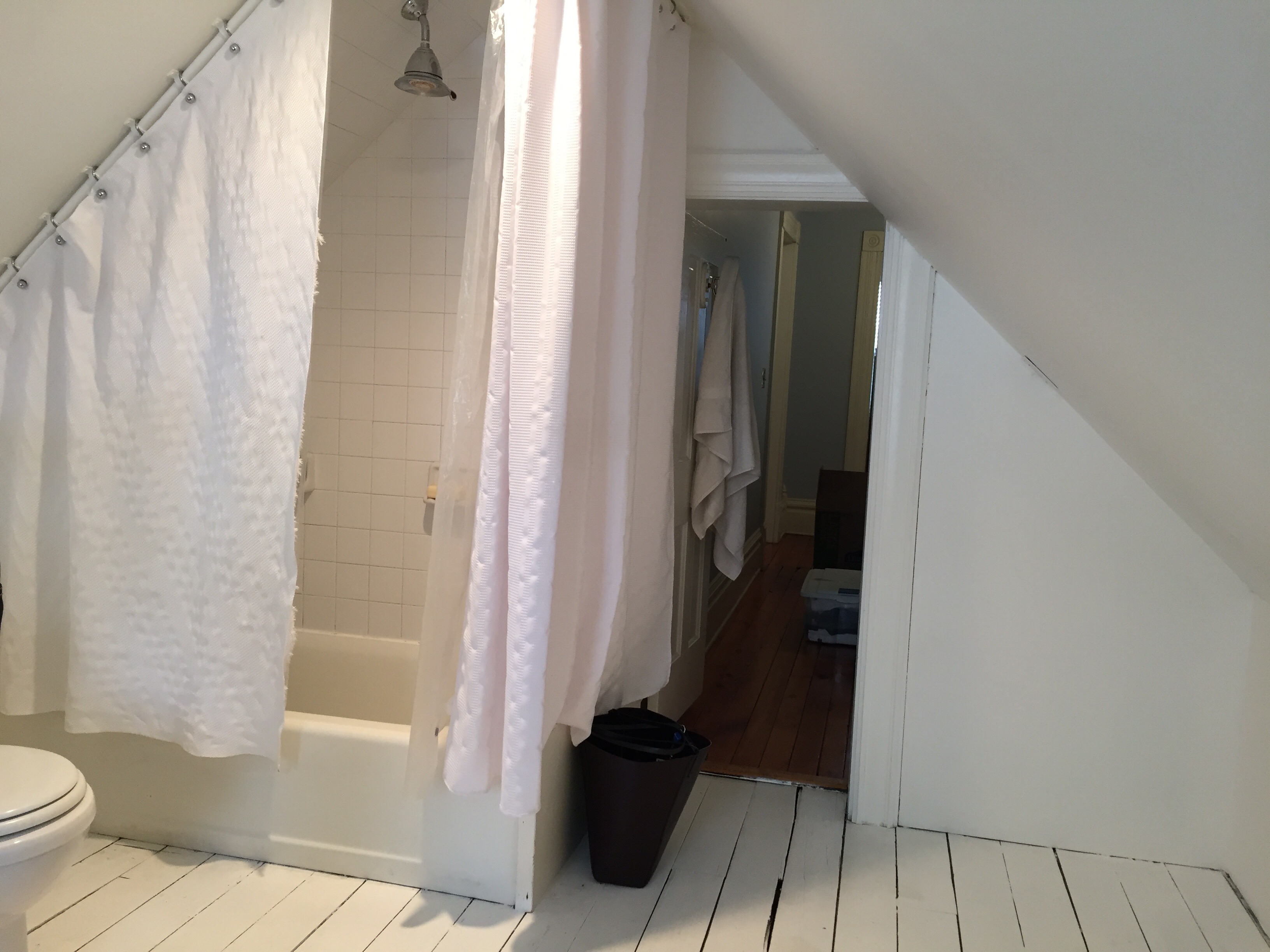
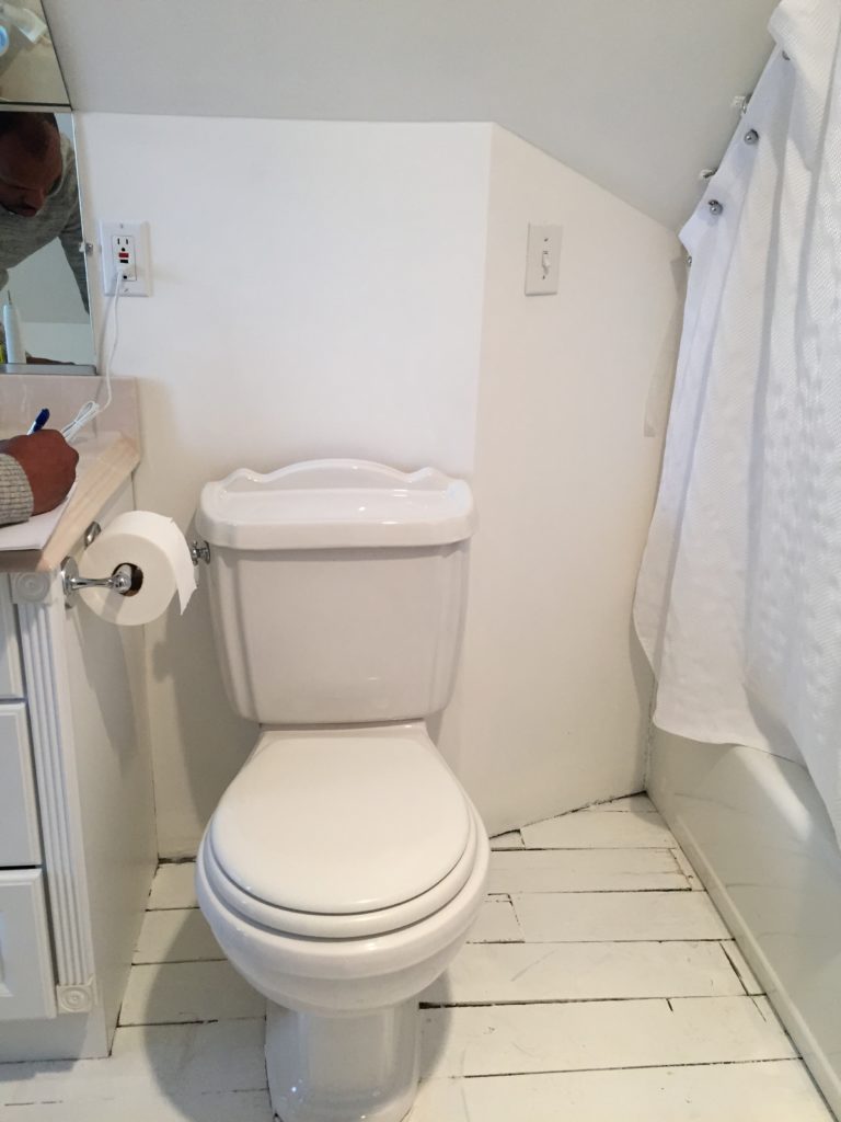 Continuing to move clockwise, it got even better with the shower.
 Our clients’ biggest requests were:
1- Ditch the tub and replace it with a shower that’s more comfortable to use (and prettier, of course!).
2- Create a sink/vanity/mirror situation that doesn’t involve bending backwards and bumping heads.
We got right to work and spent a few days coming up with design ideas. Here’s a sketch of the existing layout.
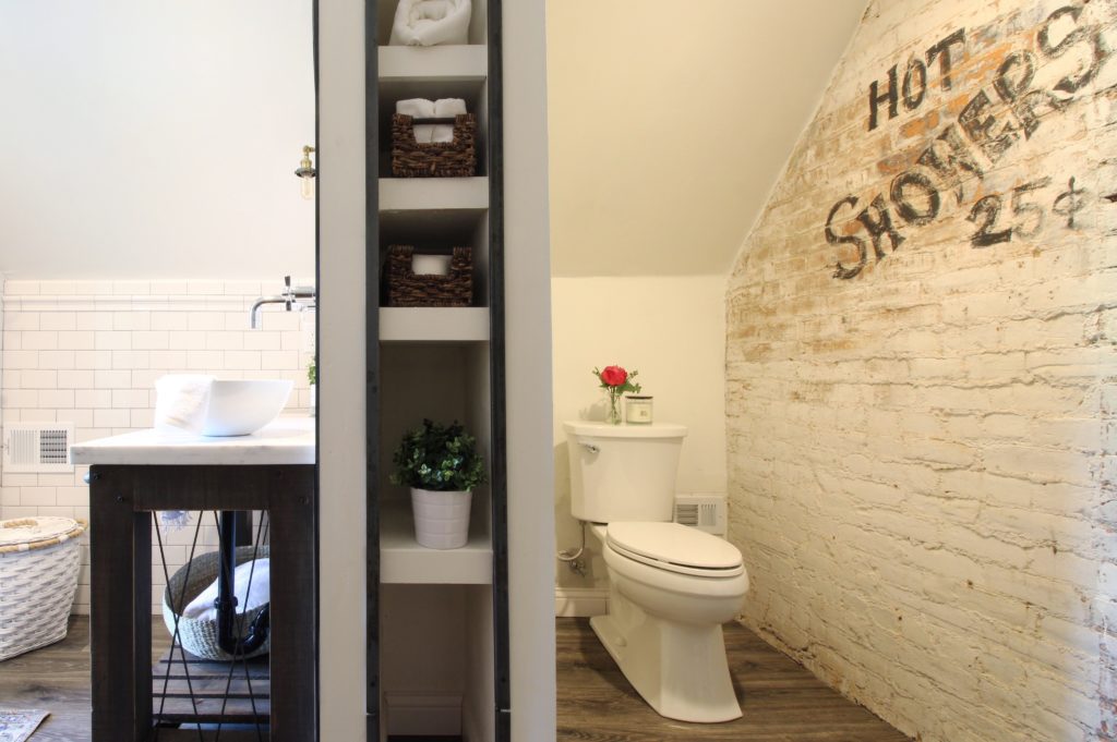
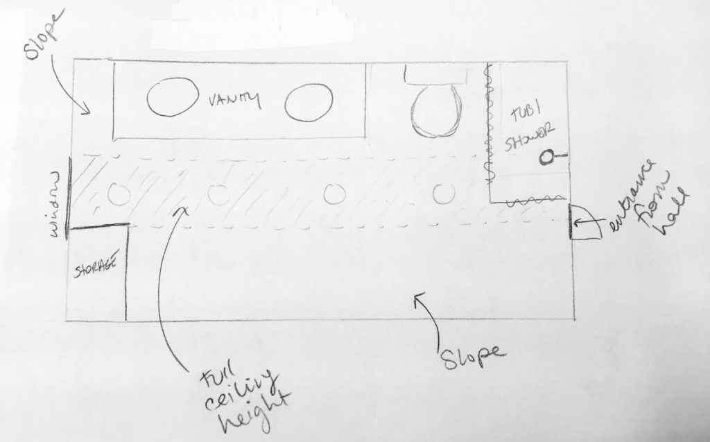 After tossing around a million different ideas, we ultimately decided to reconfigure the entire space to get both the shower and vanity out of the slopes and into the center of the room. In our new layout, we moved the shower across the room and doubled its size, added a wall to the middle of the room to separate the new vanity area and toilet area, and created built-in shelving in the unused knee wall area.
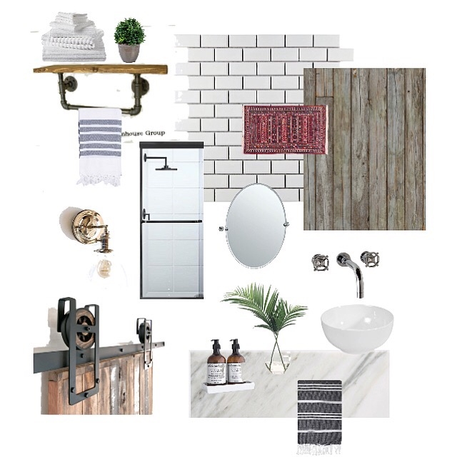
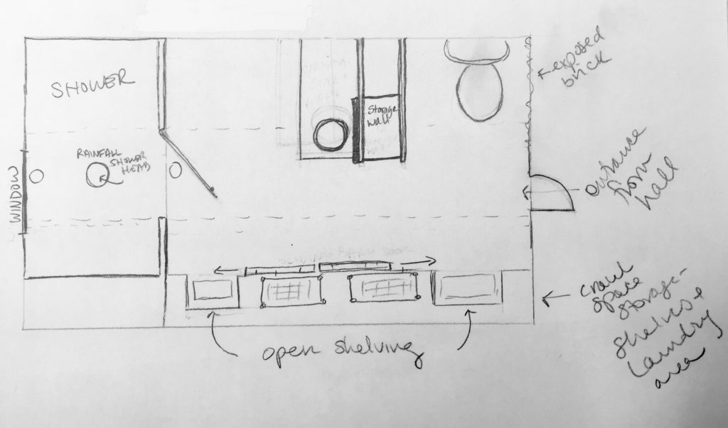 Our clients like the industrial chic look, so we channeled that in our designs.
 Once we had our plan finalized, we got all of the old stuff out and started demo. When we took out the old tub and tile, we found brick!
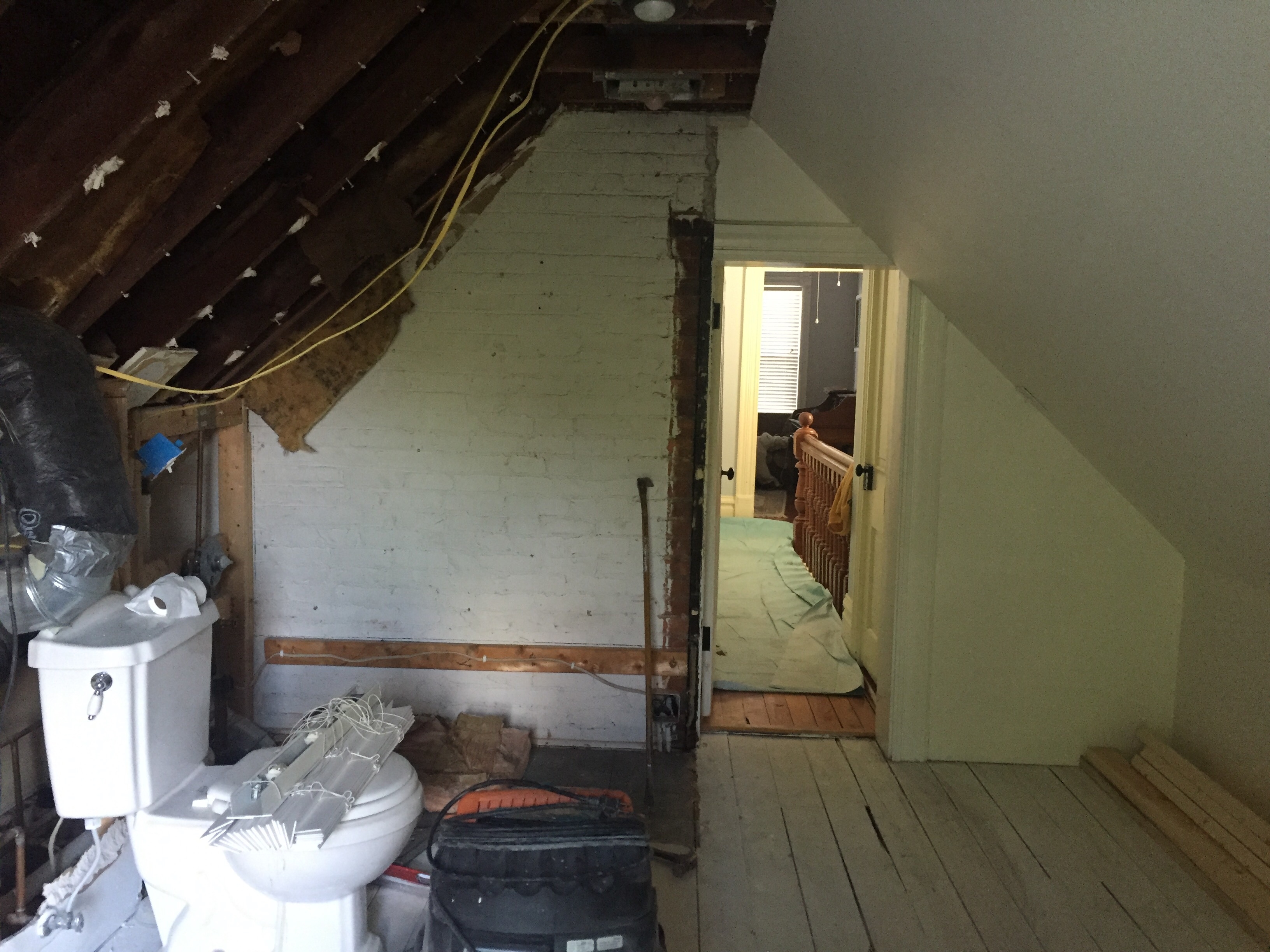
We framed the shower and the middle wall dividing the vanity area from the toilet area, and incorporated a space for extra storage shelves.
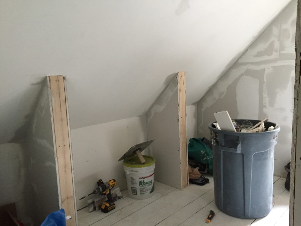
 On the left side of the room, we framed out the knee wall space with little walls for built-ins and a laundry nook in between.
 It was a ton of work, but it all came together just as we had imagined! Here’s what the view from the entrance looks like now.
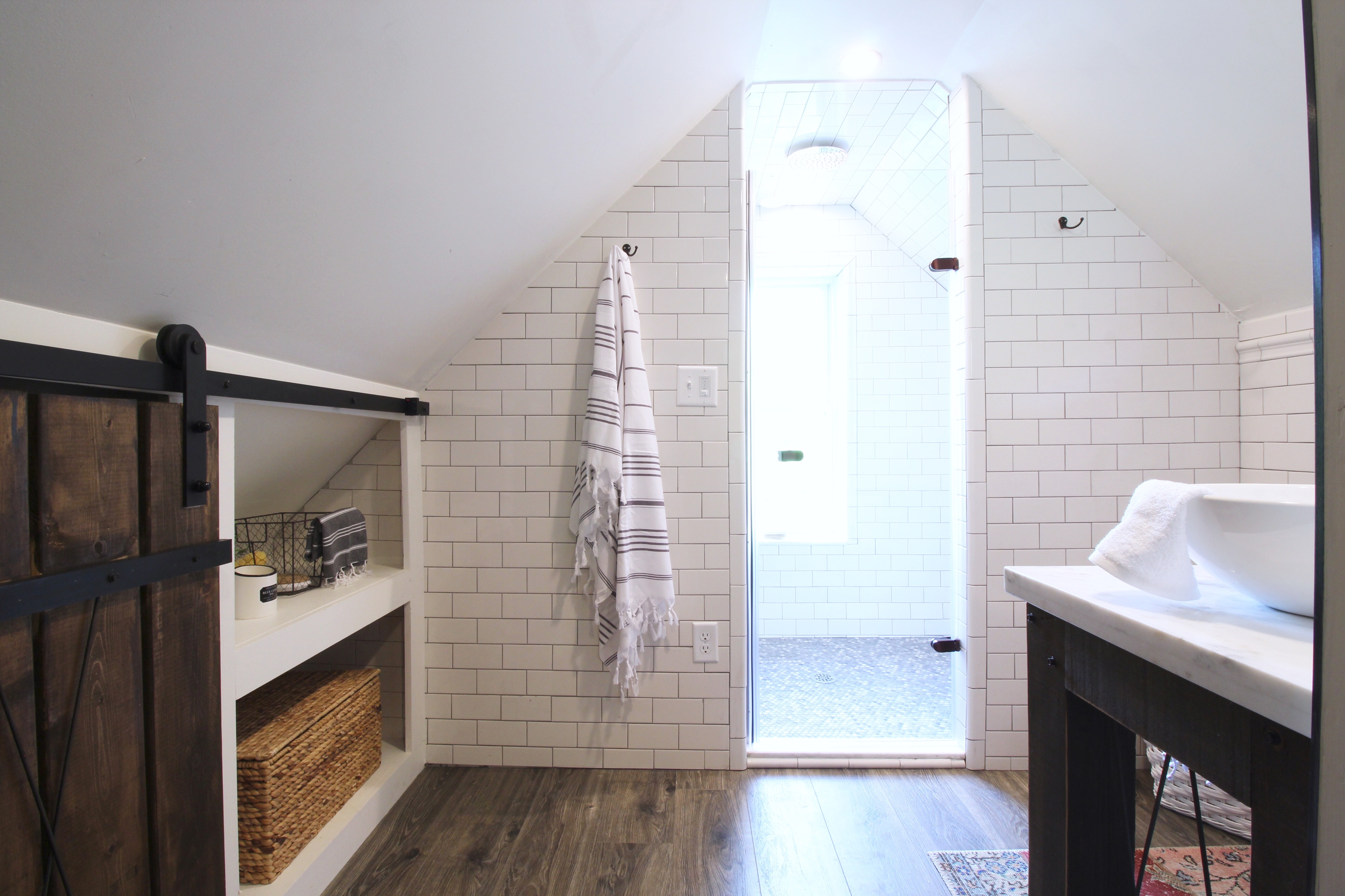
On the left of the room, we built custom shelves and barn doors to close off the laundry area.
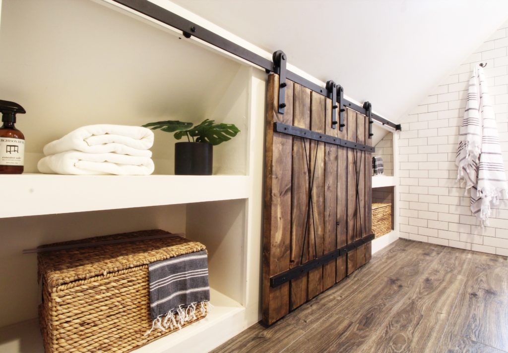
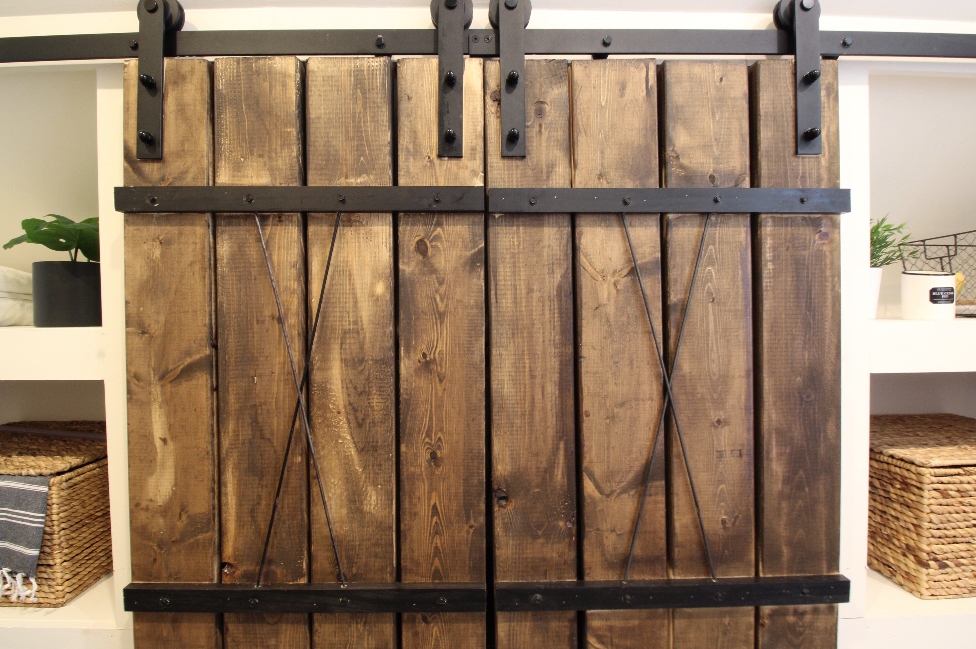
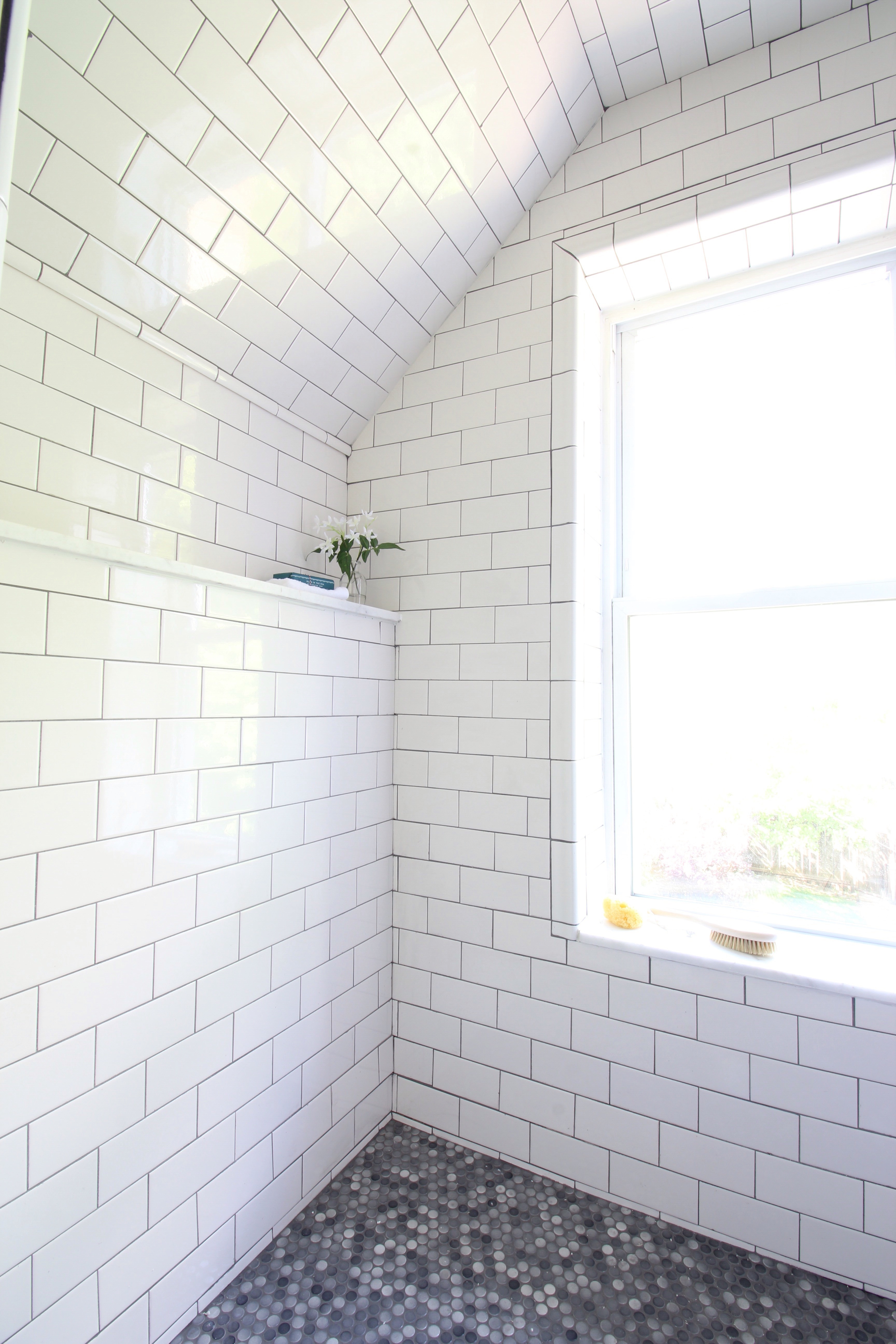
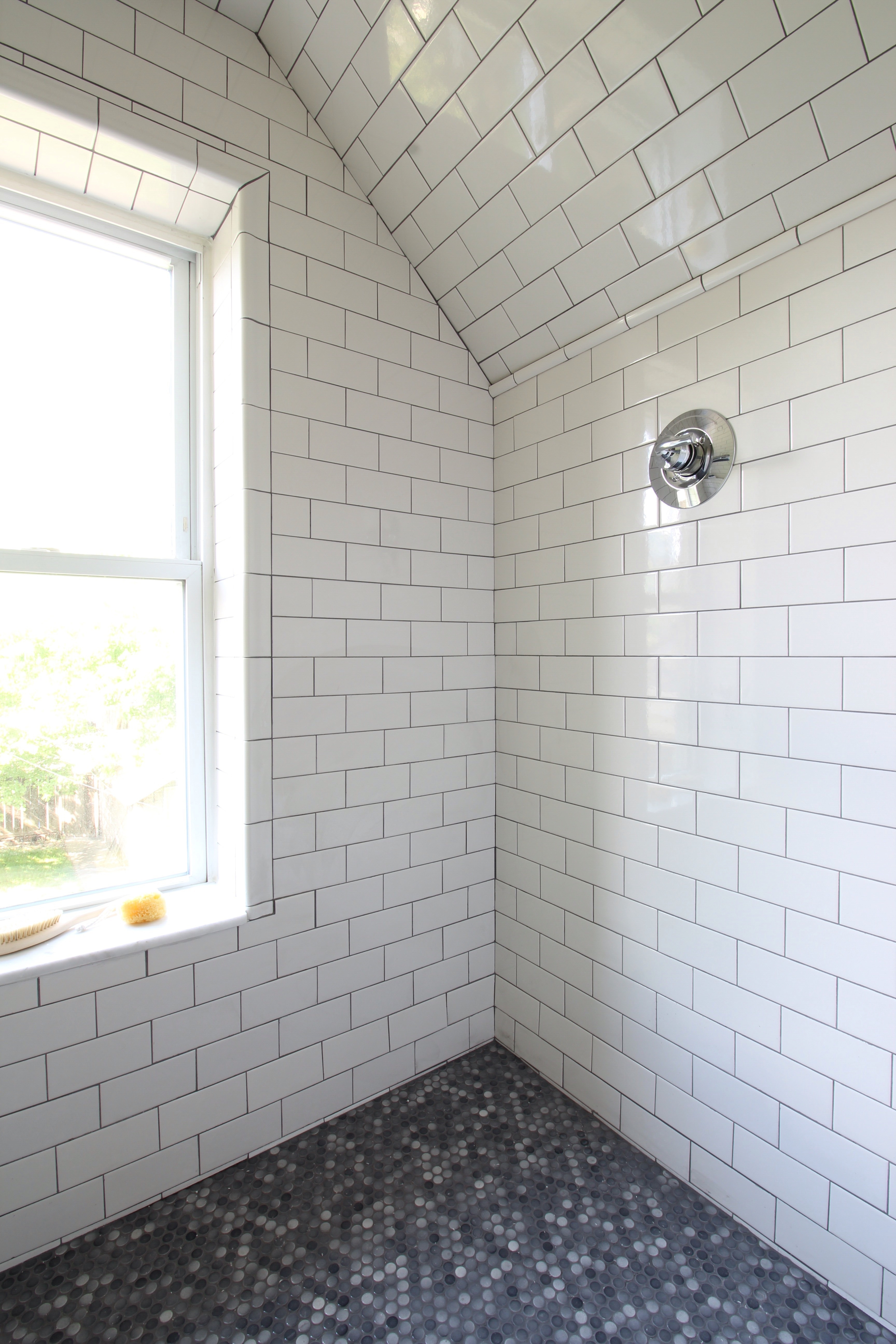
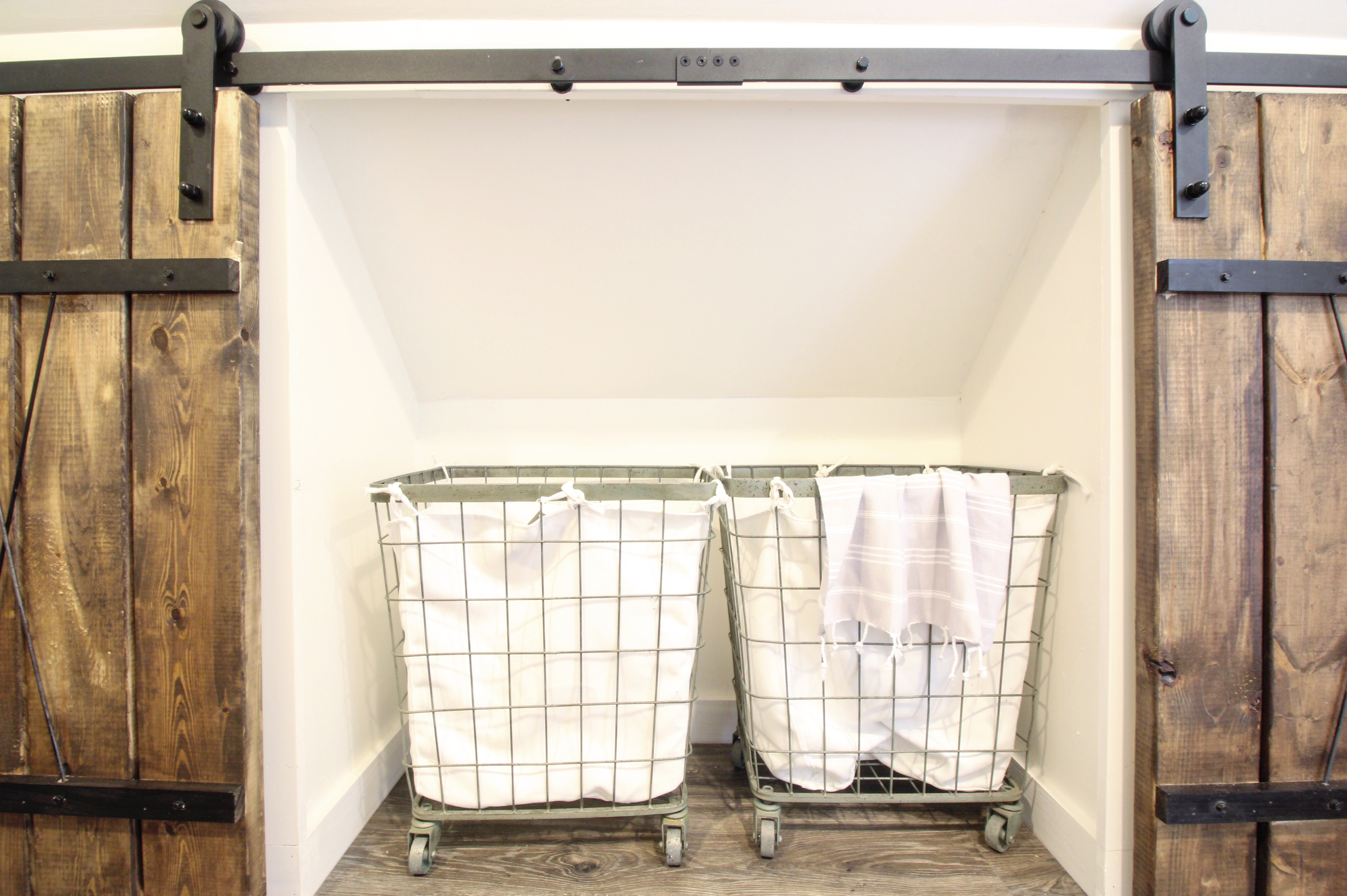 We moved the shower to the back of the room and tiled the entire inside and outside with crisp, white subway tile.
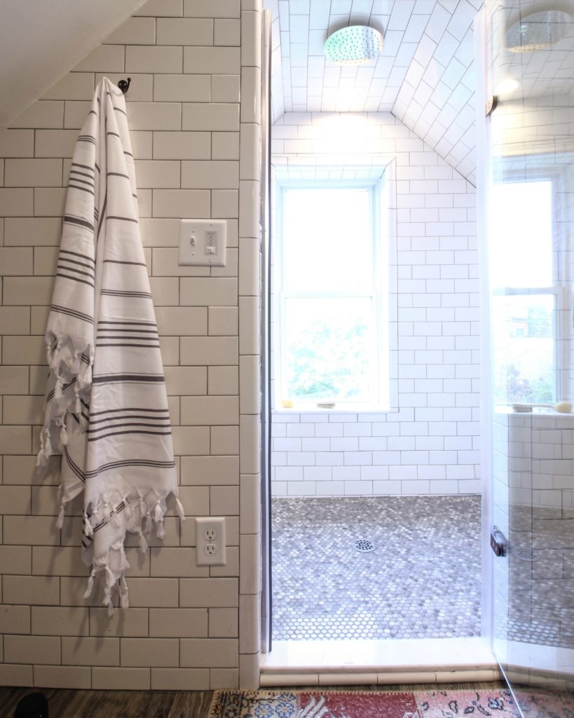
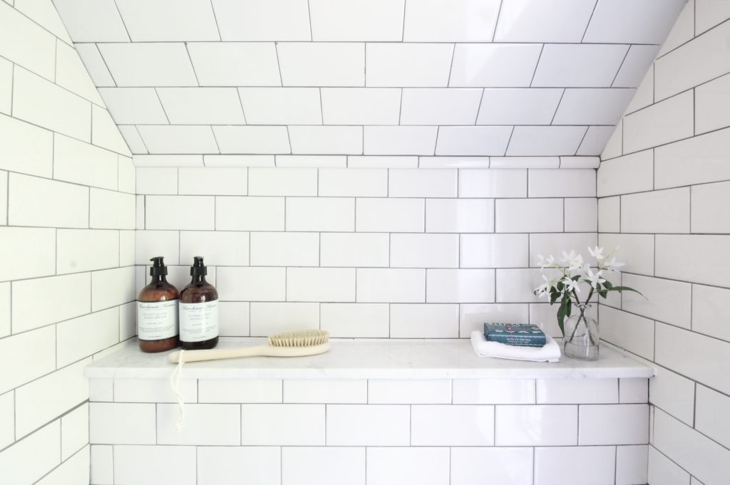
 Both of the shelves inside the shower are a classic marble.
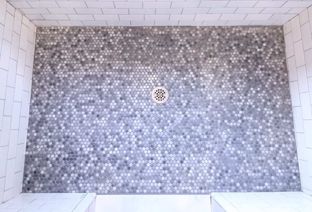
Our clients chose a fun grey penny tile for the shower floor that tied in with the white subway tile and white/grey marble.
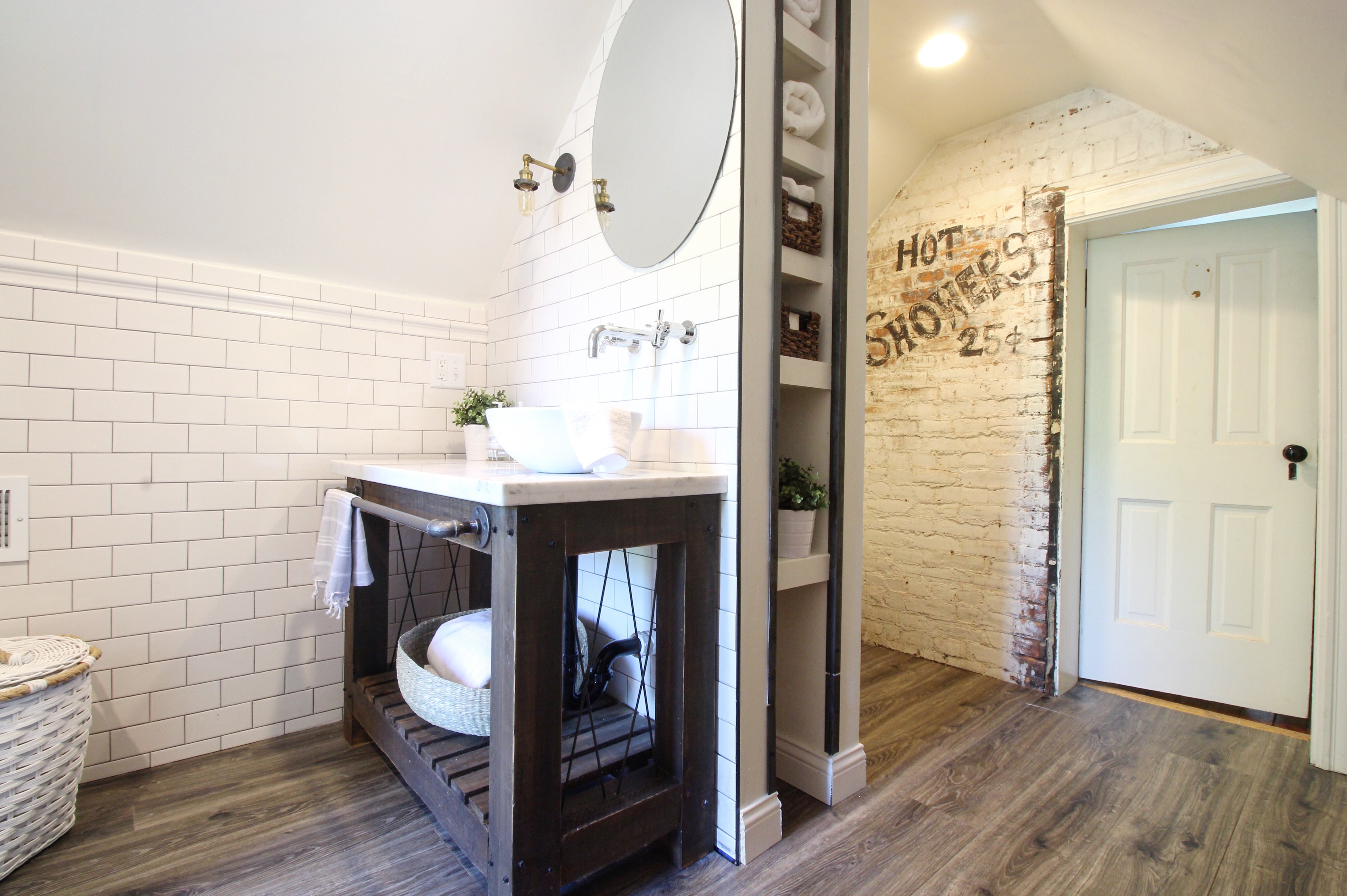
 We replaced the old vanity with a custom vanity that Bryan built out of cedar 4x4s and pipe. We stained it with a mix of classic grey and dark walnut, and added a marble top that we cut and installed ourselves.
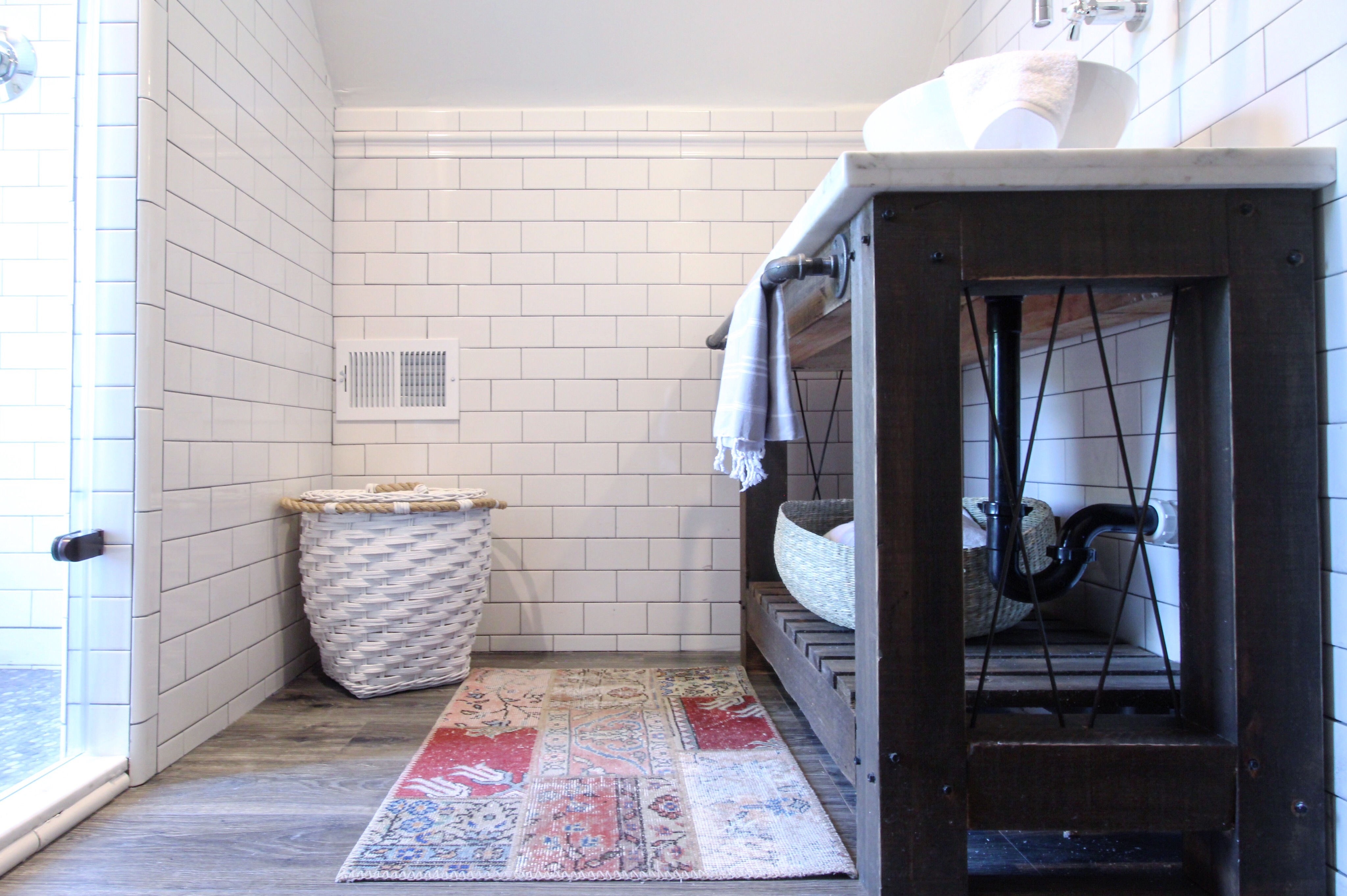
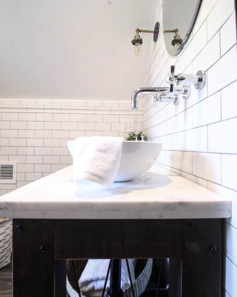
Wall mounted fixtures allowed us to save space on the depth of the vanity.
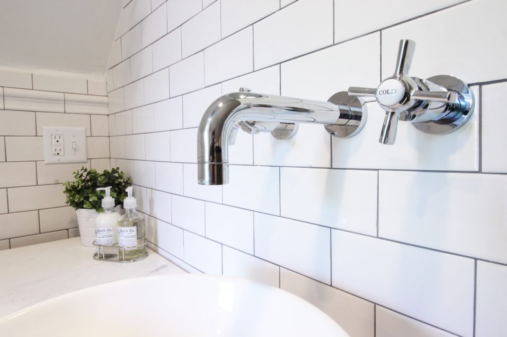
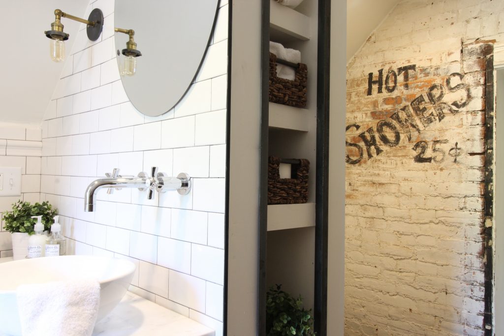
We installed the sink off to the right so our clients wouldn’t have to worry about bumping their heads anymore, and offset the mirror with a brass sconce from Restoration Hardware.
We couldn’t get all of the paint off of the wall where the shower used to be, so we worked with it by hand painting a fun vintage sign on it.
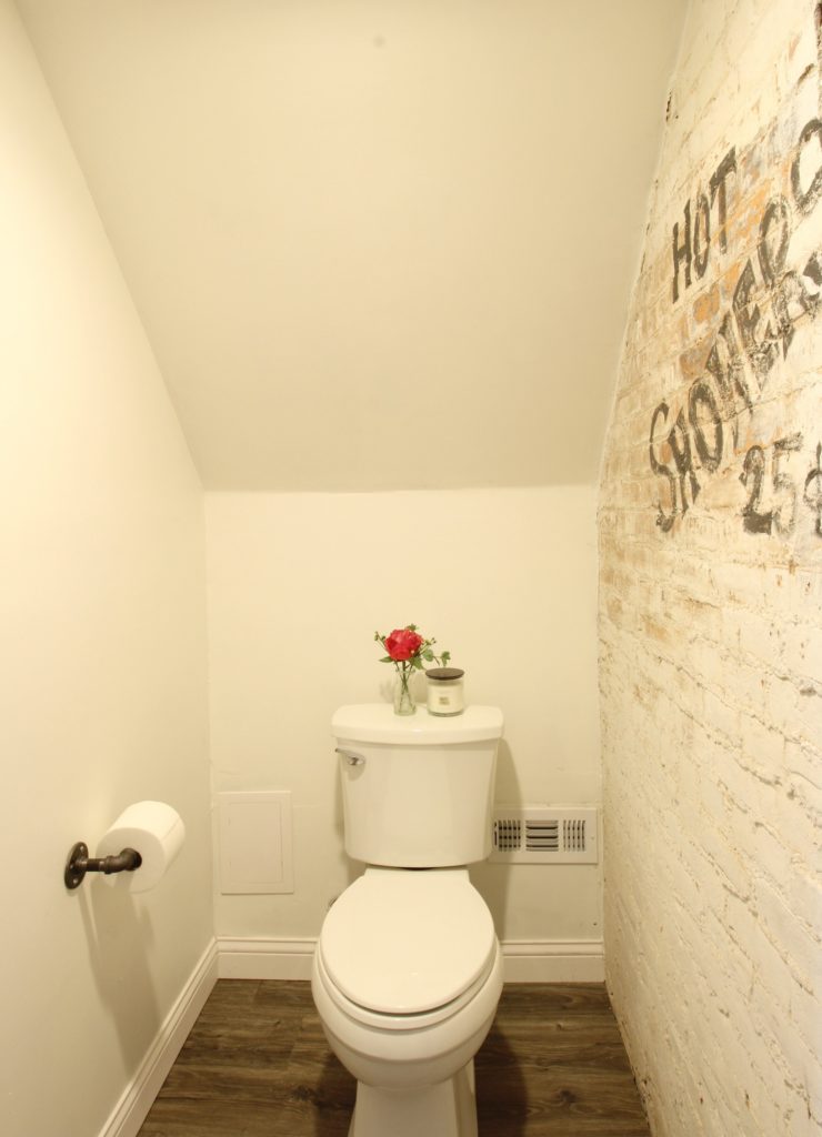
Sources:
Turkish towel on hook – Amazon
Turkish towels on open shelves – Amazon (similar here)
Baskets (variety) – World Market
Hampers on casters – World Market
Sink – Amazon
Rug – IKEA (in store)
Sconce – Restoration Hardware (similar here and here on Amazon)
Wall mounted faucet – Overstock
Shower penny tile – Floor & Decor
We’ll be back soon with more updates on our other projects. In the meantime, come hang out with us on Instagram @beginninginthemiddle!


This is gorgeous. Congratulations! I wish you could redo my bathroom. I am desperate for help.
Thank you Kelsey! We’d love to help 😉
Absolutely LOVE IT!!! It just happens to be ours 😉
[…] (Image credit: Catherine of Beginning in the Middle ) […]
[…] (Image credit: Catherine of Beginning in the Middle ) […]
[…] (Image credit: Catherine of Beginning in the Middle ) […]
[…] Thank you, Catherine! You can see more of the space on Catherine’s blog Beginning in the Middle. […]
So absolutely gorgeous!!! I’m curious how you addressed the privacy issue of the window in the shower. The bright sunlight coming in is amazing but there’s that whole hate to moon the neighbors thing lol. I love seeing projects like this that completely rearrange awkward spaces – it’s fantastic!
Thanks JH! The owners have a frosted glass privacy film that they applied to the window.
[…] (Image credit: Catherine of Beginning in the Middle ) […]
[…] (Image credit: Catherine of Beginning in the Middle ) […]
[…] (Image credit: Catherine of Beginning in the Middle ) […]
This is so wonderful! I also have a 2nd floor bathroom with sloped ceilings, sadly with a much different size but this gives me hope!
Whoa! I have that exact same stair step storage cabinet in the second photo (mine isn’t painted) and I was pretty convinced it was homemade! I got mine at an estate sale… dying to know where yours came from.
No way! This one came with our client’s house when they purchased it.
I really liked the flooring! Any info on that? Thanks!
Thanks Kristy! It’s a waterproof laminate from Floor & Decor. It was $2-3/sq.ft. Hope this helps!
I love the creative layout. Our upstairs bath has the same sloped ceilings, with the same attendant problems. Could you tell me the room’s floor dimensions? Thank you!
Thanks Susan! The room was about 14′ long x 9′ wide.
Congrats on the feature – so well deserved. It’s GORGEOUS! Love the character and the new “old” feel. Also love how you played with the sloped ceilings. Barn door storage was genius!
Thank you so much Tera!
The impact of great design. It looks beautiful! So many good ideas for function and aesthetics.:) Loved it!
Thank you so much Dani!
[…] stunning bathroom makeover. It was conducted in Ohio by a husband and wife renovation team, Catherine and Brian of Beginning in the Middle, for a client. The bathroom you’re about to see, though, is unconventional. It’s actually a […]
Very impressed with your before and after! Your technic is very good. Thank you for posting awesome content – Z
I’m installing the same penny tile in my master bath. Can you tell me what grout color was used?
It was a medium gray – Delorean Gray 🙂