A special thank you to Elkay for sponsoring this post and for supporting Beginning in the Middle. We’re thankful to have the opportunity to work with wonderful brands on our projects who are aligned with our focus on good design & quality. As always, all thoughts & opinions are our own.
This summer has been one of our busiest summers yet for Mix, our design studio, which means we have some fun reveals to share in the coming months! One of the projects we worked on was a historic rental renovation for our clients who are developers in Columbus. The house was super dated and had a layout that wasn’t functional, but also had lots of great historic features worth saving & a good amount of space to work with. Although we renovated the whole home, the kitchen takes the cake as the highest impact transformation. We’re excited to share it with you!
the BEFORE…
The old kitchen was in a small room in the back of the house. Here’s what it used to look like.
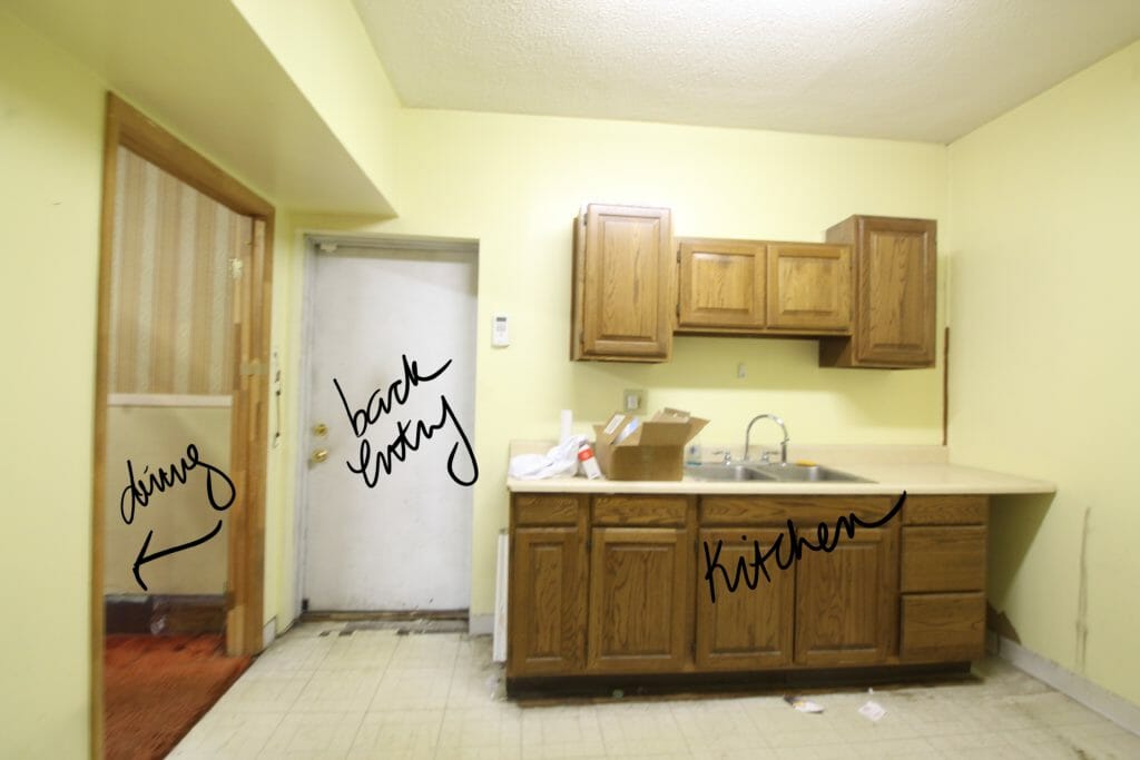
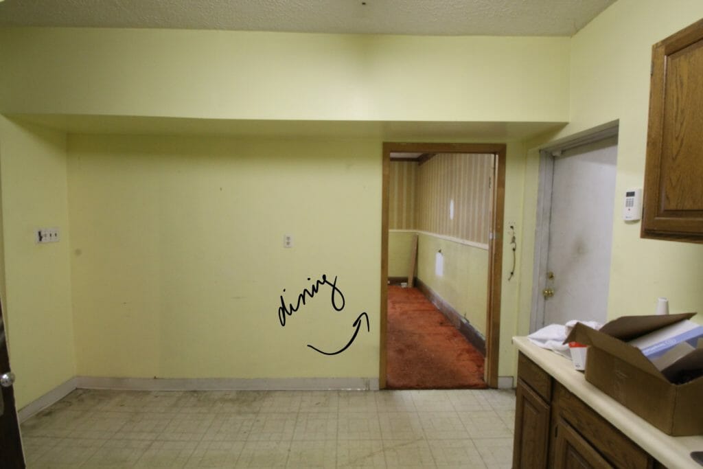
This is what the dining room used to look like from the old kitchen doorway.
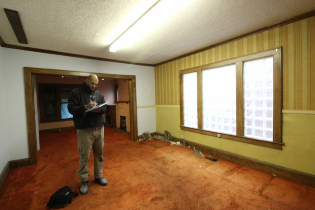
And here’s what it used to look like from the living room. The old kitchen is on the right, behind the white wall. Lotsss of red shag carpet, guys. Don’t you love it?
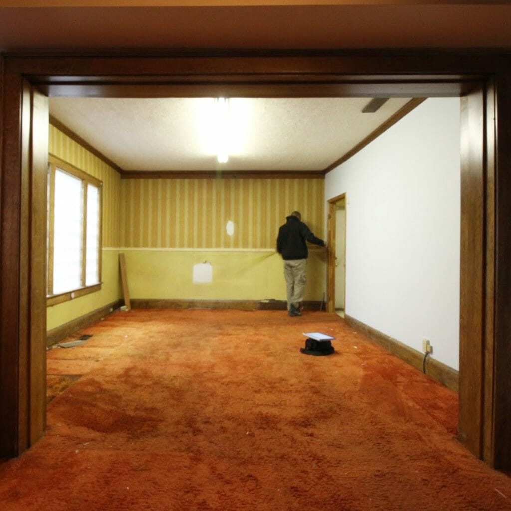
Here’s the old living room, which is right off the old dining room. The house is adjacent to a commercial space (which is currently being renovated as a soon-to-be breakfast spot!), so the super dark window you see in here on the left was not in use.
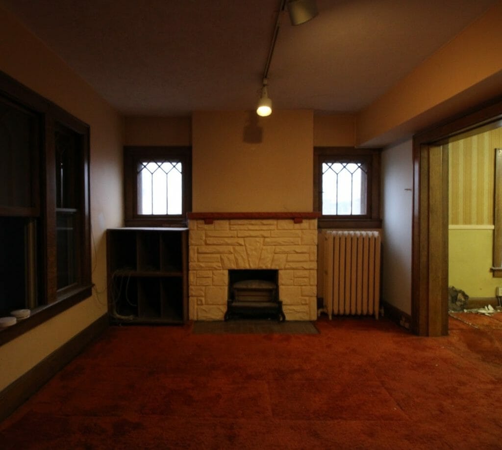
We had our work cut out for us!
LAYOUT CHANGES
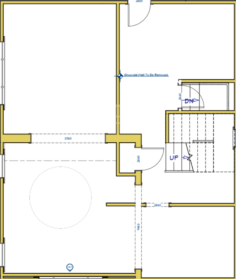
You may have heard us mention this before, but space planning and nailing down a layout is the first step to our design process. We evaluate quirks, client needs, budget and a few other factors to create the best layout for the space. Here’s what the existing layout of the first floor was. Starting in the top right corner was the kitchen, and moving counter clockwise brought you into the dining room, living room, and flex room.
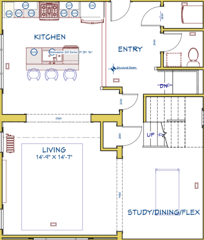
We made a few changes… the biggest one being that we moved the kitchen into the dining room to make room for a powder room and laundry room. We also decided to open up the wall between the old kitchen & dining rooms for better flow and natural light. With this new plan, the rooms all feel open to each other but are still defined. The kitchen is really big and bright, and the home now has laundry & a first floor powder room — all things that’ll make it more attractive to potential renters.
FINISHES
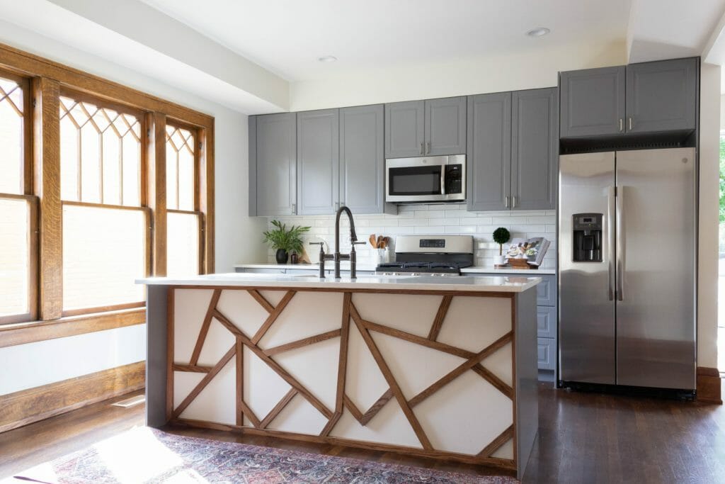
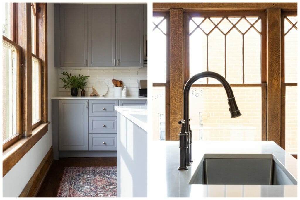
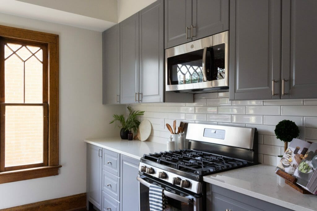
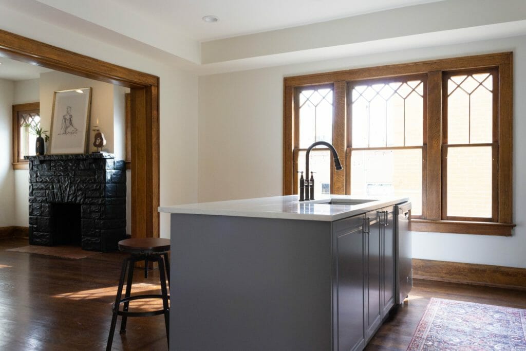
This home will be a high end rental, so we focused the kitchen design on functionality and durability while also tying in the historic character of the home. We chose grey cabinets, stainless appliances, an elongated subway tile backsplash and low-maintenance quartz countertops. We painted the walls Behr Exclusive Ivory and refinished the original hardwood floors that were hiding under that lovely shag carpet. They turned out to be white oak, which we’ve never come across in a home before, and they’re b-e-a-uuutiful.
 Bryan designed & installed a fun geometric pattern on the back of the island from scrap wood, which ties in with the original window so well! That window, by the way, used to be all glass block. This one was a leftover from the living room (recognize it from the before photo?) and happened to be an exact fit, so we repurposed it in here. It lets in so much more light than the glass block and warms up all of the grey nicely.
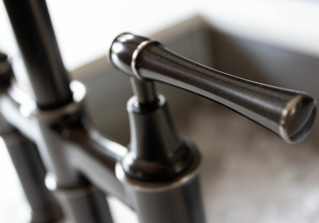
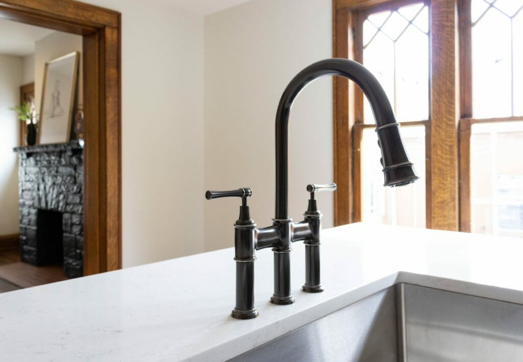
The sink and faucet are so beautiful and really make the kitchen feel extra high end. We used an Explore bridge faucet and Crosstown stainless steel sink, both from Elkay. The body of the faucet is a dark grey / black / bronze color, but it has stainless steel accents that tie it in with the stainless steel sink and appliances. The faucet has a pull-down spray head that helps with additional cleaning & rinsing. It also has a hand spray with a pause feature, which allows you to stream, spray and pause the water based on what you’re using it for. High-tech stuff, folks!
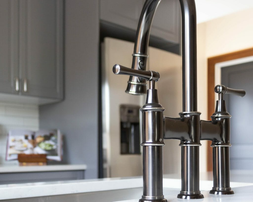
Because there is so much light gray in the kitchen, we loved that Elkay offers this style faucet in a a dark antique steel finish.
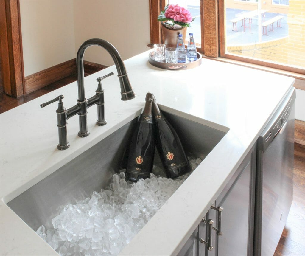
The Elkay Crosstown sink is large & sturdy (it’s 16 gauge stainless steel) so it will certainly stand the test of time. Having a sink with extra depth is something we’ve found to be super useful in our own home, so we try to incorporate that where possible — including in this kitchen. This sink is 32.5″ wide x 10″ deep and can fit A LOT in it, including oversized bottles if needed 🙂
The quarter sawn white oak woodwork was in wonderful shape in most of the house, so we left it unpainted & patched as necessary. It makes the home feel warm, inviting and historic, even though it just went through a major remodel.
before & AFter
This space has come such a long way. The former dining room that used to look like this…

Is now a kitchen that looks like this!
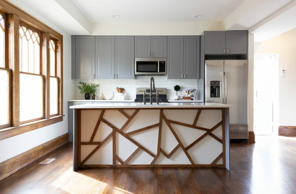
Opening up the wall between the dining room & former kitchen made the whole floor feel larger and was a game changer for the natural light situation.
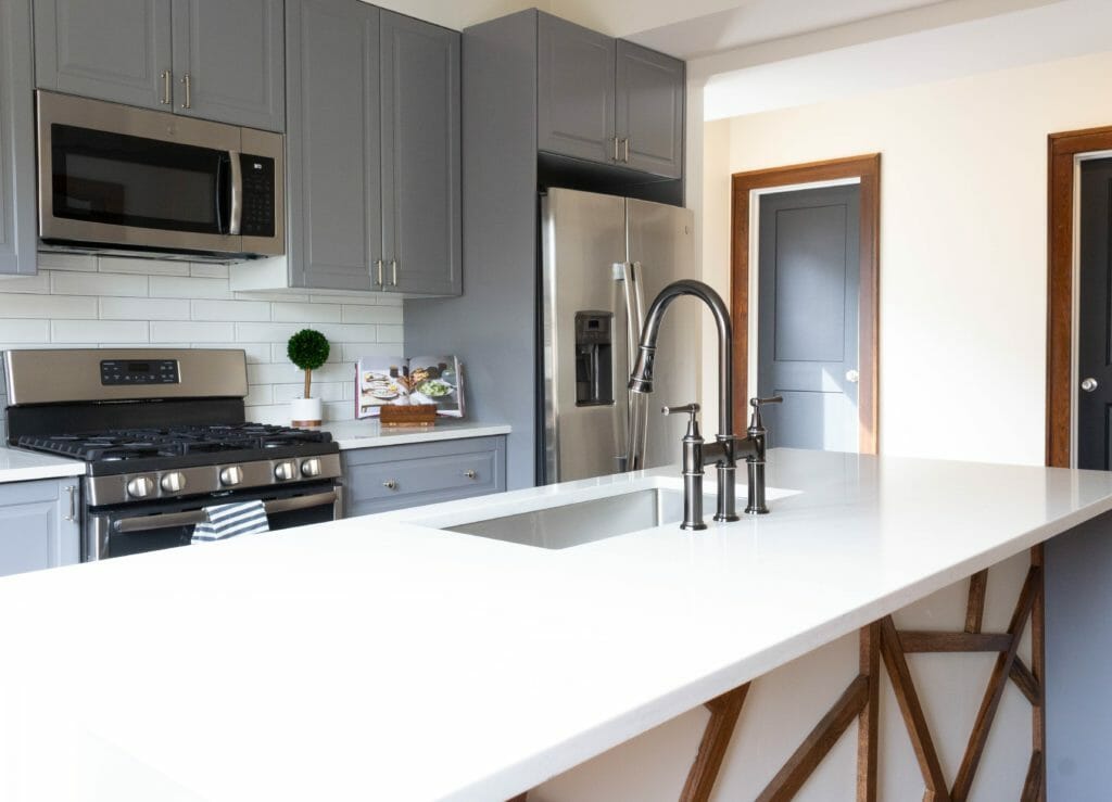
The view from the dining room into the living room went from this…

… to this!
And the living room that used to look like this…

Now looks like this.
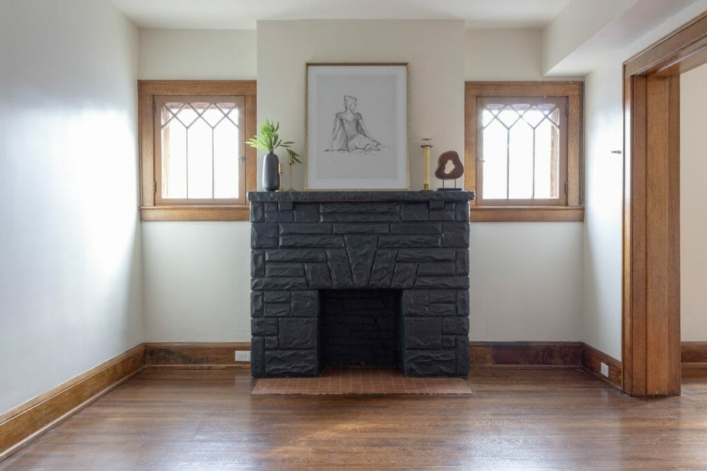
So much better, right?! It’s hard to believe it’s the same space & we hope the tenants who live there love it as much as we do. We’ll post more before/afters of the rest of the home on Instagram, so be sure you’re following us @beginninginthemiddle!
I am in awe of all the work you do! Truly amazing!
Can we see the rest of the space/reno?
We’ll be posting more to Instagram when we’re finished! (we’re @beginninginthemiddle)
OMG, what a makeover! The kitchen looks amazing.
Thanks! It’s come a long way.
[…] the whole home & shared the kitchen reveal post this fall (if you missed it, you can catch it here). This is what the kitchen (aka, the old dining room) looked like before we […]