Eight months later, we’re excited to share the details behind the coworking space that our company, Mix Design Collective, designed & renovated last fall! This was the largest commercial space we’ve worked on, and it was a fun challenge that we’re super excited we got to be a part of. Bryan & I created the design plans, managed construction, furnished & styled the space, all in a few months which was probably definitely the most expedited project we’ve ever done.
HOW IT STARTED
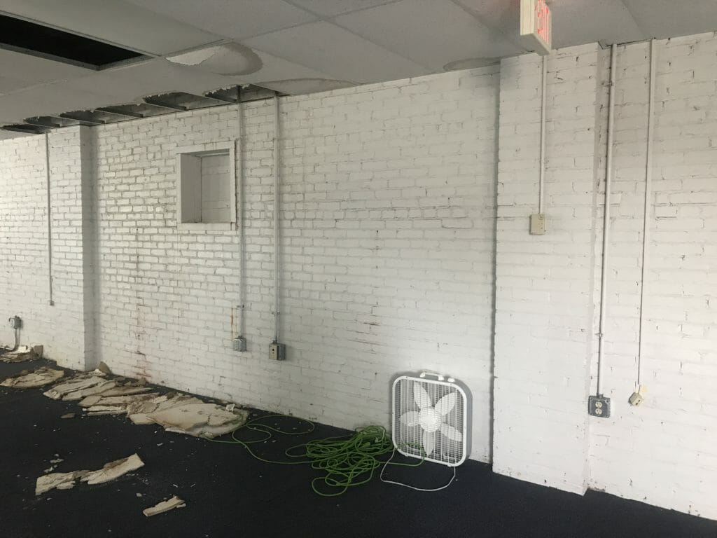
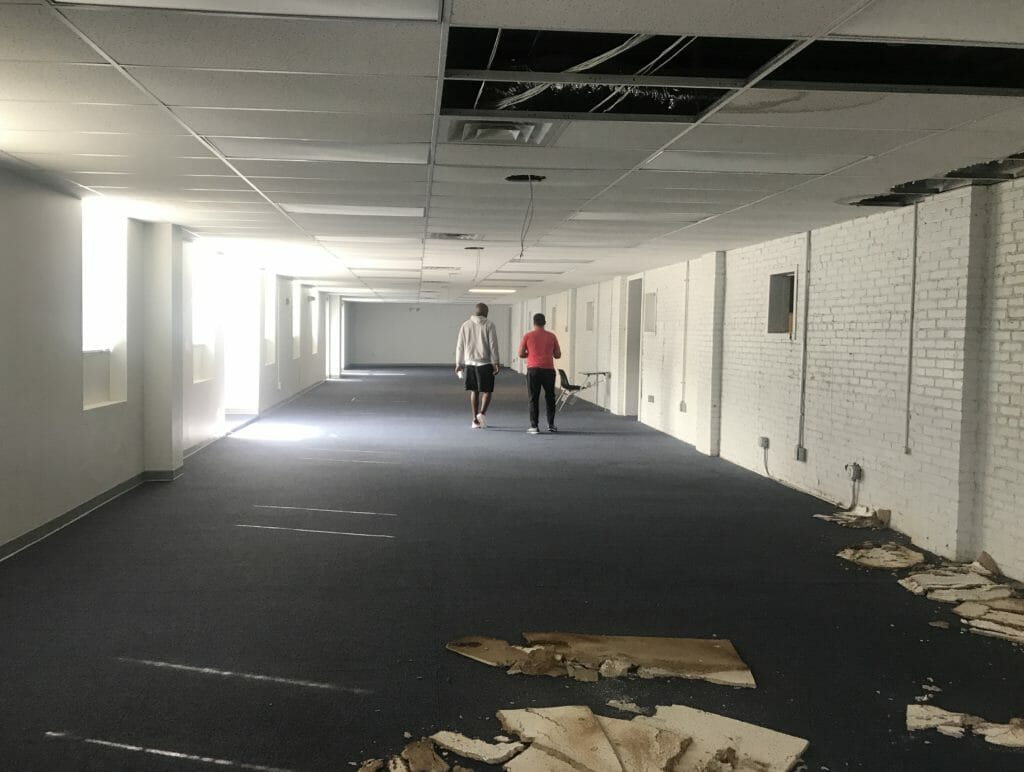
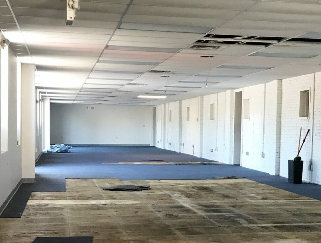
Here’s a look at what the space was like before we got started: a long, narrow 3,500 sq ft shell with old blue carpet tiles and dropped ceilings.
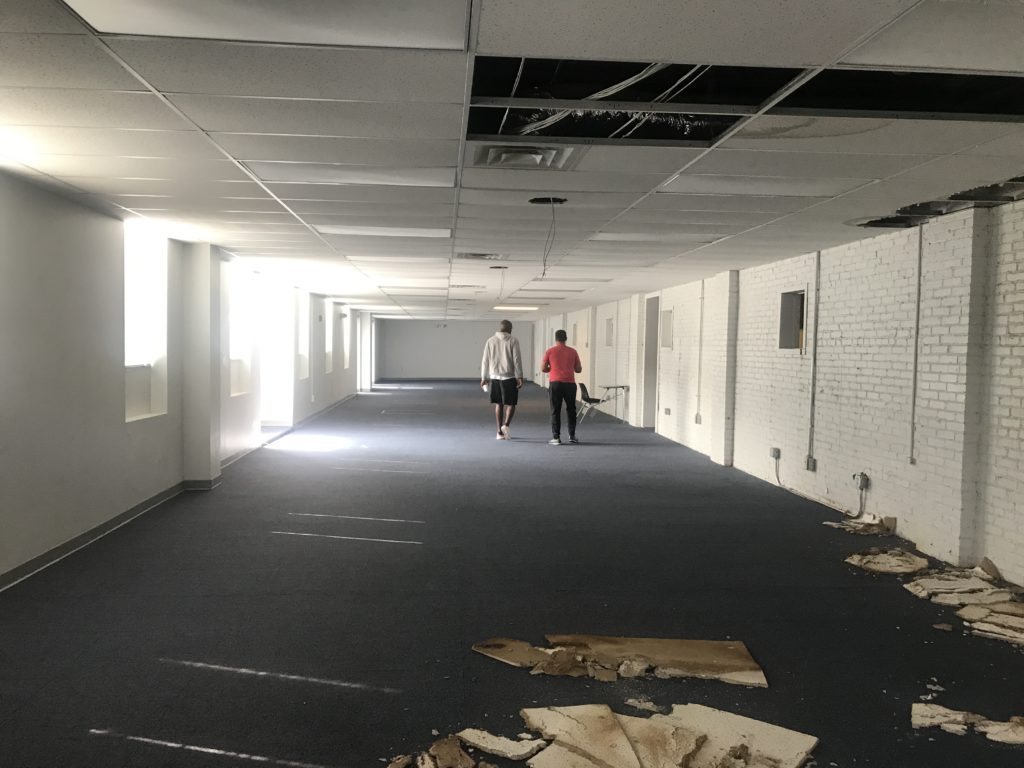
It felt like a tunnel.
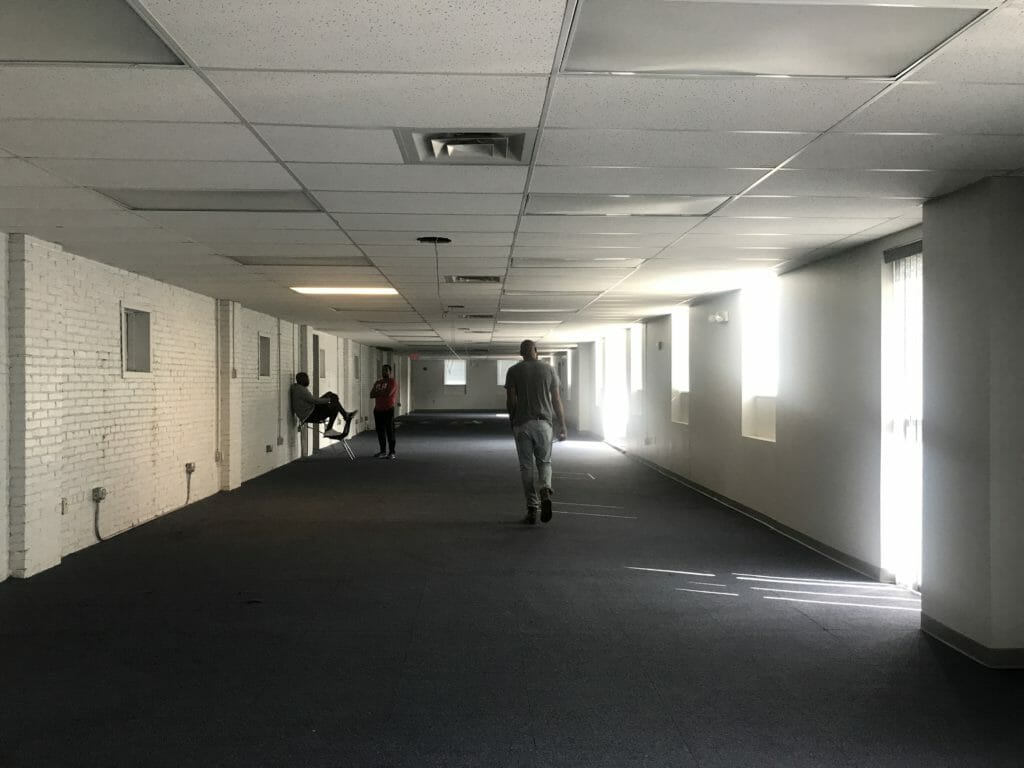
Our clients on this project invest in small businesses around the country, many of which are based in Columbus, and they wanted a place for all of them to be able to work and grow and collaborate. They spend lots of time traveling and love some of the urban designs that WeWork has so perfectly nailed, and wanted their space to have a similar vibe. Their vision was to create an inspiring space structured so that everyone was encouraged to interact with each other instead of sitting at their desk alone all day. They also wanted flexibility to use it for weekend gatherings, worship services, and other events.
OUR DESIGN PROCESS
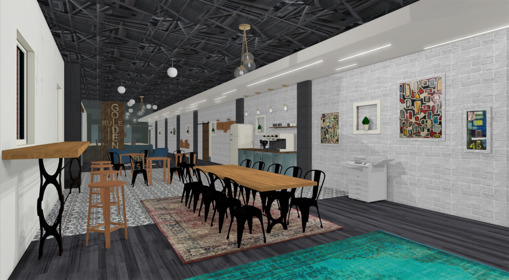
Before starting to think about aesthetics (like, how we were going to make this the SWEETEST place to work in), we got started by asking tons of questions about how the space was going to be used. What types of businesses & equipment would we need to plan for? How many desks did they need? Did they want a combination of work space and lounge space? Coffee/bar? Did they have any furniture from their old office space that they wanted to keep & use here? Based on their feedback, we decided to divide it up into a few different sections:
- Coffee bar area w/collaborative workspace for people without permanent desks
- Private workspace behind conference room for business with permanent desks
- 2 lounge areas with sofas and games, both with TVs
- Glassed in conference room for meetings
- Entertainment/flex area with small stage for events
We worked through a bunch of different floor plans, and finally landed on the one that felt right. Here are a few of the renderings we created during our planning phase.
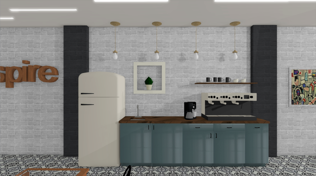
CONSTRUCTION
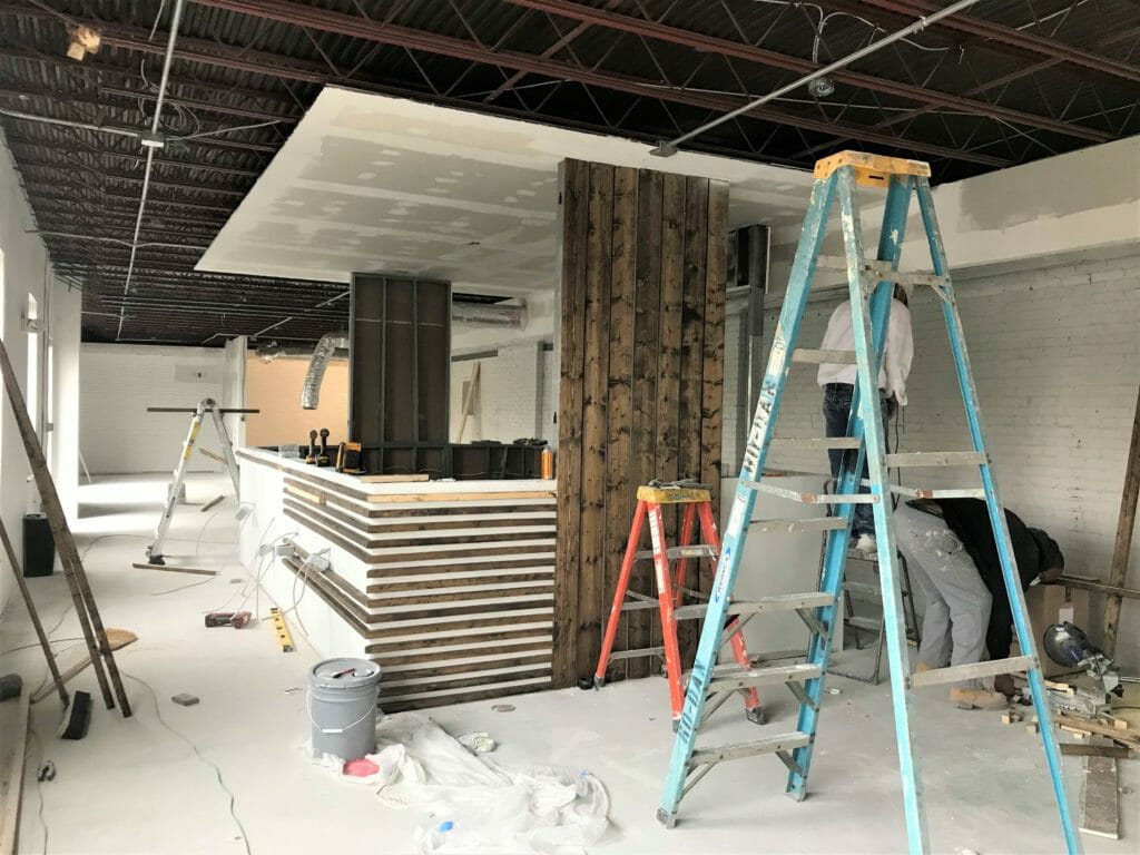
After we got our client’s approval on the plan, we got to work. We started by removing the carpet and dropped ceiling tiles, which added at least 3′ of ceiling height to the space.
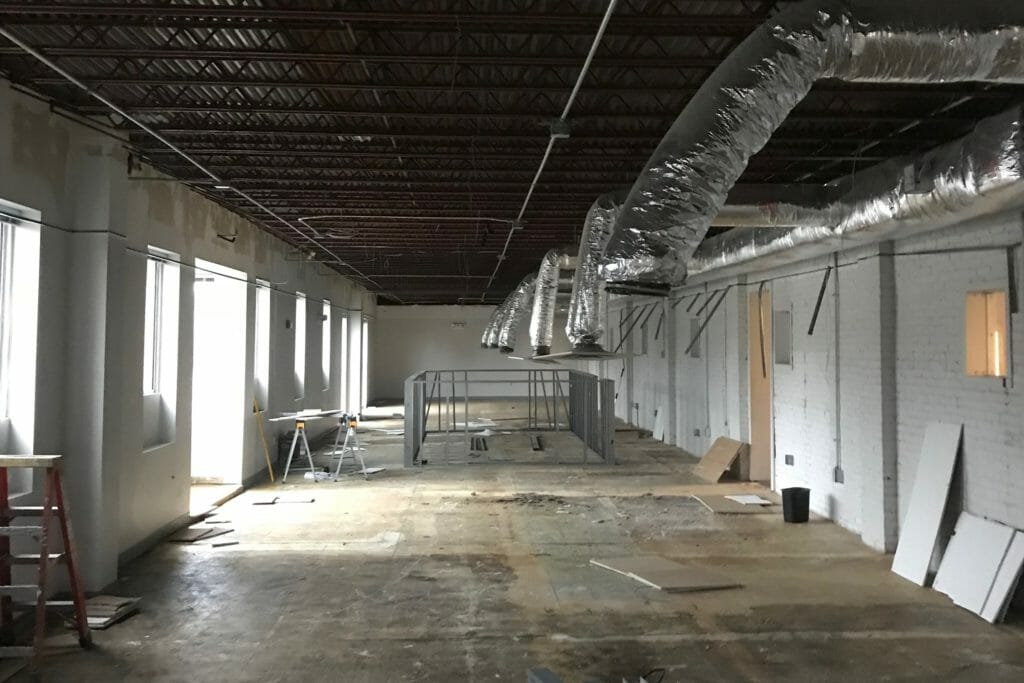
The concrete under the carpet was cracked & patchy and sticky, so we had a few more inches of concrete poured on top of it to smooth it out.
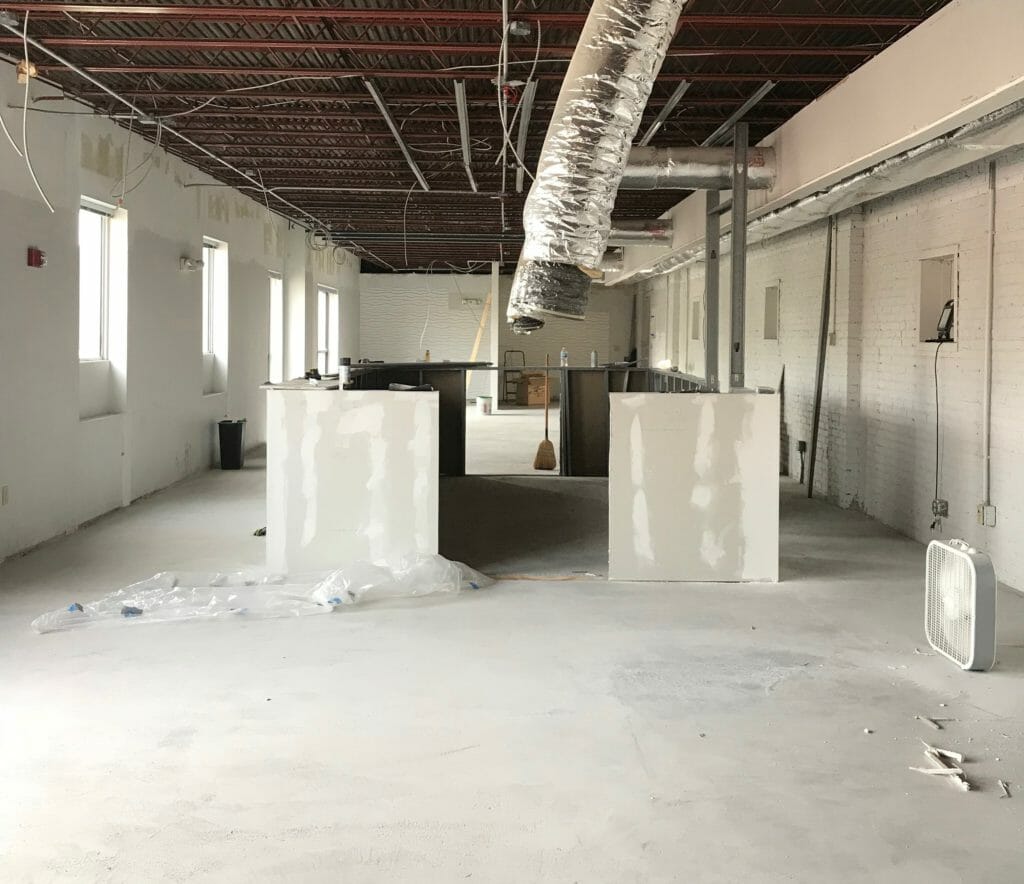
And little by little, it all started coming together.
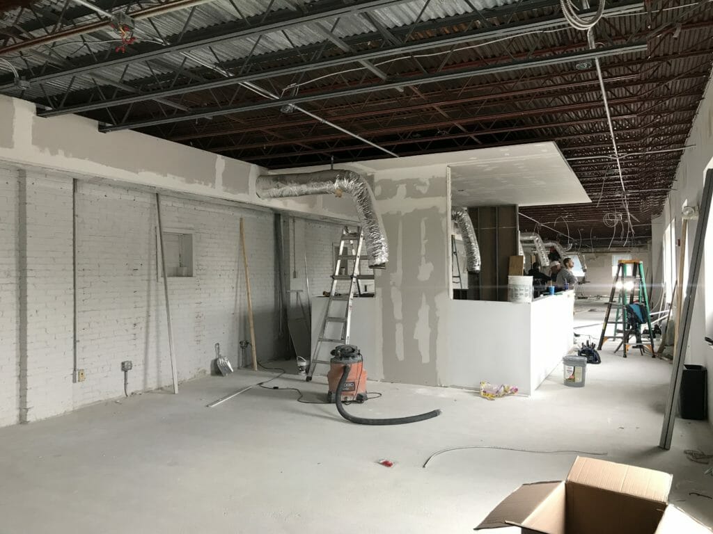
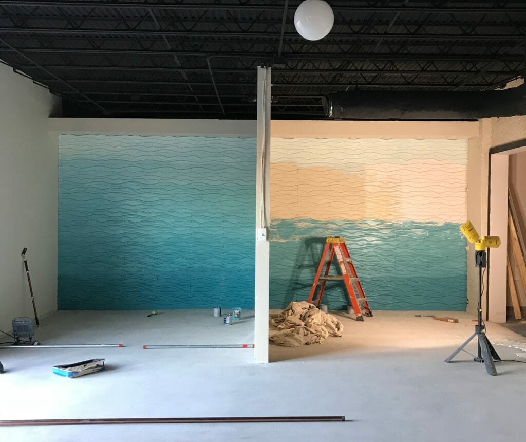
We incorporated some fun, unplanned details like this 3D ombre wall at one end of the space, illuminated with overhead can lights. Sometimes (a lot of times, actually) we don’t get our best ideas until construction has already started. It’s a big part of our process & how we work.
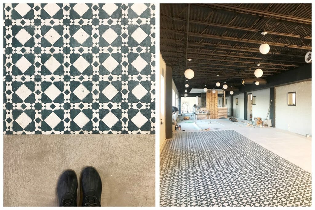
Another favorite design detail was the stenciled floors in the coffee area to create some separation of space. The pattern is simple but really fun.
HOW IT ALL TURNED OUT
This…
Now looks like this!
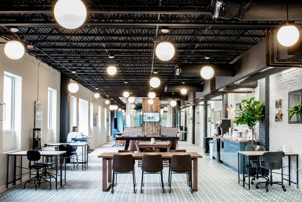
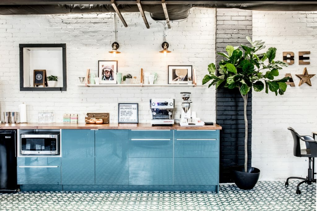
The coffee bar area ended up being larger than we had planned, but the scale works much better in the space. There’s lots of things to love here, but our favorite might be the La Marzocco espresso machine. Because it’s just soooo prettyyyy (also, it makes really great espresso, which is kind of important too).
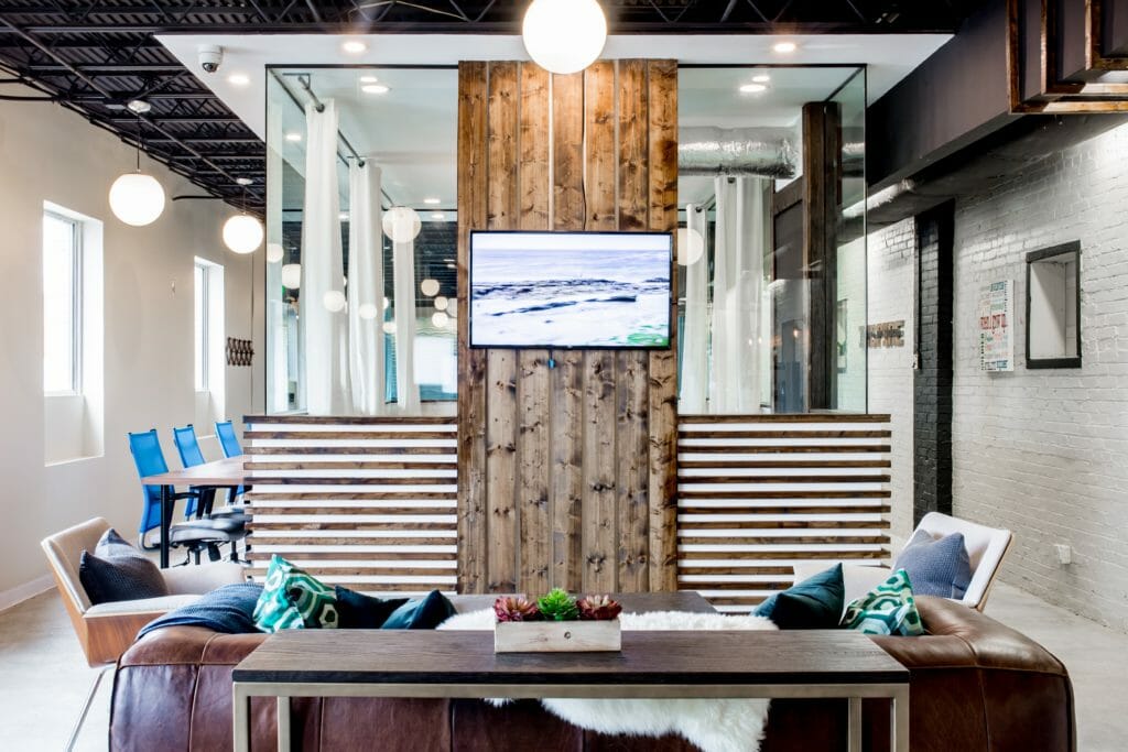
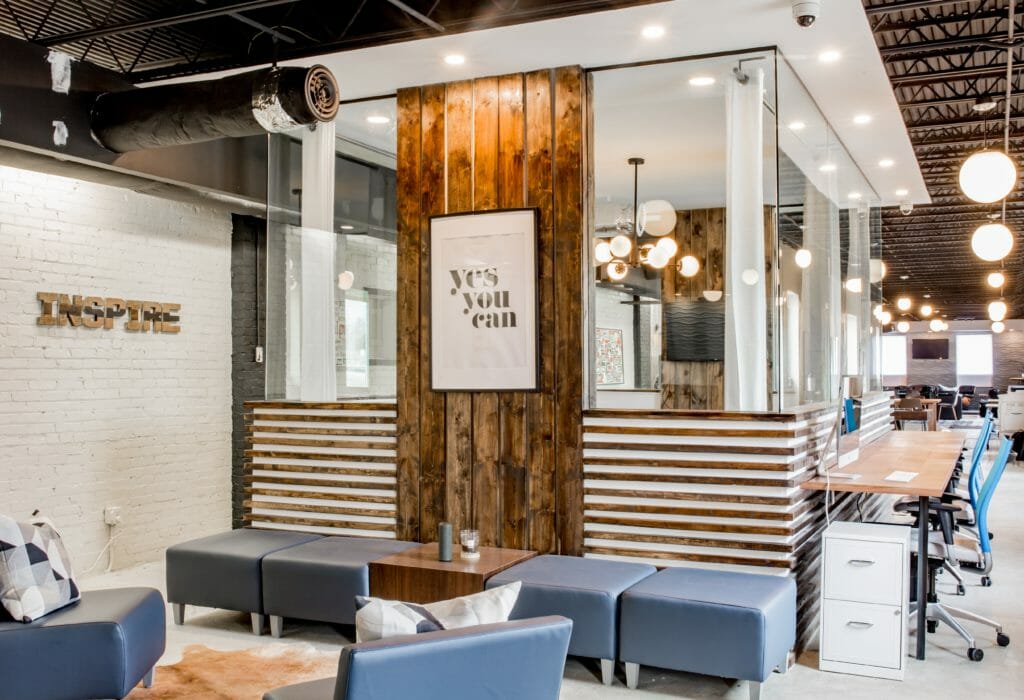
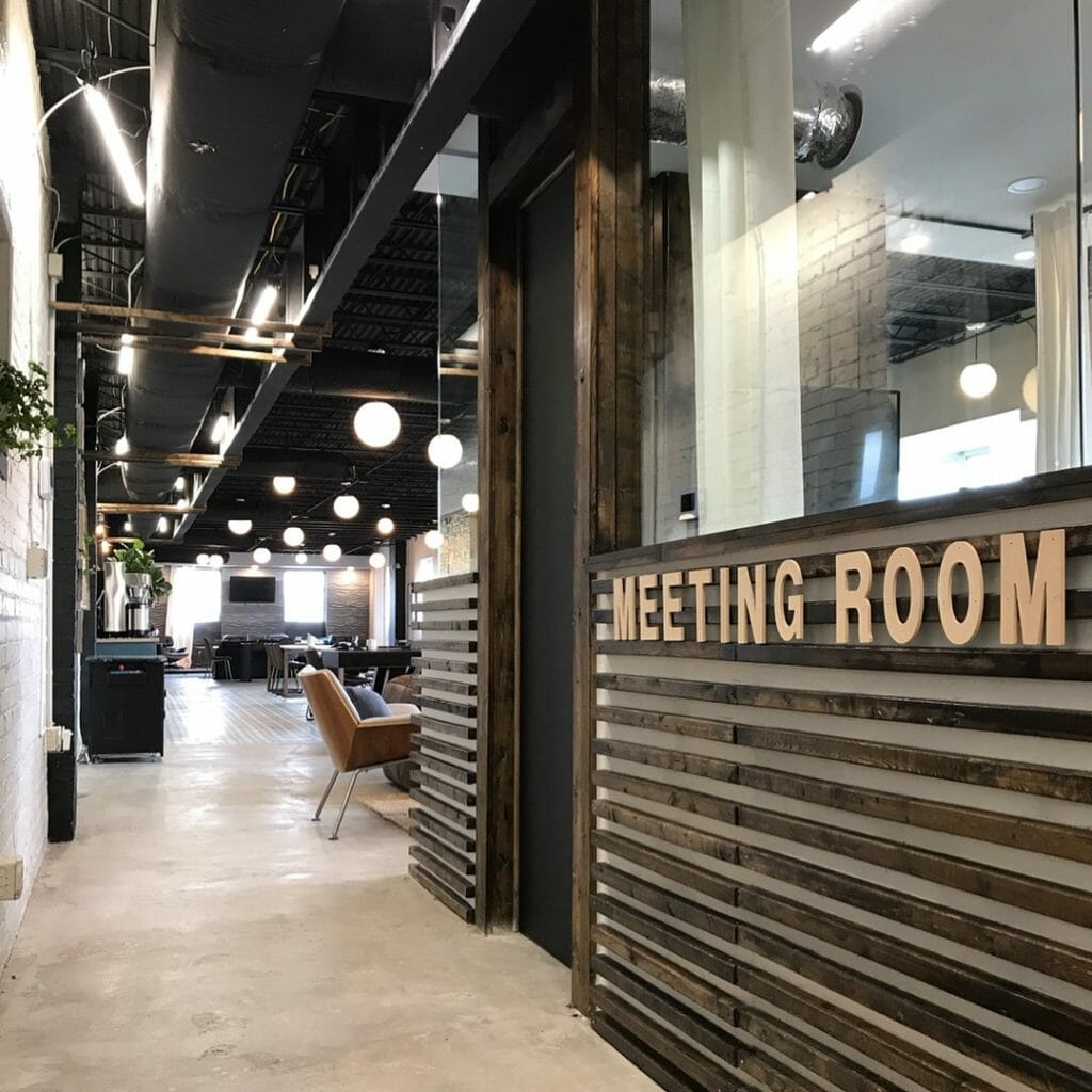
The glassed in conference room might be our favorite part of the whole project (we have lots of favorites, okay?). Aside from the interior of the conference room being a meeting space, we wanted the outside to be visually interesting. We installed lots (and lots and lots) of 2×2 slats horizontally around the exterior, as well as vertical 1×6 pieces to create wall space for hanging smart boards & TVs on both sides. We used the vertical wood pieces on the outside as the focal point for one of the lounge areas. It anchors the space and kind of feels like a fireplace. The TV is high enough so it’s visible from the coffee area & shuffle board table, but not too high to make it awkward to watch from the couch.
Because half of the conference room is glass, we filled the lower walls with sound insulation & made sure the glass was thick enough for privacy while meetings were going on. Inside, we hung curtains that can be closed for additional privacy during meetings. We love that you can see through the conference room to the wavy accent wall on the other end.
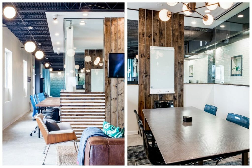
Here’s a peak at the space behind the conference room.
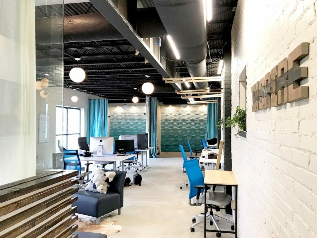 We love the look of the wavy accent wall among all of the black & white. The can lights we installed above it really make the pattern pop.
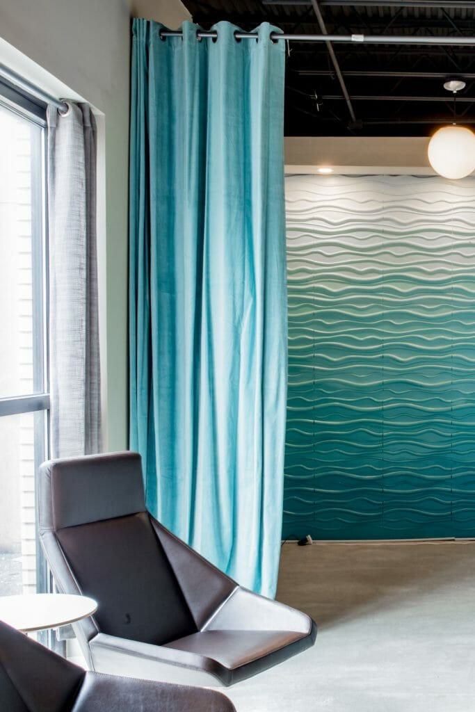
On the side of the conference room, we installed a long wood top with space for four more people to work, and on the other end, another sitting area for employees & their clients.
Here’s a look at the other end of the room, where the entertaining/flex space & stage is. We added the same wavy tiles to this wall, but painted them grey instead of blue. We built a small stage with spotlights and a TV, and created another lounge area with comfy seating and plants.
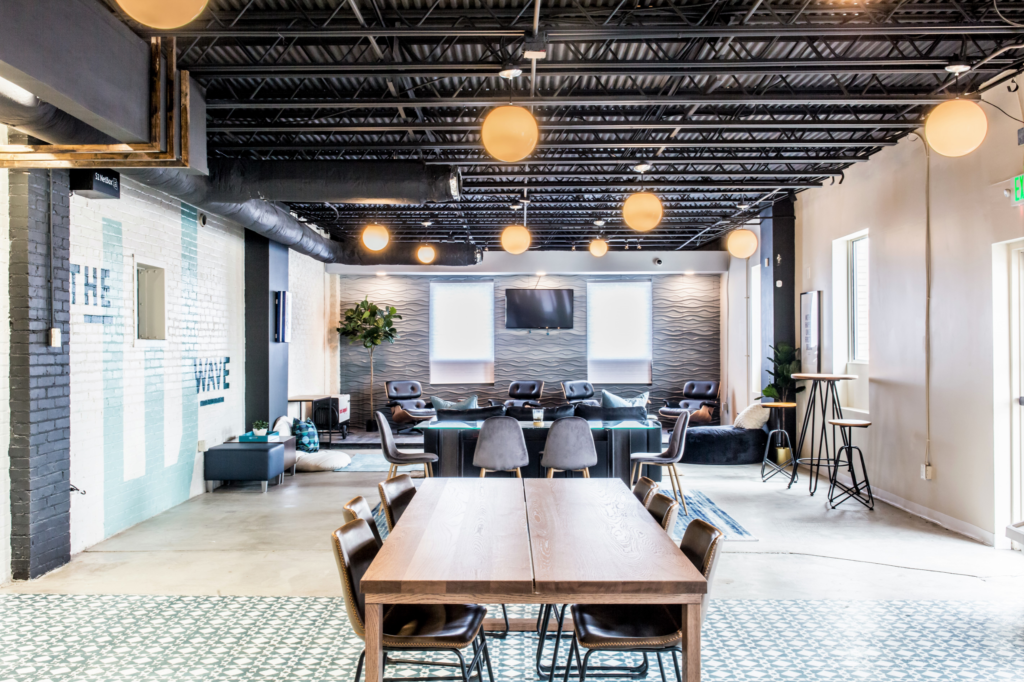
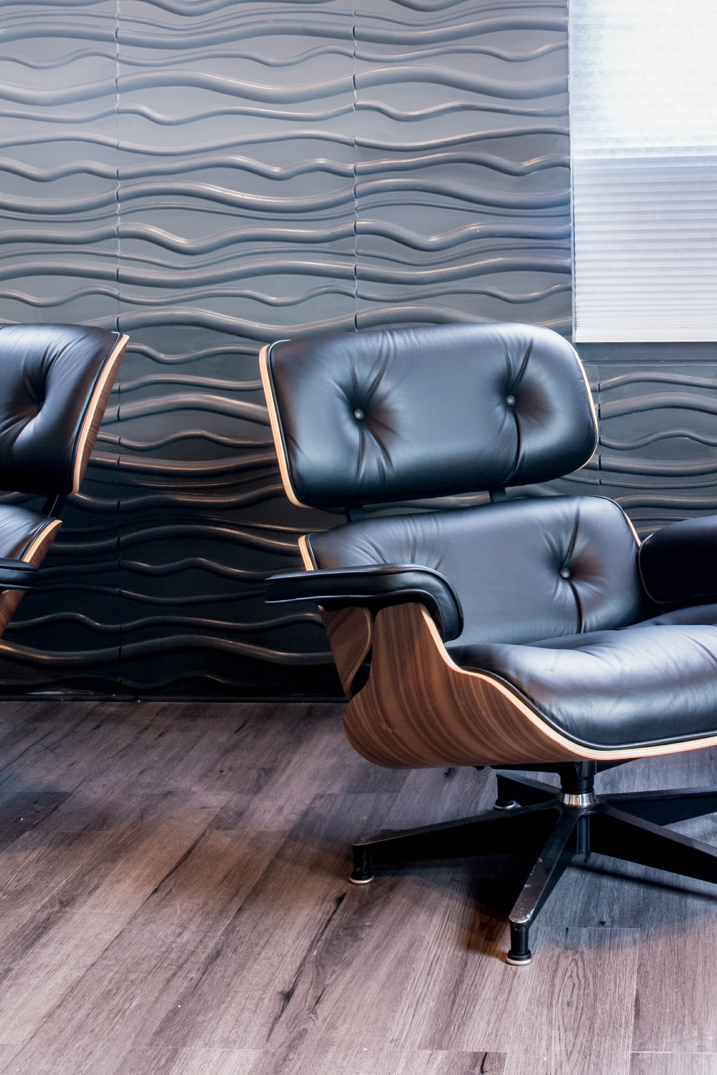
Our clients had 4 Eames chairs from their previous office space. They’re ah-mazing.
We love the way it came out! More importantly, our clients and the businesses that use it love it too. It’s hard to believe that it went from this…
To this rendering…

To this, all finished.
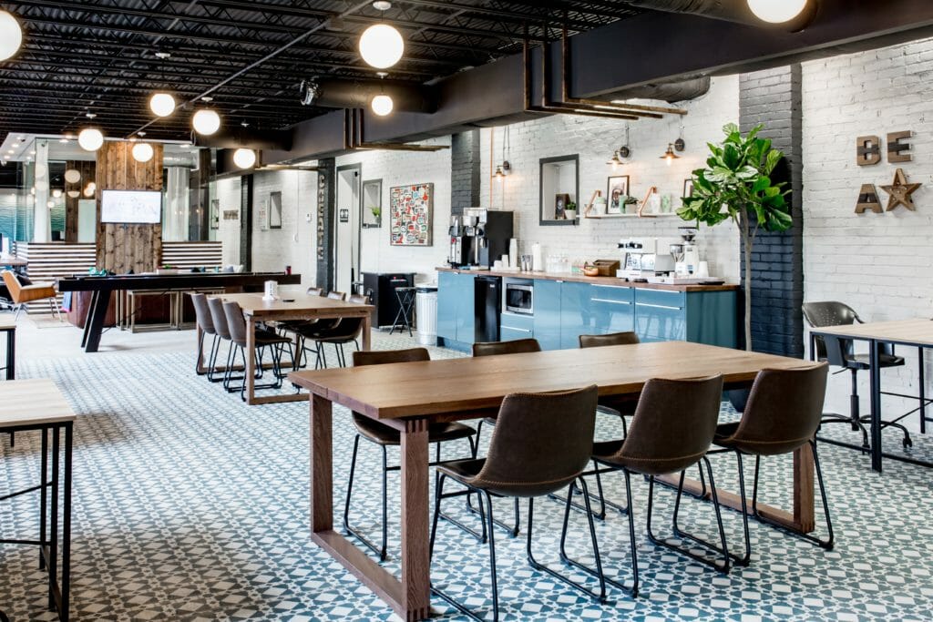
Thank you Allie & The Wonder Jam for capturing our after photos!
Until next time…
-C&B
This is absolutely amazing!!! You guys more than nailed it!
Thanks so much Lea!
You and your Husband do amazing work!
Thanks Stephen! This was a fun project.
Such a cool space!!
Thanks Kelsey!
Gorgeous!!
Thank you!
Love love love the (walnut?) tables with the dovetail joints. Did you have them custom made?
Thanks Molly! They’re from IKEA – we didn’t have enough time on this project to get them custom made, so we had to find something that looked pretty sweet off the shelf. They’re really nice, and don’t look too “IKEA” if you know what I mean 🙂
I have been a fan of your work guys. keep inspiring !!
Thank you so much! We’ll try 🙂
I have been a fan of your work.
Keep inspiring with your eyepopping craft
[…] Wave Coworking Space […]
[…] showrooms, and salespeople. We made our first purchase from them while designing the Wave coworking space in 2017. We were looking for a piece that was casual but also durable, and the Cigar sofa fit […]
Great article on coworking spaces and remote work! It’s exciting to see these trends shaping the future of work.
I’m curious about the challenges of balancing specialized coworking spaces with general-purpose ones. Also, what emerging tools or strategies are essential for remote sales agents?
Thanks for the insights!