Guys! We’re FINALLY making progress on the Vic renovation and have updates to share! If you’ve missed our prior posts on this project, you can catch up here:
- New Property: The Blonde Vic
- 1st Floor Before Tour
- 2nd Floor Before Tour
- 3rd Floor Before Tour
- Design Changes
Since our last post, we’ve gotten a lot done. Slowly. All of the windows are replaced, all new HVAC, plumbing, electrical are roughed in, drywall is finished, the hardwood flooring in the kitchen is in, and we’ve started tiling a few of the bathrooms (!!). We’ll take you through all of it, starting with the kitchen.
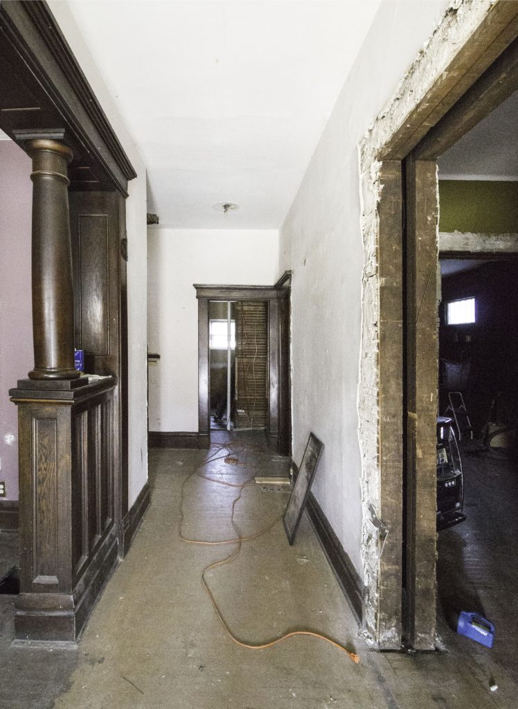
This used to be the view when you walked in the front door. The kitchen was straight ahead through the doorway.
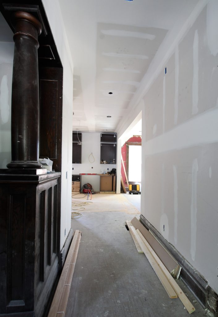
This is what it looks like now, with the kitchen space opened up.
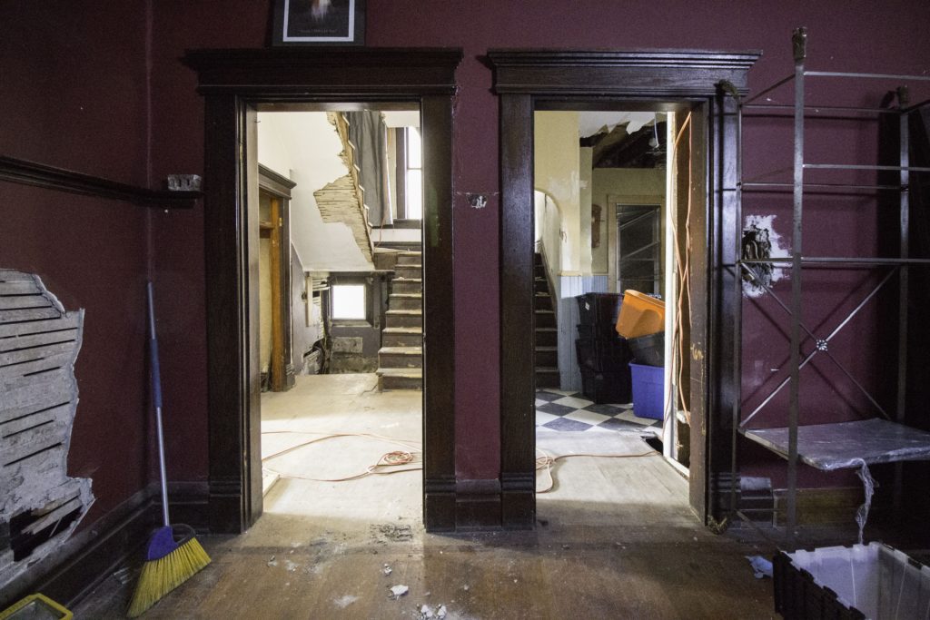
Here’s another view of the kitchen from the dining room, before we opened up the doorways.
Here’s what it looks like now. Behind the pantry cabinets is a small powder room (previously, there were 2 staircases but no bathroom on the 1st floor).
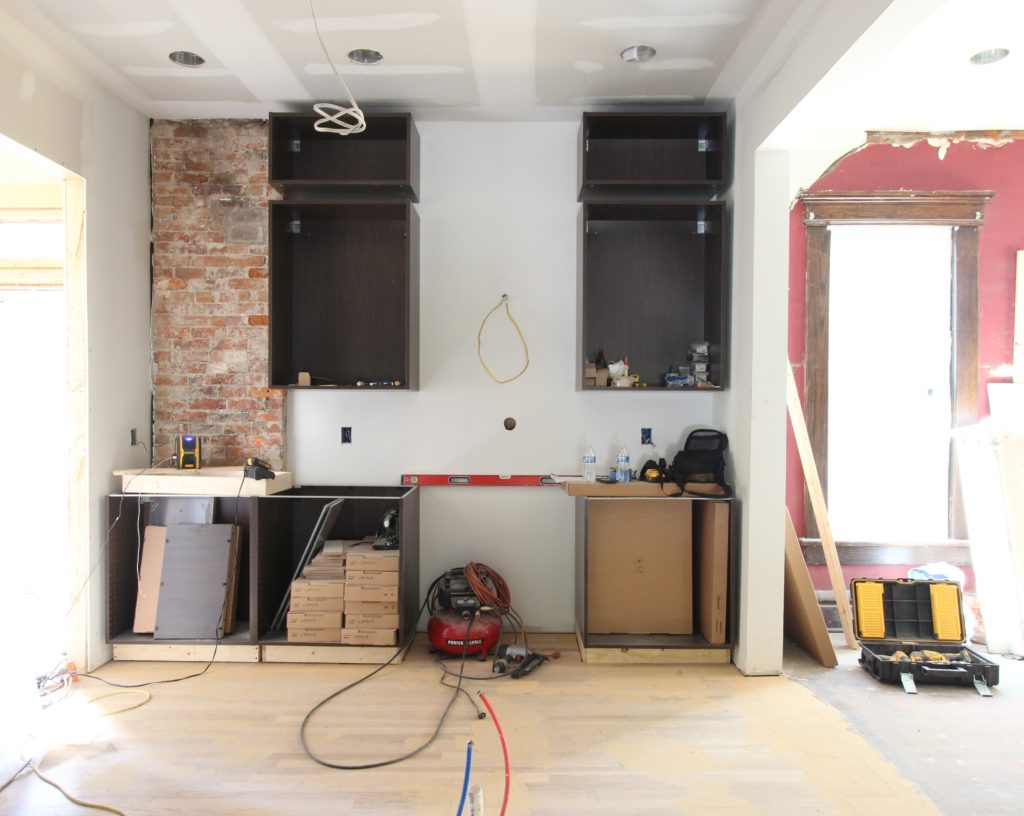
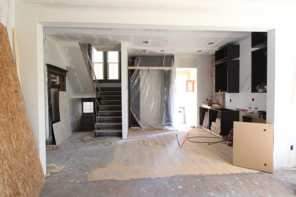 Here’s one more view of the back wall of the kitchen, then…
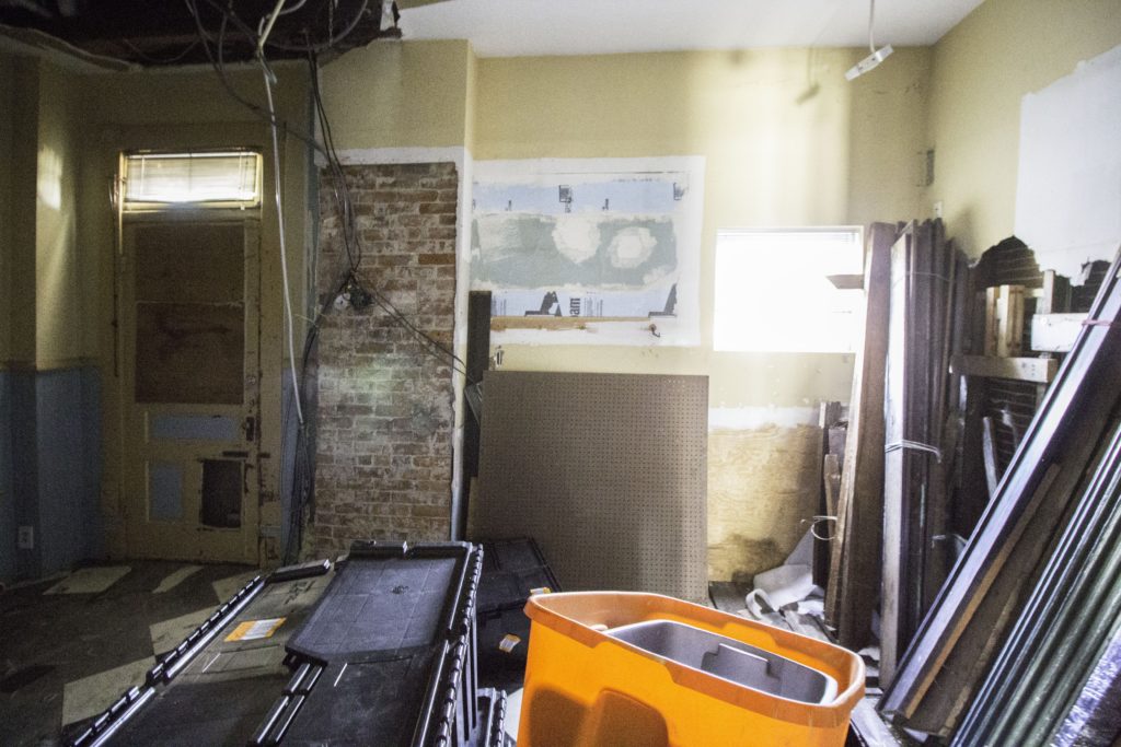
And now.
From the first time we walked into the Vic, we envisioned going dark in the kitchen. As much as we love light & bright kitchens, we felt drawn to something more moody and sophisticated in this home.
We love the simplicity of this Bloomsbury WC1 Kitchen by DeVOL. It feels elegant but not trendy. It also feels like it’s in an old house, doesn’t it?
Here’s more green from DeVOL. The Peckham Rye Kitchen is a little too green for us, but it’s still inspiring. We love the use of artwork to add color and vintage character to the space.
The bold window treatments in this kitchen are awesome. Also, the ceiling details. And brass. And marble. It was designed by Lisa Mende Design.

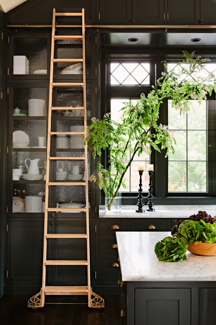
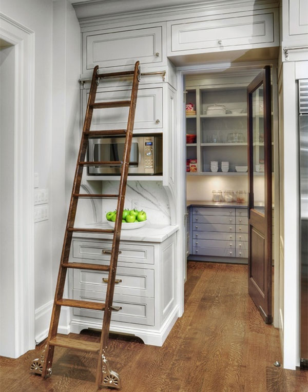
And last… the library ladder in the kitchen. We have 10′ ceilings in here, so in addition to the ladder looking pretty, it’ll actually be useful when trying to reach those high cabinets.
Here’s our latest rendering of the kitchen space. This is round 4 since we first started this renovation in March! As we spent more time in the house, our design direction shifted, and honestly, we’re happy it did. We think we’re onto something that’ll stick with this one.
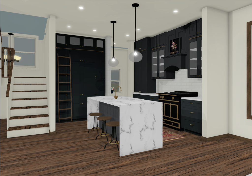
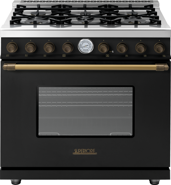
A really big source of inspo for our design is this 36″ range (48″ version here), which we found on sale for 50% off!
On the left side of the back wall, we’re going to add an appliance cabinet that will sit right on the countertop. It will house the coffee maker, microwave, toaster oven, etc. so we don’t have anything sitting out and creating clutter. We’re currently hunting down hinges that can allow the doors to retract while in use, like this via Better Homes and Gardens.

On cabinetry, we’re going to be partnering with Semihandmade, a company that makes custom doors for Ikea frames (genius, I know). We have most of the frames installed and are customizing them to incorporate a 1×4 library ladder frame between the two tiers of cabinets.
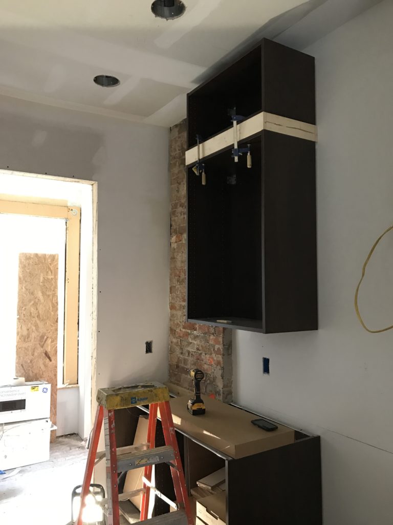
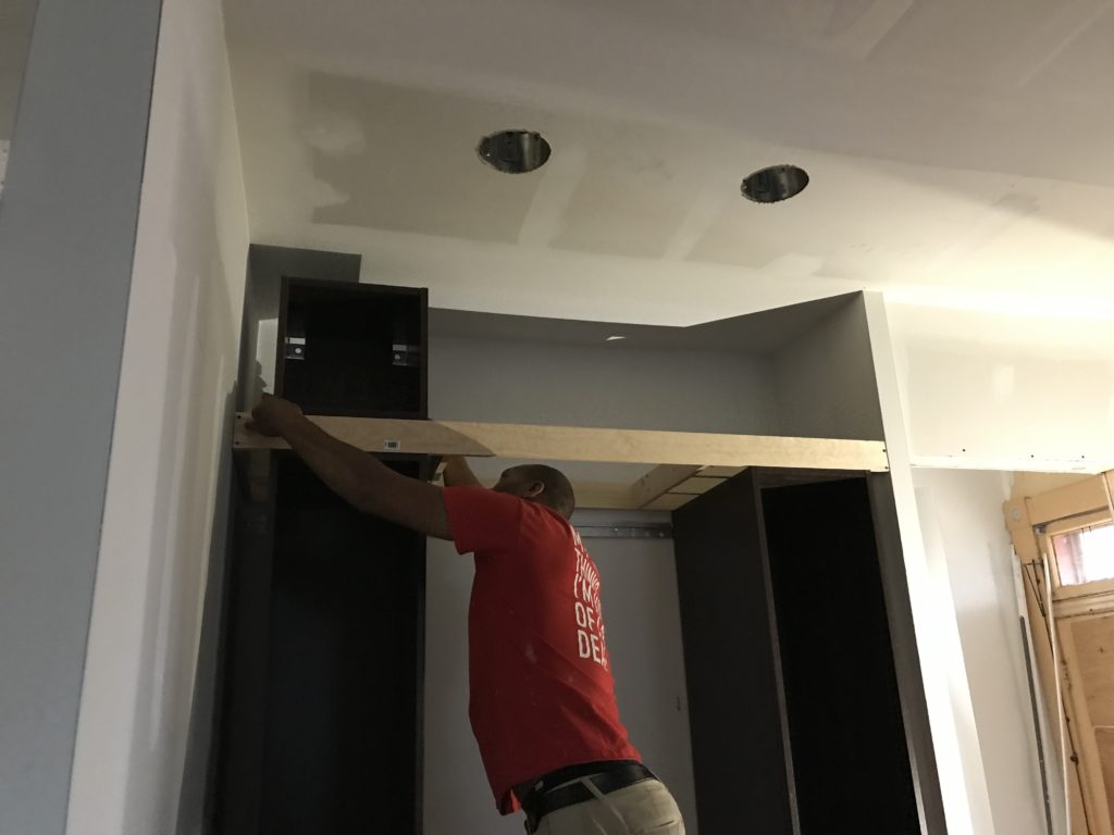
We’re going with their DIY Shaker option so we can paint the doors whatever color we want, and then paint the ladder frame the same color. We’re excited!!
We’ll be back soon with a tour of the rest of the first floor. Check out more inspo on our Blonde Vic Pinterest board and on Insta (#theblondevic) in the meantime.
Have a wonderful week!


This is going to be absolutely STUNNING. So I guess it will just be like everything else you do 😉
Thank you Kelsey!! ????
Wow!!! You have such a gift for designing (and creating) such outstanding spaces! I love your blog!! Thank you for the inspiration. 🙂 I can’t wait to see all of the hard work and thoughtful planning come together. 🙂
Thanks Eve!
So inspirational!! I can hardly wait to see your next post!!
Thanks JoAnna!
Love this design! I have been looking for a range as we plan to reno our kitchen..do you know the price of this range now?
Thank you!
Thanks Kalen! I believe it retails for around 5k. We found ours for $2,500 – it was an open box special 🙂
What a deal! Did you get it from a distributor in your area? Any tips on trying to get a similar deal? Thanks!!
We scoured the internet for weeks trying to find something similar to this one. We searched for discount luxury appliances and found it at Designer Home Surplus (online).
That range is AMAZING. I can’t wait to see how you pull it all together!
Thanks Jess! We found it after a few weeks of scouring the internet for discount luxury appliances and are super excited about it!
Can you share the grout color in the kitchen subway tile? Thank you!
Hi Chrystal! We haven’t grouted yet but plan to do a creamy white — something to blend with the tile.
Hi- can you share the grout color in the kitchen subway tile ? Thank you !
Chrystal
I once saw in your Instagram stories that you made a slatted surface on your kitchen island. It got my attention because we’re attempting one ourselves, but still debating the best way to go about it. (Ours will be floor to ceiling) Didn’t see a full post about it. Any tips?
We used wooden dowels from Lowe’s and evenly spaced them on the front of the island. We attached them with a small nail gun to plywood. We’ll share more details soon — still wrapping up the project!
[…] result. You can catch up on all of our different design changes here & see our final design here. The biggest wish list items we knew we needed to incorporate […]
[…] can catch up on all of our different design changes here & see our final design here. The biggest wish list items we knew we needed to incorporate […]