Wow, this year has started off with a bang, in a good way. We have been working on our Blonde Vic restoration (you can see our latest update here), a flip with a few other investors (more on that soon), our rentals, and our client remodels, one of which we just wrapped up and are so excited to share with you.
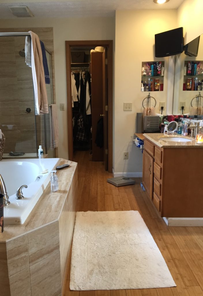
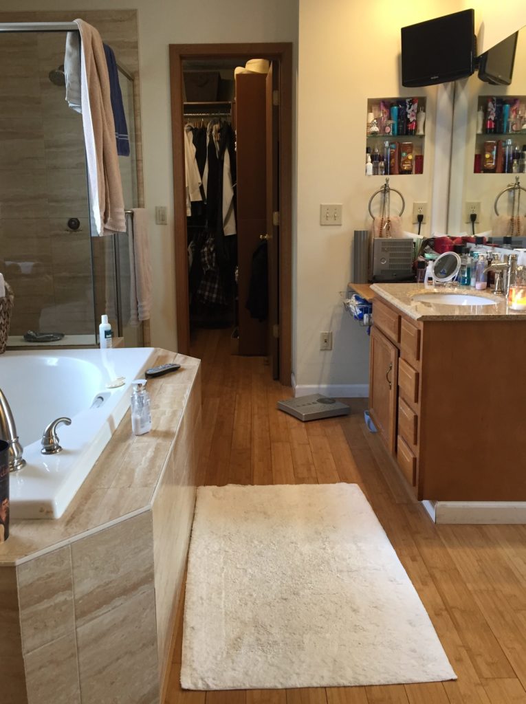
Our clients contacted us because they were looking to remodel their master bathroom. It had a great size and layout, but it had a pretty serious leak in the shower (hello black mold and damaged ceilings below), lacked storage space, and was just very… brown. Here’s what one side of the room looked like – closet entrance, shower and vanity #1. Oh, and half of a giant tub!
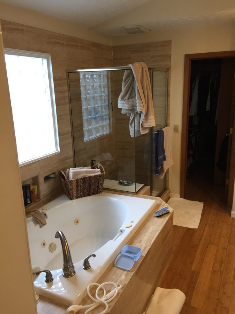
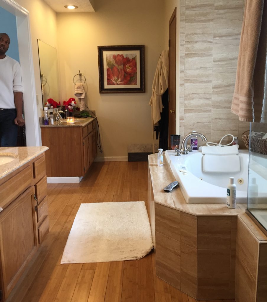
Here’s a closer look at the tub situation.
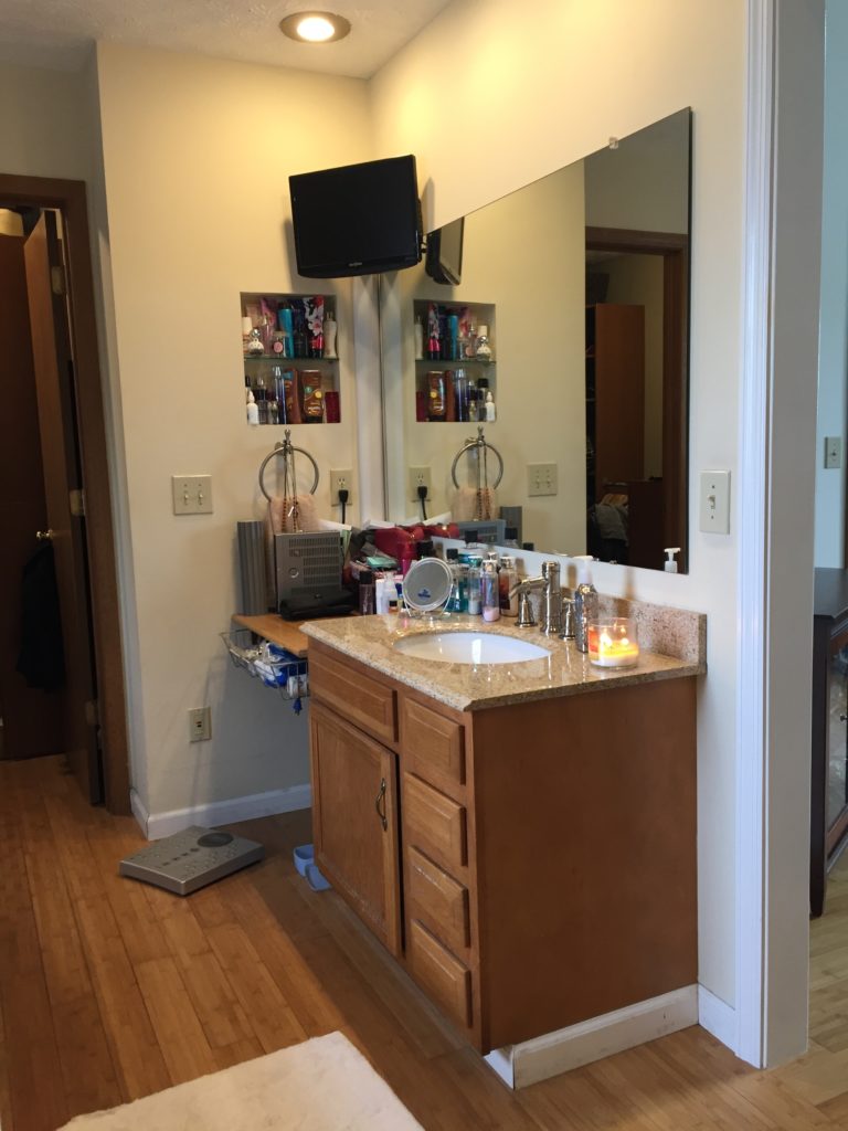
This space next to vanity #1 was a good 18″ – we saw that as an opportunity to add storage.
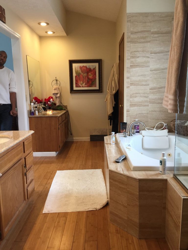
Here’s a photo of the other side of the room, which included vanity #2 and a water closet.
Our design process started by asking our clients for a Pinterest board of their inspiration so we could get a feel for their style. We also asked for their wish list, which included:
- A new shower w/ repaired plumbing leak and no glass door (if possible)
- A new freestanding tub w/a smaller footprint
- More storage
- A space that feels light, bright and clean
We talked through the implications of working with their existing layout as well as completely reworking the space to allow for a walk-in shower. They ultimately decided to keep the layout as-is, which meant that we’d need to compromise on having a glass door in the shower.
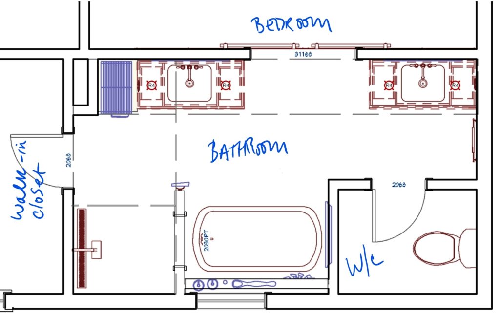
Using our client’s Pinterest boards as a starting point, we began design planning. Here’s a peak at the floorplan after swapping the tub. and adding a built-in storage closet.
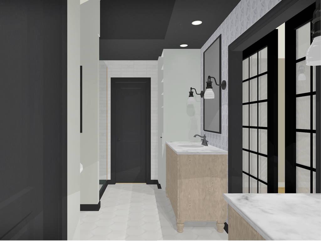
Some of the designs we came up with were edgier…
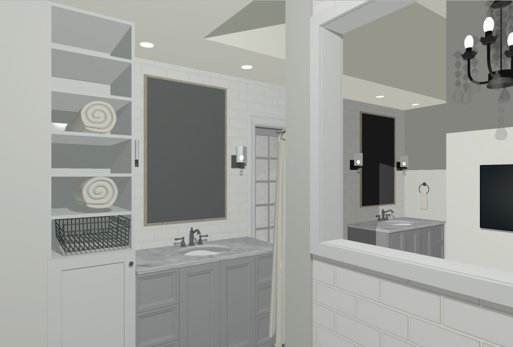
 And others were more neutral.
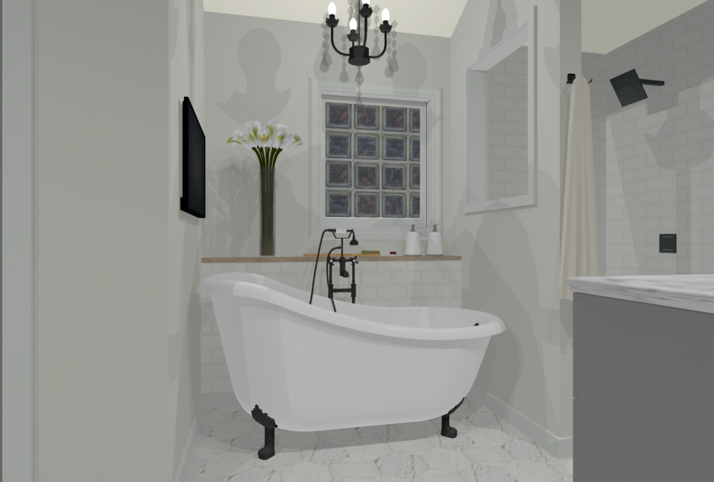
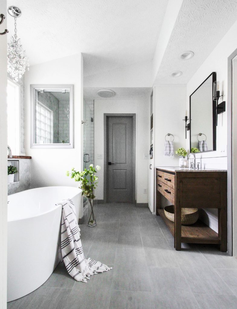
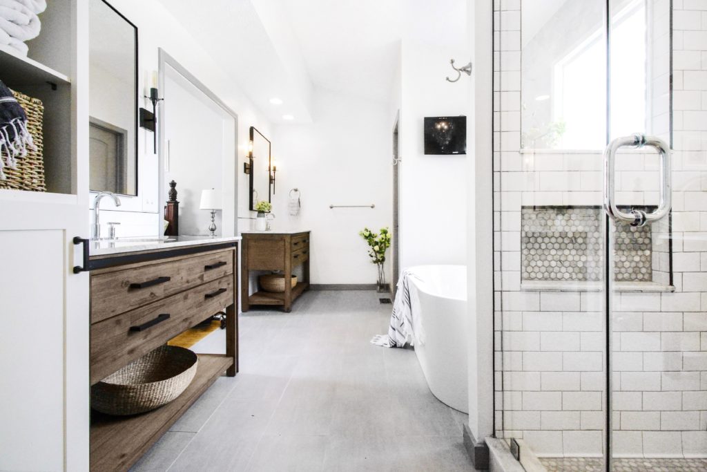
Ultimately, we ended up going with a combination of both. Here’s how it turned out!
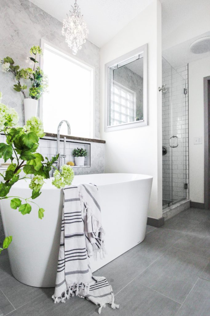
We chose a marble fishscale tile for the back wall of the tub and shower. The neutral, light colors on the floor and walls really make it feel like a spa.
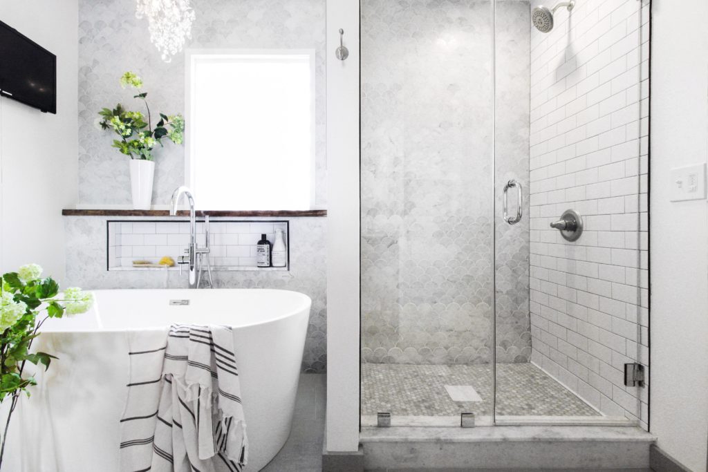
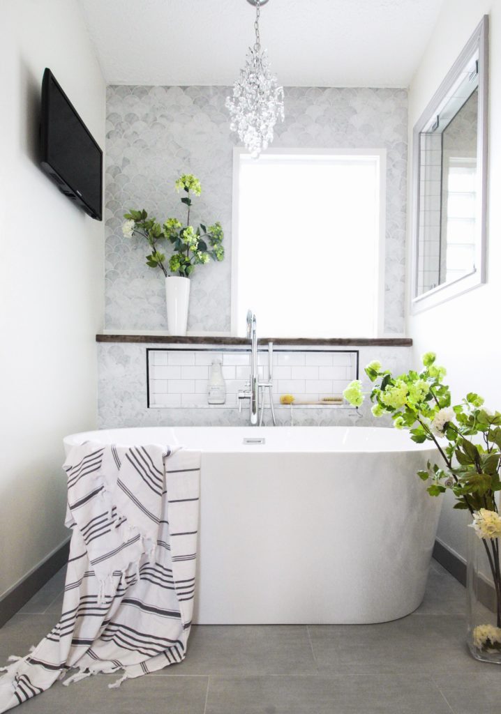
Behind the tub, we designed a shelf/shower niche combo for storage. The offset window couldn’t be centered over the tub, so we got creative with our styling and balanced it out with greenery, a pretty Turkish towel, and tub necessities on the back shelf.
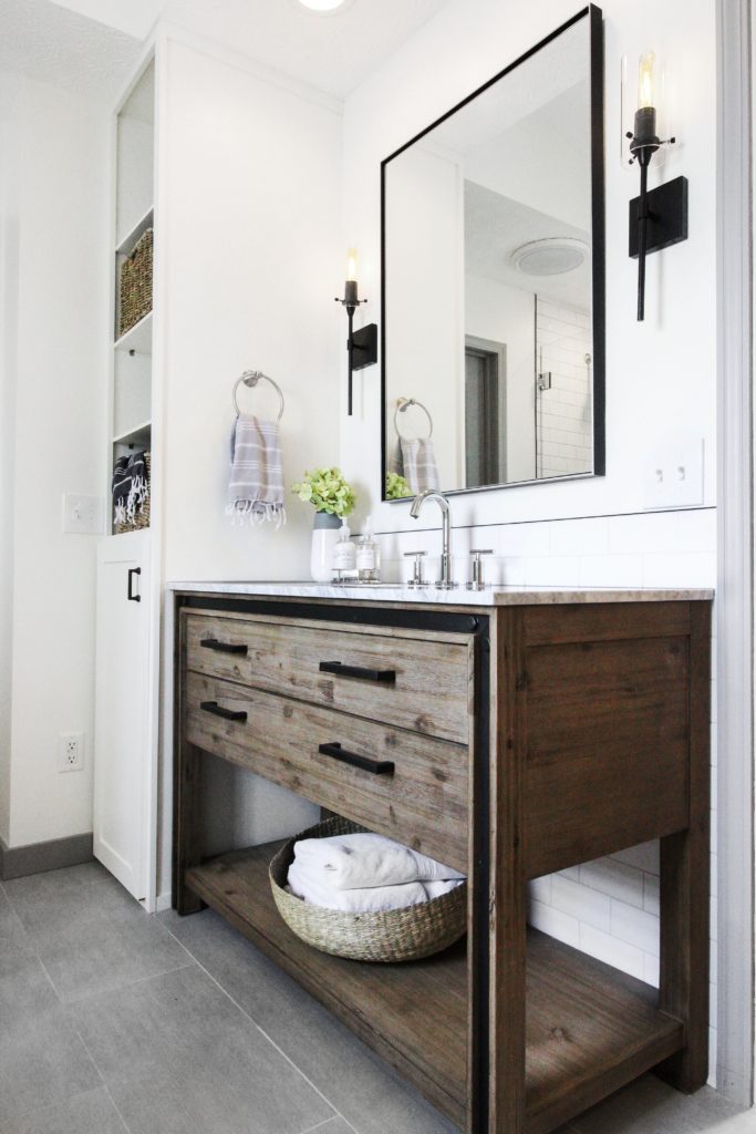
We chose wood vanities and baskets to add warmth to the space and break up all of the grey, black and white.
We incorporated a niche into the inside of the dividing wall between the tub and shower instead of on the back marble wall. Those multi-colored bottles, wash cloths, etc. can now be tucked away and only visible to the person in the shower, leaving the rest of the room feeling clean and organized. Now you see it…
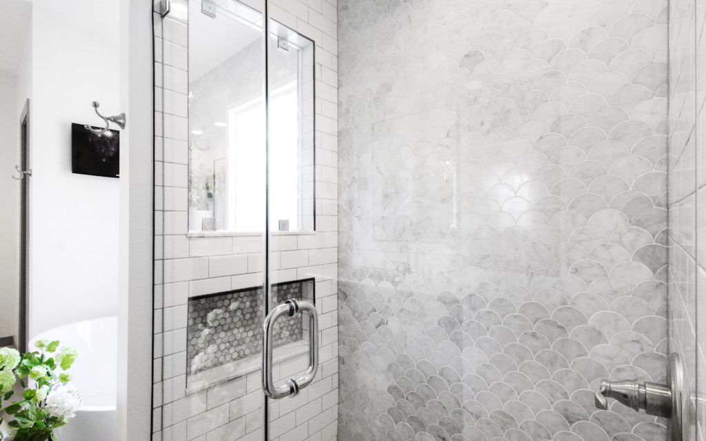 Now you don’t.
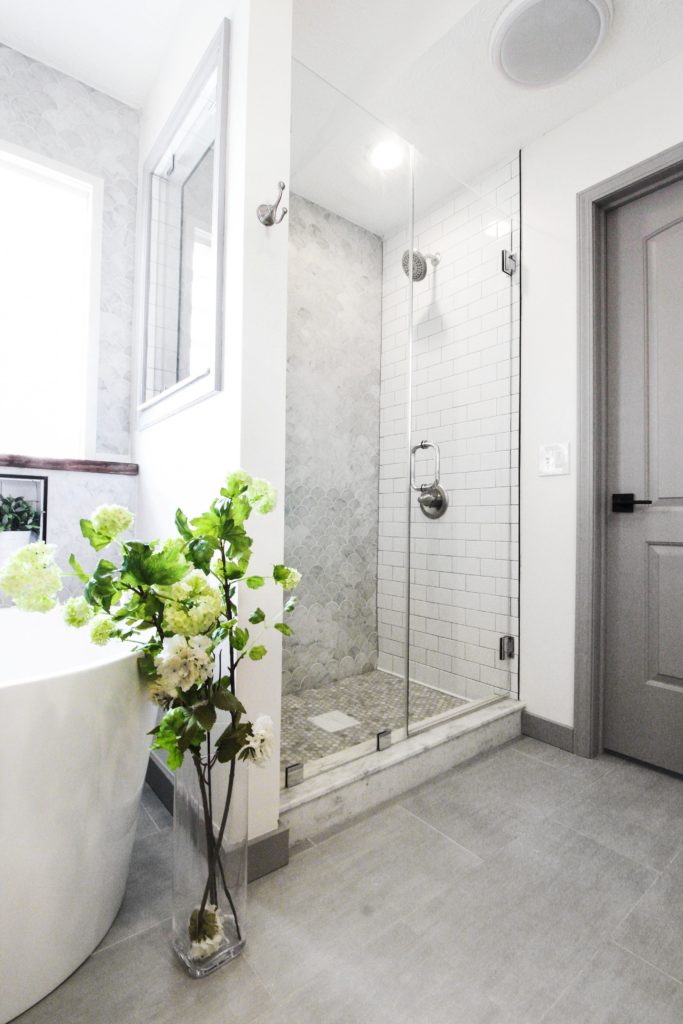
We added a glass window in the diving wall to bring natural light into the shower. It also allows our clients to catch their favorite show or game from the shower!
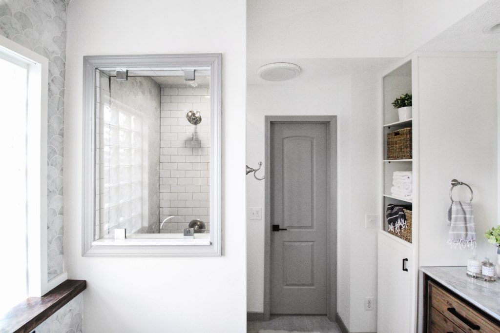
Bryan built a custom storage closet to fill the gap that had previously been unused. Now, our clients have a mix of open shelving where they can store towels, baskets of hair products, etc. and a closed cabinet on the bottom that conceals their trash can.
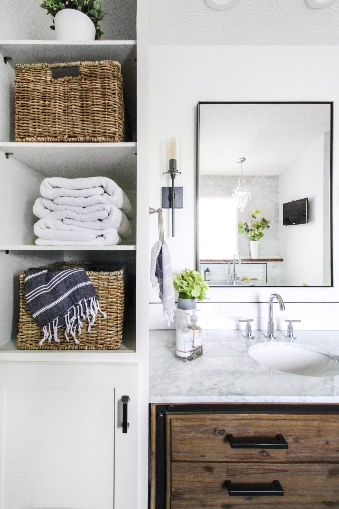
We mixed metals in this bathroom by incorporating matte black, chrome and satin nickel. The black adds contrast and interest without overpowering the space, and the chrome and satin nickel add a more elegant touch. There’s something about the combination of shiny chrome + marble that’s guaranteed to look classy.
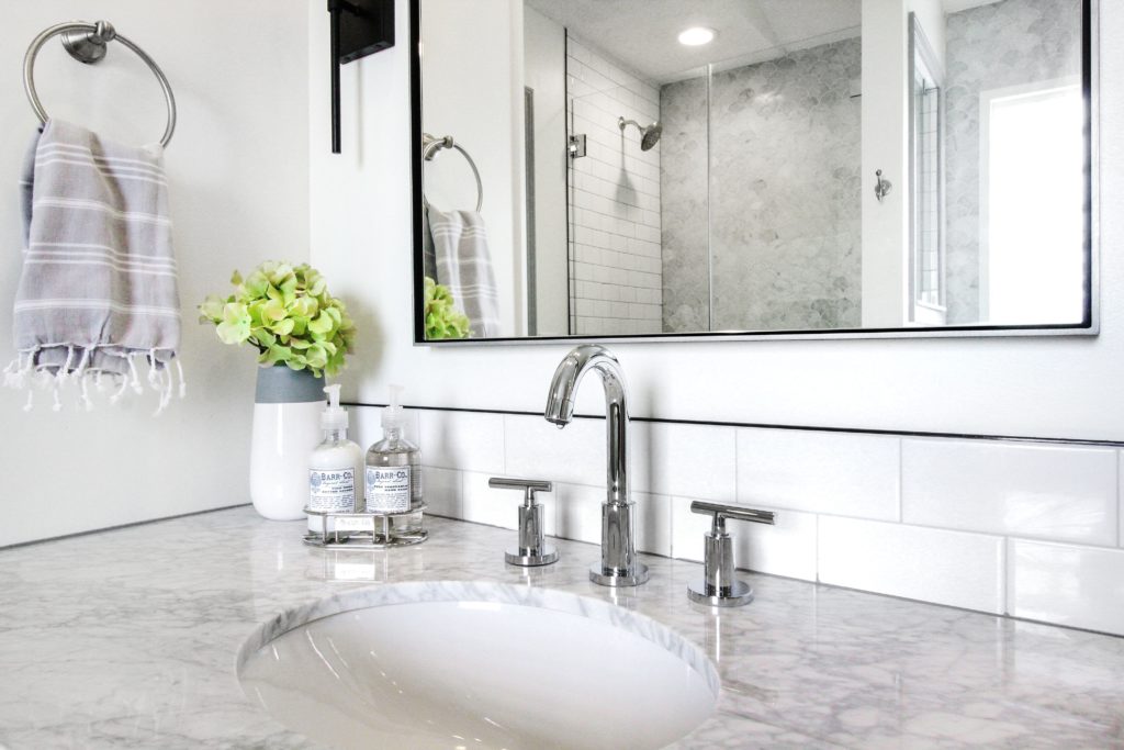 All of the doors and trim were replaced & painted Behr Falcon Gray to tie in the marble and floors. We painted the walls Benjamin Moore Simply White – our go-to!
One more look at before and after from both angles.
Sources:
Floor Tile – Brush Stroke Nickel Porcelain
Marble fish scale tile- Carrera Fan Marble Mosaic
Marble hexagon tile – Bianco Carrara Polished Hexagon Marble Mosaic
Striped towel on tub – Turkish towel 37×70
Vanities – 48″ Celebration Vanity
Sink faucets – Bareva Widespread bathroom faucet (chrome)
Tub filler – Contemporary Freestanding Tub Faucet
Tub – 59″ Freestanding Tub (other similar options – 71″ tub here and 68″ tub here)
Chandelier above tub – Elaisse 3-Light Chandelier (same as our Pearl. St. master bath!)
Sconces – Linea di Liara Sconces from Amazon
Mirrors – Restoration Hardware
Baskets – Michaels
Striped Turkish towel hanging from basket – Large size here, small size here
Paint scheme – Benjamin Moore Simply White (walls); Behr Falcon Gray (trim and doors)
You guys are geniuses! Seriously, e-v-e-r-y-t-h-i-n-g you do I love!
You’re so kind, Jill! Thank you!
**Swoon** This is such a stunning space! Your work is so extraordinary!! I looked those big round basket-ish things you have under the vanities. Do you have a source for those? Thanks for letting us share in your neat work. 🙂
Thanks Eve! The baskets under the vanities are from Ikea.
God this is GORGEOUS. I just came across your blog and if this is the sort of design touch I can expect I’m so, so excited to see more.
Thank you so much, Kerry!
wow this space is so flipping amazing. The link to the tub doesn’t work, do you know the name by any chance?
Thank you Jessica!! I just updated the link & added a few more to similar, larger ones 🙂
Wonderful tips! Love these pictures. Very inspiring when you are thinking to renovate the bathroom 🙂
Thank you!
We just moved to Columbus and I was really happy to discover this blog. I love that you are mixing darker wood elements in your projects. We have dark wood in our house that we decided not to paint because it’s in such good condition. You’re providing great inspo!
So glad to hear that, Stephanie!
I love what you did with this bathroom. I was wondering what color grouts you used for floor, marble in shower, and on white subway tile. Would you kindly let me know. So much appreciated!
We have read this post. We can comment here that you keep continue with your blogs. As we want to get in connection with you and we are always thankful for your blog posts. Nice.
The remodeling idea is awesome thanks for sharing this one.
Thank you for this nice sharing. Great post.
Yes, this design is different from other bathroom designs with a modern look given to this. Thanks for sharing this with us.
Your idea is unique and effective. This type of method is essential for remodeling. Your idea saves my huge amount of money.
I’d forever want to be updated on new blog posts on this website, saved to bookmarks!
Thanks for sharing your photos. The transformation is just amazing. My first impression was – wow! This is such a beautiful piece of work that I immediately wanted to have the same bathroom. It seems to me that there is a pleasure in it. Thank you for sharing your ideas and their wonderful implementation. It was impressive.