Welcome back, friends. I hope you are having a wonderful week! We’ve been
staying very busy at the house and actually have some good news this time. Our kitchen layout is finalized, cabinets are ordered, and appliances are purchased! There’s no looking back now.
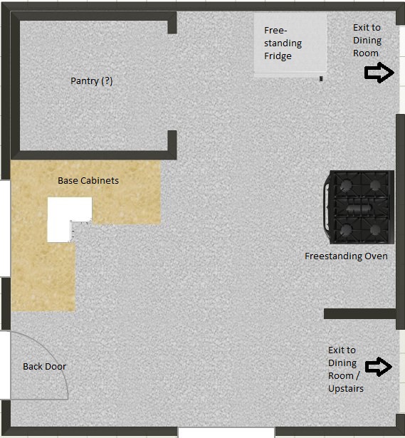
We showed you some photos of the kitchen in our last post, but haven’t shared the full floor plan. Here’s my unprofessional attempt to make one (don’t judge!). Those wall openings to the left of the cabinets and the bottom of the room are windows… and there’s supposed to be another one on the left wall of the pantry that I forgot to add (oops). The plan is not exactly to scale, but you can see there was lots of room for improvement.
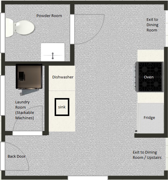
We thought about doing a U kitchen and closing off the top right walkway to the dining room. We also considered doing an L kitchen with an island. And we thought about adding a breakfast nook somewhere. All of these would have turned out great, but we ultimately decided on a galley layout for a few important reasons. First, since there is only one bathroom in the house (on the second floor), we wanted to add a powder room on the first floor. The kitchen was the only feasible spot for it given the layout of the other rooms, so we had to work around it. Another factor is that we wanted to bring laundry up to the first floor, instead of it being in the dark, creepy basement. That had to go somewhere, too. And last, we had to remind ourselves that this is not going to be our forever home. The plan is for it to be a rental down the line, which means it needs to be functional, durable, and nice without going overboard. Although we loved the idea of having a large kitchen, the convenience of having the powder room and laundry easily accessible took priority. So here’s what we came up with (also not exactly to scale, but you can get the general idea.)
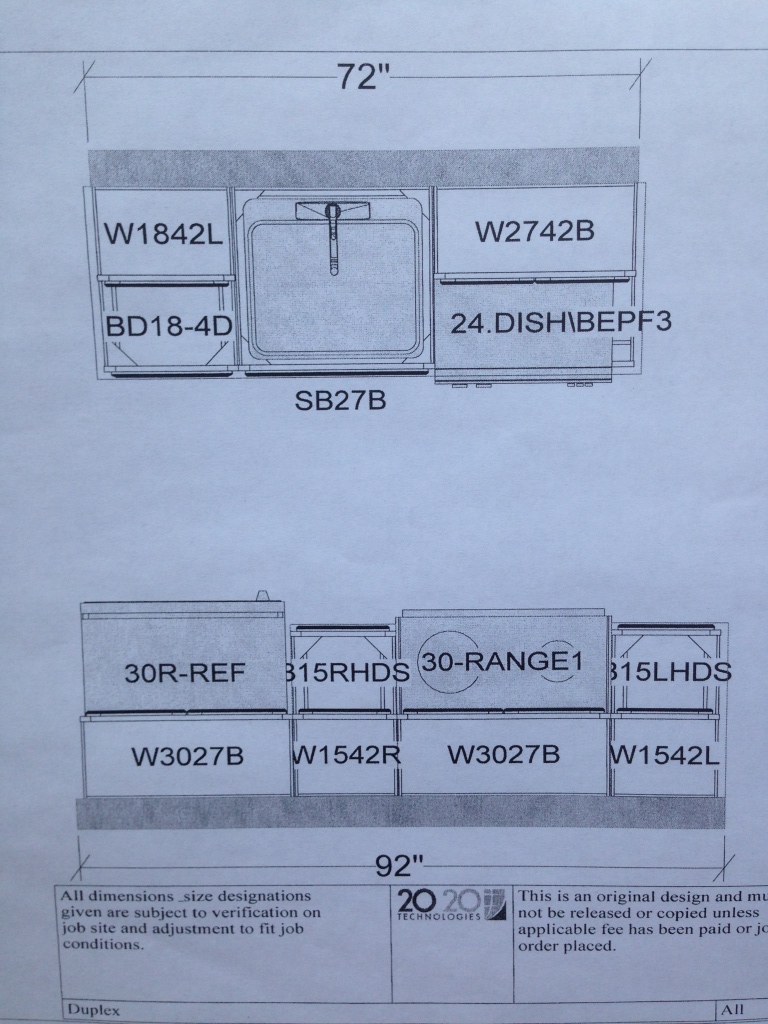
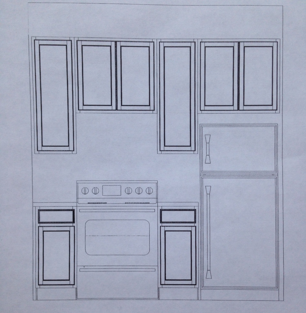
Here’s another view of the layout of the cabinets and appliances.
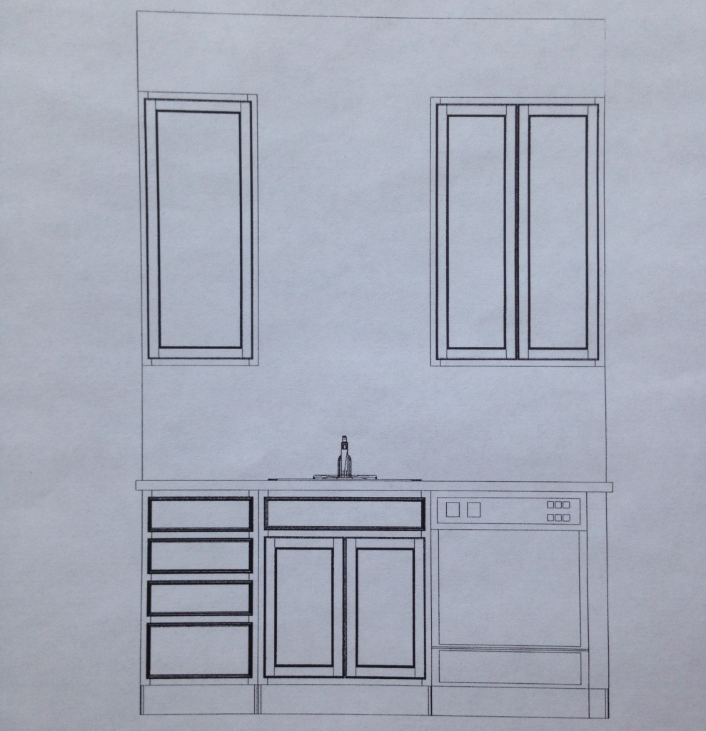
This is what the left side of the galley will look like. We purposely left the space above the sink empty so we can add our own open shelving.
This is what the right side of the galley will look like.
Since our counter space is limited, we may attach a drop leaf table to one of the walls, like this one from Ikea. This way, it can be expanded when needed, and folded down flat against the wall to ensure the walkway isn’t obstructed when it’s not being used. Or, we could add a sliding cart or a slim island if we have enough space between the cabinets. We’re just going to wait and see how the room looks with everything in it before deciding what to do.
As for the cabinets, we were originally set on white, but after speaking with the sales guy at our cabinet store, he suggested we go dark if it will be a rental. They’ll hold up better to wear and tear, and better yet, they’re less expensive. Sold. So we ended up choosing a dark brown/espresso color. For counters, we’re thinking of a light quartz or granite. Since it’s going to be a small space, it will be relatively inexpensive to choose something higher end.
I love this photo for inspiration – the high ceilings, awesome light fixtures, and dark cabinet/light counter combo.

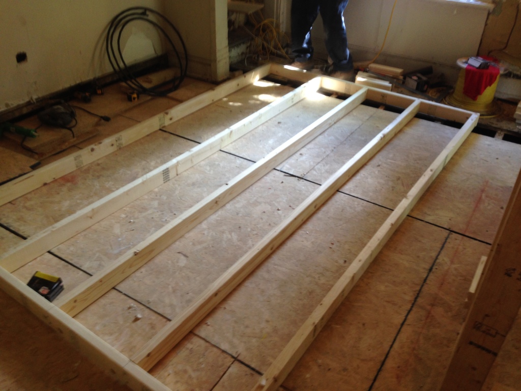
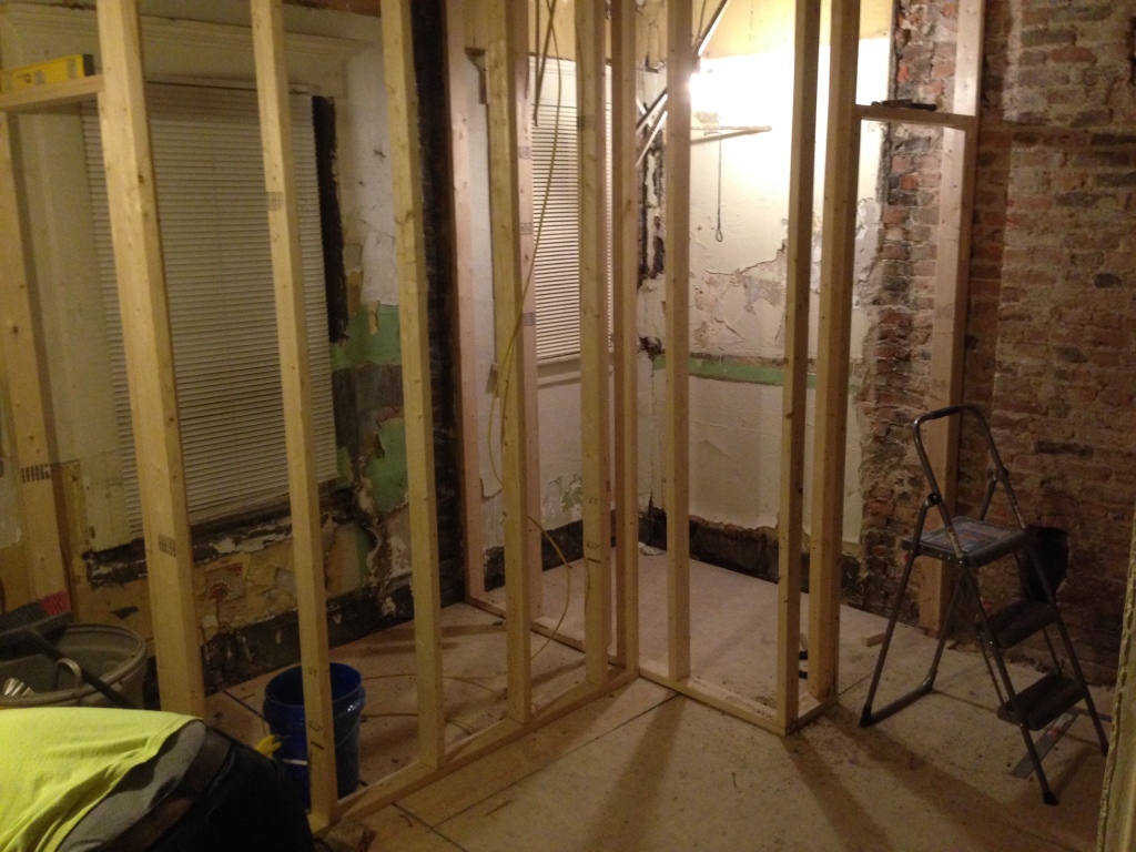
To get the kitchen moving, Bryan built frames for the powder room and laundry room, and framed the doorways.
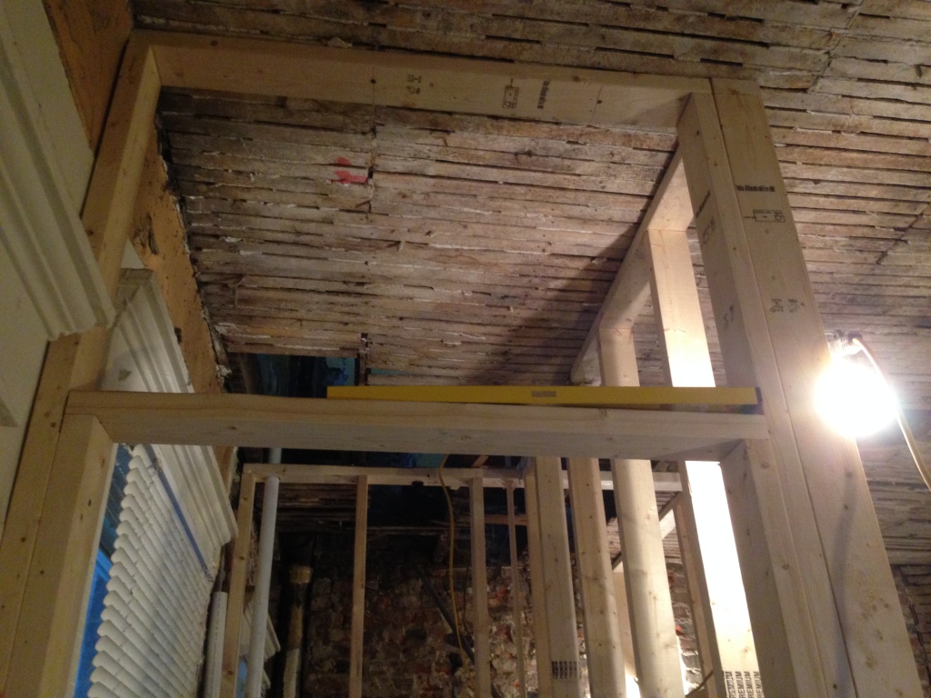
Since two of our three kitchen windows will be blocked by the bathroom and laundry room, we’re going to keep the space above the laundry room and bathroom doors – about 2.5 feet – transparent. We’ll fill the space with plastic or glass instead of drywall so that the light can come through into the kitchen. Gotta love 10′ ceilings!
We’re making progress, slowly but surely! This week, we’re going to work on exposing brick, restoring the dining room fireplace, and sanding the floors. We’re also going to finish plumbing, and get moving on electrical. We’ll check back again soon with another update. Hopefully we’ll have more good news!
Hi Catherine, Love the final layout. You’ve done a good job with the space and incorporating your needs. Go for the quartz, it’s durable AND beautiful. My husband and I renovated a duplex. lived in one side and now have it as a full rental property. You have to constantly remind yourself that it is a rental, but that doesn’t mean it can’t be beautiful and practical at the same time. When it comes time to securing tenants, you will be able to command a higher rent. What if you were to add a sliding door, or better yet, a barn door to the half bath? That way you may be able to squeeze in a small table at that end of the room without having to deal with the door swing. Just a thought. Keep on keepin’ on! All your hard work will pay off in the end.
Thanks for stopping by, Kris! It’s great hearing from someone who went through the same thing. That’s exactly our plan – live in one side for now but eventually make it a full rental.
We actually entertained the idea of the barn/sliding door for the bathroom – love that suggestion! From what we can tell, though, there won’t be enough room to the left of the doorway for the pole because the cabinets are right there. So the door wouldn’t be able to slide all the way open, if that makes sense (my floor plan is deceptive – there’s only about 6-12″ of space on either end of the door, if that). The other option is to put the fold out table right under the window on the bottom end of the kitchen, which would be more of an open space.
Honestly, we’re hoping we’ll have room for a narrow island in there and won’t have to worry about the table! We’ll keep you posted once we figure it all out. 🙂
[…] of our progress along the way (if you want to know more, check out our prior kitchen posts here and here). These photos are of just one side of the galley – the other one isn’t finished yet […]
[…] black mold and roaches and lots of other nasty stuff in there. In the process, we decided to redesign the kitchen to allow for an added powder room and first floor laundry in the space. We purchased […]
[…] you want to know more about our kitchen progress, click here, here and here. And, if you want to stay in the loop on our reno in between blog posts, follow us on […]