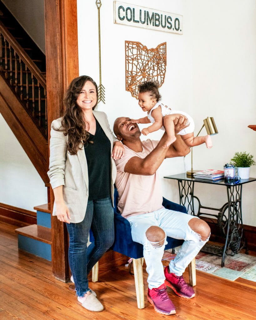
 New to BITM? Welcome! We’re Catherine and Bryan Williamson, husband & wife business owners, interior designers, renovators and Airbnb Superhosts based in Columbus, OH. We’ve renovated over a dozen houses since moving to Columbus, and are currently in the middle of upgrading my parents’ new (old) home. It’s a 1950’s cape cod that we’ve dubbed White Cape Cottage. We’re looking forward to having you along for the ride these next few weeks as we tackle the One Room Challenge. Make sure you’re following us on Instagram and subscribed to our email list for the latest updates on our progress!
Catch up on Week 1 here.
It’s Week 2 of the ORC, and demo has begun! We removed the wall and small door between the hallway and bedroom…
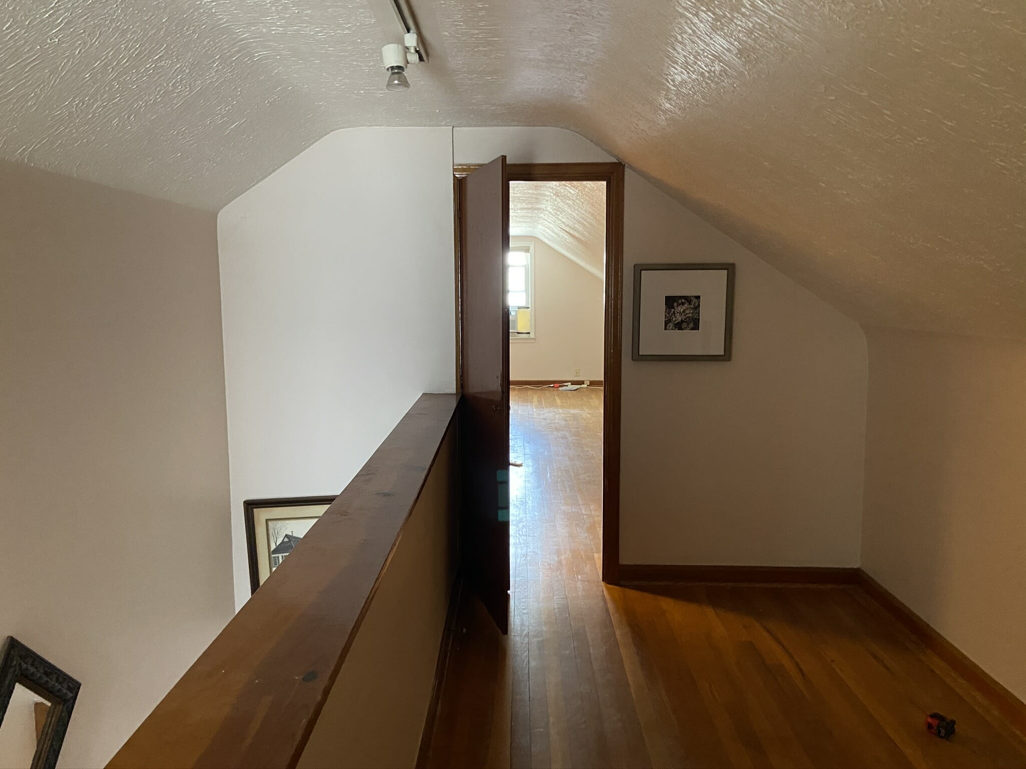
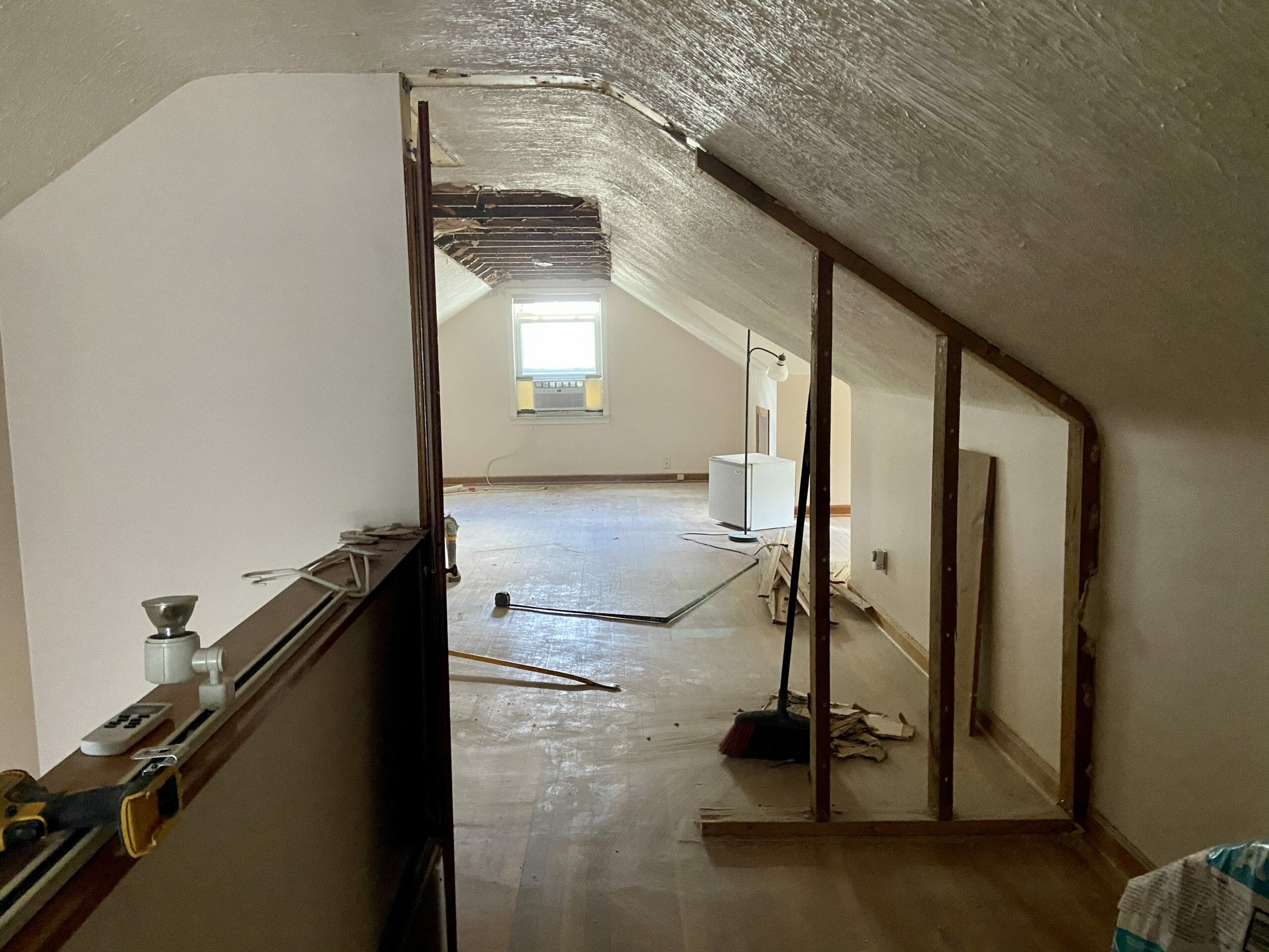
And took out about 3′ of ceiling in the main bedroom area.
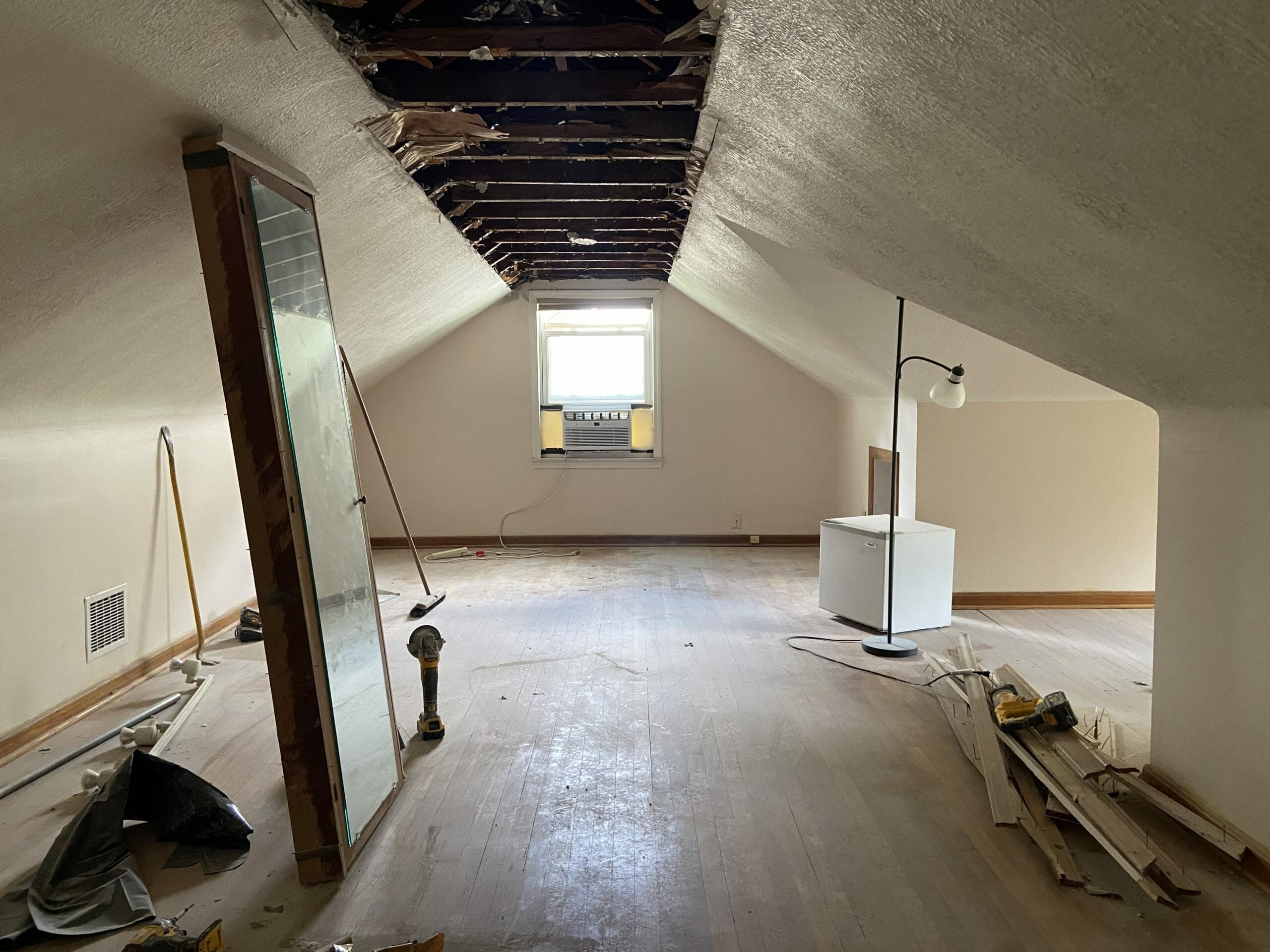
There’s about 15″ of extra height under the beams (the ceiling height below the beams is about 81″, and the ceiling height to the peak is 96″). It’s not a ton of extra space, but bringing the drywall all the way up will make the room feel larger. We also have to insulate.
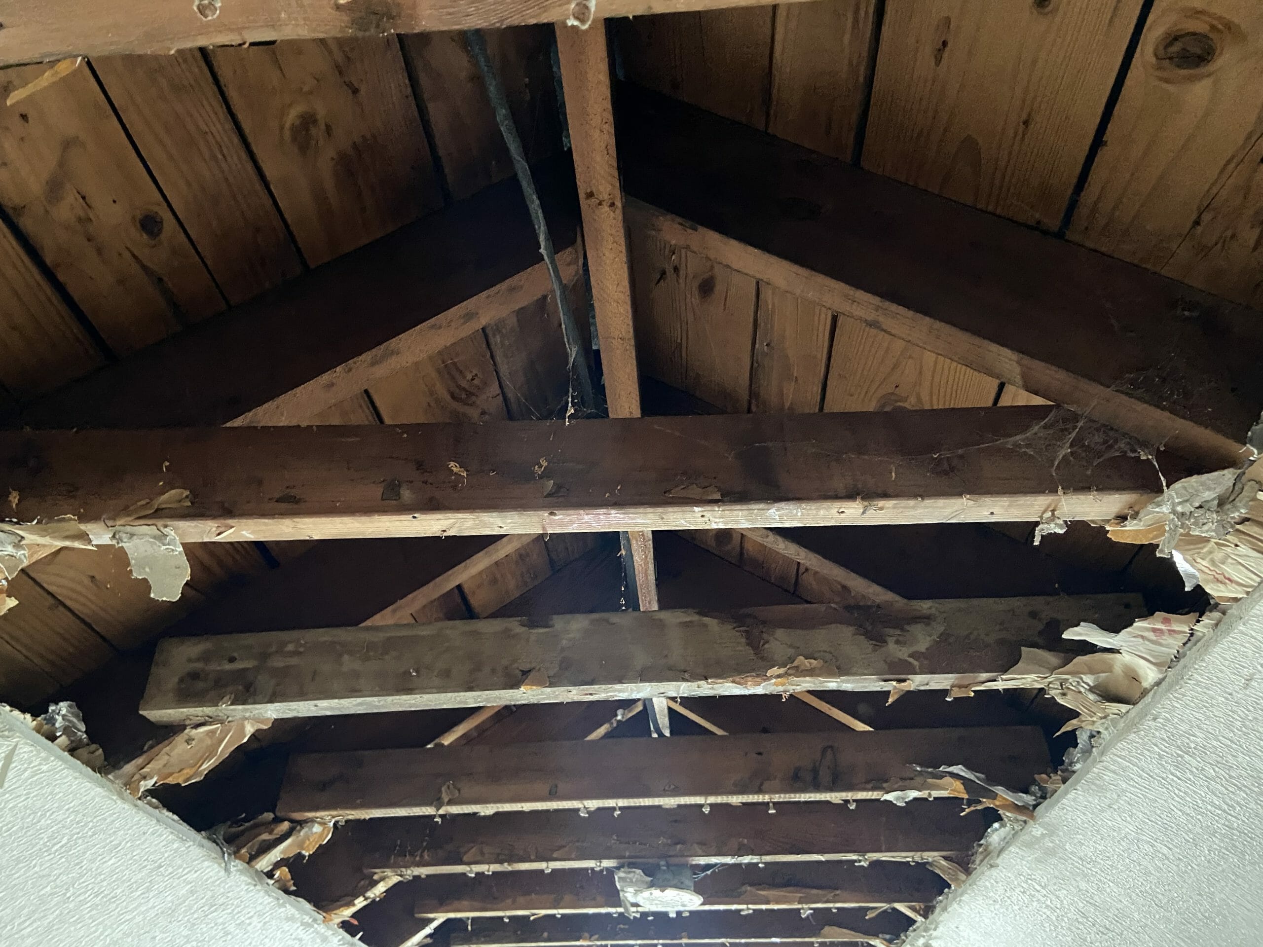
Next, we’ll begin framing the knee wall closets and bathroom. The one thing we’re still going back and forth on is the bathroom layout. One of our goals was to add a bathroom into this space without adding a dormer, but we’re reconsidering. The space we have is about 8′ wide x 6′ deep, but you can only walk in about half of that because of the slope. Here are our 3 final layouts we’re considering if we don’t do a dormer.
This one would put the sink in the slope (the black line going across shows where the slope starts). We would add skylights across the entire slope to make the room feel more open. I could see adding one big one above the sink to create some extra head height.
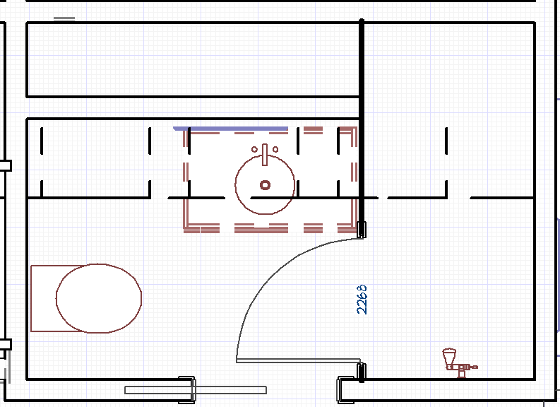
Layout #2 would switch the toilet and vanity. The pro about this one is that the vanity would be comfortable to use while standing up because you’d be in the full ceiling height space. We’d be able to have a regular mirror, storage, etc. The con about this is that the toilet is what you see when you walk in…
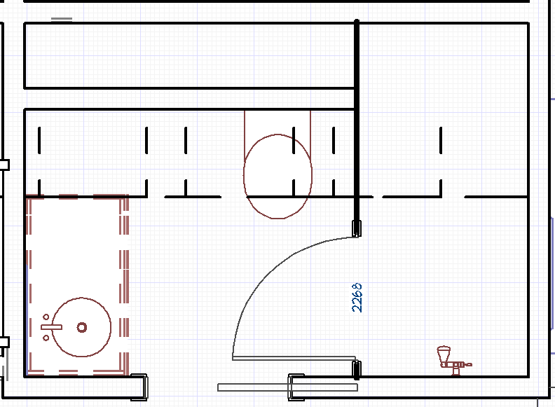
In layout #3, both the sink and toilet would be in the slope. I like the flow of this one, but I feel like we’re wasting that left full-height wall by doing this.
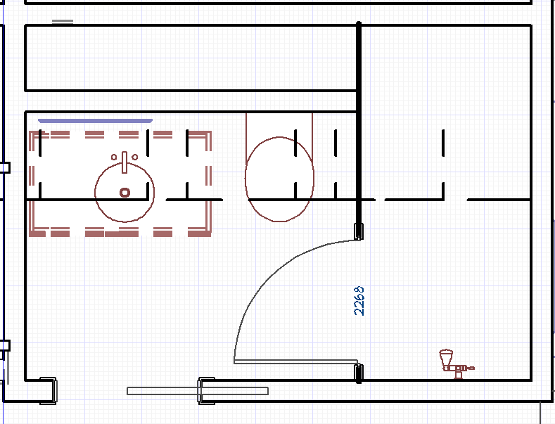
We’ve done quite a few sloped ceiling bathrooms that have worked out, so we’re not afraid of it… we just haven’t had that aha moment yet.
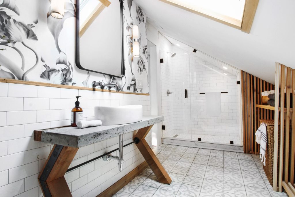
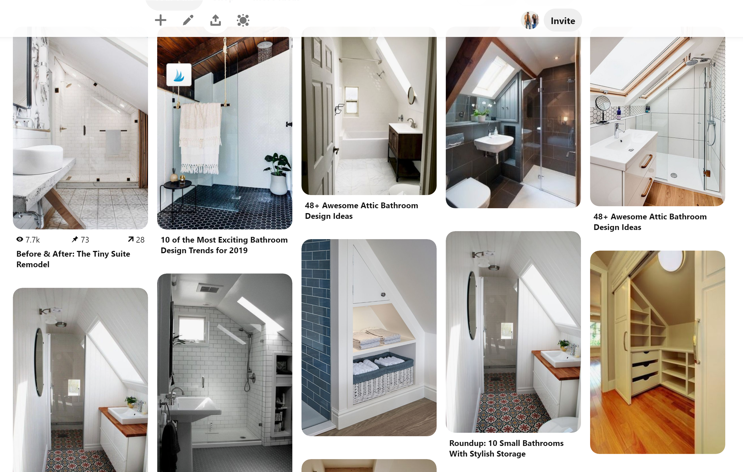
I’ve been pinning lots more inspiration. So many creative solutions!
Ok, NOW… let’s talk dormer. If we were to add a dormer, the size of the bathroom would go from being 50 sq ft (with only about 25 of those being usable because of the sloped ceilings), to 75 sq ft of usable space. This is one of the many layouts we could do if we went that route…
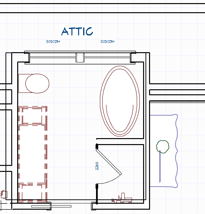
It feels like we should do it in terms of design, but we’re dealing with cost, timeline, and the big “is it really worth it” factor. Whatever we do, we want the bathroom to be functional and comfortable and usable.
We’ll be making a final decision this week! What would you do?
Be sure to check out the other designers’ One Room Challenge progress this week, too!

I’m on pins and needles!! I’m sure you will pick the best plan. I’m glad it’s not me making that call.
Do your folks need a bathtub? I think a dormer is great for light and space and I think it will be a good investment going forward. Do it!
… spoiler: we did it!!
It all depends on how much. And would they use the bath. If it doesn’t blow the budget too much then yes definitely do it. If it is time that is the constraint then leave the bathroom out and just do the rest. Not worth shortchanging yourselves for a challenge.
Thank you Vicki!